Bar charts are one of the most commonly used data visualization tools in PowerPoint presentations. Whether you are preparing a project report, a classroom lecture, a business proposal, or a technical review, a well designed bar chart helps transform raw numbers into clear insights.
For many professionals and students, knowing how to create a bar chart in PowerPoint is a must have skill. A clean and readable bar chart not only improves data comprehension but also makes your presentation look more professional and credible.
In this guide, you will learn how to create a bar chart in PowerPoint step by step using Presenti AI, an AI powered PowerPoint generator. Even if you have no prior experience with charts or presentation design, you will be able to follow along and build a polished bar chart with ease.
Why Use Bar Charts in PowerPoint Presentations?
Before diving into the steps, it is worth understanding why bar charts are so effective in presentations.
Bar charts are ideal for:
- Comparing values across categories
- Showing changes over time
- Highlighting differences between datasets
- Making complex data easier to understand at a glance
Compared to tables full of numbers, bar charts communicate trends faster and reduce cognitive load for your audience. This makes them especially useful for technical teams, educators, and project managers who need to convey insights quickly.
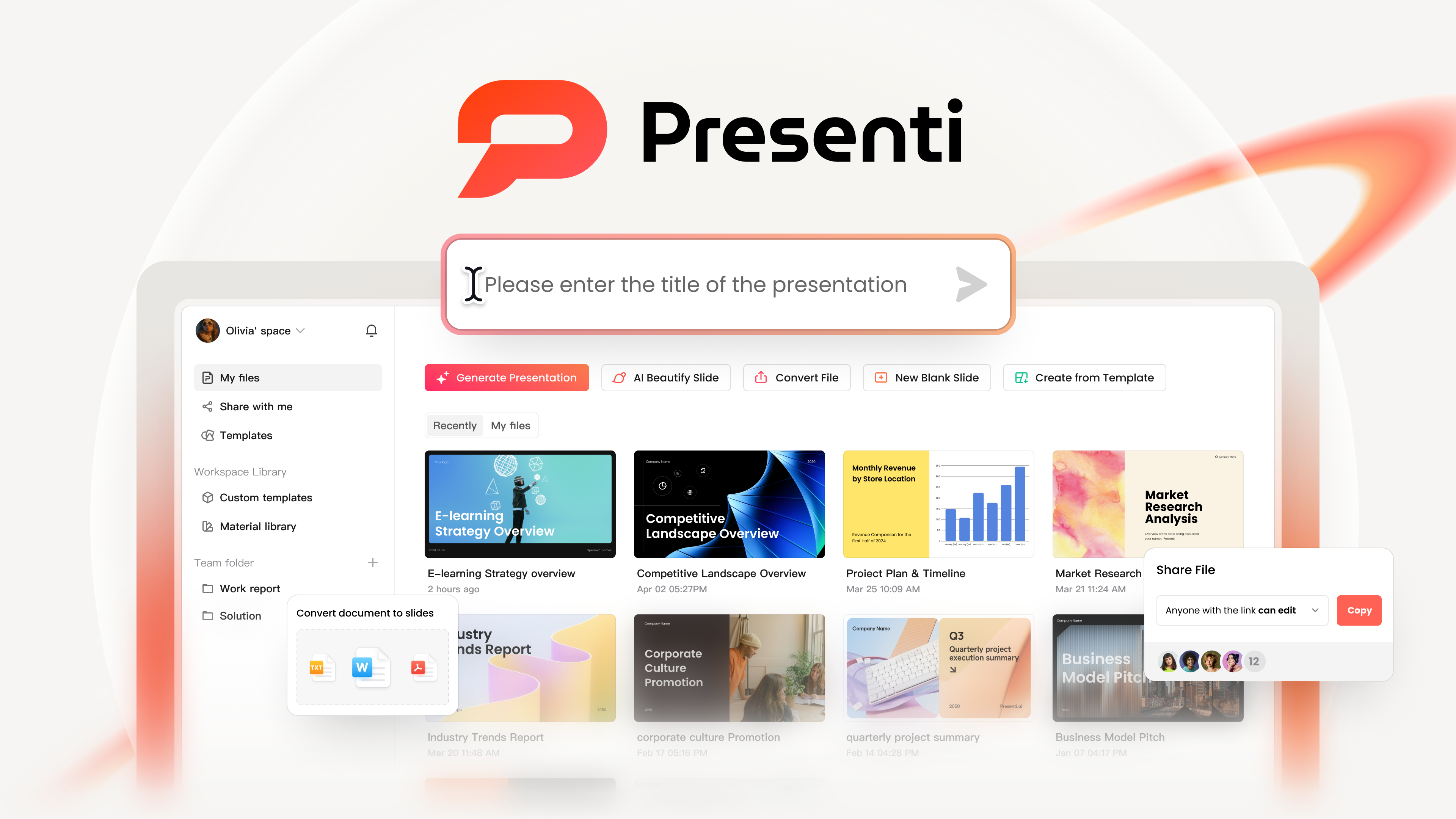
Getting Started with Presenti AI
To follow this tutorial, open your browser and visit the Presenti AI official website. Create an account or log in, then enter the workspace.
You can either:
- Generate a presentation using AI based on your content
- Or start with a blank PowerPoint and add charts manually
Once you are inside the editor, you are ready to begin creating your bar chart.
Step 1: Insert a Bar Chart
In the top toolbar of Presenti AI, click Charts, then select Bar Chart.
Presenti AI offers a wide variety of bar chart styles to match different presentation needs, including:
- Standard vertical bar charts
- Bar charts with background highlights
- Horizontal bar charts
- Mixed bar and line charts
- Comparison focused bar layouts
Choose the chart type that best matches the data you want to present. For example, vertical bar charts work well for category comparisons, while horizontal bar charts are useful when category labels are long.
After selecting a style, the bar chart will be inserted directly onto your slide canvas.
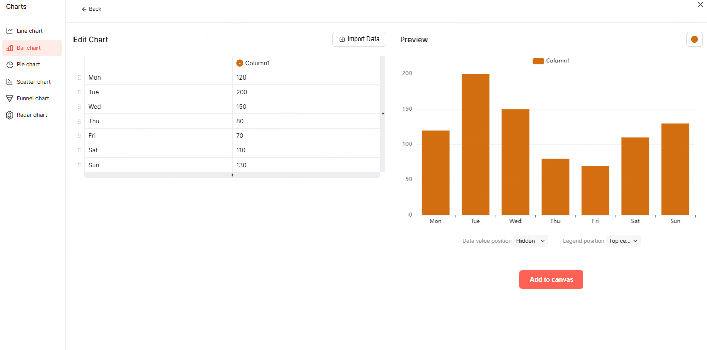
Step 2: Edit Bar Chart Data
Once the chart is selected, click Edit Data in the upper right corner.
A data editing panel will appear, allowing you to input values directly in your browser. You can:
- Add or remove rows and columns using the plus icon or trash icon
- Rename categories and data series
- Adjust numerical values in real time
As you update the data, the bar chart automatically refreshes on the slide.
To improve readability, open the Chart Tools panel and enable:
- Data labels on bars
- Clear X axis and Y axis labels
- Key value markers for important data points
Displaying values directly on the bars helps your audience understand the data without having to interpret axes manually.
Step 3: Customize Bar Chart Style
After entering your data, it is time to refine the visual appearance of your bar chart.
In the chart settings, you can customize:
- Bar colors to match your brand or theme
- Data label positions for better visibility
- Legend placement for clarity
- Axis formatting and scale
These adjustments ensure your chart looks clean, consistent, and easy to read on any screen.
Once satisfied, click Add to Canvas to finalize the chart placement on your slide.
Smart Layout with Presenti AI
One of the biggest advantages of using Presenti AI is its intelligent layout system.
Based on the amount of data in your chart, Presenti AI automatically:
- Allocates appropriate space for the chart
- Prevents overcrowding or excessive white space
- Aligns elements for visual balance
This eliminates the need for manual resizing and alignment, which often takes a significant amount of time in traditional PowerPoint workflows.
If you need to make changes later, simply double click the chart on the canvas to reopen the data and style settings.
Step 4: Beautify and Optimize the Bar Chart
Once the bar chart is placed on your slide, you can further refine its appearance.
You can:
- Resize the chart proportionally to fit the slide layout
- Adjust spacing to improve focus on key data
- Ensure consistent margins and alignment with other elements
Presenti AI also supports one click background switching. You can instantly test different slide backgrounds and color schemes to find the best visual match for your chart.
Choosing the right background improves contrast and ensures your data stands out without overwhelming the audience.
Best Practices for Professional Bar Charts
To make your bar charts more effective in professional presentations, keep these tips in mind:
- Avoid using too many colors in a single chart
- Highlight only the most important data points
- Keep axis labels short and clear
- Maintain consistent scales across slides
- Use readable font sizes for labels and values
A simple and focused chart often delivers more impact than a visually complex one.
Why Choose Presenti AI for PowerPoint Charts?
Presenti AI is more than just a chart tool. It is a complete AI powered presentation platform designed for efficiency and quality.
Key benefits include:
- Multiple chart types for different data scenarios
- A large library of professional PowerPoint templates
- Rich design assets for slides and visuals
- Multiple ways to generate presentations using AI
- Smart layout automation to save time
Whether you are creating a technical report, an educational lecture, or a business presentation, Presenti AI helps you produce professional grade slides with minimal effort.
Conclusion
Creating a bar chart in PowerPoint does not have to be complicated or time consuming. With Presenti AI, you can insert, edit, customize, and beautify bar charts in just a few steps.
From data input to intelligent layout and visual optimization, Presenti AI streamlines the entire process. The result is a clean, professional bar chart that fits seamlessly into your presentation and communicates your data with clarity and impact.
If you want to improve your presentation quality while saving time, Presenti AI is a powerful solution worth exploring.