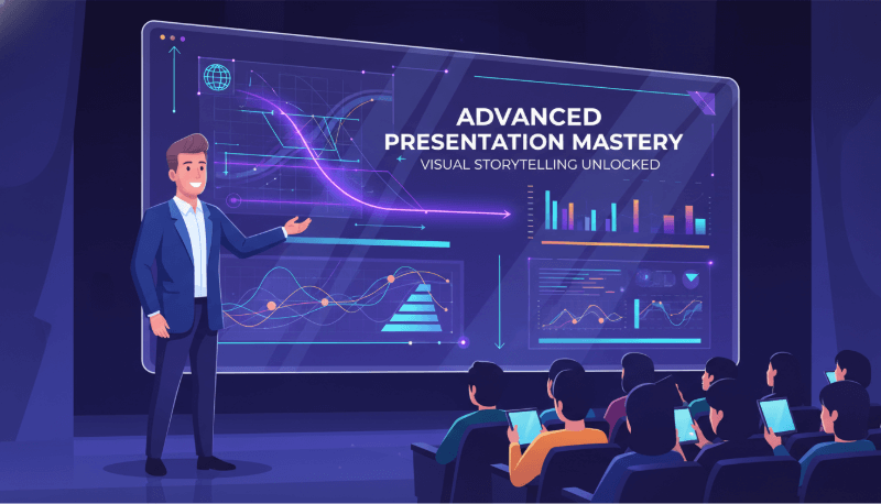
PowerPoint presentations have become an essential communication tool in education, business, and daily work scenarios. Whether you’re preparing a class project, pitching to clients, presenting a marketing proposal, or reporting to management, a well designed PPT can significantly improve clarity and persuasion. Yet many people struggle: Where should I start? Why does my PPT look messy? How do I create a logical flow? Is there a way to save time? Nowadays, the answer is yes. Besides traditional manual design, AI powered PPT generation tools, such as Presenti AI, allow anyone to build structured, visually appealing presentations in minutes. With a few keywords, AI can automatically generate layouts, templates, diagrams, and even storytelling frameworks, enabling you to focus more on insights and delivery.
This complete guide covers how to make a PPT from scratch, core design principles, advanced techniques, common mistakes, and recommended tools, along with a step by step tutorial for making PPTs with AI.
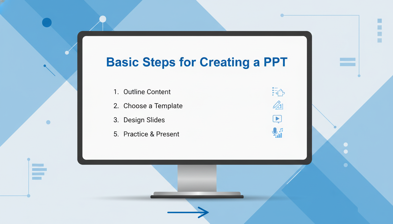
1. The Basic Steps of Creating a High Quality PowerPoint Presentation
Before diving into slides, the first task is not choosing a template. The key is understanding your audience and message. Here’s a clear step by step approach:
(1). Define Your Goal and Audience
A strong PPT always starts with clarity.
Ask yourself:
- Is this for an internal report?
- A client proposal?
- A school presentation?
- A startup pitch?
Different audiences require different depth and emphasis. Setting the right goal ensures your content stays focused rather than overly broad.
(2). Build a Clear Outline
The “Intro → Body → Conclusion” model is simple but effective.
Start by outlining:
- What you want to introduce
- The main points you’ll explain
- The conclusion or actions you expect
A good outline prevents information overload and keeps your presentation coherent.
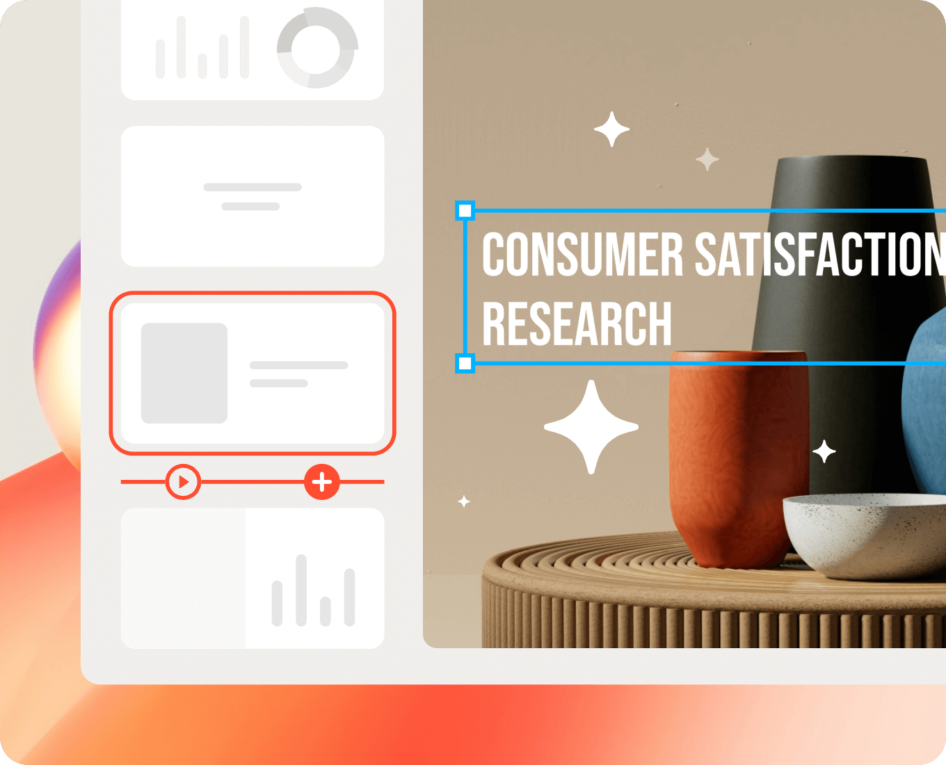
(3). Choose a Template or AI Generated Layout
If you’re not a designer, templates are your best friend. You can choose from:
- PowerPoint built in templates
- Platforms like Slidesgo, Canva, Envato Elements
- Or use Presenti AI to auto generate templates based on your topic
With AI, you simply enter your subject and style preference, and the tool produces a fully structured layout, saving hours of manual formatting.
(4). Add Content and Visual Elements
Fill each slide with text, charts, icons, and relevant images.
Keep your writing:
- Short and scannable
- Focused on one idea per slide
- Supported by visuals
A visually balanced slide is always more engaging than text-heavy paragraphs.
(5). Polish the Design
Adjust fonts, colors, spacing, and alignments. Consistency across slides boosts professionalism. Apply simple transitions or animations if necessary.
2. Four Key Design Principles for a Professional PPT
Once your structure is ready, design becomes the next focus. These four principles dramatically improve readability and aesthetics.
(1). Typography and Layout
Use clean, modern fonts such as:
- Arial
- Calibri
- Segoe UI
- Roboto
Maintain clear hierarchy:
- Titles larger than body text
- Subtitles smaller but distinguished
- Avoid more than two font families
Limit text to 6 to 7 lines per slide and highlight only essential messages.
(2). Color Palette and Style Consistency
To avoid visual clutter:
- Stick to 2 to 3 main colors
- Use contrast (light/dark combinations) to enhance clarity
- Keep color choices consistent across the deck
AI tools like Presenti AI can automatically generate harmonious color palettes and adjust layouts for high readability.
(3). Use of Images and Data Visualization
Visual elements make information more digestible. Include:
- High quality photos
- Icons
- Charts
- Infographics
Replace raw data tables with charts like:
- Bar charts
- Line graphs
- Pie charts
AI tools can instantly turn numbers into visual diagrams, saving time and ensuring graphic consistency.
(4). Clean Animations and Transitions
Use animations strategically:
- Stick to basic effects like Fade In, Wipe, or Appear
- Avoid distracting effects like spinning or bouncing
- Keep transitions subtle and consistent
Less is more, good design should support your story, not overshadow it.
3. Advanced Techniques to Make Your PPT More Persuasive
When you master the basics, it’s time to enhance storytelling and engagement.
(1). Use Story Driven Structure
Instead of listing facts, turn your presentation into a narrative. A common framework is:
- Problem
- Solution
- Execution
- Results
AI tools can automatically create story based outlines to help you communicate more effectively.
(2). Highlight Key Messages Clearly
Make sure each slide answers:
➡ What should the audience remember here?
Use:
- Bold text
- Color emphasis
- Icons
- Quotes or call outs
Clarity improves impact.
(3). Tell Stories with Data
Numbers alone do not persuade, interpretation does.
Example:
Instead of saying:
“Market size increased by 32%.”
Say:
“The market grew 32%, signaling strong expansion opportunities in the next three years.”
Charts + context = real insight.
(4). Add Interactive Elements
Involving your audience keeps them engaged. You may add:
- Questions
- Polls
- Clickable buttons
- Mini quizzes
- Embedded links
This helps maintain attention and improves memory retention.
4. Common PPT Mistakes and How to Avoid Them
Many presentations fail not because of content, but because of these common pitfalls:
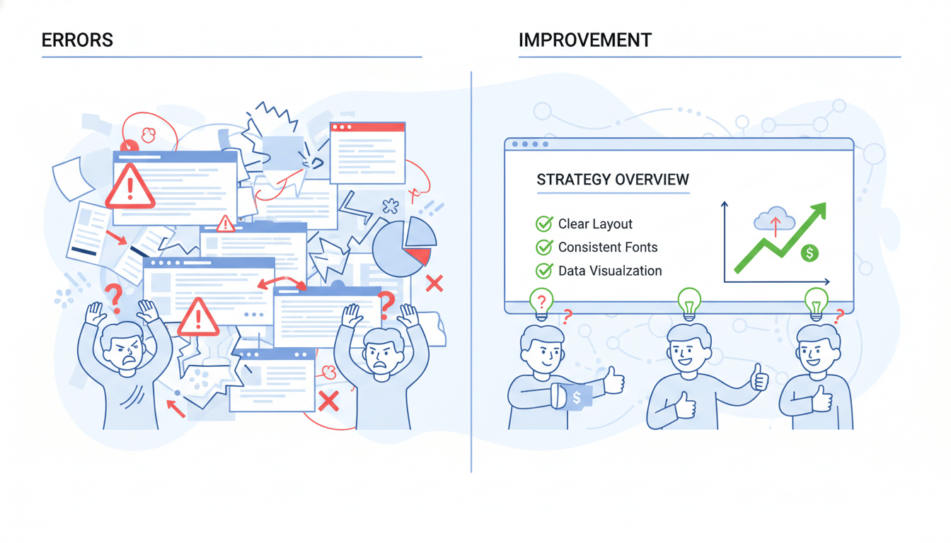
(1). Text Overload
Crowded slides overwhelm the audience.
Solution: 1 message per slide.
(2). Mismatched Templates
Random templates cause inconsistent style.
AI tools such as Presenti AI ensure unified design across all pages.
(3). No Logical Flow
Slides must follow a clear story arc.
Use outlines + transitions to maintain coherence.
(4). Excessive Animations
Overuse of movement distracts the audience.
Keep effects minimal and purposeful.
(5). Ignoring Audience Needs
Ask yourself:
“What value does my audience gain from this slide?”
This mindset ensures relevance and engagement.
5. Best Tools and Resources for Making PPTs
(1). AI PPT Generators
Ideal for beginners, busy professionals, or anyone who wants to save time.
Top tools include:
- Presenti AI
- Gamma
- Tome
- Boardmix
These tools generate outlines, templates, layouts, color themes, images, and even content drafts automatically.
(2). Template Platforms
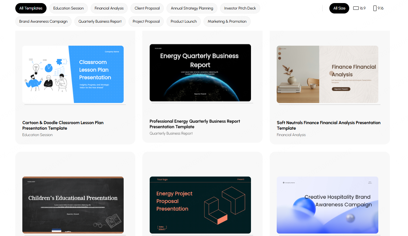
Useful for finding ready made designs:
- Slidesgo
- Canva
- PowerPoint library
- Envato
- PPTMall
Templates cover business, education, marketing, proposals, training, and more.
(3). Color and Font Resources
Get inspiration from:
- Coolors
- Color Hunt
- Adobe Color
Fonts:
Arial, Calibri, Helvetica, Source Sans, or other clean sans-serif types.
(4). Image & Icon Libraries
Quality visuals enhance credibility.
Recommended:
- Freepik
- Flaticon
- Unsplash
- Pexels
6. Step by Step Guide: How to Make a PPT with AI
Step 1: Prepare Your Content
Clarify:
- Purpose
- Audience
- Key points
- Main takeaways
Gather:
- Text
- Data
- Images
- Branding assets
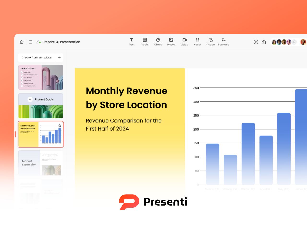
Step 2: Generate the First Draft
Choose an AI tool and input:
- Title
- Topic
- Style
- Page count
The AI generates:
- Cover
- Outline
- Content slides
- Graphic layouts
- Color themes
Step 3: Optimize the Content
Refine:
- Logic
- Structure
- Redundant text
- Key message placement
Use AI rewriting tools to improve clarity or grammar.
Step 4: Enhance Design
Adjust:
- Fonts
- Colors
- Icons
- Images
- Chart styles
Presenti AI even supports one click layout transformation.
Step 5: Add Presentation Enhancements
Optional:
- Subtle animations
- Hyperlinks
- Interactive questions
Step 6: Export and Share
Save as PPT or PDF and share across devices or collaboration platforms.
Conclusion
PPT is more than a slide deck, it’s a communication tool. With the right logic and modern AI tools, creating a polished presentation becomes easier, faster, and more effective. Instead of spending hours tweaking layouts, let AI handle design so you can focus on insights and delivery.