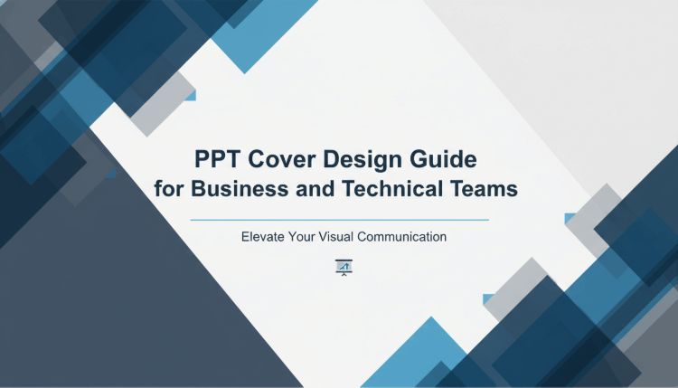
A well designed PowerPoint cover does more than look good. It sets expectations, builds credibility, and helps your audience quickly understand what the presentation is about. Whether you are preparing a business proposal, a project update, or an educational lecture, the cover slide plays a critical role in how your content is perceived.
So how do you design a professional and visually compelling PPT cover?
In this guide, you will learn six practical PPT cover design techniques that help you create clean, modern, and high end covers. These principles are widely used in professional presentations across technology teams, consulting firms, and education settings.
1. Core Elements of an Effective PPT Cover Design
Before diving into specific design techniques, it is important to understand the basic elements that make a PowerPoint cover work.
1.1 Define the Theme and Key Message
A PPT cover should communicate the main idea of the presentation at a glance. The title must be clear, concise, and focused on one central topic.
Avoid long sentences or vague wording. Strong examples include:
- Annual Market Analysis
- Product Roadmap Overview
- Q4 Project Status Update
If additional context is needed, use a subtitle to add details such as the date, team name, or presenter. This keeps the cover informative without overwhelming the viewer.
1.2 Establish Visual Hierarchy and Balance
Good layout creates clarity. The most important information should stand out first.
- The title should be the most prominent element, using a larger font size
- The subtitle should be slightly smaller and less emphasized
- Supporting details such as dates or author names should be subtle and placed at the bottom or edge of the slide
Use alignment tools and consistent spacing to maintain order. White space is not empty space. It improves readability and reduces visual stress.
1.3 Choose Professional Colors and Fonts
Color and typography strongly influence how professional your PPT appears.
Common color combinations include:
- Black, white, and gold for executive or formal presentations
- Blue and gray for technology, data, or corporate reports
- Dark green and off white for education or creative topics
For fonts, stick with clean sans serif typefaces such as Helvetica, Arial, or Inter. Limit your presentation to one or two font families. Use bold weight or color contrast to highlight key text instead of adding decorative fonts.

2. Six Practical PPT Cover Design Techniques
The following six techniques are widely used in professional presentation design. When applied correctly, they help your cover slide feel modern, polished, and intentional.
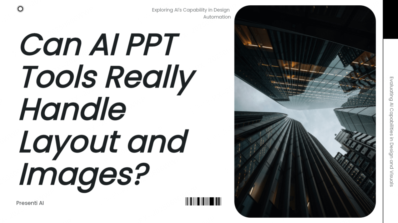
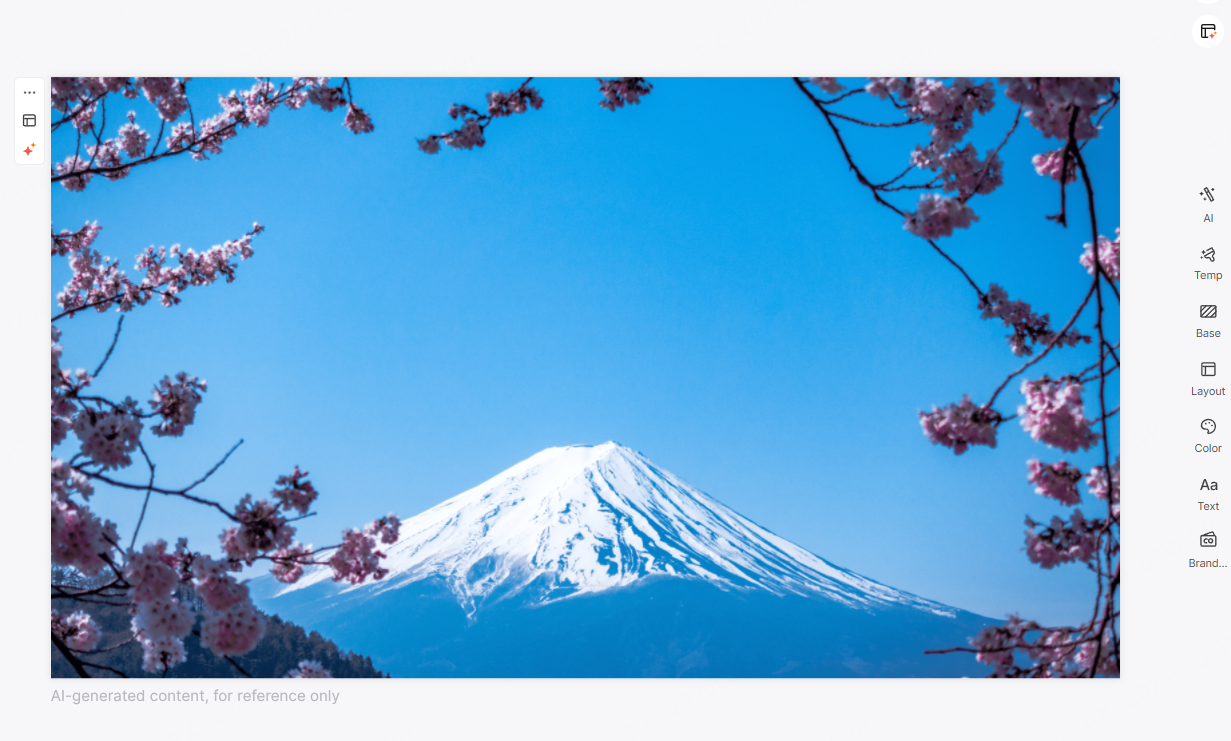
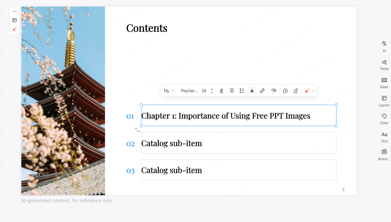
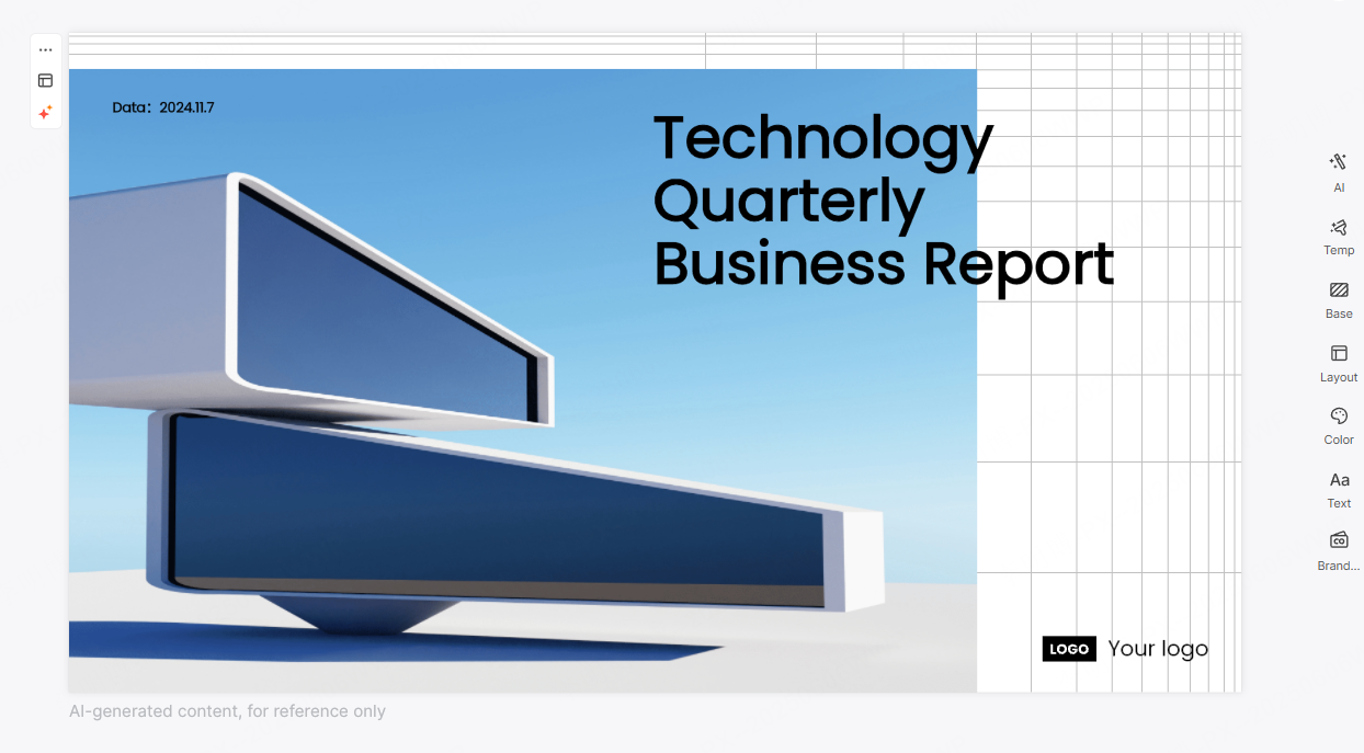
2.1 Use a Full Width Background Image to Set the Theme
Key idea: A high quality background image that aligns with your topic can immediately capture attention.
Choose images that support your message rather than distract from it. For example, technology presentations often use abstract patterns, cityscapes, or workflow visuals.
Practical tip: Reduce image opacity or apply a dark overlay so the title text remains easy to read.
Example: A startup pitch deck may use a city skyline at night to reinforce a theme of innovation and growth.
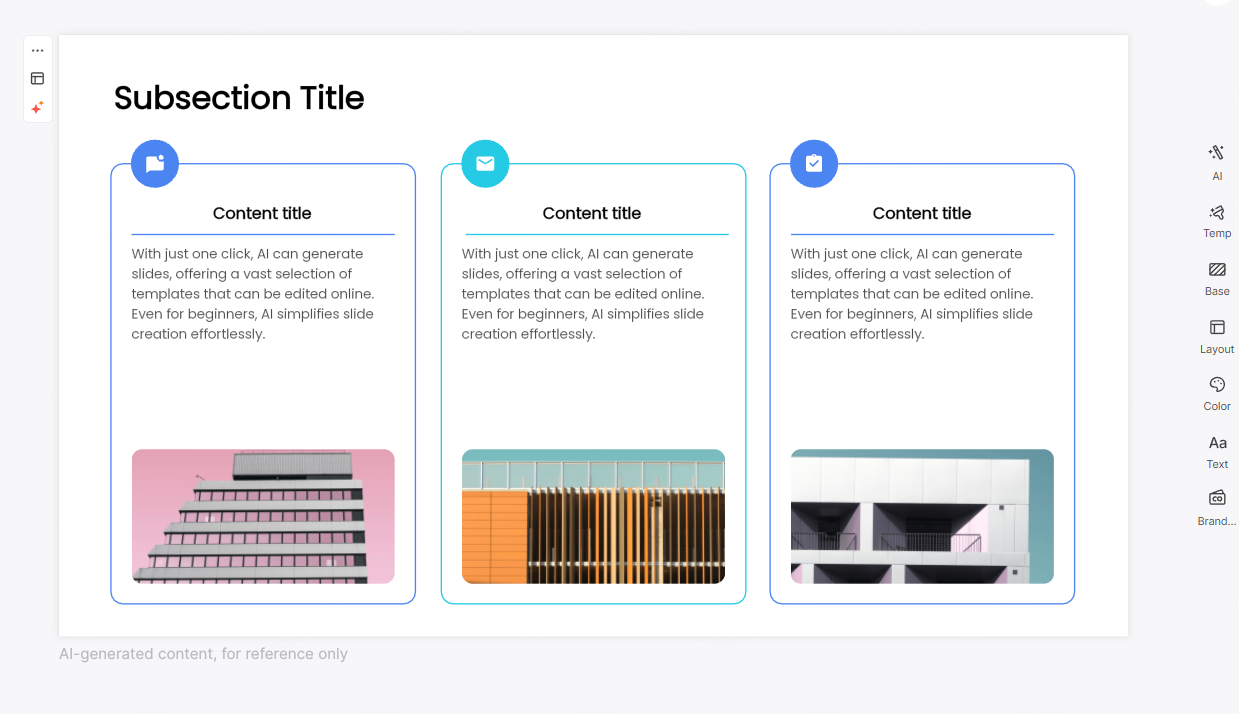
2.2 Embrace White Space for a Clean Look
Key idea: Simplicity creates impact.
White space helps guide the viewer’s eyes toward the most important elements. Removing unnecessary icons, shapes, or text often makes a design feel more confident and professional.
Practical tip: Limit the cover slide to a title and optional subtitle. Let spacing do the work instead of decorative elements.
Example: A consulting presentation with only a bold title centered on a plain background can feel more premium than a cluttered slide.
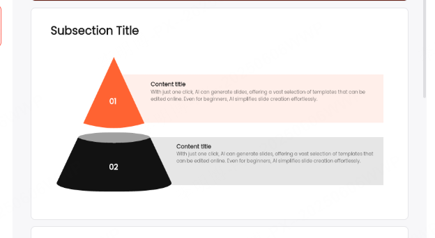
2.3 Use Geometric Shapes to Add Structure
Key idea: Simple geometric elements can enhance layout and visual rhythm.
Rectangles, circles, and diagonal lines help divide content and add depth without overwhelming the slide.
Practical tip: Use consistent shapes and subtle gradients to create movement while maintaining clarity.
Example: A product roadmap presentation might use diagonal color blocks to separate the title area from the background image.
2.4 Integrate Brand Elements Thoughtfully
Key idea: Brand consistency builds trust.
Including your company logo, brand colors, or signature visual patterns reinforces professionalism and brand recognition.
Practical tip: Keep brand elements subtle. The logo should support the design, not dominate it.
Example: A corporate presentation may use the company’s primary color as the background, with the logo placed discreetly in the corner.
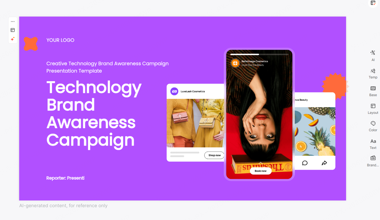
2.5 Create Interaction Between Text and Images
Key idea: Thoughtful interaction between typography and visuals increases engagement.
Text does not always need to sit on top of images. It can be embedded into visual elements or aligned with graphic features.
Practical tip: Ensure readability remains the priority. Contrast and spacing are essential.
Example: In a market analysis presentation, the title can be positioned along a trend line or data graphic to reinforce the message.
2.6 Combine Creative Typography with Refined Color Palettes
Key idea: Modern typography paired with intentional color choices elevates the overall design.
Sans serif fonts with subtle variations in weight and size work well for most professional settings. Gradients or muted accent colors can add visual interest when used sparingly.
Practical tip: Avoid decorative fonts that reduce readability, especially on large screens.
Example: A title using a bold sans serif font over a soft gradient background creates a clean and contemporary feel.
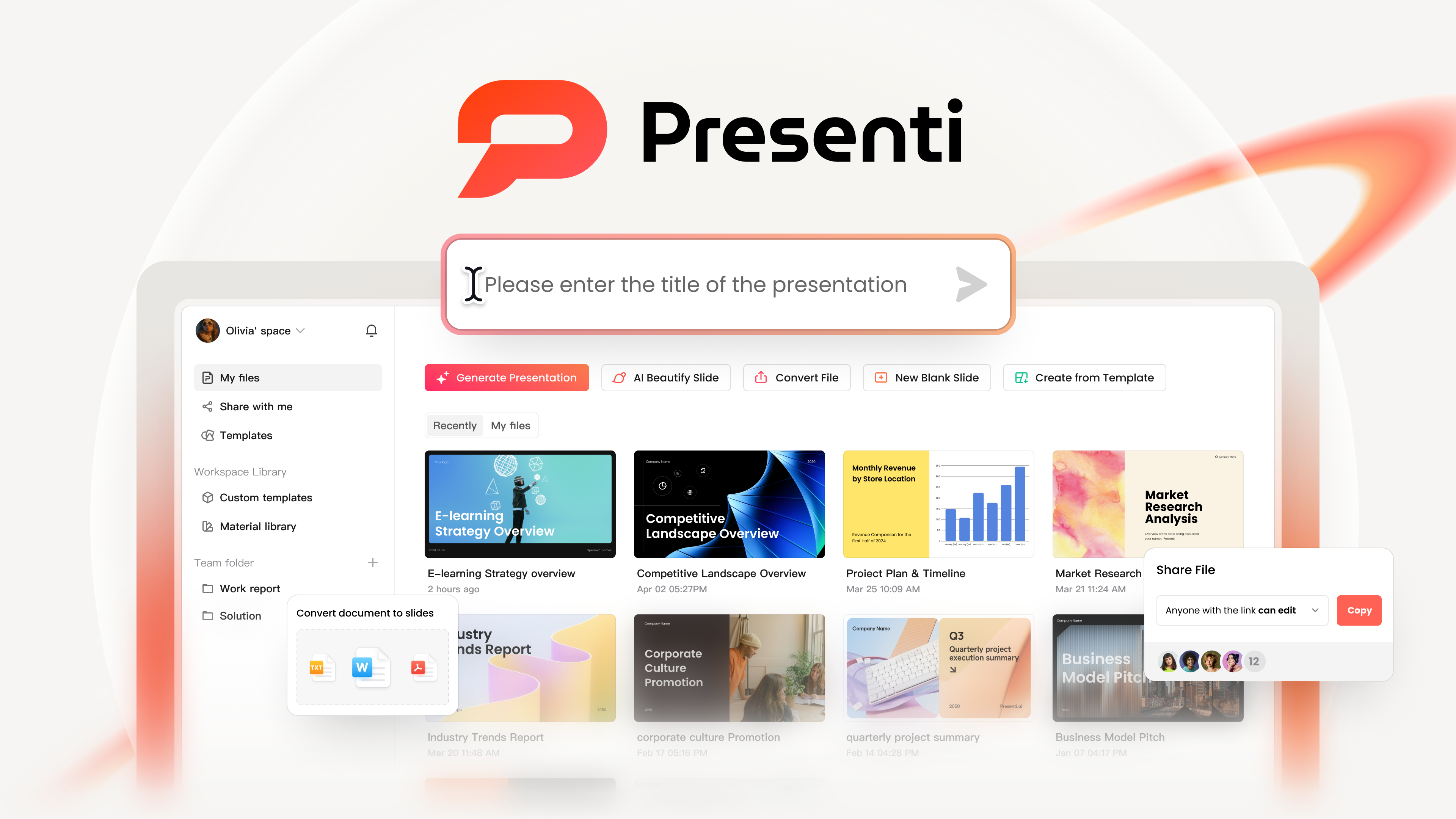
3. Speeding Up PPT Cover Design with AI Tools
Traditional PPT design can be time consuming, especially when creating covers from scratch. This is where AI powered tools like Presenti AI can help.
Presenti AI supports:
- One click generation of PPT outlines
- Automatic slide content creation
- File to PPT conversion from documents or PDFs
- Intelligent layout and spacing optimization
- AI driven text refinement
With built in professional templates and layout patterns, teams can produce polished covers quickly while maintaining consistent visual quality.
For project managers, educators, and developers who value efficiency, combining design fundamentals with AI assistance is often the most practical approach.
Conclusion
A strong PPT cover is not about decoration. It is about clarity, focus, and professional communication. By mastering layout hierarchy, color and typography choices, and the six design techniques outlined above, you can consistently create covers that feel intentional and high end. When paired with modern AI tools, the process becomes faster without sacrificing quality.
A well designed cover sets the tone for everything that follows. Invest the time to get it right.