Designing effective PowerPoint slides is not only about making them look good. Slide layout directly affects how well your audience understands your message. When slides are clear and visually organized, people can focus on the ideas instead of struggling to read or interpret the content. For technical teams, educators, project managers, and developers, presentations are often used to explain complex information. Product roadmaps, system architectures, training materials, and project updates all require structure and clarity. In these cases, good slide design becomes a communication skill rather than a design preference.
This guide introduces six practical PowerPoint layout techniques that are widely used in professional environments across North America and Europe. You do not need advanced design skills to apply them. Each tip is focused on clarity, usability, and real world presentation scenarios.
1. Start with a Clear Theme and Slide Structure
Every effective presentation begins with a clear structure. Each slide should communicate one primary idea. When a slide tries to explain too much at once, the audience quickly loses focus.
A strong slide structure relies on visual hierarchy. Titles, subheadings, and body content should be clearly differentiated so viewers can immediately understand what matters most.
To achieve this, make sure that:
- Each slide has one main topic
- Titles clearly summarize the slide’s purpose
- Supporting text stays concise and relevant
Common Slide Structures That Work Well
Title and Content
This structure works best when you need to emphasize a single point. It is commonly used for key conclusions, decisions, or summary slides.
Text with Visual Support
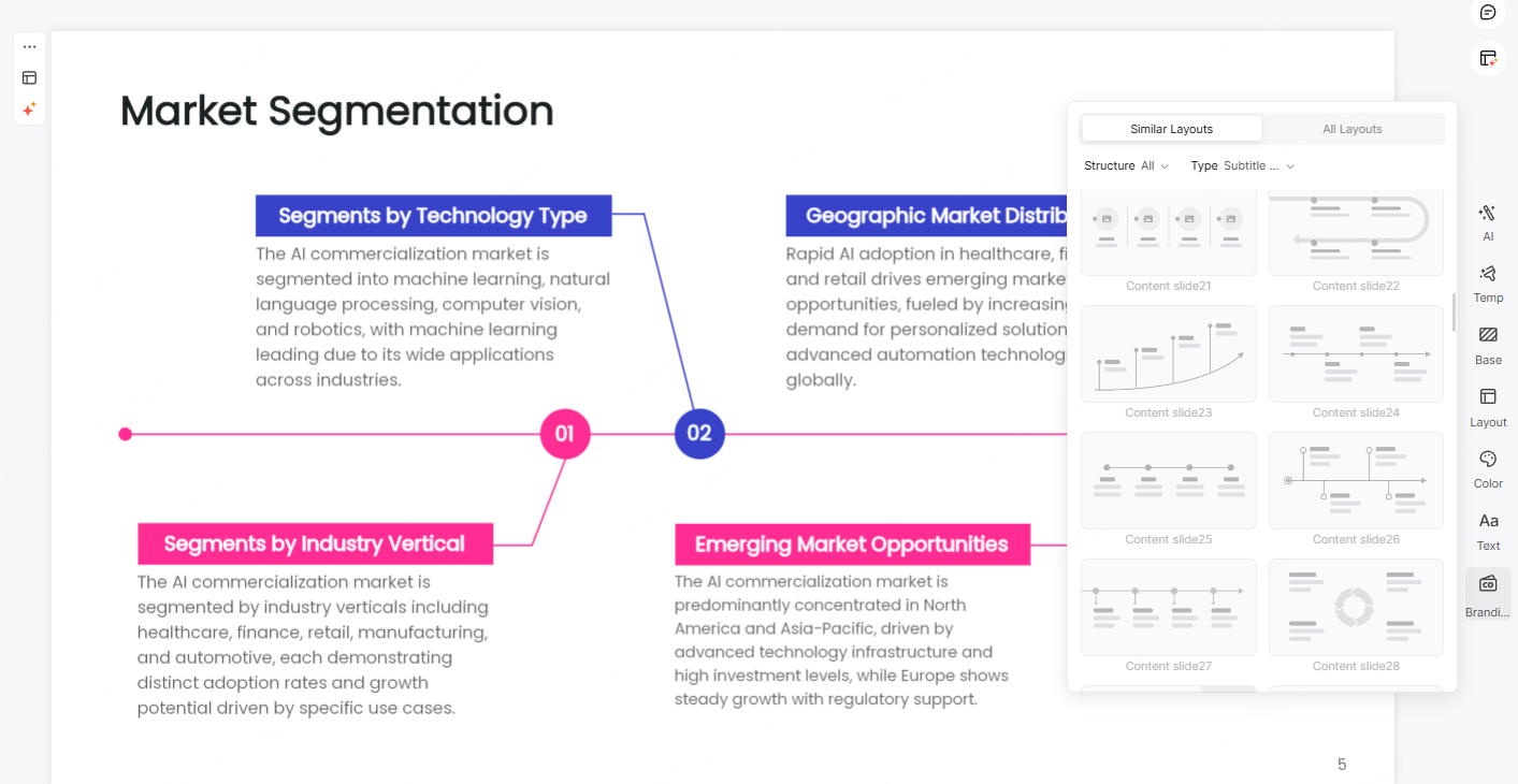
This layout is ideal for explanations, workflows, or data driven content. Pairing short text with charts or diagrams makes information easier to understand and remember.
In technical and educational presentations, choosing the right structure often matters more than decorative elements.
2. Keep Color Usage Consistent and Intentional
Color plays an important role in how information is perceived. A consistent color scheme improves readability and helps guide attention to key elements.
For most professional presentations, it is best to limit your palette to two or three main colors. Neutral backgrounds combined with a single accent color usually provide the best balance between clarity and visual interest.
Good color practices include:
- Using contrast to highlight important information
- Keeping background colors subtle
- Avoiding overly bright or saturated tones that strain the eyes
In business and technical contexts, simple and restrained color choices often look more credible and professional.
3. Use White Space to Improve Readability
White space, also known as negative space, is one of the most effective tools in slide design. It refers to the empty areas between text, images, and other elements.
Proper spacing makes slides easier to read and reduces cognitive overload. When content is tightly packed, the audience has to work harder to process information.
By leaving enough space between elements, you can:
- Improve scanability
- Guide the viewer’s attention
- Create a clean and organized appearance
A slide does not need to be full to be effective. In many cases, less content leads to stronger communication.
4. Use Images and Charts with a Clear Purpose
Visual elements should always support the message. Adding images or charts simply to fill space often weakens the presentation.
High quality visuals are especially useful when explaining abstract ideas or presenting data. Compared to text alone, visuals help the audience understand information faster and retain it longer.
When to Use Images
Images work well when you want to:
- Provide real world context
- Explain concepts visually
- Increase engagement without adding complexity
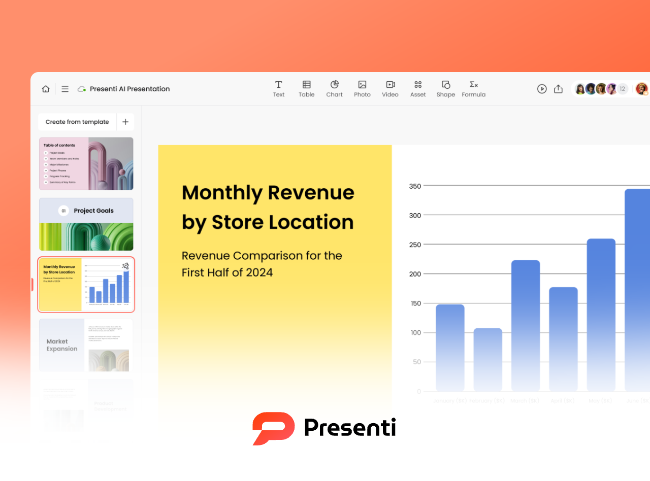
When to Use Charts
Charts are best used for data and comparisons. Different chart types serve different purposes:
- Line charts show trends over time
- Bar charts compare values
- Pie charts show proportions, but should be used sparingly
Clear labels and simple design are more important than decorative effects.
5. Apply Logical and Familiar Page Layouts
A well organized layout helps the audience follow the flow of information. Dividing each slide into clear sections improves both readability and comprehension.
Common Layout Patterns
Top and Bottom Layout
This layout places the title at the top and content below. It is ideal for section headers or topic introductions.
Left and Right Layout
This structure works well for comparisons, explanations with visuals, or before and after examples.
Three Part Layout
The slide is divided into a title area, main content area, and a supporting section. This approach is useful when presenting layered or structured information.
Choosing a layout based on the content rather than habit leads to clearer slides.
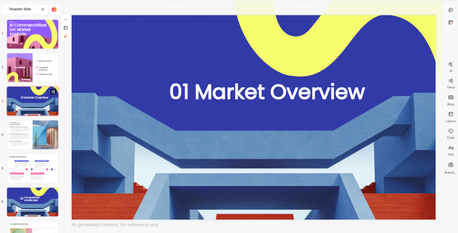
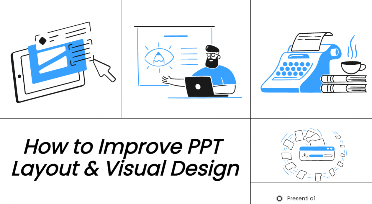
6. Use Professional Templates to Save Time
A well designed PowerPoint template can significantly improve both efficiency and visual quality. Instead of building layouts from scratch, you can focus on refining content and messaging.
When selecting a template, make sure that:
- The style matches your topic and audience
- Typography is clean and easy to read
- Spacing and alignment are consistent
For technical and educational presentations, simple templates with clear structure are usually more effective than visually complex designs.

Recommended Tool: Presenti AI
For professionals who need to create high quality presentations quickly, Presenti AI offers an efficient alternative to manual slide design.
Presenti AI is an AI powered presentation tool that helps users generate structured and visually consistent PowerPoint slides with minimal effort. It is especially useful for marketing teams, educators, consultants, and product managers who work with tight deadlines.
Key Features
AI Generated Presentations
Users can generate a complete slide deck by entering a topic or uploading a document.
Document to Slide Conversion
Reports, proposals, and training materials in Word, PDF, or Markdown formats can be converted into presentation ready slides.
AI Assisted Writing and Editing
Built in AI support helps refine slide content, improve clarity, and adjust tone.
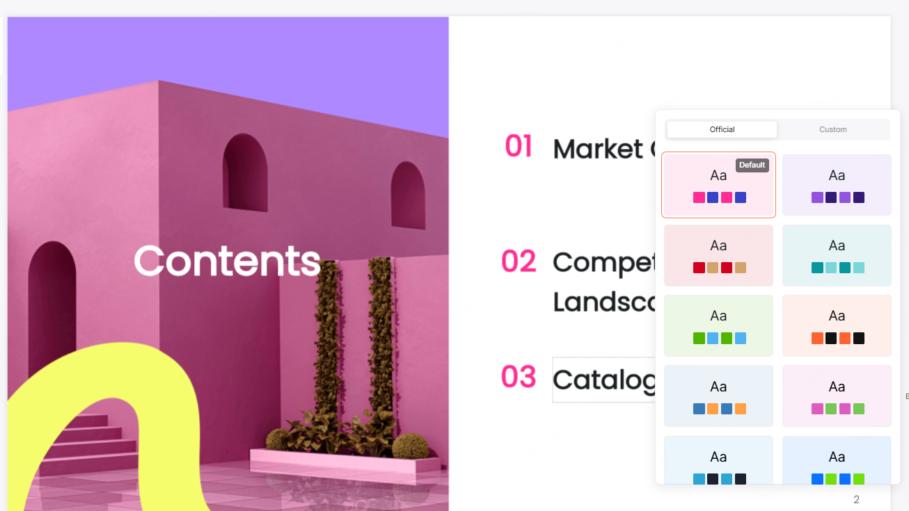
Extensive Template Library
A wide range of templates and themes supports different presentation scenarios and industries.
Automatic Layout and Design Optimization
Slides are formatted automatically to maintain visual consistency and professional quality.
How AI Tools Improve Presentation Workflows
AI powered presentation tools reduce the time spent on formatting and layout decisions. By automating design tasks, teams can focus more on content accuracy and storytelling.
This approach helps organizations:
- Create consistent presentations across teams
- Improve communication efficiency
- Reduce repetitive design work
For fast paced environments, AI assisted slide creation is becoming a practical standard rather than a novelty.
Final Thoughts
Effective PowerPoint design is about clarity, structure, and purpose. By applying these six layout principles, you can create slides that communicate ideas clearly and look professional.
When combined with modern AI tools like Presenti AI, these principles allow teams to produce high quality presentations faster and with less effort. Whether you are presenting technical concepts, teaching a class, or sharing project updates, good slide design makes your message easier to understand and more persuasive.