We’ve all sat through "Death by PowerPoint"—those cluttered, chaotic slides that feel like reading a textbook during a marathon. In a world of infinite distractions, the most powerful thing you can do is simplify. Minimalism isn't just an aesthetic choice; it’s a strategic advantage that ensures your message isn't just heard, but remembered. Using a simple slideshow maker like Presenti allows you to strip away the noise and focus on what truly matters: your ideas.
The Philosophy of "Less is More"
Before we dive into the buttons and menus, we need to shift our mindset. Minimalism in design is the intentional move to show only the essential. When you use a minimalist presentation tool, you aren't "losing" information; you are gaining the audience's attention. Every element on your slide should have a reason for existing. If an icon, a line of text, or a decorative shape doesn't support your core point, it’s clutter.
6 Pillars of Minimalist Presentation Design
1. The Rule of One: Single Focus per Slide
The biggest mistake in presentation design is trying to say too much at once. Humans cannot read a wall of text and listen to a speaker simultaneously. A simple slideshow maker works best when you follow the "Rule of One."
- One Idea: Each slide should represent exactly one concept.
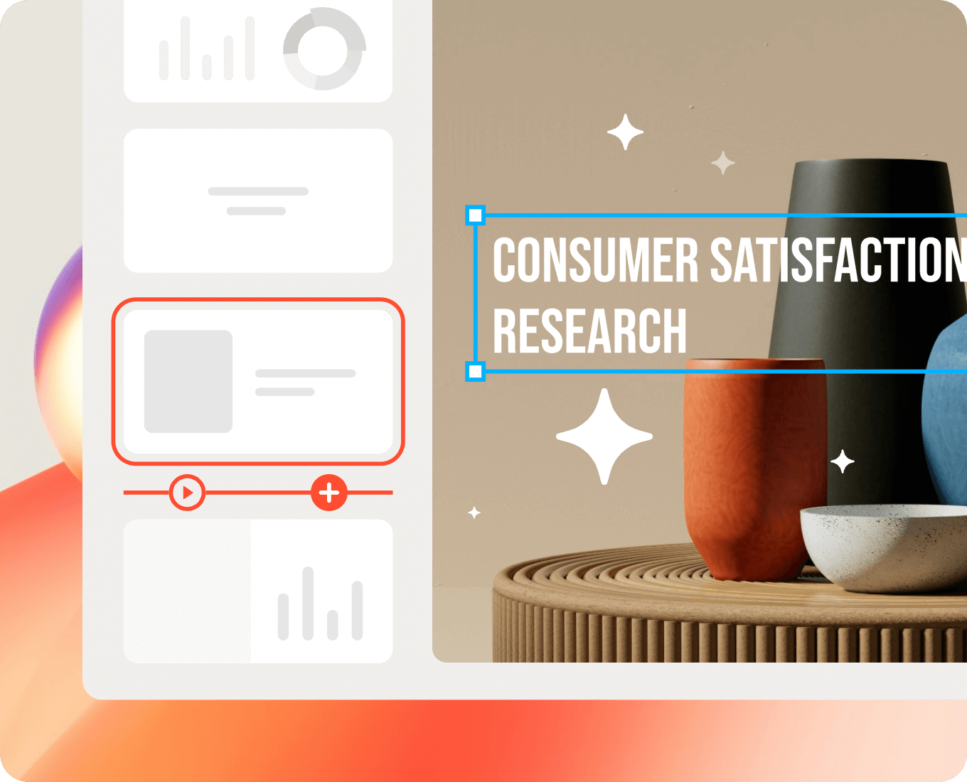
- One Image: Use a single high-quality visual rather than a gallery of thumbnails.
- One Action: What do you want the audience to feel or do after seeing this slide?
By using easy presentation design software, you can quickly duplicate slides to break down complex ideas into bite-sized, digestible pieces. Remember, slides are free—don’t be afraid to use more of them to keep each one clean.
2. Typography as the Interface
In minimalist design, your text is your graphic. You don't need clip art when you have beautiful, bold typography. A clean slides maker usually provides a curated selection of fonts because choice overload often leads to poor design.
- Stick to Two Fonts: One for headings, one for body text.
- Hierarchy Matters: Use size and weight to tell the audience what to read first. A massive headline paired with a small subheadline creates an immediate visual path.
- Sans-Serif is King: Fonts like Helvetica, Inter, or Montserrat are staples of the minimalist presentation tool world because they are highly legible on screens.
3. The Power of Whitespace
Whitespace (or negative space) is the "breathing room" around your content. Amateurs feel the need to fill every corner; professionals use space to create elegance. When using a simple slideshow maker, resist the urge to stretch images to the edges or fill gaps with "fluff." Whitespace directs the eye toward the center of your message and makes your brand look more premium and confident.
4. A Controlled Color Palette
Color evokes emotion, but too much of it creates confusion. To keep your slides professional, limit your palette.
| Layer | Usage | Pro Tip |
|---|---|---|
| Primary | Backgrounds/Main Text | Stick to Neutrals (White, Light Gray, or Navy). |
| Secondary | Accents/Icons | Use your brand's main color. |
| Highlight | Call to Action | A single pop of color (like Orange or Teal) to draw the eye. |
Presenti, as an easy presentation design software, often includes smart themes that lock these colors in place for you, ensuring that you don't accidentally create a rainbow eyesore.
5. Visuals Over Bullet Points
Bullet points are where interest goes to die. If you find yourself writing a list of six items, try turning them into six separate slides with one icon each. A clean slides maker encourages the use of "Visual Metaphors." Instead of writing "Our profits grew," show a single, clean arrow trending upward.
- High Resolution: Never use pixelated images.
- Consistency: If you use outlined icons, keep them all outlined. Don't mix 3D illustrations with flat line art.
6. Purposeful Motion and Transitions
Minimalism doesn't mean static, but it does mean subtle. If a transition takes three seconds and involves a "starburst" effect, it's distracting. A simple slideshow maker focuses on "Fade" or "Push" transitions that mimic the natural movement of an eye turning a page. In easy presentation design software, motion should be used to show a relationship between two objects—for example, a "Magic Move" that shrinks an object to show it becoming part of a larger group.
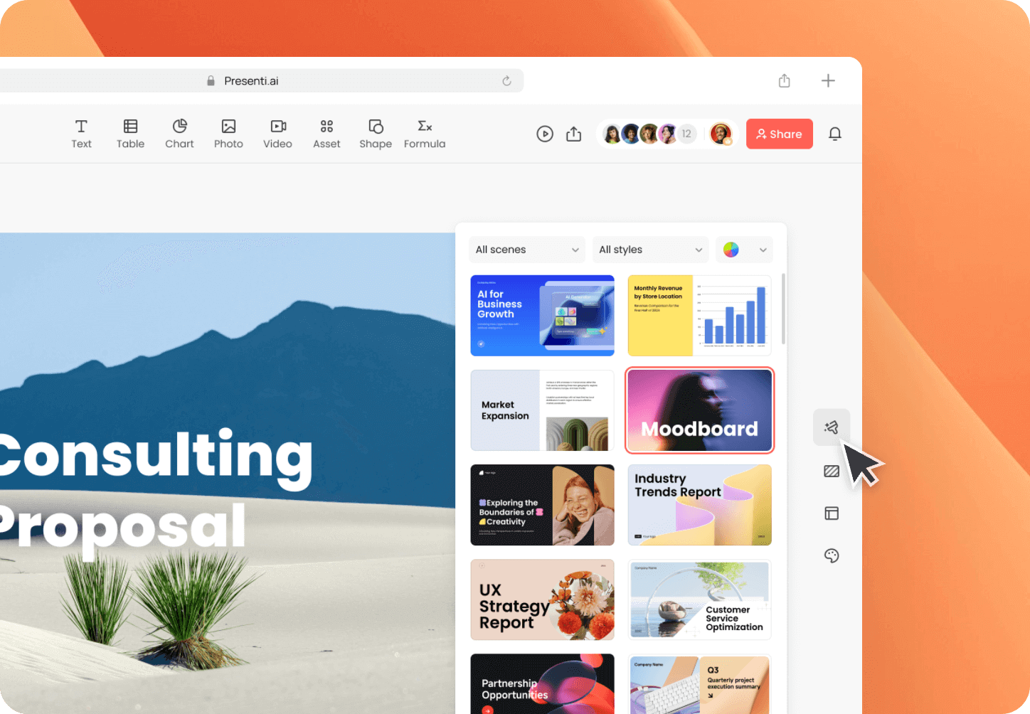
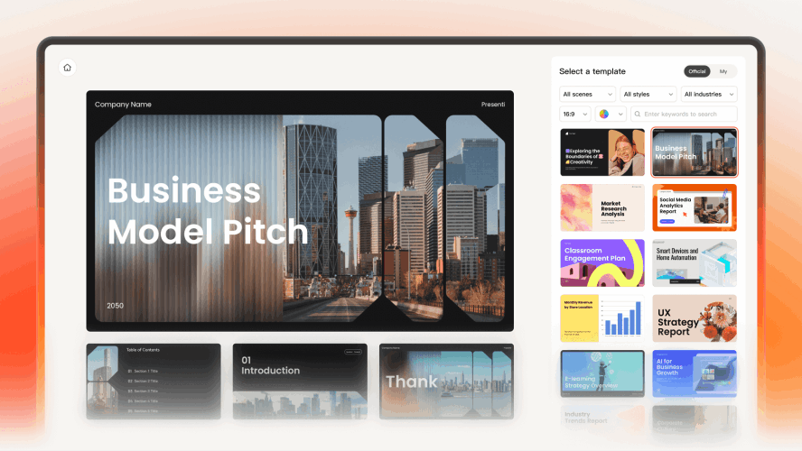
Curated Minimalist Templates: One-Click Professional Design
Instead of starting from a blank page, you can leverage Presenti’s pre-designed templates that embody the "minimalist" aesthetic. Simply enter the following keywords into the template library search bar to find them:
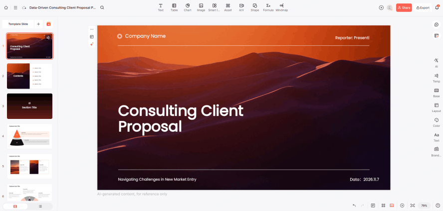
Search Keyword: "Minimal"
Style Profile: This is the most classic minimalist option. It features a high ratio of white space and typography that follows the golden ratio, completely free of unnecessary lines or decorations.
Best For: Creative proposals, personal introductions, or brand concepts. It makes every slide look as sophisticated as a placard in a high-end art gallery.
Search Keyword: "Business Clean"
Style Profile: Focused on the clear presentation of data and logic. It strips away the cluttered color blocks found in traditional business templates, replacing them with slender charts and a unified accent color (such as deep blue or graphite gray).
Best For: Annual reports, quarterly reviews, or pitch decks. It maintains a professional edge while preventing "visual fatigue" for your audience.
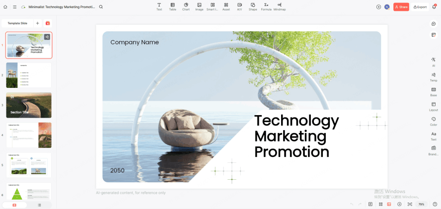
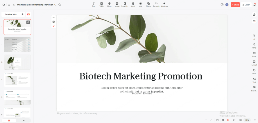
Search Keyword: "Modern Portfolio"
Style Profile: Specifically optimized for large-scale visuals. It uses an "image-first, text-second" layout paired with crisp sans-serif fonts to create a powerful visual focal point.
Best For: Design showcases, photography portfolios, or product launches. It uses large areas of solid background to make high-quality assets pop.
Search Keyword: "Focus"
Style Profile: The ultimate in reductionism. Each slide is designed to hold only one visual center. It forces you to subtract everything but the core message.
Best For: Keynotes or presentations intended to provoke deep thought, ensuring the audience's attention remains entirely on the speaker.
Search Tip:
When using these keywords in Presenti, prioritize results with clean backgrounds and unified typography. These templates not only save you 50% of your design time but also come with pre-set grid systems that ensure you won’t break the "minimalist vibe" while making edits.
Conclusion
Mastering minimalist design is the fastest way to improve your communication. By choosing a simple slideshow maker like Presenti, you've already taken the first step toward clarity. Stop decorating and start communicating; use a clean slides maker to cut the fluff, embrace the whitespace, and let your ideas shine through.