Polishing a PowerPoint presentation is far more than simply making slides look “prettier.” It is a structured, multi layered enhancement process that strengthens both the visual quality and communication efficiency of your deck. A well polished PPT features clean layout, cohesive color styles, concise messaging, refined visuals, and a smooth narrative flow. Whether you're preparing a business pitch, a project report, a classroom presentation, or a design proposal, effective PPT polishing can dramatically improve audience engagement and message clarity.
This comprehensive guide walks you through what PPT polishing really means, what it includes, how to optimize each element: layout, colors, content, images, charts, and animations, and how to use AI tools to polish presentations efficiently.

1. What Does PPT Polishing Mean?
PPT polishing refers to the systematic optimization of an existing slide deck across multiple dimensions: layout, typography, color schemes, content clarity, visual hierarchy, images, charts, and even animations.
The primary goals are:
- Enhance visual professionalism
- Improve logic, message clarity, and information structure
- Increase audience understanding & retention
- Create a compelling narrative flow
In short, PPT polishing transforms an ordinary or messy slide deck into a structured, visually appealing, high impact presentation that effectively communicates your key messages.
2. What Does PPT Polishing Include?
Though many people think polishing is mostly about aesthetics, it actually includes deeper adjustments to structure, logic, and storytelling. Here are the five core areas you need to focus on:
2.1 Layout Optimization: Clean, Logical, Professional
A polished layout strengthens the organization and readability of your slides.
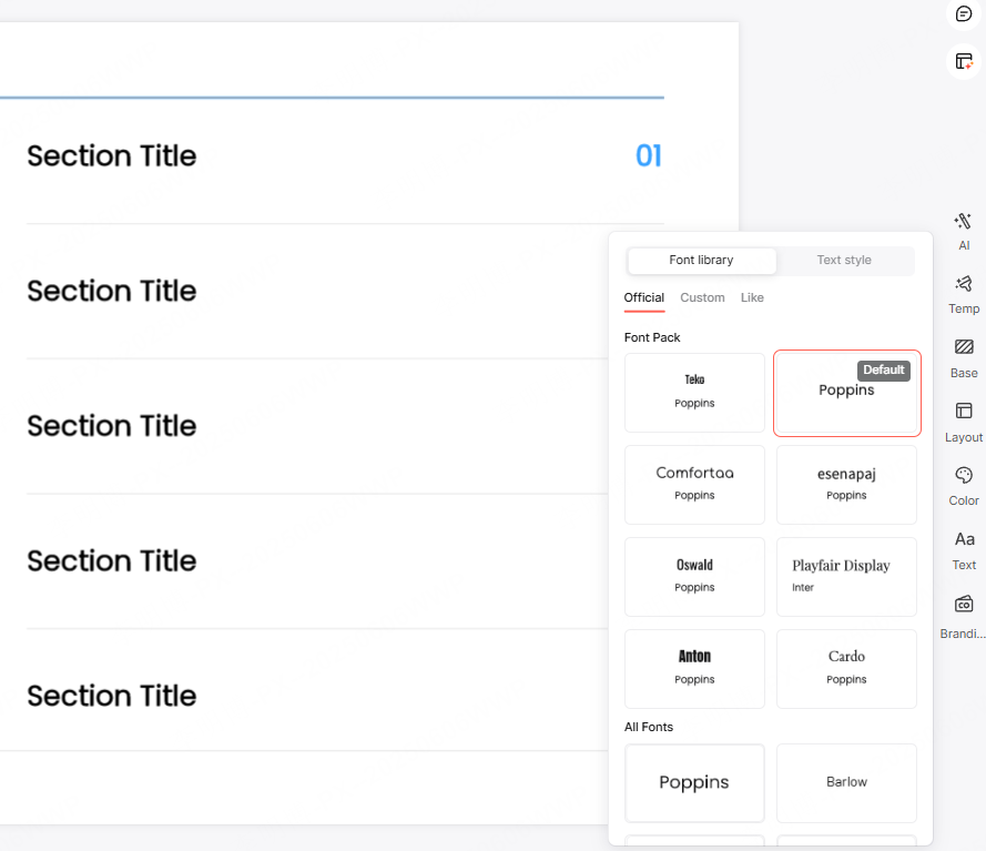
✓ Keep fonts consistent
Avoid mixing more than 2 to 3 fonts in one deck. Use clean sans serif fonts like Arial, Roboto, or Source Sans Pro for a professional, modern look.
✓ Use proper spacing and line height
Slides should have breathing room.
Recommended:
- Line spacing:2 to 1.5
- Adequate margins & consistent padding
✓ Balanced text-image ratio
A strong slide usually has:
- 30/70 or 50/50 text to visual balance
- Meaningful white space
- Only 1 to 2 key points per slide
✓ Keep structure consistent
Headings, content blocks, and image placements should follow consistent alignment and margin rules.
2.2 Color Optimization: Minimal, Cohesive, Purposeful
A good color system elevates the entire presentation.
Use the “Primary Secondary Accent” 3 Color Rule
- Primary color: headlines, key shapes
- Secondary color: backgrounds, charts, dividers
- Accent color: highlights, key numbers, conclusions
Limiting your deck to 3 major colors creates cohesion and prevents visual clutter.
2.3 Content Polishing: Clear, Concise, Impactful
Good design cannot rescue poor content. Content polishing ensures your message is structured and sharp.
✓ Simplify text
Replace long paragraphs with:
- Short sentences
- Bulleted ideas
- Keywords
- Charts or diagrams where possible
✓ Use “information dense” slide titles
Instead of vague headings like “Market Analysis,” use titles that convey conclusions:
❌ Market Analysis
✅ “Q1 2025 User Base Grew 34% Driven by Short Video Traffic”
✓ Follow the “Opening Body Summary” logic
Each slide should:
- Begin with a clear statement
- Present evidence (data, visuals, arguments)
- End with a conclusion or transition
2.4 Image & Chart Enhancement: Clear, Unified, Professional
Strong visuals increase comprehension and credibility.
✓ Use high quality royalty free images
From platforms like:
- Unsplash
- Pixabay
Avoid low resolution or inconsistent style images.
✓ Unify chart styles
Keep consistent:
- Colors
- Font sizes
- Line thickness
- Legend placement
✓ Avoid over designed charts
No 3D effects, shadows, or excessive gradients.
Focus on clarity and readability.
✓ Apply alignment & white space rules
Images and text should align neatly with consistent margins.
2.5 Animation & Transition Optimization
Animations should enhance understanding, not distract.
Keep it simple
Use basic animations:
- Fade
- Wipe
- Appear
Avoid complex preset animation templates.
Pace control
Limit animations to 3 to 4 per slide.
Use:
- On click
- With previous
to maintain rhythm.
Use one transition style for the entire deck
“Fade” or “Push” works well for most professional presentations.
3. Recommended Tools for PPT Polishing
If you want faster, more intelligent polishing, these tools can help:
Presenti AI
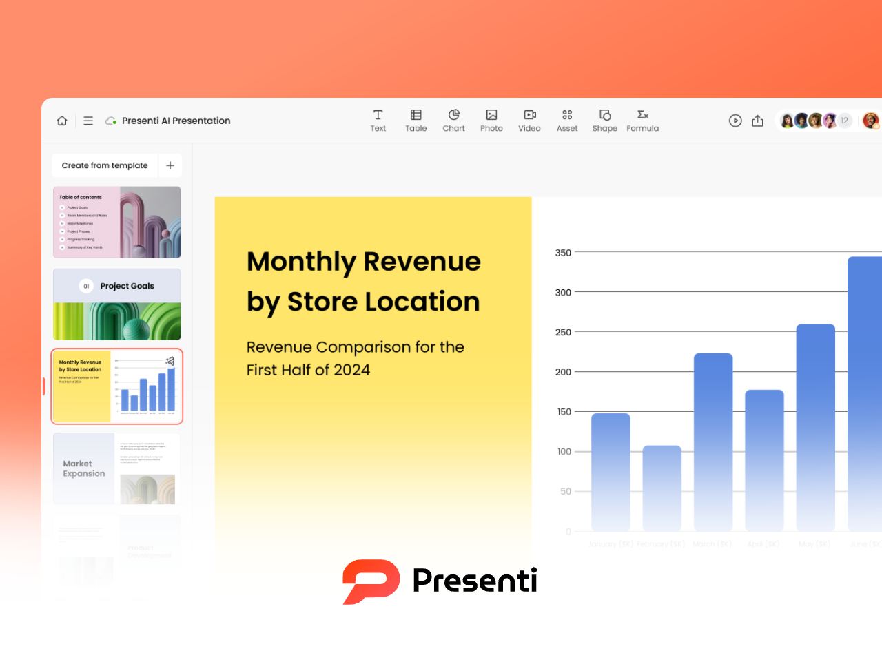
An all in one AI tool that supports:
- Automatic layout
- Smart color styling
- Slide creation
- Text rewriting & polishing
Perfect for users without design experience.
Beautiful.ai

Known for:
- AI driven auto layout
- Consistent, sleek visual standards
- Built in chart & animation uniformity
Great for business presentations.
Slidesgo / Canva Templates
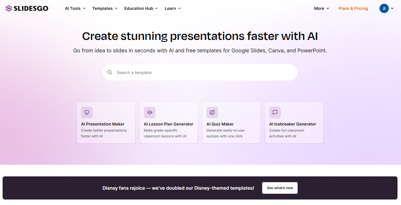
Provide:
- Thousands of free templates
- Built in color palettes
- Pre designed charts & icons
Ideal for fast, ready made deck creation.
iSlide Plugin
A professional PowerPoint plugin offering:
- One click beautification
- Icon library
- Color schemes
- Layout tools
A favorite among corporate professionals.
Coolors / Khroma (Color Tools)
Excellent for generating cohesive color palettes when you’re unsure how to choose colors.
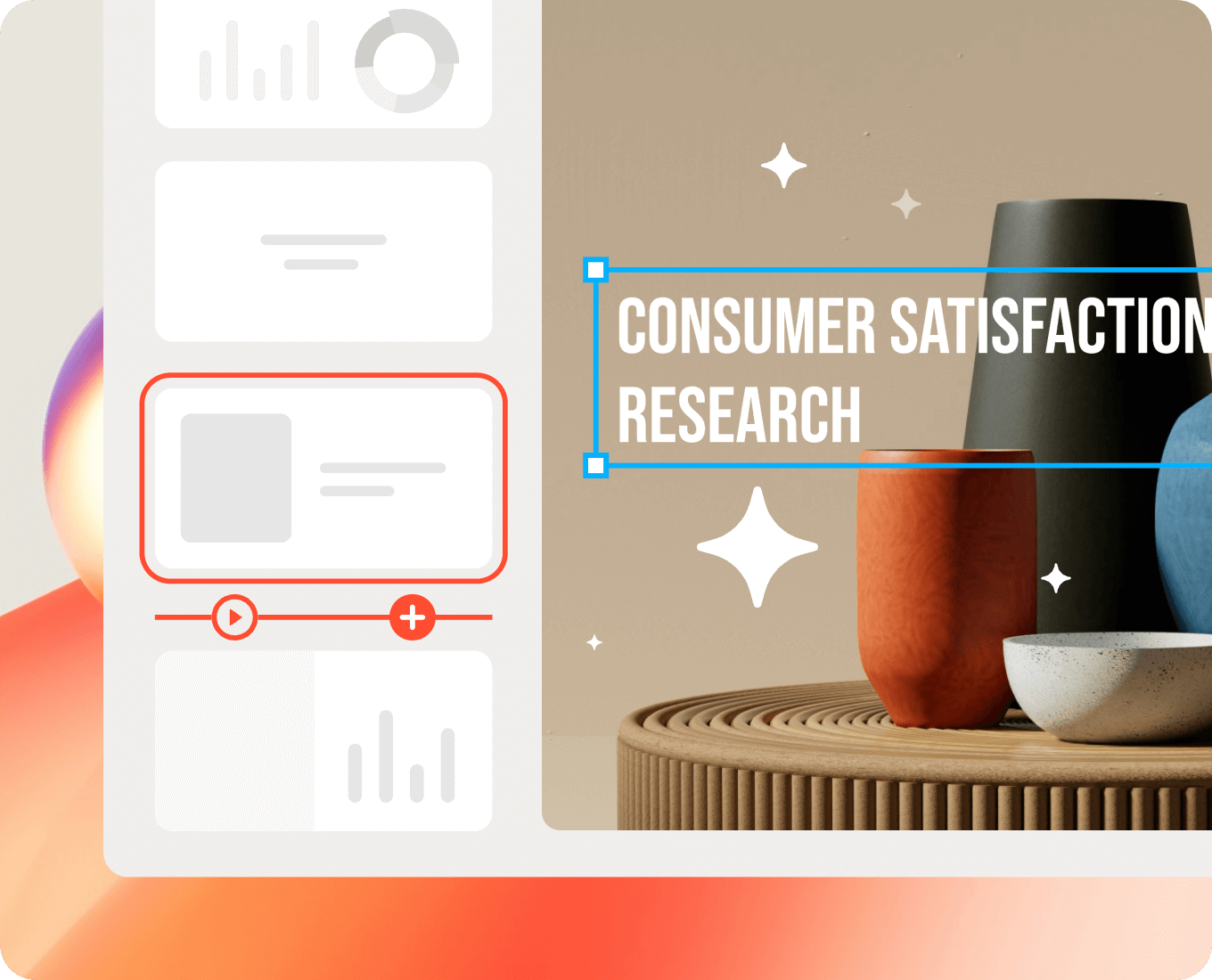
4. Hands On Tutorial: How to Polish a PPT Using AI Tools
Here’s how to polish a PPT smoothly using Presenti AI, even without design experience:
Step 1: Import your content
Upload:
- Word documents
- Notes
- Outlines
The system auto generates a structured PPT draft.
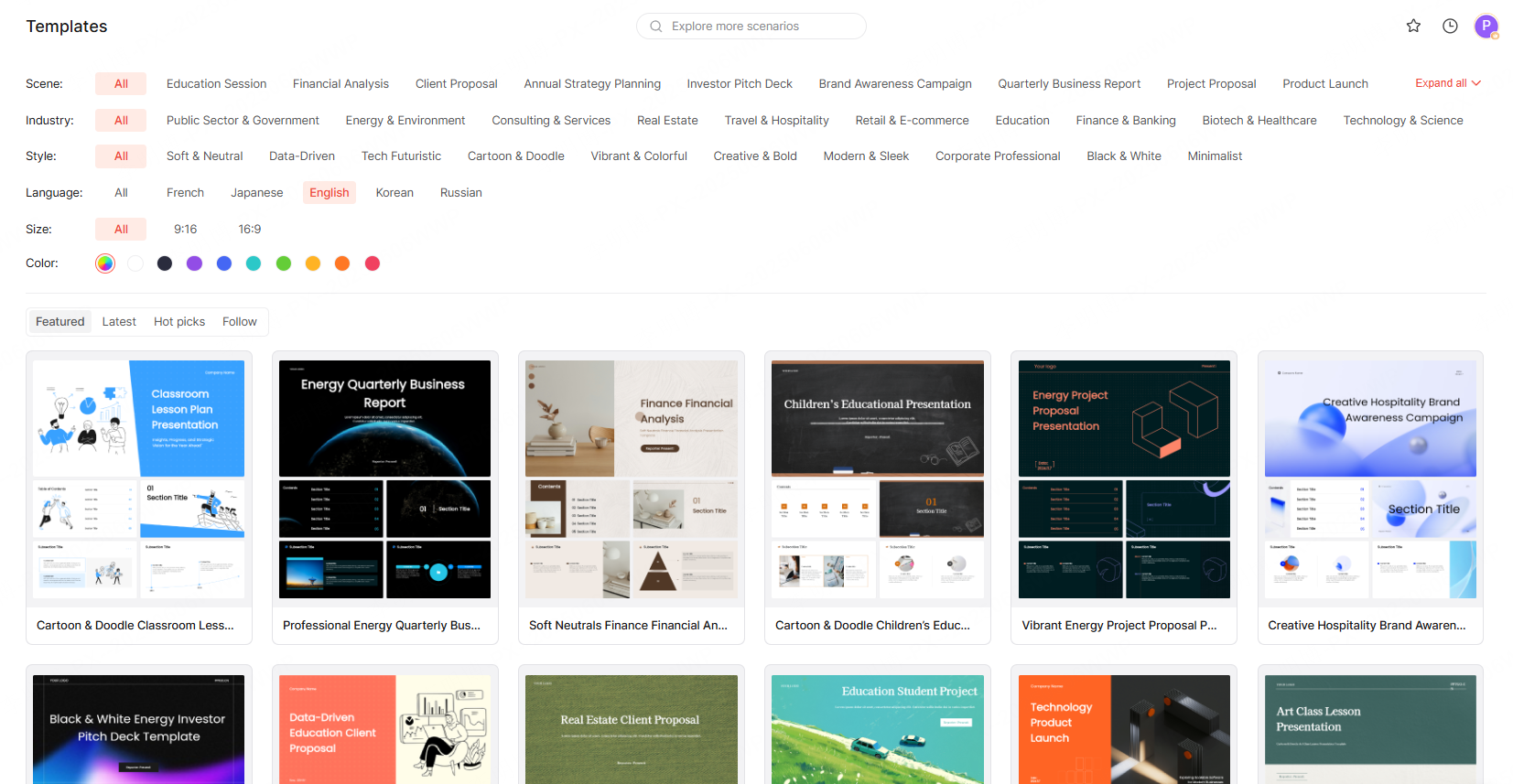
Step 2: Apply a template
Choose from templates for:
- Business reports
- Pitches
- Defenses
- Academic presentations
Each template includes optimized layout, colors, and structure.
Step 3: Polish both content and visuals
(1) Content enhancement
Use AI to:
- Rewrite text
- Simplify wording
- Fix grammar
- Summarize
- Improve logic
(2) Layout adjustments
Switch between premade structures like:
- Compare/contrast
- Timeline
- Value proposition
- Data layout
- Process flows
(3) Replace visuals
Update images, icons, and charts using the built in material library.
Step 4: Export
Download as:
- PPTX
Or share online for collaboration and cloud storage.
5. FAQ: Common Questions About PPT Polishing
Q1: What’s the difference between polishing and beautifying a PPT?
- Beautifying: Visual improvements only
- Polishing: Visual + content + structure + logic + narrative flow
Q2: Can I polish a PPT without design experience?
Yes. Modern AI tools handle most of the design work. You only need to focus on content logic.
Q3: What should I check before finalizing a polished PPT?
- Font consistency
- Color coherence
- Typos & grammar
- Logical flow
- Chart clarity
- Animation pacing