A PowerPoint background is the first visual element your audience notices. Long before they read a headline or examine a chart, the background sets the tone, mood, and perceived quality of your presentation. A well chosen background does more than look good. It improves readability, reinforces your message, and makes your slides feel intentional and professional. A poor background, on the other hand, can distract, confuse, or make even strong content feel amateur.
In this guide, you will learn how to fill PowerPoint backgrounds effectively using modern tools and proven design principles. We will cover common background types, practical setup steps, and professional design tips that work for business presentations, technical briefings, and educational content alike.
1. How to Fill a PowerPoint Background
PowerPoint backgrounds typically fall into three categories: solid color fills, pattern or texture fills, and image backgrounds. Below, we will walk through each option using Presenti AI, a modern AI powered presentation tool, as an example. The same principles apply to PowerPoint, Google Slides, and most online presentation editors.
1.1 Solid Color Backgrounds
Solid color backgrounds are the most widely used option for professional presentations. They are clean, predictable, and easy to maintain across large slide decks.
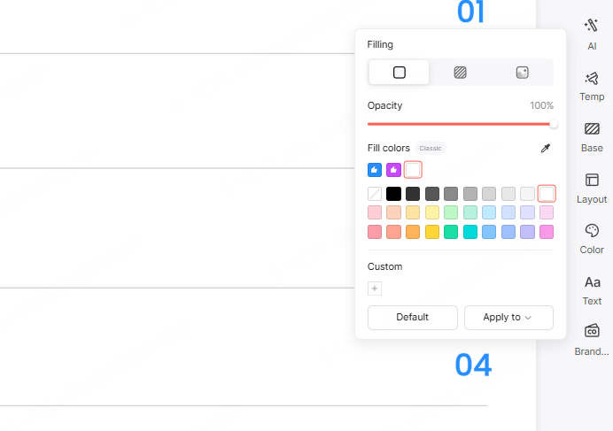
In Presenti AI, open your presentation and select the Background option in the right side toolbar. The default setting is solid color fill. You can choose any color from the palette or use the color picker to match your brand colors. Opacity controls allow you to fine tune how strong the background appears.
Best use cases for solid backgrounds:
- Technical presentations
- Product demos
- Internal reports
- Educational slide decks
Neutral colors such as white, light gray, navy, or charcoal work well for text heavy slides and data visualization.
1.2 Pattern or Texture Backgrounds
Pattern and texture backgrounds add subtle visual interest without overwhelming the content when used correctly.
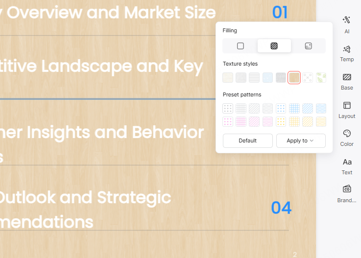
After selecting the Pattern or Texture Fill option, Presenti AI provides a library of pre designed textures and patterns. These can be applied to individual slides or the entire deck with one click. Choose patterns that match the tone of your presentation. For example, soft geometric patterns work well for technology topics, while light paper or fabric textures can suit educational or training materials.
Design tip: Patterns should remain subtle. If your audience notices the background before the content, it is likely too strong.
1.3 Image Backgrounds
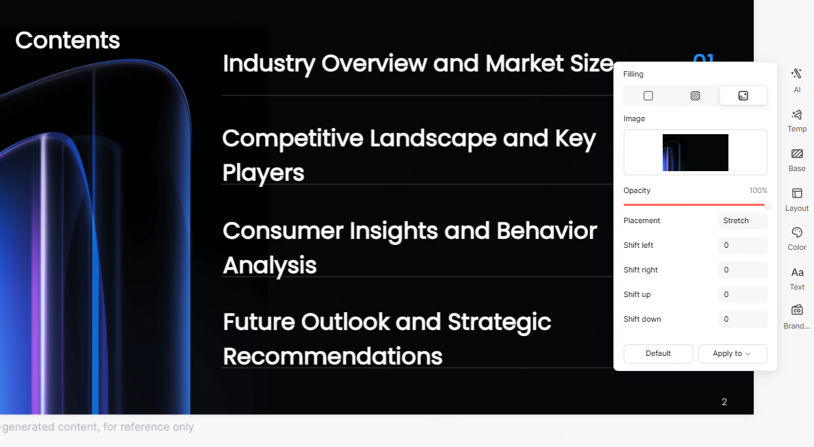
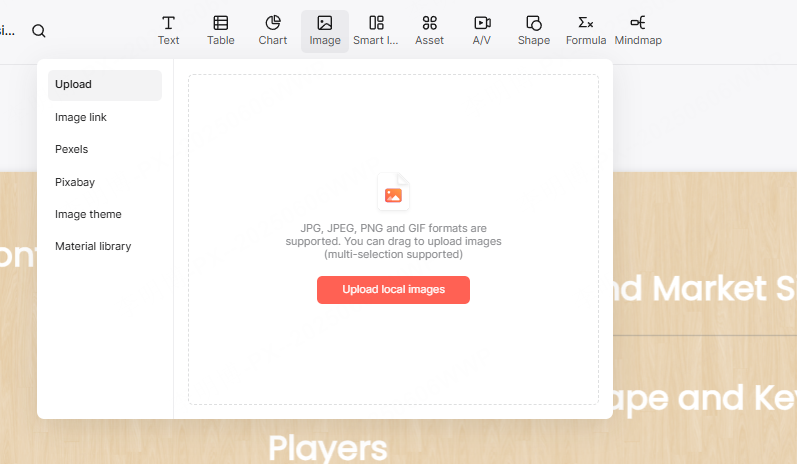
Image backgrounds can create strong emotional impact when used thoughtfully. Presenti AI allows you to upload local images, paste an image URL, or select photos from an integrated Pexels stock image library.
Once the image is added, you can adjust opacity, alignment, and cropping. Fine control over positioning helps ensure key content areas remain readable.
Recommended scenarios for image backgrounds:
- Opening or closing slides
- Marketing or branding presentations
- Vision or strategy decks
Avoid using busy or high contrast images behind dense text. When necessary, add a semi transparent overlay to improve readability.
2. Professional Tips for PowerPoint Background Design
Choosing a background is not only about aesthetics. The following best practices help ensure your slides remain readable, consistent, and effective.
2.1 Maintain Strong Contrast Between Text and Background
Text should always stand out clearly from the background. Dark backgrounds work best with light text, while light backgrounds pair well with dark text.
Avoid low contrast combinations such as gray text on a light gray background. These combinations strain the eyes and reduce comprehension, especially in large rooms or video calls.
2.2 Use Image Overlays to Improve Readability
When placing text on an image background, color harmony matters. Adjust image opacity so the background does not overpower the content. Another effective technique is placing text inside a semi transparent rectangle or gradient overlay.
This approach keeps the image visible while ensuring the text remains legible.
2.3 Embrace White Space
White space, also known as negative space, gives your content room to breathe. Crowded slides feel overwhelming and reduce audience focus.
A clean background with adequate spacing helps guide attention and makes complex information easier to absorb. Professional presentations rarely try to fill every pixel.
2.4 Avoid Overly Complex Backgrounds
Backgrounds should support your content, not compete with it. Complex gradients, loud patterns, or decorative graphics can distract from key points.
If you use gradients, keep them soft and limited to two closely related colors. Subtlety is the hallmark of professional slide design.
2.5 Add Texture and Light Shadow for Depth
Subtle textures can add depth and sophistication to flat designs. Light paper grain, soft noise, or minimal fabric textures create a refined look without drawing attention.
Similarly, gentle shadow effects behind text boxes or charts can improve visual hierarchy and help separate content from the background.
2.6 Customize Gradients and Transparency
Gradients can make backgrounds feel dynamic and modern when applied with restraint. Use gradual transitions rather than sharp color shifts.
Transparency controls allow backgrounds to blend naturally with charts, images, and text. This technique is especially useful when layering visual elements on complex slides.
3. Recommended Tool for Efficient Presentation Design
Presenti AI is an AI powered presentation platform designed to help users create high quality slide decks with minimal effort. It supports AI generated outlines, text to presentation workflows, file to presentation conversion, intelligent layout suggestions, and built in content optimization.
Even users without design experience can generate polished presentations in minutes using its template library and smart layout engine.
Key Features of Presenti AI
User friendly interface
The clean and intuitive interface makes background customization easy, even for beginners. Background fills can be applied globally without manually editing each slide.
Rich templates and design elements
A wide selection of professionally designed templates and layouts helps ensure visual consistency while saving time.
Intelligent color suggestions
Smart color matching features recommend coordinated background colors based on your theme or selected images.
One click global application
Apply background settings across your entire presentation instantly, improving efficiency and consistency.
Conclusion
PowerPoint background design plays a critical role in how your presentation is perceived. With the right background choices, your slides become clearer, more engaging, and more professional.
Tools like Presenti AI simplify the process by combining intelligent design assistance with flexible customization options. Whether you are building a technical briefing, a classroom presentation, or a business proposal, mastering background design will significantly elevate the impact of your slides.