Creating effective PowerPoint presentations is a core skill for modern professionals. Whether you are delivering a technical briefing, teaching a class, or presenting a business proposal, slide quality directly affects how well your message is understood and remembered.
This guide provides practical, field tested PowerPoint design tips focused on clarity, structure, and efficiency. Instead of decorative tricks, it emphasizes visual communication principles that work across technical, educational, and business environments. These techniques help you create professional slides faster while maintaining consistency and credibility.

Universal PowerPoint Design Principles
Balance Text and Visual Elements
Strong visuals significantly improve comprehension and engagement. Choose images, icons, and diagrams that directly support your message. Avoid decorative visuals that add noise without meaning.
Slides overloaded with text reduce attention and retention. When possible, replace long explanations with icons, simple illustrations, or diagrams. Common tools used in Western workplaces and classrooms include PowerPoint Icons, The Noun Project, and built in Microsoft 365 visual libraries.
A practical rule of thumb is this:
Your audience should understand the main idea of a slide within five seconds.
If they cannot, the slide likely contains too much information.
Use Animations and Transitions with Intention
Animations can be helpful when they guide attention or explain a process step by step. For example, revealing bullet points gradually during a technical explanation can improve focus.
However, excessive animations and flashy transitions distract from the message. In professional and technical settings, simple fades or subtle motion effects are usually sufficient. Clarity always matters more than visual effects.
Improve Logical Flow and Structure
Well structured slides support clear thinking. Organize content into clearly defined sections and use consistent headings to guide the audience through your narrative.
Charts, diagrams, and visual frameworks often communicate ideas more effectively than paragraphs. Flowcharts, timelines, and comparison tables help turn abstract concepts into concrete visuals.
Each slide should communicate one core idea. If a slide feels crowded, it likely needs to be split into two.
Maintain Layout and Visual Consistency
Consistent layouts improve readability and reduce cognitive load. Use grid based alignment and spacing tools available in modern presentation software.
Pay attention to margins, line spacing, and alignment. Choose no more than two fonts for a presentation and apply them consistently. Consistency signals professionalism and builds trust with the audience.
Design Techniques for Different Slide Types
Cover Slide Design
The cover slide sets expectations for the entire presentation. Keep it clean and focused. The title should clearly communicate the topic without unnecessary wording.
In professional contexts, include brand elements such as a company logo or brand colors. Avoid busy backgrounds and excessive text. A simple layout signals confidence and credibility.
Agenda or Outline Slides
Agenda slides help the audience understand the structure of your presentation. Use short, descriptive section titles rather than vague labels.
Icons or subtle color blocks can visually separate sections. This approach is especially effective in longer presentations where structure plays a critical role.
Content Slides
Each content slide should support one key message. Use concise bullet points and reinforce them with diagrams, screenshots, or charts.
Avoid full sentences when possible. Slides are visual aids, not documents. The speaker provides context while the slide highlights key ideas.
Data Visualization Slides
Data slides should prioritize clarity over decoration. Replace paragraphs with charts whenever possible. Bar charts, line charts, and comparison tables help audiences understand trends and differences quickly.
Highlight key data points using contrast or emphasis. Remove unnecessary gridlines, labels, or decorative elements that reduce readability.
Closing Slides
A strong closing slide reinforces key takeaways. Summarize the main points clearly and include a call to action when appropriate. This may include next steps, contact information, or links to additional resources.
A simple thank you message combined with clear contact details keeps the ending professional and approachable.
PowerPoint Tips for Different Presentation Scenarios
Academic Defense and Research Presentations
Academic defense presentations prioritize logic, evidence, and clarity. Use calm and neutral color schemes such as blue, gray, or white. Avoid decorative visuals that distract from the content.
A common academic presentation structure includes:
- Title Slide: Research title, author, advisor, institution
- Background: Research context and problem definition
- Methodology: Process diagrams and experimental design
- Results: Key findings supported by charts and tables
- Conclusion and Future Work: Summary and next steps
- References: Selected citations
Slide count should align with presentation time. Reviewers value clarity and reasoning more than volume.
Educational and Training Presentations
Teaching and training slides should focus on understanding and retention.
Modular Content Design
Break complex topics into modules. Each module addresses one concept or skill. This approach works well in technical subjects such as programming, mathematics, and engineering.
Visual Learning Support
Use diagrams, flowcharts, and short demonstrations to explain abstract ideas. Visual explanations reduce learning friction and improve retention.
Interactive Elements
Include discussion prompts, short exercises, or reflection questions. Interaction increases engagement and encourages active learning.
Business and Corporate Presentations
Business presentations aim to communicate decisions, insights, or strategies efficiently.
Concise Messaging
Limit each slide to three to five key points. Avoid long paragraphs. Executive and client facing meetings value clarity and speed.
Brand Consistency
Apply consistent colors, fonts, and layouts aligned with corporate brand guidelines. Consistency reinforces trust and professionalism.
Data Driven Storytelling
Support recommendations with data. Use KPIs, benchmarks, and charts to strengthen credibility. Ensure smooth transitions between sections so the audience can follow your logic.

Essential Tools for Efficient PowerPoint Creation
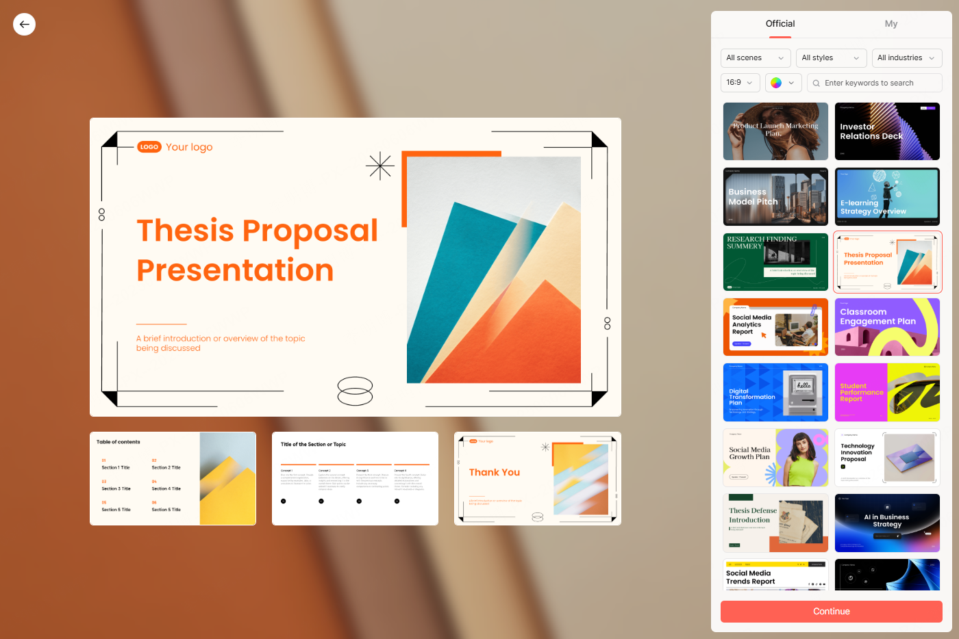
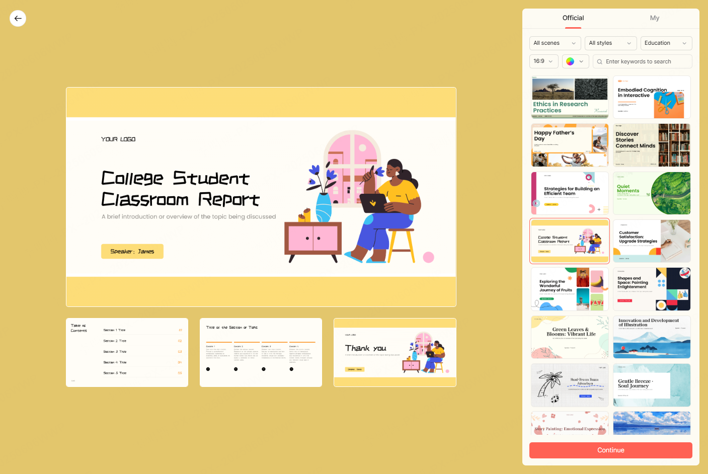
Using AI Assisted Presentation Tools
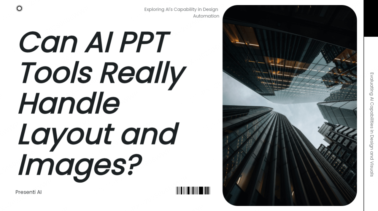
AI assisted tools are increasingly used to accelerate presentation creation. One example is Presenti AI, an AI powered presentation generator designed to reduce manual workload.
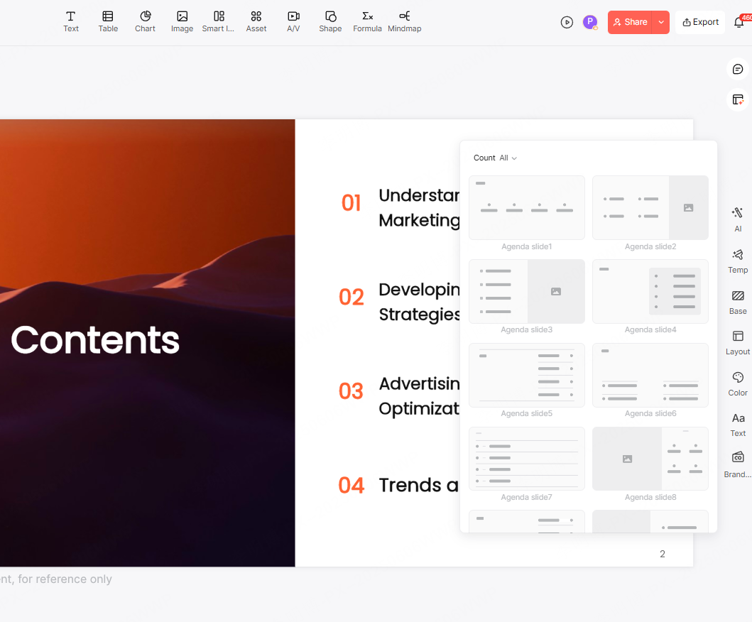
Presenti AI can generate slide outlines, layouts, color schemes, and draft content based on a topic or uploaded document. This workflow is familiar to users who already rely on tools such as Microsoft Copilot, Google Workspace AI, or Notion AI.
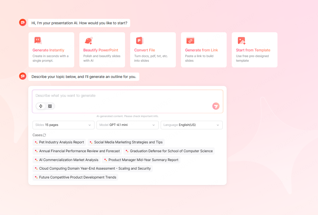
Step 1: Access the Tool
Open Presenti AI and select the option to generate a presentation using AI.
Step 2: Choose a Creation Method
- Topic based generation
- Document import from Word or PDF
- Template selection combined with AI generated content
Step 3: Refine and Customize
Review the generated slides and adjust wording, visuals, and layout. Human review ensures accuracy and relevance for the target audience.
AI tools accelerate the starting phase, but thoughtful refinement remains essential for quality.
Conclusion
Effective PowerPoint design combines clear thinking with strong visual communication. High quality slides are not about decoration. They help the audience understand, remember, and act on your message.
By applying these design principles and using modern tools wisely, you can create presentations that communicate efficiently across academic, educational, and business contexts.
Consistent practice and intentional refinement are the keys to mastering professional presentation design.