Every operations researcher eventually arrives at the same inflection point: a study is complete, the results are compelling, and the abstract submission to the INFORMS annual meeting has been accepted. Now comes the harder task — building an INFORMS conference presentation that does the work justice. Not a slide deck stuffed with equations and tables, but a structured, visually coherent argument that holds a room of specialists for exactly the time allotted, invites rigorous questions, and leaves the audience with something worth remembering. This guide covers what INFORMS is, how its conference format works, what the best presentations contain, how to design slides that hold up under scholarly and professional scrutiny, and how modern AI tools are compressing the production time from weeks to hours.
What Is INFORMS and Why Does the Presentation Standard Matter?
INFORMS — the Institute for Operations Research and the Management Sciences — is the world’s largest professional society dedicated to operations research, analytics, and management science. Its flagship event, the INFORMS Annual Meeting, draws more than 6,000 attendees from academia, industry, and government each year, making it one of the most intellectually dense gatherings in any quantitative discipline.
The INFORMS Annual Meeting is not a single-track conference. It runs hundreds of parallel sessions simultaneously across multiple days. That context creates a specific competitive pressure: your session competes directly with dozens of others happening at the same time. Attendees choose deliberately. They show up because your abstract promised something specific. The INFORMS presentation has to deliver on that promise — clearly, efficiently, and within a tight time window.
The standard 20-minute slot at an INFORMS session typically breaks into 15 minutes of presentation and 5 minutes of Q&A. Some sessions allocate slightly more; some cluster-format sessions run shorter. The constraint is real, and the audience is unforgiving in a particular way: they are not passive. They are peers who are simultaneously evaluating your methodology, comparing your approach to their own work, and formulating questions. A presentation that is structurally sound and visually clear gives them the cognitive space to engage at that level. One that requires them to parse dense slides just to follow the argument loses them early.
Types of Presentations at the INFORMS Annual Meeting
Understanding the format you have been assigned shapes every structural and design decision you make.
Contributed Paper Presentations
The most common format. A 15-minute talk in a themed session with three to four other presenters, followed by brief Q&A. These sessions are organized around methodological or application areas — stochastic programming, humanitarian logistics, healthcare operations, machine learning in OR, and hundreds of other clusters. The audience is a mix of deep specialists and adjacent researchers.
Invited Sessions and Cluster Sessions
Organized by a session chair around a specific theme or ongoing research conversation. These tend to draw more focused audiences and often allow slightly richer discussion. Being invited into a cluster session signals standing in a research community — the presentation expectations are correspondingly high.
Tutorial Sessions
Longer, more pedagogical in format. Tutorials at the INFORMS annual meeting are often 90 minutes and designed to bring an audience up to speed on a methodology, tool, or emerging research area. Slide design for tutorials emphasizes progressive disclosure and clarity over data density.
Poster Sessions
INFORMS runs dedicated poster sessions where researchers present single-panel visual summaries of their work and engage directly with attendees who stop at their display. The INFORMS presentation template logic for posters differs fundamentally from slide-based formats — spatial layout, visual hierarchy, and self-explanatory figures matter more than narrative flow.
Key Components of an Effective INFORMS Presentation
The architecture of a strong operations research presentation at INFORMS follows a logic that is both academic and practical. Here is the standard structure that experienced INFORMS presenters use:
Motivation and Problem Framing (2–3 minutes)
Open by establishing the problem — not the technical formulation, but the real-world or theoretical gap that motivates it. Why does this problem matter? What breaks down if it remains unsolved? This section earns the audience’s attention before the formalism begins. Even a room full of specialists needs to be oriented to the specific angle of your contribution.
Literature Positioning (1–2 minutes)
Where does this work sit? What existing methods does it build on, challenge, or extend? In a 15-minute slot, this cannot be exhaustive — two or three key citations positioned to show exactly where your contribution differs. The goal is not a literature survey; it is establishing the space your work occupies.
Model Formulation or Methodological Framework (3–4 minutes)
The technical core. Present the formulation, algorithm, or analytical framework with enough precision that a specialist can evaluate it — but not so much that you lose the non-specialist members of the audience before reaching your results. A single clean formulation slide, perhaps supported by a notation reference slide, typically works better than building the model incrementally across five slides.
Results and Computational Findings (4–5 minutes)
This is what the audience came for. Numerical experiments, benchmark comparisons, case study outcomes, analytical bounds — whatever the output of your method is, present it with clarity. Tables need to be legible. Figures need labeled axes and clearly stated takeaways. Every result slide should have a headline that tells the audience what to take from it, not just what is shown.
Managerial or Policy Implications (1–2 minutes)
In operations research, results without implications are incomplete arguments. What do your findings mean for practice? What decisions change, and for whom? This section matters particularly when the audience includes practitioners or when your work sits in an applied domain.
Conclusions and Open Questions (1 minute)
Brief, direct, and forward-looking. What did you show? What remains open? Ending with a genuinely interesting open question generates better Q&A than a rote summary of contributions.
INFORMS Presentation Design Principles
The INFORMS presentation template conventions that experienced OR researchers apply are not arbitrary — they reflect the specific cognitive demands of presenting technical content to a peer audience under time pressure.
Equations Deserve Their Own Space
A slide with a full LP formulation, a heuristic pseudocode block, and a results table is not a slide — it is three slides collapsed into one. Mathematical content needs room to breathe. Isolate key formulations. Use consistent notation across the deck. Number equations if you plan to reference them during Q&A.
Tables Must Be Readable at the Back of the Room
This is violated constantly at operations research conferences. A 9pt font table imported directly from a LaTeX paper is not a presentation slide — it is a wall of illegible data. For a table to belong on a slide, every cell must be readable at normal projection distance. That typically means four to six rows maximum, stripped of all columns not essential to the point you are making.
Reserve Animation for Information Revelation
Builds and animations are useful in technical presentations when they reveal information progressively — showing a graph being constructed, a solution improving across iterations, or a model being built component by component. They are counterproductive when they merely add visual movement to content that could appear at once. Use reveal animations purposefully; avoid decorative transitions entirely.
Backup Slides Are Not Optional
Every INFORMS presenter should arrive with a set of appendix slides covering: the full model formulation if the presentation version was compressed, complete numerical results tables, sensitivity analyses, proof sketches for theoretical results, and answers to the two or three most obvious methodological challenges to the work. These slides never appear in the main talk. They surface when Q&A goes deep — and they signal preparation, rigor, and command of your own material.
How Presenti AI Helps Operations Researchers Build INFORMS Presentations
The production gap in academic conference presentations is well-documented among researchers. The intellectual work — the model, the algorithm, the proofs, the experiments — consumes the available time. Slide production happens in a compressed window under deadline pressure. The result is often a deck that undersells genuinely strong work because the visual and structural quality does not match the scientific quality.
Presenti AI addresses that gap directly.
From Paper to Slides in Minutes
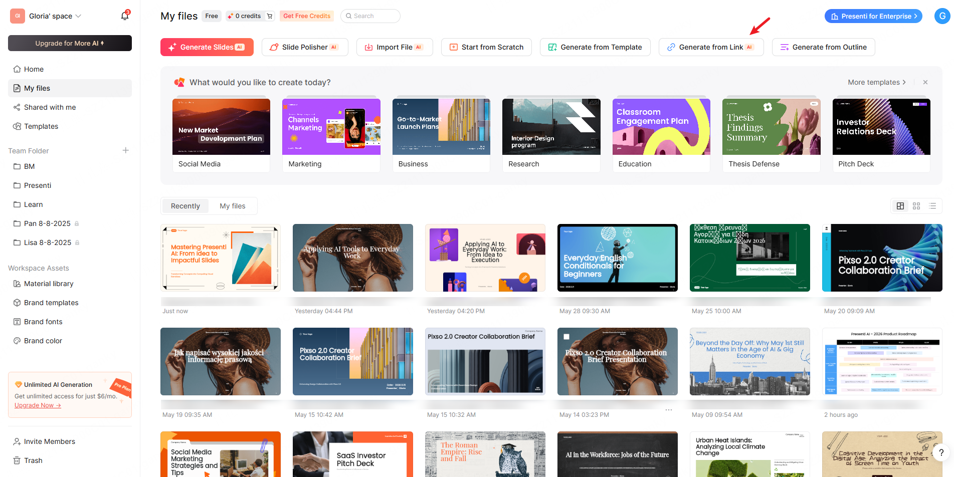
Presenti accepts the formats that operations researchers actually work in. Upload a PDF preprint, a working paper, or a conference submission draft, and Presenti reads the document structure — identifying the problem formulation, the methodology, the computational results, and the conclusions — and generates a structured slide framework organized around that content. A researcher uploading a 30-page working paper receives a complete draft deck, appropriately sectioned for a 15-minute INFORMS slot, within minutes.
The same process works from a Word document for those working from manuscripts, from a TXT file for researchers who maintain bullet-point research notes, from an audio recording for those who prefer to brief the AI verbally on their research, or from a web link for papers available on SSRN, arXiv, or similar preprint servers. For researchers with an existing but visually inconsistent deck, uploading the PPTX directly lets Presenti restructure and redesign without rebuilding content from scratch.
Intelligent Compression for Time-Constrained Formats
The jump from a full research paper to a 15-minute presentation requires aggressive but principled compression. Presenti applies that logic automatically — identifying which methodological details are essential for audience evaluation versus which belong in the paper, selecting the most significant experimental results for the slide treatment, and restructuring the discussion to match the time constraint rather than the paper’s section proportions.
One-Click Theme Switching for Institutional and Conference Alignment
INFORMS presentations often need to reflect institutional branding — university color schemes, research center logos, lab visual identities. Presenti’s one-click theme switching applies a complete visual system across every slide simultaneously: typography, color palette, layout proportions, header styles. A researcher presenting at INFORMS 2026 and then at a departmental seminar two weeks later can maintain one content base and switch the visual treatment for each context in seconds.
Common Mistakes in INFORMS Presentations
Starting with the model, not the motivation. Jumping directly into formulation before establishing why the problem matters loses a significant portion of the audience in the first two minutes. Frame the problem before you formalize it.
Over-relying on conference proceedings figures. Figures from a double-column journal or proceedings layout are formatted for 8.5×11 paper, not a 16:9 projector slide. Axis labels become illegible. Color distinctions collapse. Every figure used in the talk needs to be rebuilt or substantially reformatted for the projection context.
Attempting to present the full paper. A 15-minute slot is not a compressed version of the full paper. It is a different document entirely — one designed to communicate the central contribution clearly enough to generate informed Q&A, not to replace the reading experience.
Neglecting the Q&A preparation. At the INFORMS annual meeting, the questions are often as technically sophisticated as the presentation. The three most predictable challenges — alternative formulations, benchmark comparisons, generalizability of results — deserve prepared responses supported by backup slides.
Misusing the available time. Ending at 12 minutes in a 15-minute slot signals incomplete preparation. Running to 17 minutes is disrespectful to co-presenters and the session chair. Time your talk to 14 minutes in rehearsal; the actual delivery will run slightly longer.
Conclusion
A polished INFORMS conference presentation is not merely the wrapper around your research — it is the argument itself, made live, in front of the people whose opinions matter most to your work. The structure, the slide design, the compression decisions, and the time discipline all shape how a room of specialists receives and evaluates what you have done. Whether you are presenting a methodological contribution, an application-driven case study, or a tutorial at INFORMS 2026, the fundamentals remain constant: clear motivation, rigorous but accessible formulation, results that answer the question the paper set out to investigate, and implications that connect the technical work to something worth caring about.
Presenti AI compresses the production gap that consistently degrades the presentation quality of genuinely strong operations research conference work. Upload your paper, paste your abstract, or describe your contribution from scratch. The slides take shape around your content. The argument lands with the clarity it deserves. Your work gets the INFORMS presentation it has earned.
Frequently Asked Questions
Q1: How long should an INFORMS conference presentation be, and how many slides should it include?
The standard contributed paper slot at the INFORMS annual meeting is 15 minutes for the presentation, followed by approximately 5 minutes of Q&A. For a 15-minute talk, 12 to 18 slides is the appropriate range — roughly one slide per minute, with some slides warranting more time than others. The title slide, motivation section, and conclusions tend to move quickly; formulation and results slides require more sustained attention. Aim for 14 minutes in rehearsal to account for natural delivery variation. Exceeding the time limit in a multi-presenter session is professionally damaging and disrespectful to co-presenters.
Q2: What is the best structure for an INFORMS presentation on a mathematical programming or optimization paper?
The structure that works most consistently across optimization and mathematical programming presentations at INFORMS is: motivation and problem framing (establishing real-world or theoretical stakes), literature positioning (two to three key citations showing where the contribution fits), model formulation (clean and self-contained, with a notation slide if needed), solution approach or algorithm (compressed to the essential logic), computational results (the main evidence for the contribution’s value), managerial or theoretical implications, and conclusions with open questions. This sequence mirrors the logic of the paper while compressing it into the time constraint.
Q3: How do I present complex mathematical formulations without losing the non-specialist audience members?
The most effective approach is a two-layer presentation strategy. For the formulation slides, use clean notation with verbal walkthrough — state what each component represents in plain language as you present it. Immediately after the formulation, include a concrete small-instance or illustrative example that shows the model working on interpretable data. Specialists get the formal precision; non-specialists get the intuition from the example. Avoid building formulations incrementally across multiple slides unless the progressive structure genuinely aids comprehension — it typically creates confusion about which version is final.
Q4: How should I handle the Q&A session at an INFORMS presentation?
Treat Q&A preparation as seriously as slide preparation. Before the presentation, identify the three most technically challenging aspects of your work — the most contestable modeling assumption, the most obvious alternative benchmark comparison, the most significant limitation — and prepare a clear, concise response to each. Build backup slides for these topics specifically. During Q&A, listen to the full question before responding, confirm your understanding if the question is complex, and answer directly rather than deflecting. If a question reveals a genuine gap, acknowledge it honestly — INFORMS audiences respect intellectual honesty far more than defensive deflection.
Q5: What are the most common visual design mistakes in operations research conference presentations?
The most damaging recurring errors are: using tables copied directly from the paper without reformatting for projection (illegible at typical viewing distances), presenting equations at font sizes appropriate for print rather than slides (typically 10–12pt in papers versus 20–28pt needed on slides), using color palettes with insufficient contrast for conference room lighting conditions, failing to include axis labels and units on all figures, and mixing multiple visual styles across the deck in ways that create credibility-eroding inconsistency. The underlying principle is that academic audiences evaluate presenter rigor through slide quality, consciously or not — visual carelessness raises questions about methodological carelessness.
Q6: How is an INFORMS poster session presentation different from a 15-minute talk, and what adjustments does it require?
A poster session at the INFORMS annual meeting requires a fundamentally different communication approach. Instead of a linear narrative with controlled pacing, a poster must communicate the core contribution self-sufficiently to viewers who may spend anywhere from 30 seconds to 15 minutes at your display. The poster should lead visually with the most important result — not the methodology — and compress the problem motivation to two or three sentences. Figure quality is paramount: every chart and table must be readable at 1.5 to 2 meters without explanation. The researcher’s role during the session shifts from presenter to conversationalist — the poster establishes context, and you deepen it based on what each viewer asks. A verbal pitch of 90 seconds that you can deliver consistently to each new visitor is essential preparation.
Q7: Can AI tools like Presenti AI produce technically accurate slides for operations research presentations?
Presenti AI generates the structure, layout, and content organization of the presentation based on the documents and content you provide — your paper, working draft, abstract, or verbal briefing. The technical accuracy of the mathematical content, the correctness of the formulations, and the validity of the results presented on the slides depend entirely on the source material you provide. What Presenti handles is the translation problem: taking a dense technical document and restructuring it into an appropriately compressed, visually organized slide framework calibrated to the time format and audience. The researcher reviews the output, verifies the technical content, adjusts framing, and refines the slides to reflect their exact formulations and findings. The tool eliminates production overhead; the intellectual responsibility remains entirely with the researcher.