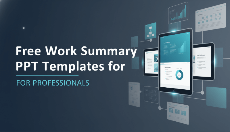
In modern workplaces, a well structured work summary PowerPoint does more than review completed tasks. It communicates impact, clarifies results, and strengthens your professional credibility. Whether you are reporting to leadership, presenting to stakeholders, or reviewing progress with your team, a strong summary PPT can significantly influence how your work is perceived.
So how do you create a work summary presentation that is both clear and persuasive?
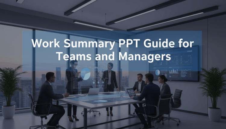
In this guide, we analyze five high quality work summary PPT examples created with Presenti AI. Each example highlights a distinct design approach and reporting strategy that is commonly used by project managers, educators, product teams, and developers in global organizations. By breaking down these patterns, you will learn practical techniques you can apply immediately to your own presentations.
1. Clear and Concise Work Summary PPT
A concise presentation focuses on clarity over volume. Instead of long explanations, it emphasizes goals, execution, and outcomes in a structured way. This approach helps your audience quickly understand what was planned, what was done, and what was achieved.
Key design principles
Use simple templates
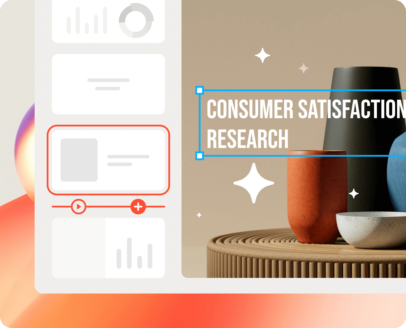
Presenti AI allows users to select clean, minimalist templates that reduce visual noise. These templates are ideal for executive reviews, sprint retrospectives, and quarterly updates where clarity matters more than decoration.
Highlight key metrics with large typography
Critical results such as “Revenue Growth: 30%” or “Project Delivery Rate: 95%” should stand out immediately. With Presenti AI’s text editing tools, key data points can be displayed using larger fonts and clear emphasis, placed in visually prominent areas of each slide.
Use whitespace intentionally
Whitespace improves readability and reduces cognitive load. Presenti AI’s automatic layout engine ensures that each content block has sufficient spacing, allowing the audience to focus on what matters most without distraction.
This style works especially well for leadership updates and performance reviews where time is limited.
2. Data Driven Work Summary PPT
For technical teams and project managers, data is often the most convincing evidence of success. A data driven work summary uses charts, metrics, and performance indicators as the foundation of the presentation.
Key design principles
Clear and focused charts
Presenti AI includes built in data visualization tools that support bar charts, line charts, and pie charts. These formats are commonly used in product reporting, engineering dashboards, and business analytics. Each chart is designed to communicate insights quickly without unnecessary visual elements.
Effective use of color
Color should guide attention, not distract from the data. Presenti AI offers intelligent color palettes that help distinguish categories and trends. This makes it easier for viewers to identify changes over time, compare performance, and understand outcomes at a glance.
Consistent visual style
Icons, labels, and markers follow a unified design system within Presenti AI. This consistency improves readability and gives the presentation a polished, professional look that aligns with enterprise level reporting standards.
This approach is ideal for KPI reviews, product performance updates, and data focused project summaries.
3. Story Based Work Summary PPT
Story driven presentations organize information along a timeline or narrative structure. Instead of isolated results, they show progress, challenges, and outcomes as part of a coherent journey. This format is especially effective when explaining complex projects or long term initiatives.
Key design principles
Creative visual elements
Presenti AI provides a library of shapes and visual components that support storytelling. These elements help illustrate transitions, milestones, and turning points in a project lifecycle.
Timeline based layouts
With timeline and step based slide layouts, Presenti AI makes it easy to present work progression clearly. This is useful for software releases, curriculum development, research projects, and cross functional initiatives where context matters.
Emotional engagement through structure
A narrative structure helps the audience connect with the work. By showing how challenges were addressed and goals were achieved, the presentation feels more engaging and memorable.
This style is often used in product launches, case studies, and post project reviews.
4. Logically Structured Work Summary PPT
A logically structured presentation follows a clear framework such as problem, analysis, solution, and outcome. This approach is highly effective for technical explanations and decision making scenarios.
Key design principles
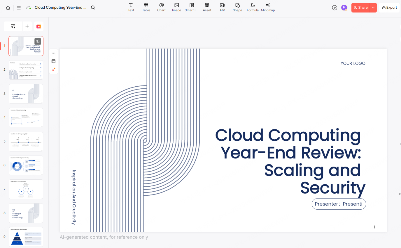
Structured templates
Presenti AI offers templates designed for logical progression. These templates automatically organize content into clear sections, making them suitable for technical reviews, architecture decisions, and process improvements.
Balanced layout and hierarchy
Each section is visually separated to reinforce structure. Presenti AI’s layout tools help align elements, create contrast, and repeat visual patterns, ensuring the audience can follow the logic without effort.
Focus on key insights
Simple icons and symbols from Presenti AI’s asset library can be used to highlight innovations, risks, or breakthroughs. This helps decision makers quickly identify what matters most.
This format is commonly used in engineering reviews, operational reports, and strategic planning presentations.
5. High Impact Visual Work Summary PPT
Visual impact focused presentations combine images, diagrams, and multimedia to showcase achievements in a more dynamic way. When used correctly, visuals can reinforce key messages and make results more memorable.
Key design principles
Bold but controlled color usage
Strong color contrast can draw attention to critical points. Presenti AI allows users to customize color schemes while maintaining visual balance, making sure the presentation remains professional.
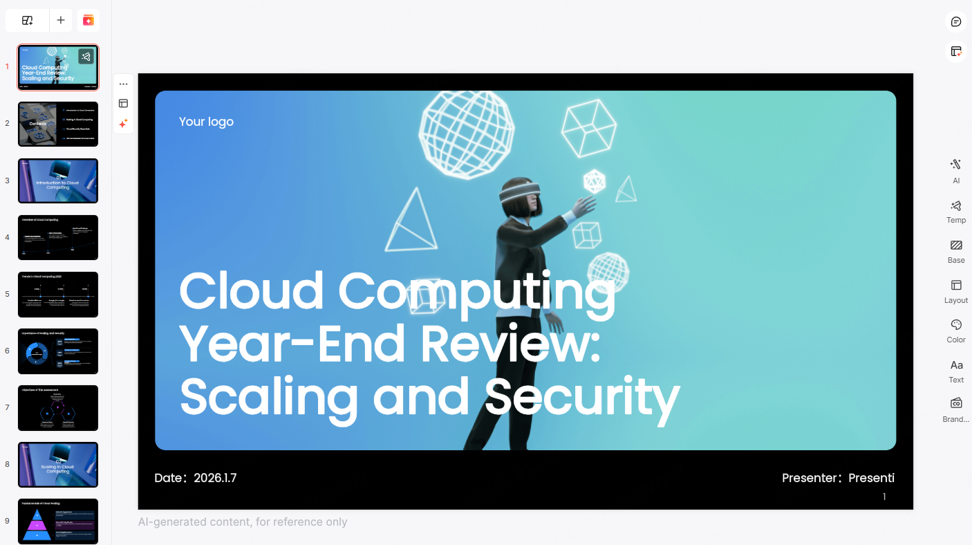
Creative layouts
With flexible layout tools, Presenti AI supports non traditional slide designs. Users can break away from rigid formats while still maintaining structure and clarity. This is useful for showcasing project highlights, product demos, and creative initiatives.
Professional visual consistency
Even with creative layouts, Presenti AI ensures consistent spacing, alignment, and typography, helping presentations remain polished and credible.
This style works well for demos, portfolio reviews, and innovation showcases.
Why These Work Summary PPT Examples Matter
All five examples above are created using Presenti AI. By studying these proven patterns and using the right tools, professionals can improve how they communicate results and demonstrate value. A strong work summary PPT not only reflects what you have done, but also how well you understand your impact.
What Makes Presenti AI a Powerful PPT Creation Tool
Presenti AI is designed for professionals who value efficiency, clarity, and quality in presentation creation. Its core features include:
AI powered generation
Users can generate presentations from a single sentence, documents, plain text, or links. Presenti AI automatically extracts key points, builds a logical outline, and designs slide layouts, significantly reducing manual work.
Flexible customization
All content, layouts, and visual elements can be edited. An integrated AI assistant helps optimize wording, while built in assets such as images, backgrounds, and slide styles can be applied with one click.
Extensive template library
Presenti AI offers a wide range of high quality templates for business reporting, education, project presentations, and market analysis. Users can quickly establish a solid structure and focus on content rather than formatting.
Real time collaboration
Multiple users can edit and review presentations simultaneously. This feature supports distributed teams and improves collaboration efficiency while maintaining version accuracy.
Conclusion
An effective work summary PPT is not about adding more slides. It is about choosing the right structure, focusing on meaningful insights, and presenting information clearly. By learning from proven examples and using intelligent tools like Presenti AI, professionals can create presentations that communicate value, build trust, and support better decisions.