Every researcher knows the feeling: your study is solid, the findings are meaningful, and then the conference abstract gets accepted — as a poster. Suddenly you need an academic poster template that can distill months of rigorous work into a single, visually compelling panel that strangers will absorb in under three minutes while holding a coffee. The stakes are real. A poorly designed research poster buries good science. A well-structured one generates conversations, collaborations, and citations. This guide covers everything you need to know — what academic posters are, how to structure them, how to design them for maximum impact, common mistakes to avoid, and how modern AI tools are transforming the process of building them.
What Is an Academic Poster Template?
An academic poster template is a pre-structured layout designed specifically for presenting scholarly research in a visual, single-page format — typically displayed at academic conferences, symposia, research fairs, and departmental events. Unlike a slide deck or a written paper, a research poster must communicate the essence of a study at a glance: the problem, the method, the findings, and the implications, all contained within a spatial arrangement that guides the viewer’s eye without requiring narration.
The template provides the scaffold: a grid of columns, predefined text blocks, placeholder areas for figures and tables, a consistent typographic hierarchy, and a color system that creates visual coherence across the panel. With the right poster template academic foundation, the researcher’s job shifts from wrestling with layout decisions to focusing on the content itself.
A well-built academic poster template accounts for:
- Standard poster dimensions (typically 36×48 inches, 48×36 inches, or A0 format depending on the conference)
- Column-based grid structures (two- or three-column layouts are most common)
- Hierarchical typography that distinguishes title, section headers, body text, and captions
- Designated zones for abstract, methodology, results, and conclusions
- Figure and table placeholders scaled for legibility at typical poster-viewing distances of one to two meters
- Institutional branding elements including logo placement and color palette compliance
Why a Strong Conference Poster Design Matters More Than You Think
There is a common misconception that conference posters are a secondary format — less prestigious than an oral presentation, less rigorous than a journal article. This misunderstands the unique function of the scientific poster presentation. A poster session is the most direct form of scholarly dialogue at most conferences. You stand next to your work. Peers walk up, read, ask questions. The conversation that emerges is immediate, specific, and often more substantive than the brief Q&A that follows a 15-minute talk.
A strong conference poster accomplishes three things that no other format achieves simultaneously: it presents your data visually, it invites informal peer review in real time, and it positions you as a scholar worth knowing. The poster is your face in the room when you are not speaking. It needs to be able to hold attention without you standing there to explain it.
Design quality is not vanity. It is a communication strategy.
Key Sections of an Effective Research Poster
Every discipline has conventions, but the core architecture of an effective research poster presentation is consistent across fields. Here is what a complete academic poster should contain:
Title and Author Block
The title should be legible from three to five meters away — minimum 72pt font, often larger. Include all authors, institutional affiliations, and contact information. A QR code linking to the full paper or supplementary data has become standard practice and is worth incorporating.
Abstract
Many templates include an abstract block, though opinions divide on its necessity — the poster itself functions as a visual abstract. If your conference requires it, keep it under 150 words. Do not simply copy-paste your submission abstract without editing it for the spatial context.
Introduction and Background
Two to three short paragraphs establishing the problem, its significance, and the gap your study addresses. Bullet points work well here. The goal is to orient viewers who are not specialists in your specific subfield without losing specialists who are.
Research Questions or Objectives
State them explicitly, numbered, in a visually distinct block. Viewers scan posters — making your core questions immediately visible ensures that everything else on the panel is interpreted in the right frame.
Methodology
This section is invariably the hardest to compress. A flow diagram or visual schematic of your research design communicates method far more efficiently than prose. Aim for a figure with a concise caption rather than a paragraph-heavy description. Give enough detail for a peer to evaluate your approach; do not give enough for them to replicate it from the poster alone.
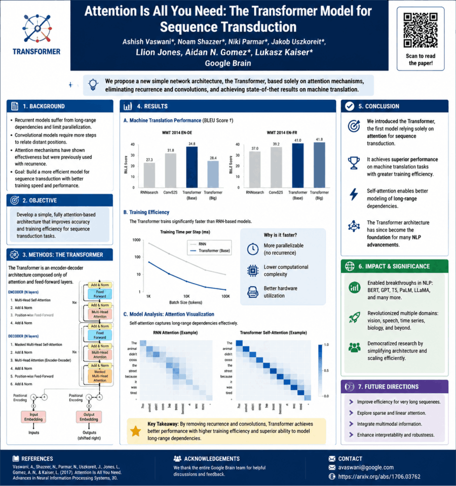
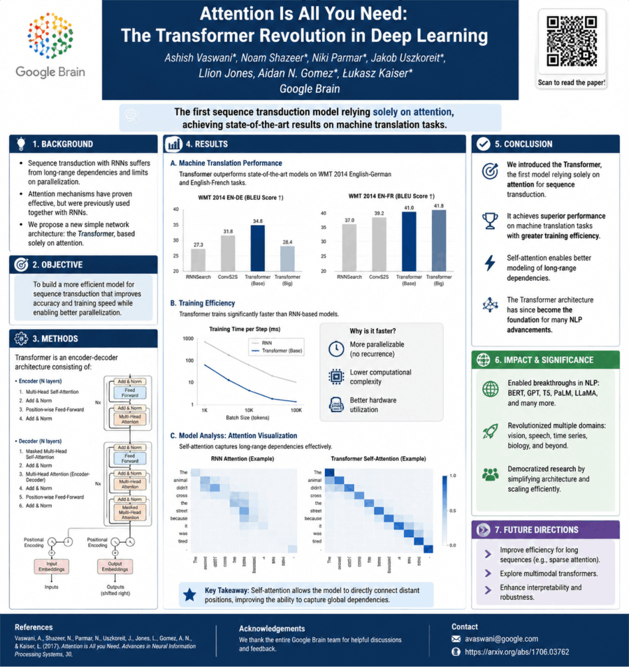
Results and Findings
The visual heart of the poster. Figures, charts, and tables should dominate this section — two to four well-chosen visualizations with clear titles, labeled axes, and stated units. Data presented visually is processed faster, retained longer, and generates more conversation than the same data presented as text. Every figure should be self-explanatory without requiring your presence.
Discussion and Conclusions
Brief. Three to five bullet points summarizing what the results mean, how they connect to or extend the existing literature, and what they imply for practice or future research. This is not the place for hedged academic prose. Be direct.
Acknowledgments and References
Keep references minimal — five to eight key citations formatted consistently. Acknowledgment of funding sources is expected and professionally important.
Academic Poster Design Principles: What Separates Good from Mediocre
An understanding of design fundamentals is the difference between a scientific poster that draws a crowd and one that gets glanced at and passed. You do not need to be a graphic designer. You need to understand a small number of high-leverage principles.
Visual Hierarchy
Every element on the poster competes for attention. Your job is to control that competition deliberately. Title gets the highest visual weight. Section headers are next. Body text is smallest. Figures are positioned centrally because they carry the most information. A viewer who glances at your poster for five seconds should walk away knowing your title, your core finding, and your conclusion. Hierarchy makes that possible.
White Space Is Not Wasted Space
The single most common design error in academic posters is overcrowding. Researchers, trained to value thoroughness, cram every available inch with text. White space — empty margins, breathing room around figures, gaps between sections — does not indicate incompleteness. It directs attention. A poster with generous spacing looks confident and professional. A poster without it looks panicked.
Color Strategy for Scientific Posters
Use a restrained color palette: one primary color, one accent color, and neutral backgrounds. Color should encode meaning — distinguishing experimental conditions, highlighting key data points, differentiating sections — not decorate. High contrast between text and background is non-negotiable; low-contrast combinations become illegible under the variable lighting of a conference hall.
Typography Discipline
Two typefaces maximum, used consistently. A sans-serif face for headers and a legible serif or sans-serif for body text covers every need a conference poster presentation has. Never use decorative or script typefaces in an academic context. Body text on a printed poster should be minimum 24pt; section headers minimum 36pt; the title 72pt or above.
Figures First, Text Second
When in doubt, replace a paragraph with a figure. Research in instructional design consistently shows that visual information paired with minimal explanatory text outperforms dense prose in comprehension and recall. Every text block on a scientific poster presentation should earn its presence by providing something a figure cannot.
How to Create a Standout Academic Poster with ChatGPT?
Creating a standout academic poster with ChatGPT is less about “getting AI to design it” and more about using it as a research distiller, structure builder, and copy editor, while you handle the visual layout in tools like PowerPoint, Canva, or Illustrator.
Here’s a practical workflow that actually produces conference-ready results.
Step 1. Start by turning your research into poster-ready content
Most academic posters fail because they copy-paste paper sections. Instead, use ChatGPT to compress your work into visual logic.
Prompt to use:
“Summarize this research paper into an academic poster format with: Title, Background (3 bullets), Methods (3–5 steps), Results (3–5 key findings), Conclusion (2–3 bullets), and Implications (2 bullets). Keep it concise and non-technical for a conference audience.”
What you get:
- Clean hierarchical structure
- Reduced jargon
- Bullet-ready content blocks
Step 2. Define a strong poster narrative (this is the difference-maker)
A standout poster is not “sections of a paper”—it’s a story in 30 seconds:
Problem → Why it matters
Approach → What you did
Key result → What you found
Impact → Why it matters now
Prompt:
“Refine this academic content into a compelling 30-second narrative suitable for a conference poster. Make it engaging but still academic.”
Step 3. Generate a visual layout plan (before opening PowerPoint)
Ask ChatGPT to design the structure first.
Prompt:
“Design a clean academic poster layout for a 36x48 inch conference poster. Include section placement, hierarchy, and reading flow. Optimize for fast scanning in under 1 minute.”
Typical output structure:
- Top: Title + Authors + Institution
- Left column: Background + Objective
- Center: Methods (visual-heavy)
- Right column: Results (charts) + Conclusion
- Bottom: References + QR code
Step 4. Turn results into visuals (not paragraphs)
Ask ChatGPT to convert results into charts or diagram ideas.
Prompt:
“Convert these research results into 3 suggested visualizations for a poster (e.g., bar chart, flow diagram, comparison table). Explain what each should show.”
This helps you avoid dense text blocks—which are the #1 reason posters get ignored.
Step 5. Improve academic writing clarity
Use ChatGPT like a scientific editor.
Prompt:
“Rewrite the following section to be concise, academic, and suitable for a poster. Reduce word count by 40% without losing meaning.”
Also useful:
- tone polishing (“make it more formal but readable”)
- grammar cleanup
- simplifying jargon
6. Generate design guidance (colors, typography, spacing)
Even if you’re not a designer, consistency matters more than creativity.
Prompt:
“Suggest a professional academic poster design system: font pairing, color palette (3–4 colors), spacing rules, and readability guidelines for a conference poster.”
Best-practice defaults:
- Fonts: Arial / Helvetica / Source Sans Pro
- Colors: 1 primary + 1 accent + neutrals
- Rule: minimal paragraphs, max 40–60 words per block
- Use whitespace aggressively
Step 7. Create a QR code + engagement hook
Modern posters often fail because they don’t extend beyond the board.
Prompt:
"Write a short QR code call-to-action for an academic poster that encourages viewers to access the full paper or dataset.”
Step 8. Final polish checklist (use ChatGPT as reviewer)
Prompt:
“Critically review this academic poster content. Identify clarity issues, redundancy, and weak messaging. Suggest improvements for a conference audience.”
What makes a academic poster stand out?
What actually makes a poster pop? It’s not the decorations. In fact, clutter is the enemy.
- One clear message (not a paper dump)
- Visual hierarchy (eyes know where to go first)
- Minimal text, maximum signal
- Strong results visualization
- Clean spacing (most overlooked factor)
The posters that stop people in their tracks succeed because they master the art of restraint. They focus on one single, memorable takeaway—not a copy-paste job of an entire paper. And the secret sauce? Clean spacing. It’s the number one thing people forget, but it’s exactly what elevates a poster from looking like an amateur draft to a masterpiece.
Common Mistakes in Academic Poster Design
Too much text. If your poster requires five minutes of uninterrupted reading to understand, it will not get five minutes of uninterrupted reading. Cut body text by half. Then cut it again.
Figures imported directly from the paper. Journal figures are formatted for print at 300 DPI in two-column layouts. They are not formatted for a 48×36-inch poster viewed from 1.5 meters. Every figure needs to be rescaled, its labels enlarged, and its line weights adjusted for the poster context.
Ignoring the title’s visual weight. Viewers read titles first, from a distance. A title in 40pt font on a 48×36-inch poster is invisible from three meters. The title should dominate the top of the panel visually — 85pt to 120pt depending on length.
No clear visual flow. Without a deliberate visual path — typically left to right, top to bottom, column by column — viewers do not know where to start or how to proceed. Use section numbering, visual separators, and spatial positioning to guide the eye.
Neglecting the QR code. A QR code linking to the full paper, supplementary data, or a project page costs nothing and adds a dimension of engagement that no printed poster can replicate. Every academic poster design should include one.
Conclusion
An academic poster template is the starting point for turning rigorous research into a visible, accessible, conversation-generating presence at a conference. The right template handles the structural and visual decisions — column layout, typographic hierarchy, color system, section sequencing — so the researcher can focus on what actually matters: the clarity of the science, the quality of the figures, and the precision of the conclusions. In a room of a hundred posters, design quality is what makes yours the one people stop at.
Frequently Asked Questions
Q1: What are the standard dimensions for an academic conference poster?
The most common academic poster dimensions are 36×48 inches (portrait) and 48×36 inches (landscape), which correspond to the A0 paper size used internationally (841×1189mm). Always confirm the required dimensions with your specific conference — some venues specify 40×60 inches or 36×60 inches, and submitting a poster in the wrong aspect ratio creates significant print and layout problems. Design your template to the correct specifications before placing any content.
Q2: How much text should an academic poster contain?
As a practical rule: fewer words than you think necessary, and far fewer than your first draft contains. A well-designed research poster functions primarily as a visual document, with figures and diagrams carrying the primary informational load. Total word count across all text blocks — excluding the title, section headers, figure captions, and references — should typically fall between 300 and 800 words. If your poster reads like an abbreviated journal article, it has too much text.
Q3: What is the best layout structure for a scientific poster?
The three-column portrait layout is the most widely used structure for academic posters and works well for most research formats. It supports a logical left-to-right reading flow while allowing figures sufficient width to be legible. Two-column layouts are appropriate for studies with fewer but larger figures. Landscape two- or three-column layouts work well for data-heavy quantitative research. Regardless of the structure, the reading path should be unambiguous: viewers should never have to guess whether to read down a column or across a row.
Q4: How do I make my conference poster stand out visually without sacrificing academic credibility?
Restraint and precision are the distinguishing markers of a credible academic poster design. A visually distinctive poster is one that uses white space confidently, chooses a focused color palette applied with internal logic, presents data in clear and well-labeled figures, and maintains typographic consistency throughout. The goal is not to make the poster look like marketing material — it is to make the science immediately accessible. Posters that try too hard with decorative elements, excessive color, or unconventional layouts typically undermine rather than enhance credibility.
Q5: Can I create both a conference poster and an oral presentation from the same research content?
Yes, and this is one of the most efficient workflows available to active researchers. The core research logic — problem, method, findings, implications — is identical across both formats. The poster compresses that content into spatial, visual form for self-directed viewer engagement. The oral presentation expands specific sections, adds narrative transitions, and calibrates depth to the available time. Tools like Presenti AI can generate both formats from a single uploaded document, adapting content structure and visual treatment to the output type automatically.
Q6: What should I include in my poster’s results section?
The results section should be anchored by two to four high-quality figures — charts, graphs, microscopy images, maps, or schematic diagrams — that directly answer your stated research questions. Each figure should have a descriptive title, fully labeled axes with units, a clear legend if multiple conditions are represented, and a one- to two-sentence caption stating what the figure shows and what the key finding is. Statistical significance markers should follow your discipline’s conventions. Avoid presenting results that do not connect directly to your research questions; a tightly focused results section is more persuasive than a comprehensive one.