Every researcher eventually faces the same moment: a completed study, a conference deadline, and a blank slide deck staring back at them. An academic research presentation template solves that paralysis. It gives your findings a structure, your data a visual home, and your argument a pathway the audience can actually follow. This guide covers what academic research presentations are, what every strong one contains, how to design slides that hold up under scholarly scrutiny, and how modern AI tools are fundamentally changing how researchers turn months of work into a coherent, compelling presentation in a fraction of the time.
What Is an Academic Research Presentation Template?
An academic research presentation template is a pre-structured slide framework built specifically for communicating scholarly work — at conferences, seminars, departmental colloquia, journal club meetings, or grant review sessions. Unlike a generic business deck, an academic template is organized around the logic of research: problem, method, findings, interpretation, implication. Every section has a purpose. Every slide serves the argument.
The distinction matters because academic audiences are unforgiving in specific ways. A conference committee or faculty panel is not evaluating your design sensibility. They are evaluating the rigor of your reasoning, the transparency of your methodology, and the significance of your contribution. A research presentation template keeps that intellectual architecture intact while reducing the cognitive overhead of building slides from scratch.
A well-constructed research presentation template typically provides:
- Standardized section layouts for each phase of the research narrative
- Visual hierarchy that reflects the logical weight of each component
- Placeholder frameworks for figures, tables, and data visualizations
- Consistent typography and color systems that do not compete with content
- Slide structures calibrated to common academic time formats (10, 15, 20, and 45 minutes)
The Anatomy of a Strong Academic Research Presentation
Understanding what goes into a high-quality academic presentation is the prerequisite for building one. The sections below represent the standard architecture used across disciplines — from the social sciences and humanities to STEM fields and professional schools.
Title and Author Information
The opening slide establishes identity and context: your name, institutional affiliation, the study title, the venue, and the date. Keep it clean. A cluttered title slide signals disorganization before you have spoken a single word.
Research Background and Motivation
This is where you make the case for why the work matters. What problem exists? Who is affected? What is inadequately understood? Do not assume your audience is intimately familiar with the specific gap your study addresses — even at a specialist conference. Frame the stakes clearly and concisely.
Literature Review and Theoretical Framework
Position your work within the existing scholarly conversation. You are not summarizing everything written on the topic — you are identifying the specific intellectual lineage your study belongs to and the gap it fills. Two to four slides, tightly focused, with explicit connections to your research questions.
Research Questions or Hypotheses
State them directly, numbered, one per line. These are the anchor of the entire presentation. Every methodological choice you made should be traceable back to answering these questions. Every finding should map onto them in the results section.
Methodology
This section demands precision. What design did you use and why? What data sources, instruments, or experimental conditions? What analytical framework? Committees and peer audiences will probe methodology — anticipate that and address the most likely challenges within the slides themselves, before they are raised.
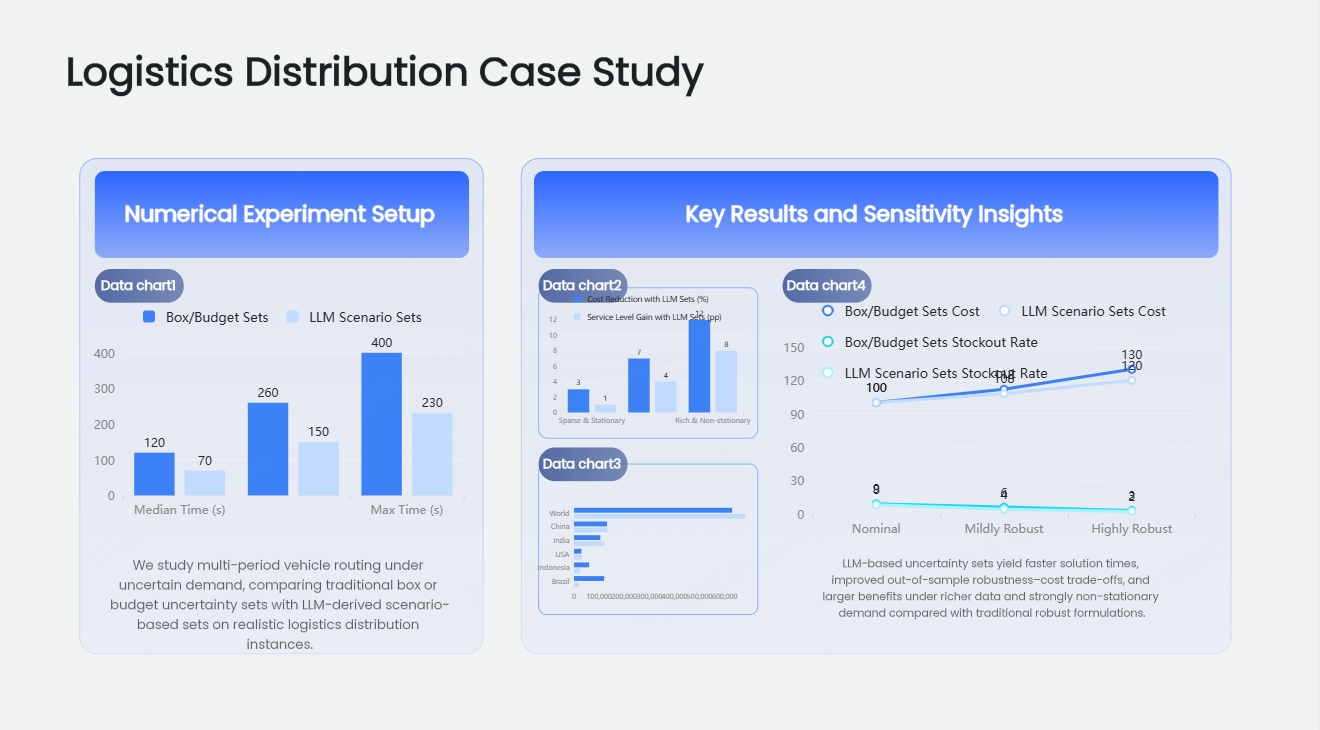
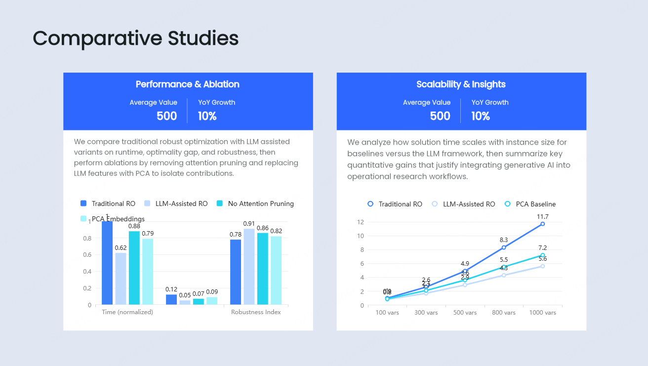
Results and Findings
The intellectual core of the presentation. Organize findings to correspond directly to your research questions, one by one. Use charts, figures, and tables that are clearly labeled, properly sourced, and legible at the back of a conference room. Resist the urge to present every data point — present the findings that answer the questions you set out to investigate.
Discussion and Interpretation
What do the results mean? How do they connect to, challenge, or extend the existing literature? This is where scholarly maturity is demonstrated — not in the raw findings, but in what you make of them. A confident interpretation, with appropriate epistemic humility, distinguishes strong research presentation slides from mere data delivery.
Limitations
Mandatory, not optional. Addressing limitations proactively establishes credibility. It signals that you understand the boundaries of your evidence and are not overclaiming. Reviewers who raise a limitation you have already acknowledged have nothing new to add.
Conclusions and Contributions
What did you learn? What does it contribute to the field? Be specific. Vague contribution statements (“this adds to the literature on X”) are easy to dismiss. Concrete ones (“this study resolves the apparent contradiction between Y and Z by showing that…”) are not.
Future Directions and Acknowledgments
Where does the research go next? A forward-looking closing positions you as an active scholar, not a student completing an assignment. Acknowledge funding sources, collaborators, and institutional support — these details matter in academic contexts.
Scientific Presentation Design: Principles That Actually Hold Up
Design in academic contexts operates under constraints that do not apply in commercial presentations. A scientific presentation design has to function in projection environments with inconsistent lighting, on conference room screens viewed from 20 meters, and in contexts where the audience is simultaneously evaluating your claims rather than passively absorbing them.
These principles are non-negotiable:
Legibility over aesthetics. The minimum readable font size for body text on a projected slide is 24pt. Axis labels on figures should be no smaller. If your chart requires a legend that takes 10pt font to fit, the chart needs to be redesigned.
One claim per slide. Academic audiences think carefully. Putting multiple findings or arguments on a single slide forces them to choose what to attend to. Give each significant point its own visual space.
Color as signal, not decoration. Use color to indicate categorical differences in data, to highlight the most important element on a slide, or to maintain visual continuity with your presentation theme — not to make the deck look more exciting. Muted palettes with one or two accent colors outperform bold, multicolor schemes in academic contexts.
Figures must be self-explanatory. Every chart, diagram, and table should include a title, labeled axes, units of measurement, and a data source citation. A figure that requires three minutes of verbal explanation to interpret is not ready for a slide.
Consistent visual identity across all slides. Mixing font families, switching color schemes mid-deck, or using three different header sizes creates visual noise that erodes credibility. Academic slide design depends on uniformity — every slide should feel like it belongs to the same family.
Conference Presentation Template: Adapting for Different Formats
A 10-minute conference paper presentation is not the same as a 45-minute invited lecture. The conference presentation template you use needs to be calibrated to the specific format you are filling.
For a 10-minute conference presentation: aim for 8 to 12 slides. Strip the literature review to a single framing slide. Compress methodology to one overview slide. Let findings and implications carry the time.
For a 15-minute research presentation: 12 to 18 slides. Space for two to three methodology slides and two to three results slides. Brief discussion.
For a 20-minute seminar presentation: 18 to 25 slides. Room for a fuller literature positioning and richer discussion section.
For a 45-minute departmental talk or invited lecture: 35 to 55 slides. This format supports a genuine engagement with the theoretical literature, multiple results threads, and an extended discussion of implications.
The slide count is not the point — the point is that the depth of each section should be proportional to the total time, and the template structure should reflect that from the start.
How Presenti AI Transforms Academic Research Presentation Creation
The practical challenge for most researchers is not knowing what to put in a research paper presentation — it is converting the dense, heavily qualified language of a written paper into slides that communicate clearly to a live audience under time pressure.
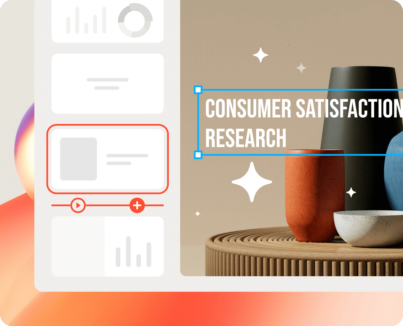
The AI presentation maker, Presenti AI, is built for exactly that transformation.
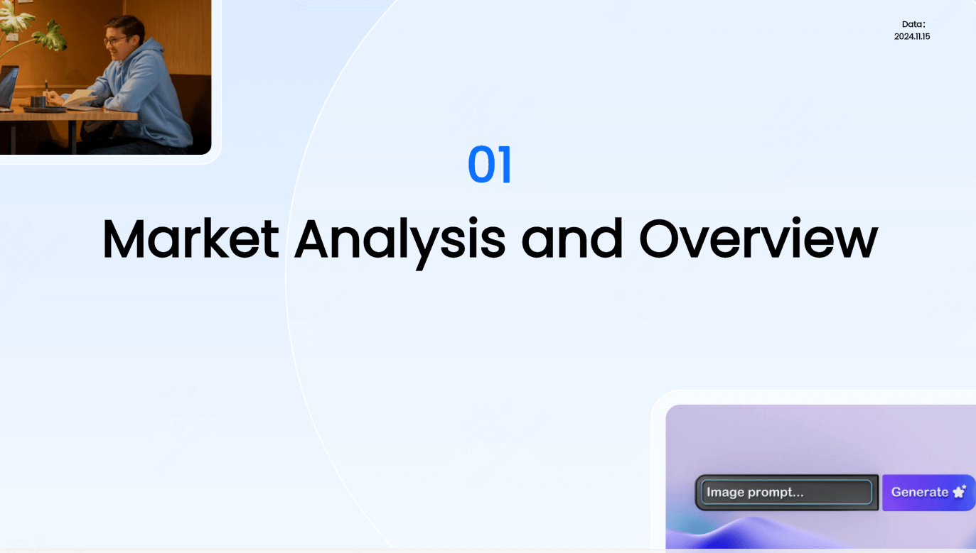
Multi-Format Input: Start With What You Have
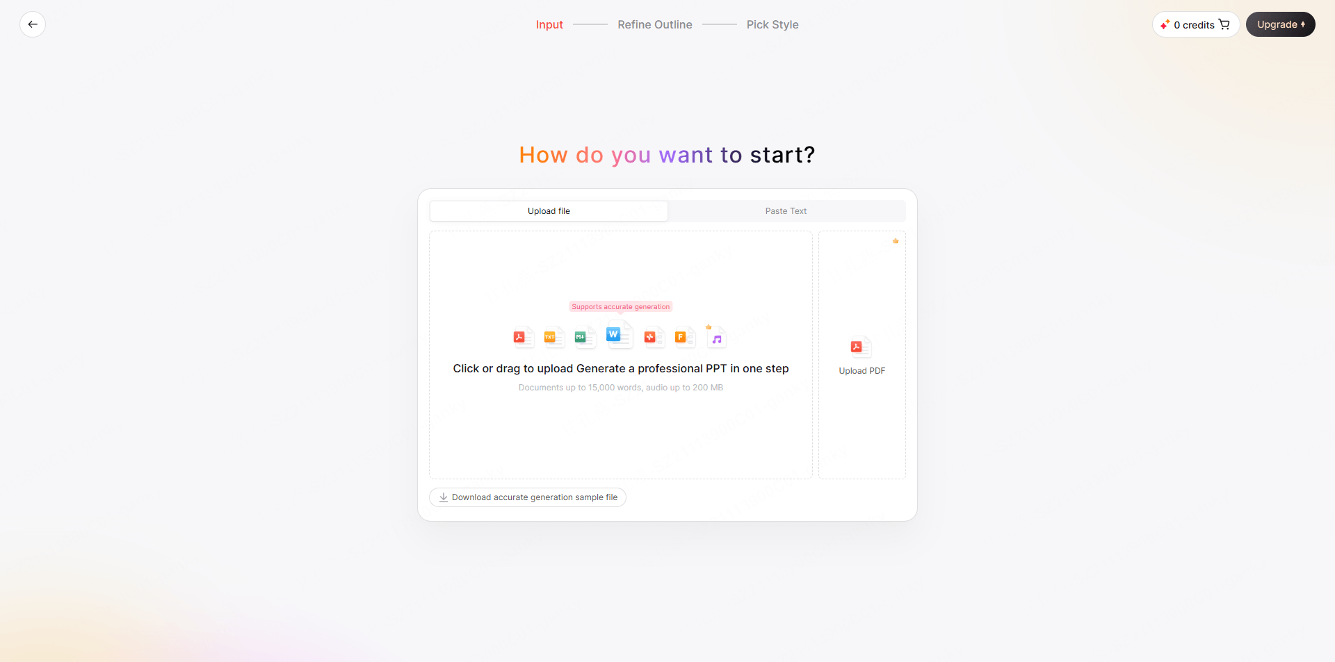
Researchers rarely start from nothing. They have papers, drafts, notes, abstracts, and data reports in various formats. Presenti accepts all of them:
- PDF: Upload your full paper, preprint, or conference abstract. Presenti reads the document, identifies the research logic, and generates a structured slide framework organized around your actual content.
- Word document: Working from a draft manuscript or thesis chapter? Upload the DOCX file and receive a presentation outline built around your existing structure.
- TXT file: Paste raw notes, bullet-point outlines, or a stream-of-consciousness research summary — Presenti organizes the content into a coherent presentation sequence.
- PPTX: Have an older version of the presentation that needs restructuring or redesigning? Upload it and let the AI polisher rebuild the layout while preserving your content.
- Audio: Record a verbal summary of your research — your problem, approach, and key findings — and Presenti transcribes and converts it into a slide deck.
- Web link: If your paper is available as a preprint on arXiv, SSRN, or a similar platform, paste the URL directly. Presenti pulls the content and builds the presentation from the source document.
AI-Powered Structure Generation
The jump from a written paper to a presentation is conceptually difficult. Papers justify methodology exhaustively. Presentations summarize it. Papers present all results; presentations highlight the key ones. Presenti understands this distinction and applies it automatically — compressing, prioritizing, and restructuring content into formats appropriate for a live academic audience rather than a manuscript reader.
One-Click Theme Switching for Academic Contexts
Many institutions and research groups have specific visual identities — university color schemes, branded templates, departmental style guides. Presenti’s one-click theme switching applies a complete visual system — typography, color palette, slide layout style — across the entire deck in a single action. A researcher presenting at three different venues in a semester can maintain one content base and switch the visual presentation to match each context instantly.
Speaker Notes and Verbal Script Support
One of the most underappreciated features for academic presenters: Presenti generates speaker notes for every slide. For researchers who are confident in their subject matter but less practiced at verbal delivery, having a starting-point script for each slide — one that can be refined into natural spoken language — is a significant practical advantage. The notes follow the slide content directly, ensuring that what is said aligns with what is shown.
Case Study: Conference Presentation for a Published Study
A sociologist presenting a journal article at an international conference has a 15-minute slot and a 9,000-word paper. They upload the PDF to Presenti, specify the 15-minute format and their target audience (academic specialists), and receive a 16-slide draft deck within minutes. The draft correctly identifies the theoretical framework, compresses the literature positioning to two slides, selects the three most significant findings for detailed presentation, and generates a discussion section that maps directly onto the paper’s conclusions. The researcher adjusts two figures, updates the institutional branding via one-click theme switch, and adds speaker notes in their own voice. Total preparation time: approximately one hour.
Common Mistakes in Academic Research Presentations
Knowing what not to do is as valuable as knowing what to do.
Reading directly from the slides. The most common and most damaging habit. Slides are visual anchors, not scripts. If every word on the slide is also coming out of your mouth, neither the slide nor the speech is doing its job.
Including too much detail in the methodology section. Reviewers and conference audiences need to understand your approach well enough to evaluate your findings — not to replicate your study from your slides alone. That level of detail belongs in the paper.
Presenting every finding rather than the key ones. Selectivity signals judgment. Knowing which results to foreground — and which to relegate to a backup appendix slide — is a mark of scholarly confidence.
Using figures directly from the paper without reformatting. Journal-quality figures are formatted for print, not projection. Axis labels shrink. Legends become illegible. Lines lose contrast. Every figure used in a slide deck should be rebuilt or significantly reformatted for the projection context.
Underestimating the Q&A. The presentation is the public face of your work. The questions are where the intellectual evaluation actually happens. Prepare for the three most challenging methodological questions your work invites. Have backup slides ready with the data or argumentation to support your answers.
Conclusion
An academic research presentation template is not a shortcut — it is a scaffold. It holds the architecture of your argument in place while you focus on the substance: the findings, the interpretations, the implications, and the conversation your work opens. Whether you are preparing for a 10-minute conference slot, a departmental seminar, or a grant review session, starting with the right template structure means your intellectual work gets the presentation it deserves.
In 2026, that process no longer requires hours of manual formatting. Presenti AI accepts your research — in whatever format it currently exists — and generates a structured, professionally designed research presentation ready for review and refinement. Upload your paper, paste your abstract, speak your brief, or describe your study from scratch. The slides take shape. The argument lands clearly. The committee pays attention.
Frequently Asked Questions
Q1: What is the ideal number of slides for an academic research presentation?
Rule of thumb: 1–2 slides per minute.
10-min conference: 8–12 slides
20-min seminar: 18–25 slides
45-min lecture: 35–55 slides
Principle over number: Each slide must convey a single clear point and earn its place.
Q2: What should every academic research presentation include?
Regardless of length, every presentation must structurally cover the full research arc:
Opening: Title, authors, background, and motivation.
Core: Literature positioning, hypotheses/questions, and methodology.
Closing: Key results, discussion, limitations, and future directions.
Q3: How is a conference presentation different from a seminar presentation?
Conference (10–20 mins): High-density summaries delivered to a broader peer audience with varying sub-specialties.
Seminar (45–90 mins): Deep dives into methodology, theory, and extensive Q&A with a closer-knit group.
Q4: How does Presenti AI handle discipline-specific content?
Presenti reads and interprets the content you provide — your paper, outline, abstract, or verbal brief — and structures the presentation around the logic present in that content. You review, refine, and adjust the output to ensure disciplinary accuracy and terminology are precisely correct.
Q5: Is it appropriate to use AI to build an academic presentation?
Yes. Using an AI presentation tool handles the tedious structural formatting, slide sequencing, and layout design—much like LaTeX or Word formats a manuscript. The intellectual substance, arguments, and data remain entirely yours. Presenti AI acts as your communication co-pilot, saving you hours of formatting so you can focus entirely on your research and delivery.