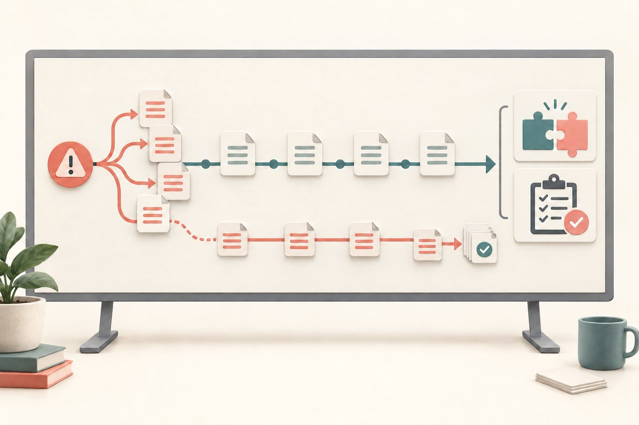
A customer journey presentation is useful when a team needs to agree what the customer is trying to do, where the experience breaks and which improvement deserves attention first. It is not a decorative timeline. Build it from evidence, name the limits of what you know and connect every friction point to an owner and a next action.
For a broader marketing planning workflow, the marketing presentation guide helps place the journey in a campaign or growth decision. This article focuses on the journey itself: stages, moments, evidence, emotions, friction and action.

1. Start with one journey question
Decide what the map must help the audience choose. Examples include “Where should onboarding remove the most effort?” and “Which moment is causing qualified trials to stall?” A map that tries to represent every audience and channel becomes a wall of labels with no decision.
Define the customer segment, scenario and time window. A journey for a first-time buyer differs from a renewal journey. State whether the map reflects observed behavior, reported experience, an internal hypothesis or a mixture. This boundary is essential: a workshop assumption should not be presented as a measured customer fact.
Write the desired outcome in one sentence. For example, the team may want a prioritized experiment for the first week after signup. That sentence becomes the test for every slide: does this detail help the audience select an action?
2. Choose stages that follow the customer
Use stage names that describe what the customer is doing rather than what the company department is doing. “Recognize a need,” “compare options,” “start,” “reach first value” and “return” may be clearer than “marketing,” “sales,” “implementation” and “support.” The right stages depend on the scenario.
Give each stage a consistent set of fields: customer goal, key touchpoints, customer questions, evidence and friction. Avoid adding a new field for every interesting comment. Consistency lets the audience compare moments and spot patterns.
Keep the map legible by splitting it into two views when needed. The overview shows the stages and highest-friction moments. Detail slides show the evidence and context for one stage. A single oversized canvas may contain everything but communicate little in a meeting.
3. Connect observations to evidence
Use a source label for each observation. A support transcript, product analytics event, interview note, survey response and stakeholder assumption are different kinds of evidence. They can all inform the map, but they should not appear interchangeable.
When using a quote, preserve the meaning and record the date and segment. Remove personal information that is not needed for the decision. A single quote can illustrate a friction point; it cannot establish how common the problem is. Pair qualitative observations with a count, rate or sample description when such information is available.
For quantitative signals, define the denominator and period. “Thirty users dropped” says little without the number who entered the step and the time window. If the metric is directional or incomplete, say so beside the chart. Accuracy builds more trust than a precise-looking number.
4. Describe friction as a moment, not a verdict
Write friction in the customer’s terms: “I do not know which file to upload,” or “I cannot tell whether my request was received.” Then distinguish the visible symptom from the possible cause. A slow page might reflect network conditions, unclear status feedback or a process outside the interface.
Use a severity rule that the team understands. You could rate impact, frequency and confidence separately rather than multiplying them into one unexplained score. For example, a high-impact issue with low confidence may deserve research before a large redesign.
Mark moments that delight or reassure the customer too. A map made only of problems can lead to unnecessary change. Knowing what is already working helps the team protect useful cues when it addresses a nearby friction point.
5. Move from friction to an owned action
Prioritize a small number of moments using criteria relevant to the decision: customer impact, business effect, confidence, effort and reversibility. Make the rule visible. A priority is a choice under constraints, not a claim that every other problem is unimportant.
For each chosen moment, name the proposed action, owner, measure and review date. “Improve onboarding” is not an action. “Test a shorter import checklist with ten new accounts and compare completion to the current flow” is specific enough to learn from, while still leaving room to revise the design.
Include the customer signal that would change the plan. If the issue is assumed to be missing information, a test that shows users understand the information but fail for another reason should redirect the team. This protects the presentation from becoming a fixed verdict.
6. Tell the story in a meeting
Start with the journey question and the segment. Show the overview, then zoom into the two or three moments that matter. For each moment, move from customer goal to evidence, friction, interpretation and action. End with the decision, owners and follow-up signal.
Keep labels plain. Replace internal abbreviations with terms a new teammate can understand. Use the same stage names on every slide and provide a short legend for any scale. If the map is based on a limited sample, include that fact near the conclusion rather than hiding it in an appendix.
After the meeting, publish the source notes and decision log with the map. A customer journey presentation earns its value when people can act on it and later compare the new evidence with the original hypothesis.