When data needs to do more than fill a table, infographic PowerPoint presentation templates are the tool professionals reach for. Dense spreadsheets and bullet-heavy slides have a well-documented attention problem — audiences tune out fast. But a well-structured infographic slide? It turns raw numbers and complex concepts into visuals that stick. This guide covers what infographic templates actually are, why they outperform standard slides, which formats work best for different scenarios, and how to build them faster than you ever thought possible.
What Are Infographic PowerPoint Presentation Templates?
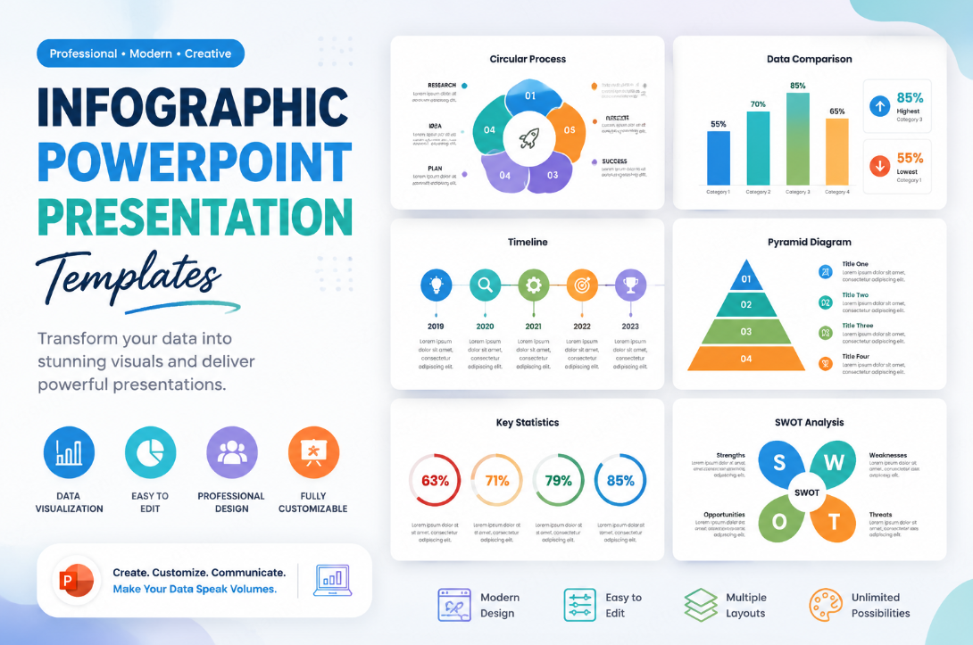
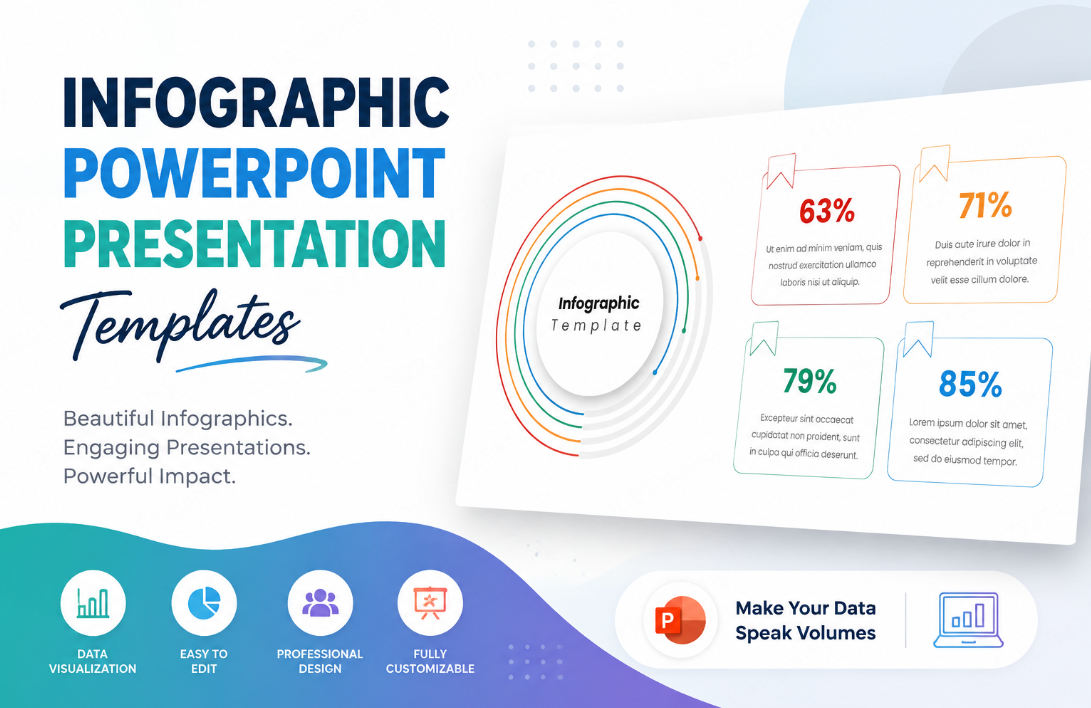
Infographic PowerPoint presentation templates are pre-designed slide layouts that present information through visual elements — icons, timelines, flowcharts, comparison charts, statistical callouts, and process diagrams — rather than relying on text alone. The goal isn’t decoration. It’s comprehension. Every visual element is chosen to replace or reinforce words, making the message easier to absorb at a glance.
A well-built infographic presentation template typically includes:
- Statistical highlight slides featuring large-format numbers with supporting icons
- Process flow diagrams for step-by-step workflows or procedures
- Comparison layouts that place two or more options side by side visually
- Timeline infographics for showing chronological progress or milestones
- Data visualization templates including bar charts, donut charts, and heat maps styled into the deck design
- Icon-driven list slides that replace plain bullet points with visual shorthand
An infographic layout is useful when the visual arrangement helps explain a relationship. A plain table or short text slide may be clearer for other tasks.
Why Infographic Presentation Templates Actually Work
A useful infographic makes a relationship visible: a comparison, sequence, proportion, or trend. Add labels and source details so readers can understand what the image shows.
Visual data templates work for several compounding reasons:
- They reduce friction: Viewers don’t have to work to extract meaning. The visual structure does it for them.
- They make relationships visible: A labeled chart can show a trend or comparison that is difficult to see in a paragraph.
- They expose the evidence: Clear scales, units, labels, and sources let viewers inspect the data behind the message.
- They scale across audiences: Whether you’re presenting to a technical team or a boardroom of executives, visual communication bridges the gap between specialist and non-specialist understanding.
None of this means every slide should be an infographic. But for the moments when you need to land a key data point, explain a multi-step process, or make a comparison argument — an infographic template is one useful option to consider.
Types of Infographic PowerPoint Presentation Templates
Choosing the right format matters. The wrong template for your content creates confusion just as quickly as a wall of text.
Data Visualization Infographic PowerPoint Templates
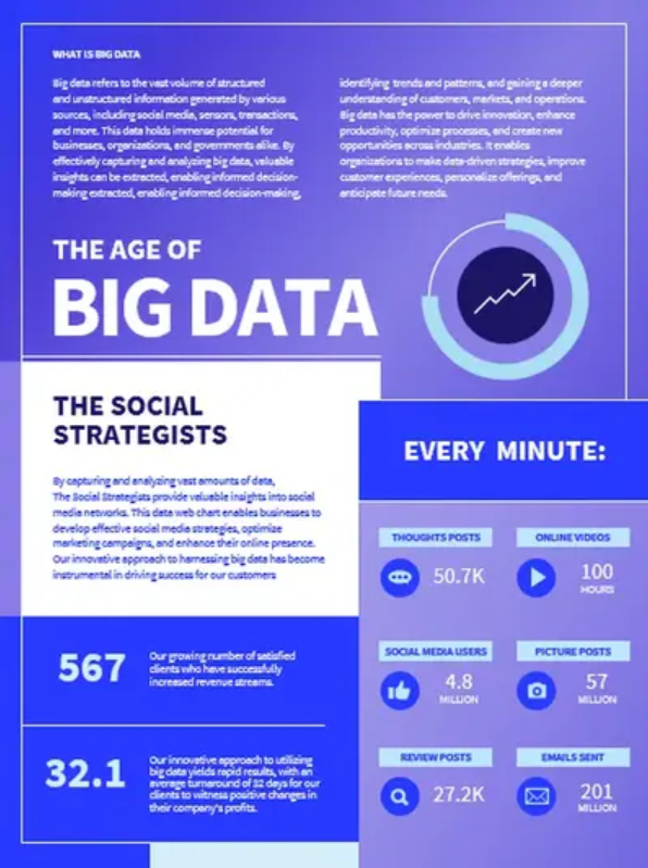
Built for quantitative storytelling. These slides transform raw figures — revenue numbers, survey results, market share percentages — into charts, graphs, and callout statistics that communicate magnitude and relationship at a glance. Ideal for financial reviews, marketing performance decks, and research summaries.
Process and Workflow Infographic PowerPoint Templates
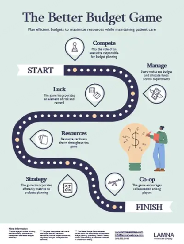
Used when you need to explain how something works. Sequential steps, decision trees, circular process loops — these templates are standard in operations presentations, onboarding decks, and product documentation walkthroughs.
Comparison Infographic PowerPoint Templates
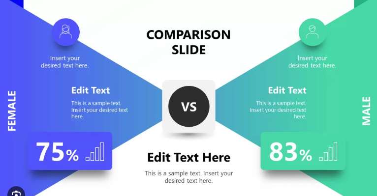
Side-by-side layouts built for before/after scenarios, competitive analysis, or option evaluation. Aligned columns can make trade-offs easier to compare. Use a table when exact values or repeated fields are more important than visual emphasis.
Timeline Infographic Templates
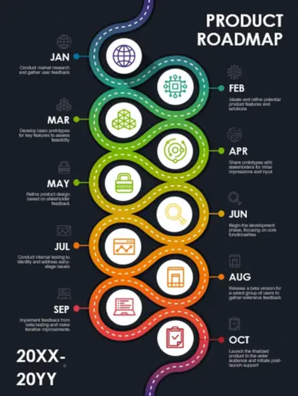
Horizontal or vertical timelines that map events, milestones, or project phases across a time axis. These work particularly well in project kickoff presentations, company history slides, and product roadmap decks. Compare AI timeline drafts and editable template sources when deciding whether to start with your own milestone brief or adapt an existing timeline layout.
Statistical Callout Templates
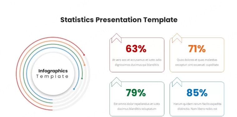
Single-focus slides that elevate one key number or fact to headline status — large typography, supporting icon, minimal surrounding copy. These are the slides that get photographed at conferences. Used strategically, they punctuate a presentation with moments of genuine impact.
How to Use Infographic Templates Effectively
Having the right template is half the equation. Applying it well is the other half. These principles separate effective infographic slides from decorative ones:
1. Let the data drive the format choice.
Don’t force a timeline layout onto data that’s fundamentally comparative, or a flowchart onto information that’s purely statistical. The format should emerge from the content — not the other way around.
2. Limit each slide to one core idea.
Infographic slides lose their power when they try to carry too much. One key insight, one visual, one message per slide. If you have three data points to make, build three slides.
3. Maintain visual consistency across the deck.
Mixing three different icon styles, four font sizes, and five accent colors across your visual data templates creates visual noise that undermines the professionalism you’re trying to project. Pick a design system and stick to it.
4. Treat color as a communication tool.
Color should encode meaning — category differences, priority levels, positive versus negative performance — not just fill space aesthetically. Establish a clear color logic and apply it consistently.
5. Pair visuals with a single line of context.
An infographic slide works best with a brief headline that tells the audience what to take from the visual. Don’t make them draw their own conclusions. Guide them directly to the insight.
Presenti: Building Infographic Presentations Faster With AI
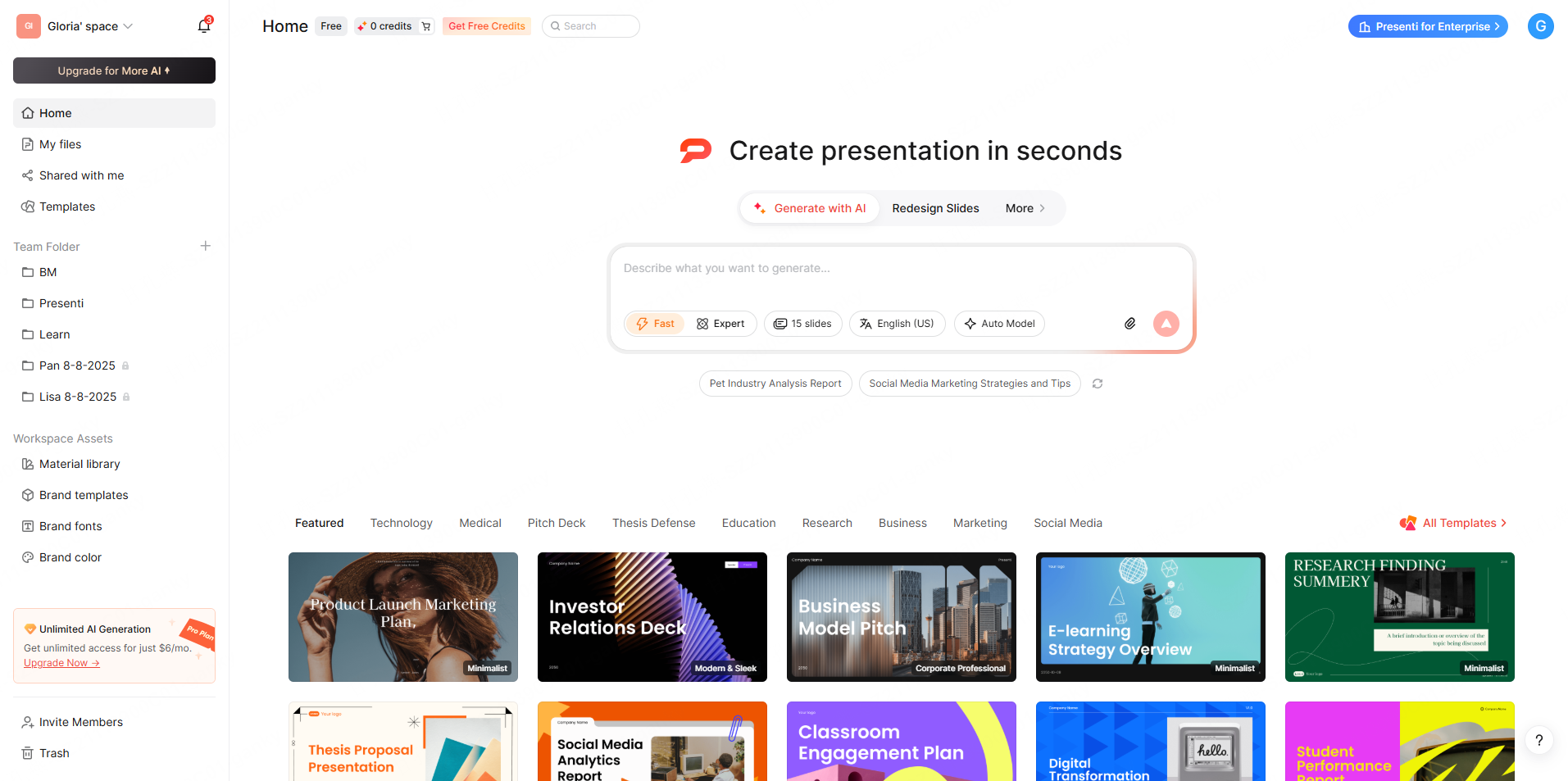
Preparing an infographic deck involves choosing a layout, replacing placeholder data, adjusting labels, and applying a consistent style. AI can help with the first draft, but charts and interpretations need review against the source.
The AI presentation maker, Presenti AI, eliminates most of that friction.
Instead of starting with a blank or borrowed template, you bring your content — in a supported format — and Presenti builds the presentation around it. The input flexibility alone changes the workflow entirely:
- Type a prompt or outline directly into the tool and let the AI draft an infographic-style deck from scratch
- Upload a Word document containing your research or report, and Presenti extracts the key data points and structures them visually
- Drop in a PDF — a brief, a study, a strategy document — and the system parses the content into appropriately formatted slides
- Import a TXT file with raw notes and watch the AI organize them into a coherent visual flow
- Submit an audio recording of a briefing or meeting, and Presenti transcribes and translates the content into presentation-ready slides
- Paste a link to an article or webpage, and the tool pulls the relevant content and formats it automatically
- Upload an existing PPTX that needs a visual redesign, and Presenti restructures the layout into infographic-style slides
After generation, choose a suitable theme and review the colors, type, chart labels, and spacing. Apply approved brand values and inspect slides whose content needs a different layout.
The finished presentation exports as a fully editable PPTX on an eligible paid plan. Open a sample in PowerPoint or Google Slides to check the layout and editable elements.
Common Mistakes to Avoid With Infographic Slides
Even strong templates get misused. Watch out for these recurring errors:
- Overloading a single slide: Adding six data points, three icons, two charts, and a paragraph of explanatory text defeats the entire purpose of an infographic layout. Simplify ruthlessly.
- Choosing style over clarity: A visually striking template that obscures the actual data is worse than a plain table. Beauty serves comprehension — it doesn’t replace it.
- Ignoring accessibility: Ensure sufficient color contrast for viewers with visual impairments. Don’t rely solely on color to encode meaning — pair it with labels or patterns.
- Skipping the narrative thread: Infographic slides still need to connect. Each slide should flow logically from the last, building toward a clear conclusion rather than functioning as isolated visual moments.
Conclusion
The best infographic PowerPoint presentation templates don’t just make your slides look more polished — they make your arguments more persuasive, your data more memorable, and your audience more engaged. Whether you’re presenting quarterly results, mapping a product strategy, or walking stakeholders through a complex process, the right infographic presentation format transforms information into insight.
Presenti can draft slides from supported documents, audio, links, or a prompt, subject to plan limits. Review the suggested visuals, confirm the underlying data, and use an eligible paid plan for editable PPTX export.