
You have spent two, three, maybe five years on this research. And now you have ten minutes to make it count.
That is the reality of the 10 minute thesis presentation — one of the most demanding formats in academic life. Not a shorter version of your full defense. Something fundamentally different: a focused argument, ruthlessly edited, delivered with precision. The students who struggle most are not the ones with weak research. They are the ones who try to compress everything instead of choosing what actually matters.
This guide covers everything you need to nail it. How to structure your presentation section by section. How many slides to build. What to include and what to cut without regret. How to manage time without rushing. How to design slides that work under conference lighting. And how an AI presentation maker like Presenti AI can turn hours of slide-building work into minutes — so your prep time goes where it belongs: on your argument and your delivery.
What Is a 10 Minute Thesis Presentation and When Is It Used?
Not every short academic presentation is the same thing, and understanding the specific context you are preparing for changes how you approach it considerably.
The Formats Where This Comes Up
A 10 minute thesis presentation typically appears in one of four settings.
Graduate research conferences and departmental showcases. Events like RESCON and similar university-run symposia invite students to present ongoing or completed research to a mixed academic audience. Ten minutes is the standard slot, followed by a short Q&A. The room includes faculty, fellow students, and sometimes external guests — you cannot assume deep familiarity with your subfield, which means your framing needs to land for an intelligent non-specialist.
Thesis committee previews and progress reports. Some departments require students to present research updates before the full defense. These tend to be shorter and more informal, but the 10-minute constraint still applies. The audience already knows your project, which means you can move faster through background context and spend proportionally more time on what has changed or what you have found.
Academic conference paper presentations. Most disciplines allocate 10 to 15 minutes per paper at formal conferences. If you are presenting published or submitted work, this is the format. The expectation is tight, focused delivery — not a lecture, not a seminar, not a classroom explanation.
Three-Minute Thesis adjacent formats. Some universities run extended 3MT variants with longer slots. A 10-minute version is common and shares the same underlying philosophy: make your research compelling to a non-specialist audience, in direct language, without leaning on jargon as a substitute for clarity.
How It Differs from a Full Thesis Defense
This distinction matters more than most students realize. A full thesis defense runs 20 to 30 minutes of formal presentation, sometimes longer, followed by an extended Q&A with your committee. The expectation is comprehensive coverage — your committee has read your thesis and will probe every methodological decision.
A 10 minute presentation operates on entirely different logic. Comprehensive coverage is not the goal. Convincing communication is. Your audience does not need to know everything about your study. They need to leave understanding what you found, why it matters, and that you are a credible researcher. That requires prioritization, not completeness.
What Evaluators Actually Expect
Whether at a conference or a departmental event, the people in the room are evaluating roughly the same things: Is the research question clear? Is the contribution meaningful? Can this person communicate their work to an audience that is not already inside their head?
What they are not evaluating: whether you cited every relevant study, or whether you walked through every step of your data cleaning process. Ten minutes does not allow for that, and experienced academic audiences know it. Trying to cram everything in reads as poor judgment, not thoroughness.

How to Structure a 10 Minute Thesis Presentation
Structure is the single most important decision you make in a short presentation. With ten minutes, you cannot improvise your way through it. Every section needs a defined role and a hard time limit — and you need to have made those decisions before you open PowerPoint, not while you are building slides.
The following breakdown represents the consensus structure used across disciplines, built around 8 to 10 slides and tested against actual conference and defense formats.
Recommended Time Allocation
| Section | Slides | Time |
|---|---|---|
| Title & Context | 1 | ~30 sec |
| Research Problem & Gap | 1–2 | ~1.5 min |
| Research Question / Thesis Statement | 1 | ~45 sec |
| Methodology (brief) | 1 | ~1 min |
| Key Findings | 2–3 | ~3 min |
| Discussion / Implications | 1 | ~1.5 min |
| Conclusion & Future Work | 1 | ~1 min |
| Q&A Buffer | — | ~1 min |
Section-by-Section Guidance
Title & Context (30 seconds, 1 slide). State your name, your institution if relevant, and your thesis topic. One sentence on the broader field you are working in — enough to orient the audience before you move. Do not linger here. Most presenters waste 90 seconds on a title slide when 30 is ample.
Research Problem & Gap (1.5 minutes, 1–2 slides). This is where you earn the audience’s attention. You are not summarizing the literature — you are identifying what is missing from it. One or two slides that answer a single question: what exists, and why does it fall short? Be specific. “Prior studies have examined X in controlled settings but not in real-world conditions” is infinitely more persuasive than “this is an important and underexplored area.”
Research Question / Thesis Statement (45 seconds, 1 slide). This is the single most important slide in your deck. Put your central question or argument on screen — one sentence, clearly worded, readable from the back of the room. If you could only show an audience one slide, this would be it. Say it, then pause. Let it land before you move on.
Methodology (1 minute, 1 slide). Enough to establish credibility, not enough to become a methods lecture. One slide covering your approach, your data source or sample, and any key frameworks or instruments. The goal is not to teach your method — it is to demonstrate that your findings are trustworthy. If your methodology is genuinely novel, give it slightly more airtime, but “slightly” means 90 seconds at the outer limit.
Key Findings (3 minutes, 2–3 slides). This is the heart of your presentation, and it gets the most time for that reason. Two to three slides, each presenting one finding with one visual where possible. Title each chart or figure with the finding itself, not the variable name — “Group A recovered 40% faster across all cohorts” rather than “Figure 2: Recovery Rates by Group.” Your audience should understand the significance of a slide before you say a word about it.
Three minutes disappears fast when you are explaining data. Resist the urge to show every result. Choose the two or three findings that most directly support your central argument. The rest belongs in the appendix.
Discussion / Implications (1.5 minutes, 1 slide). What does it mean? This is the section most students under-prepare, and the one evaluators care most about. Connect your findings back to the gap you opened at the start. What does your work add to the field? Who benefits, and how? One slide, three to four clear implications, delivered with confidence. This is your opportunity to show intellectual maturity, not just technical competence.
Conclusion & Future Work (1 minute, 1 slide). One slide that restates your central contribution in a single sentence, then names one or two directions for future research. Ending on your contribution — not on a trailing list of limitations — is the difference between landing the presentation and merely finishing it.
Q&A Buffer (1 minute). Do not script this, but build it in. Finishing your substantive content at 8 minutes 30 seconds means you end cleanly when the moderator signals. Presenters who run to zero and get cut off mid-sentence leave a weaker impression than those who step back with time still on the clock.
The One Idea Per Slide Rule
Under tight time constraints, this rule is not a stylistic preference — it is a structural requirement. Every slide should carry one message. If you cannot name the single point a slide makes in five words or fewer, the slide is doing too much. Split it, or cut it.
The most common structural mistake is front-loading the deck with a long literature review section. One to two slides on the problem and gap is the maximum. Literature review content belongs in your thesis document. Not in a 10-minute presentation.
How Many Slides for a 10 Minute Thesis Presentation?
This is one of the most consistently searched questions around this format, and the answer is more specific than most people expect.
The Core Guideline: 1 Slide Per Minute
The one-slide-per-minute rule holds well for academic presentations. It accounts for the fact that research slides — particularly those carrying data, charts, or diagrams — require speaking time beyond the visual itself. A methodology flowchart might hold an audience for 90 seconds. A clean findings chart with a striking result might need two full minutes of explanation. Averaging to one slide per minute gives you the pacing room to handle that variation without rushing.
For a 10-minute thesis presentation, the target range is 8 to 10 slides.
8 Slides vs. 10 Slides
8 slides works best for argument-heavy or theoretical theses where the intellectual contribution needs verbal development. Fewer slides means more time per slide, which gives you space to build the reasoning without feeling like you are racing through it.
10 slides works better for methods-heavy or data-rich theses where visual evidence carries the argumentative weight. More slides means more data surfaces — but each one needs to be clean enough for the audience to process in under 60 seconds.
The deciding factor is not the length of your thesis. It is how much of your argument lives in the visuals versus the narration. If your data speaks for itself, lean toward 10. If your argument needs unpacking, lean toward 8.
Why More Slides Is Rarely the Answer
Adding slides does not increase the amount of information your audience retains. It decreases it. Cognitive load is real: when an audience processes a new visual every 45 seconds, they are not absorbing the nuance of your argument — they are simply keeping pace with your deck. A 15-slide presentation in 10 minutes almost always results in either rushing through every slide in 30 seconds or running significantly over time. Neither serves your research.
Slides That Can Usually Be Cut
- A dedicated literature review section covering more than two key gaps
- Dense methodology tables showing full statistical parameters
- An acknowledgements slide placed anywhere other than the very end
- Multiple background slides before the research problem is stated
- Separate slides for findings that could share one well-designed visual
Cutting slides is not a failure of preparation. It is the preparation. The discipline of deciding what gets cut forces the discipline of deciding what actually matters in your argument — which is the entire point of the format.

What to Include (and What to Cut) in a 10 Minute Thesis Presentation
Every slide you add is a trade. You are trading time, attention, and cognitive bandwidth. The students who perform best in this format are not the ones who know the most — they are the ones who made the sharpest decisions about what to leave out.
The guiding question for every single slide: Does this help the audience understand my contribution? If the answer is anything other than a clear yes, the content does not belong in the deck.
What You Must Include
The research gap. One or two slides establishing precisely what is missing or misunderstood in the existing literature. Not a full review — a precise identification. Specificity is persuasive here. “Prior studies have examined X but consistently excluded populations who Y” is a real gap. “This topic deserves more research” is not.
Your central argument or finding. Non-negotiable. One slide, one sentence. Whether your thesis advances a theoretical claim or reports an empirical result, it needs to be stated explicitly — not buried in hedging language, not spread across three slides. If someone leaving the room were asked to summarize your presentation in one sentence, this is the sentence they should be able to produce.
One or two pieces of supporting evidence. Not the full dataset. One representative chart or finding that makes your argument concrete and credible. The goal is not to reproduce your results chapter — it is to demonstrate that your claim rests on something solid.
A stated implication. The “so what” is not optional. Evaluators want to know what the field now understands that it did not before. A single slide with three or four clear implications signals intellectual maturity and makes your contribution land beyond the technical detail.
What to Cut Without Hesitation
The full literature review. Your thesis document contains the literature review. Your presentation does not. Two sentences establishing the gap is sufficient. A parade of citation references is not a presentation — it is a bibliography delivered with a microphone.
Detailed statistical tables. A twelve-row, eight-column table communicates nothing in a 10-minute slot. If your results are quantitative, choose one chart that shows the most important finding clearly. Full output belongs in the appendix.
Exhaustive methodology. One slide. Your approach, your data source, and your key framework. If your method is genuinely novel or central to your contribution, give it slightly more time — but “slightly” means a single extended slide, not four.
Mid-deck acknowledgements. Appropriate at the very end, briefly. Placed in the middle of a 10-minute presentation, they break your momentum for no analytical gain.
Limitations paragraphs. One sentence acknowledging the scope of your study is credible and expected. A full slide dedicated to everything your research did not do signals defensiveness and eats time you cannot spare.
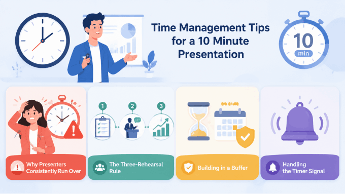
Time Management Tips for a 10 Minute Presentation
Most thesis presenters do not run over because they have too much to say. They run over because they have not practiced saying the right things in the right order at the right pace. Time management in a short presentation is a rehearsal problem, not a content problem.
Why Presenters Consistently Run Over
The two most common culprits are over-explaining methodology and under-rehearsing slide transitions. On methodology: students routinely spend 30 to 45 seconds more per methodological detail than the audience needs. Multiplied across several decisions, that is two minutes gone before you reach your findings.
On transitions: the gap between slides is where time quietly disappears. When a presenter finishes a slide, glances at the next one, pauses to locate their place, and then resumes — that sequence takes 10 to 15 seconds. Across 8 to 10 slides, you have lost up to two minutes to silence and mental searching. Rehearsed transitions eliminate this entirely.
The Three-Rehearsal Rule
Do not review your slides. Run your presentation — out loud, standing up, timed — at least three times before the event.
First rehearsal: content check. Go through the full deck at a natural pace without stopping to fix anything. The goal is to identify gaps — moments where you run out of things to say, where a transition is missing, where a slide makes no sense without three minutes of context you do not have. Note the gaps. Fix them before rehearsal two.
Second rehearsal: time checkpoints. Set three targets. By minute 3, you should be finishing the research question slide. By minute 6, you should be entering the discussion section. By minute 9, you should be one sentence into your conclusion. If you miss these checkpoints, you know precisely where the problem lives — not at the end of the presentation, but at the specific slide that consumed more than its allocated time.
Third rehearsal: recording check. Record yourself on your phone — video, not just audio. Watch it back and pay attention to three specific things: where you look (at the screen or at the audience), how long each slide actually holds your attention, and where your sentence structure collapses into filler phrases. Every “um,” every trailing “so…” at a transition, every moment of turning to read your own slides is a signal worth addressing. One camera rehearsal reveals more than five silent reviews.
Building in a Buffer
Plan to finish your substantive content by 8 minutes 30 seconds. That final 90 seconds is not dead time — it is your landing zone. Moderators signal early. Microphones switch slowly. Ending clearly and calmly with a strong contribution statement, then stepping back, is far more effective than racing through your final slide as the timer hits zero.
Handling the Timer Signal
If a moderator signals that you have one minute left and you are not near your conclusion, do not speed up. Rushed speech in the final minute undermines everything that came before it. Instead, skip directly to your conclusion slide and deliver your central contribution statement. One clear sentence about what your research established is a complete ending. Trailing off through three additional slides is not.
Slide Design Tips for a 10 Minute Thesis Presentation
A 10-minute presentation does not give your audience time to decode a complex slide. First impressions form within three seconds of a slide appearing. If the key point is not immediately visible, the audience spends the next 30 seconds processing the visual — while you are speaking. The design principle for short academic presentations is not aesthetics. It is clarity under time pressure.
One Message Per Slide
Each slide should carry exactly one claim, one data point, or one concept. If you find yourself writing “and” in a slide title — “Methodology and Data Collection” — you are describing two slides, not one. Split them, or decide which one actually carries the argument.
The title of each slide should state the point, not the topic. “Study Design” is a topic. “Semi-structured interviews captured experiences that surveys consistently miss” is a point. Title-as-claim means your audience understands what a slide is saying before you begin speaking — which means your narration can develop the idea rather than introduce it.
Font Size and Readability
The minimum body text size for a presentation slide is 24pt. For key claims, thesis statements, or finding headlines, 32pt or larger. This applies to any screen size, not just large auditoriums. Smaller text forces the audience to lean forward or squint, breaking the rhythm of listening and watching simultaneously.
Avoid more than two font families in a deck. Choose one clean sans-serif typeface — Inter, Source Sans Pro, or Calibri are all reliable — and use weight variation (regular versus bold) to create hierarchy rather than switching typefaces.
Color and Contrast
High-contrast, restrained color palettes consistently outperform elaborate gradient themes in academic contexts. Dark text on a light background or light text on a dark background both work. Medium-value text on a medium-value background does not — it becomes unreadable under conference lighting conditions.
Limit your palette to two or three colors: one for primary content, one for emphasis, one for backgrounds or borders. Color should direct attention, not decorate slides.
Data Visualization: Title the Finding, Not the Variable
Every chart or graph in your presentation should be titled with the finding it demonstrates. Not “Figure 3: Recovery Rates by Group.” Instead: “Group A recovered 40% faster across all age cohorts.” The audience reads the title before they read the chart. If the title tells them what to conclude, their processing of the visual confirms the claim rather than trying to construct the meaning independently.
Use one chart per slide. Placing two or three charts together to “save space” is the most common data visualization error in academic presentations — the audience cannot absorb both in the time available, and you will find yourself glossing over whichever one runs out of clock.
Visual Consistency Signals Competence
An inconsistent deck — different fonts on different slides, varying margins, three different shades of blue — communicates carelessness. In an academic evaluation context, design inconsistency creates a halo effect: if the slides look hastily assembled, the research begins to feel hastily assembled too. Apply one template, one color palette, and one typographic system across the entire deck before your first rehearsal. Design decisions made early are design decisions you do not have to revisit at midnight the night before.
Common Mistakes in 10 Minute Thesis Presentations (And How to Fix Them)
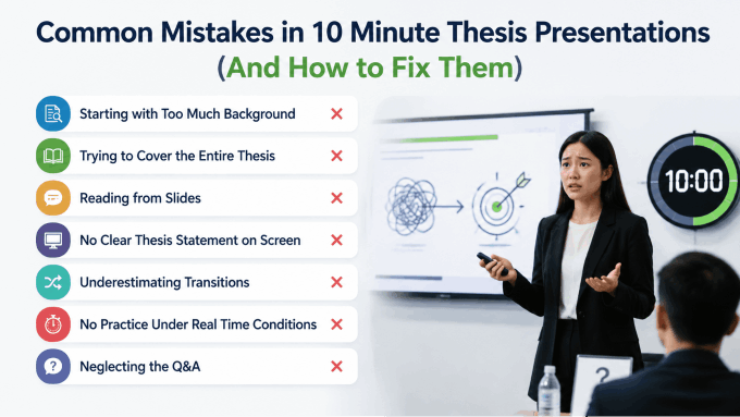
Knowing what goes wrong is as useful as knowing what to do right. These are the patterns that recur most consistently across academic short presentations — and every one of them is fixable with targeted preparation.
Starting with Too Much Background
The mistake: spending the first two to three minutes on field context, historical background, or motivating examples before stating the research problem. By the time the thesis statement appears, a quarter of the presentation is already gone.
The fix: state the research gap within the first 90 seconds. Background should be the minimum necessary to make the problem legible to a non-specialist. One well-chosen sentence of context will serve better than three slides of it.
Trying to Cover the Entire Thesis
The mistake: treating a 10-minute slot as a compressed version of the full document. Every chapter gets a section. Every finding gets a slide. The presentation becomes a rapid-fire summary that covers everything and communicates nothing clearly.
The fix: accept that a 10-minute presentation is an argument, not a summary. Choose your single strongest finding and build the entire presentation around making that one thing undeniably clear and significant to the room.
Reading from Slides
The mistake: turning to the screen and reading the bullet points aloud. It happens under nerves, and it loses the audience within 60 seconds. Presenters who read from slides signal that they do not know their material well enough to speak about it — and that signal lands immediately and irreversibly.
The fix: slides are memory prompts, not scripts. Each slide should contain so little text that there is nothing to read verbatim. If a slide has full sentences, they should be reserved for direct quotes, not your own narration.
No Clear Thesis Statement on Screen
The mistake: the central claim exists in the speaker’s head and in the thesis document, but never appears explicitly on a slide. Audience members who cannot identify your core argument by minute 3 will spend the rest of the presentation constructing their own interpretation of what you are arguing.
The fix: one slide, one sentence, stated plainly, on screen. Pause after you say it. The thesis statement slide is the anchor of the entire presentation. Everything before it builds toward it. Everything after it flows from it.
Underestimating Transitions
The mistake: each slide exists as an independent unit with no spoken connection to the one before it. The presentation feels like a series of stops rather than a moving argument.
The fix: write one transition sentence for every slide change before you rehearse. “That gap is exactly what this study addresses — here is how we approached it.” These bridges take five seconds to deliver and transform a slide deck into a coherent narrative.
No Practice Under Real Time Conditions
The mistake: reviewing notes, reading through slides, or rehearsing silently is not the same as presenting. Students who prepare this way discover timing problems for the first time in the actual presentation room.
The fix: stand up, speak out loud, run the timer. The physical act of presenting — managing breath, pacing between slides, handling transitions in real time — cannot be simulated by reading. Three timed, spoken rehearsals will reveal every problem that a silent review never surfaces.
Neglecting the Q&A
The mistake: treating the Q&A as something separate from preparation, entirely unconnected from the work that went into the presentation. A question arrives about a methodological decision, or a finding the presenter skipped, and the answer is halting and uncertain.
The fix: prepare three to five anticipated questions and practice short, direct answers. In most 10-minute presentation formats, the Q&A window runs disproportionately long relative to the talk — sometimes five to ten minutes. How you handle that window shapes the overall impression just as much as the presentation itself.
How to Create a 10 Minute Thesis Presentation Fast with Presenti AI
You now know exactly what to say and how to structure it. The slide-by-slide breakdown is clear. The time checkpoints are set. The common mistakes are on your radar. So what is left?
For most students, the remaining bottleneck is the one nobody talks about: actually building the slides. Not the thinking, not the argument — the formatting, the layout iteration, the font choices, the color palette decisions, the business of turning a research outline into a deck that looks professional under conference room lighting. That process, start to finish, typically consumes three to five hours. At the thesis stage, those hours are not yours to spend on slide design.
Presenti AI is an AI presentation maker built to eliminate exactly that bottleneck. Upload your existing content or describe your research in a prompt, and Presenti generates a fully structured, professionally designed slide deck in minutes. The structural work, the visual hierarchy, the theme consistency — handled automatically. What remains for you is refinement, not construction.
Why Thesis Presentations Specifically Benefit from an AI Presentation Maker
A thesis presentation has a known, predictable structure. That makes it one of the strongest use cases for AI-assisted slide generation. The sections do not change across disciplines — problem, gap, question, methodology, findings, implications, conclusion. Presenti understands that hierarchy. When you feed it a research abstract or a chapter summary, it does not produce a generic business pitch deck with stock photography. It maps your content onto a logical academic sequence, with the right section order and the right level of information density per slide.
The output is not a finished presentation you read verbatim. It is a structured first draft that handles 80 percent of the build work — leaving you to focus on the 20 percent that only you can do: confirming that your thesis statement is prominent, verifying that your key finding is on the correct slide, and ensuring the deck accurately reflects your argument before you rehearse.
Key Features Relevant to Thesis Presentations
Document-to-deck generation. Upload your thesis abstract, chapter outline, or research notes as a PDF or Word document. Presenti reads the structure, identifies the key claims, and builds a slide deck around them — automatically mapping introduction, methodology, findings, and conclusion to their corresponding slide positions. You start from a complete draft, not a blank canvas.
Prompt-based generation. If you would rather describe your research than upload a document, type a prompt: your topic, your methodology in one sentence, your central finding, and your main implication. Presenti builds the full presentation structure from that input. Particularly useful for early-stage presentations or committee previews where the written document is not yet finalized.
Academic-appropriate templates. The template library includes clean, minimal themes designed for research and academic contexts. Not the bold gradient layouts built for startup pitch nights. The kind of restrained, high-readability designs that look credible in a seminar room, a conference hall, or a departmental review — where the content is supposed to carry the visual weight, not the decoration.
One-click theme application. Apply a consistent visual identity across every slide simultaneously. Font choices, color palette, spacing — unified in a single action. This eliminates the inconsistency problem that makes self-built decks look hastily assembled. Every slide looks like it belongs to the same presentation because structurally it does.
Smart content structuring. Presenti understands research document hierarchy. When it processes a thesis abstract or outline, it does not treat all text as equal — it recognizes what belongs on a title slide, what belongs in a findings section, and what should appear as a single declarative headline rather than a bullet list. The result is a deck that reads like an argument, not a transcript.
Fully editable PPTX export. Every deck exports as a standard PowerPoint file. Open it in PowerPoint or Google Slides, swap in your actual data charts, adjust the thesis statement wording, reorder a slide if the structure requires it. The AI handles the build; you retain full control of the final output.
How to Use Presenti AI: Step-by-Step
Step 1: Go to presenti.ai and create a free account. The signup process takes under two minutes. No credit card required to start.
Step 2: Choose your input method. Upload your thesis abstract, chapter summary, or research notes as a PDF or Word document — Presenti parses the structure and generates slides from your content directly. Alternatively, type a prompt describing your research: your topic, your key methodology, your central finding, and what it contributes to the field. Document upload tends to produce more content-specific output; prompt-based generation is faster when you want a structural scaffold to refine from.
Step 3: Select a template style. Browse the template library and choose an academic or minimal theme. Look for clean typography, restrained color use, and layouts that leave visual room for data. Avoid templates with heavy decorative elements or business-specific iconography — they read as mismatched in an academic presentation context.
Step 4: Review the generated structure. Presenti produces a complete slide deck. Check the section order against the structure outlined earlier in this guide: does the research gap appear before the thesis statement? Do the findings slides each carry one result? Is the implications slide present? Adjust the sequence in the editor if anything is out of order.
Step 5: Edit and refine the content. Replace placeholder language with your actual thesis statement, your exact finding wording, and your specific methodology details. Swap generated chart placeholders for your real data visualizations. Confirm that your central research question appears on its own slide, prominently worded, and that nothing critical is buried in a sub-bullet the audience will not have time to read.
Step 6: Apply a consistent theme. Use the one-click theme tool to lock in visual consistency across all slides. This is the step most manual deck-builders skip — and the one that most visibly separates a polished presentation from an assembled one.
Step 7: Export as PPTX. Download the finished deck as a PowerPoint file. Open it, run through it once in Slide Show mode to check display and spacing, make any final edits, and save a backup PDF copy for day-of contingency use.
The entire process — from upload to export-ready deck — takes under 10 minutes for a standard 8 to 10 slide thesis presentation. What used to occupy an afternoon of formatting work becomes the time between finishing your argument and starting your first rehearsal. That is exactly where your time should go.
10 Minute Thesis Presentation Examples and Templates
Structure advice and design principles are useful in the abstract. At some point, though, most people want to see what a strong 10-minute thesis presentation actually looks like in practice — what goes where, how much text appears on a typical slide, and whether a template they found online will hold up in a real seminar room.
What Makes a Strong Example
A well-executed 10-minute thesis presentation shares a few consistent characteristics regardless of discipline. The thesis statement is visible on screen by the third slide, stated in one sentence, not buried in a bullet list. Findings slides carry short, declarative titles that state the result rather than name the variable — “Intervention group showed 35% improvement” rather than “Figure 4: Group Comparison.” Each slide has one dominant element and enough whitespace that the eye immediately knows where to look.
The most instructive examples are the ones that demonstrate restraint. A humanities presentation with eight clean slides, each anchored by a single argument, is a stronger model than a STEM deck with fourteen slides that front-loads four slides of literature review before the research question appears. Volume is not the quality signal. Clarity is.
Real-World Structure by Discipline
STEM example (data-driven thesis, 10 slides):
- Slide 1: Title, institution, brief topic orientation — 30 seconds
- Slide 2: Research gap — what prior models fail to account for — 1 minute
- Slide 3: Research question — one sentence, displayed alone — 30 seconds
- Slide 4: Methodology overview — study design and sample — 1 minute
- Slides 5–7: Key findings — one chart per slide, each titled with the finding — 3 minutes
- Slide 8: Discussion — three implications connected back to the gap — 1.5 minutes
- Slide 9: Conclusion and future directions — 1 minute
- Slide 10: Acknowledgements and references — left on screen during Q&A
Humanities example (argument-driven thesis, 8 slides):
- Slide 1: Title and topic — 30 seconds
- Slides 2–3: Research problem and gap in existing scholarship — 1.5 minutes
- Slide 4: Central argument — one thesis statement — 45 seconds
- Slide 5: Primary source or methodological approach — 1 minute
- Slides 6–7: Two pieces of supporting evidence, each with a direct implication — 3 minutes
- Slide 8: Conclusion — contribution to the field, one direction for further research — 1.5 minutes
Both structures arrive at the same destination by different routes: the gap is established early, the central claim is stated explicitly on its own slide, and the findings section carries the most time because that is where the intellectual work lives.
How to Evaluate a Template Before Committing
Not every template labeled “academic” is suited for a 10-minute thesis presentation. Before building your deck in any template, run it through four checks.
Readability at distance. Stand six feet from your screen and try to read the body text. If the default font size is 18pt or smaller, the template was designed for document reading, not projection. Reject it.
Slide variety. A usable template includes at least four distinct layout types: title slide, text-primary slide, data or chart slide, and a transition or section divider. Templates with only one layout flatten the visual hierarchy your audience uses to track your argument’s structure.
Visual restraint. Decorative borders, heavy background textures, and oversized logo placements all compete with your content. An academic template should put content first and make the design invisible. If you notice the template before you notice the text, that template is working against you.
Field appropriateness. A template that works for a business pitch reads as mismatched in a seminar room. Aim for minimal aesthetics: clean sans-serif typography, a neutral or single-color background, two to three colors maximum.
Where to Find Thesis Presentation Templates
Presenti AI’s template library is built specifically for research and academic contexts. Clean layouts, readable typography, and structures that map directly onto the thesis presentation format. Because the templates are generated alongside your content, the structure and design are matched from the start rather than assembled separately after.
Google Slides academic themes are minimal and functional. Not visually remarkable, but readable, consistent, and free. For a committee preview or departmental presentation where design is not being evaluated, they work reliably.
PowerPoint’s built-in academic layouts deliver similar results. Filter by “education” or “academic” in the template search.
How to Practice and Deliver Your 10 Minute Thesis Presentation Confidently
Getting the structure right and building a clean deck solves two of the three problems in a 10-minute thesis presentation. The third is delivery — and delivery is where well-prepared students still lose points, because they practiced the wrong things.

The Three-Rehearsal Rule, Applied
There is a meaningful difference between reviewing your presentation and running it. Reviewing — flipping through slides, reading notes, silently reciting talking points — prepares you to read. Running the presentation means standing up, speaking every word at full volume, advancing slides in real time, and letting the timer count from zero.
Rehearsal one: content check. Run the full presentation without stopping to fix anything. The goal is to identify gaps — moments where you run out of things to say, where a transition is missing, where a slide makes no sense without context you no longer have time to provide. Note the gaps after the run, then fix them before rehearsal two.
Rehearsal two: time check. Set three checkpoints: minute 3, minute 6, minute 9. Run the presentation and compare where you actually are at each checkpoint to where the time allocation says you should be. If you are 45 seconds behind at minute 3, the problem is in the first three minutes, not at the end. Find the specific slide consuming more than its share, cut the narration there, and run again.
Rehearsal three: recording check. Record yourself on your phone — video, not just audio. Watch it back once, paying attention to where you look, how long each slide holds your attention, and where your sentences collapse into filler. Every “um,” every trailing “so…” at a transition, every moment of turning to face your slides is a signal. One camera rehearsal reveals more than five silent reviews combined.
Managing Nerves Without Pretending They Do Not Exist
Nervousness before a high-stakes academic presentation is not a problem to be solved — it is energy to be directed. The students who walk in feeling calm are usually the ones who have rehearsed enough times that the material feels owned rather than borrowed. Anxiety about timing drops when you have confirmed through timed rehearsal that your content fits the slot. Anxiety about questions drops when you have practiced three-sentence answers to the five most likely challenges to your methodology or findings.
One technique that consistently works: before you begin, spend 20 seconds looking at your opening slide and silently saying the first two sentences of your presentation. You are not memorizing a script — you are activating the familiar pathway. The first 30 seconds of a presentation are the most cognitively demanding because everything is new. Once you are through the opening, the rehearsed material takes over.
Physical Delivery: The Basics That Matter
Face the audience, not the screen. This sounds obvious and is consistently violated under pressure. If you need to check what is on the current slide, glance at the presenter view on your laptop, not at the projected image behind you.
Pause after your thesis statement slide. Stand still for two full seconds after you say your central claim. It feels longer than it is. It gives the audience time to process the most important sentence in your presentation, and it signals that you know it is important.
Slow down in the findings section. The instinct under time pressure is to accelerate through complex material. The audience needs the opposite. One deliberate sentence per finding, a pause, then the implication. Faster delivery of complex data communicates less, not more.
Day-of Logistics That Prevent Avoidable Problems
Arrive early enough to test the slide display. Projector aspect ratios vary. Colors shift under different room lighting. Font rendering changes between machines. Load your deck, run through the first three slides, and confirm everything displays as expected. If you are presenting from someone else’s laptop, do this 15 minutes before the session starts.
Keep a PDF copy of your deck on a USB drive and in your email. Technology fails. A PDF is less flexible than a PowerPoint file, but it is better than reading from notes when the projector connection refuses to cooperate.
Know your first sentence cold. When you step up to present, you will carry the full weight of the room’s attention before your first slide appears on screen. The faster you get into your opening line — smoothly, at a measured pace — the faster that weight converts from pressure into momentum.
Conclusion
A 10-minute thesis presentation is not a short version of your thesis. That is the starting point for everything else in this guide. The moment you accept that 10 minutes demands an argument rather than a summary, the structural decisions become clearer, the cuts become easier, and the rehearsal becomes purposeful rather than anxious.
The framework is straightforward: establish the gap, state the claim, show the evidence, explain what it means. Eight to ten slides. One idea per slide. Three timed rehearsals before the day. A clean, consistent deck that puts the content in front of the audience without competing with it for attention.
What separates the students who land this format from the ones who run over, rush through findings, or never quite land their contribution is rarely the quality of the research. It is the preparation work — and specifically, the willingness to make hard choices about what to leave out.
The slide-building part of that preparation does not need to take three hours. Presenti AI is an AI presentation maker that generates a structured, professionally designed thesis presentation deck in minutes from your existing research documents or a short prompt. Upload your abstract, select an academic template, review the structure against this guide, and export a PPTX ready for final editing. The time you save goes where it belongs — into knowing your material, rehearsing your delivery, and walking into the room with the confidence that comes from genuine preparation.
Your research took years. Give the presentation the preparation it deserves.