Black and white PowerPoint templates are a reliable choice when you want a presentation to feel clean, professional, and easy to read without relying on decorative color. From business reports and research presentations to creative briefs and portfolio decks, a well-designed monochrome presentation template keeps attention on structure, typography, data, and imagery.
Presenti offers a range of black-and-white and minimalist presentation styles that can be applied to AI-generated presentations. In this guide, we'll look at five templates available in Presenti, explain when monochrome design works best, and show how to create a polished minimalist PowerPoint design from your own content.
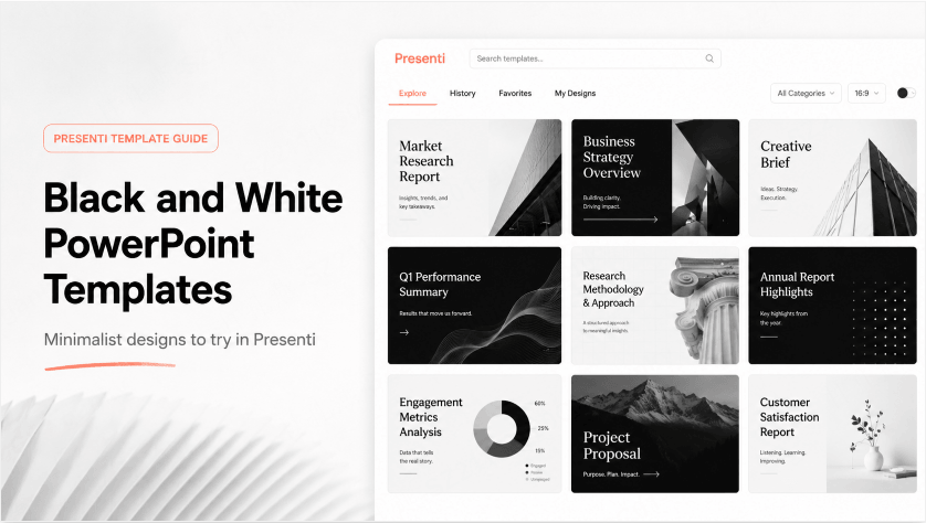
Why Black and White PowerPoint Templates Still Work

Choosing a monochrome presentation style is more than an aesthetic preference. Removing unnecessary color can make it easier to establish hierarchy, maintain consistency, and keep the audience focused on the actual message.
Strong Visual Hierarchy
Black-and-white presentation design naturally creates strong contrast. Large dark headlines on light backgrounds, or white typography on near-black slides, make it easier to distinguish titles, supporting text, statistics, and key takeaways.
This is especially useful for presentations where the structure matters more than decoration, such as business proposals, academic presentations, research reports, strategy decks, and executive summaries.
Better Readability Across Different Displays
Presentations are often shown on different monitors, projectors, and meeting-room displays. Subtle gradients and low-contrast pastel colors can look different depending on the equipment being used.
A high-contrast monochrome presentation template generally maintains clearer separation between text and background across different viewing environments.
Easier Printing and Sharing
Black-and-white presentations also tend to reproduce more predictably when printed in grayscale. If a presentation may eventually become a handout, PDF report, thesis appendix, or printed meeting document, monochrome design can help preserve its original hierarchy.
One Color System, Different Visual Moods
Monochrome does not mean every presentation has to look the same.
- White backgrounds with dark typography work well for reports, thesis defenses, research presentations, consulting decks, and corporate documentation.
- Dark backgrounds with white typography can create a more dramatic look for technology presentations, portfolio decks, product launches, and creative pitches.
- Black-and-white photography can give editorial, architecture, fashion, and creative presentations a more distinctive visual identity.
5 Black and White PowerPoint Templates to Try
Presenti's Pick Style gallery includes presentation templates across business, research, marketing, creative, and other use cases. If you're looking for black and white PowerPoint templates, several designs in the current gallery are particularly suitable for building a monochrome or minimalist deck.
1. Customer Satisfaction Survey Report

Customer Satisfaction Survey Report uses a clean black-and-white composition with structured typography and clearly separated content areas.
The style works particularly well for:
- Customer satisfaction surveys
- Market research reports
- User feedback analysis
- Business performance reviews
- Management presentations
Because the design relies on typography and layout rather than multiple accent colors, statistics and written insights remain the focus. It is a strong choice if you want a professional minimalist PowerPoint design for a data-oriented presentation.
2. Engagement Metrics Analysis

Engagement Metrics Analysis combines a light editorial layout with high-contrast black-and-white photography.
The combination of serif-style editorial typography, monochrome imagery, and generous spacing gives the presentation a more sophisticated report-like appearance.
It is well suited to:
- Marketing performance reports
- Social media analysis
- Audience engagement reviews
- Brand reports
- Media presentations
If you're searching for a monochrome presentation template that feels more editorial than corporate, this is one of the most distinctive options.
3. Creative Brief

Creative Brief is built around bold typography, black-and-white architectural imagery, and large areas of negative space.
Rather than filling every slide with visual elements, the template lets a limited number of images and headlines carry the composition.
This makes it particularly useful for:
- Creative project briefs
- Architecture presentations
- Photography portfolios
- Brand concept presentations
- Design case studies
The result is a strong example of how minimalist PowerPoint design can create visual impact without depending on bright colors or decorative graphics.
4. Research Methodology Review

Research Methodology Review uses a more editorial and academic visual language, combining grayscale textures, structured typography, and illustration.
It can work well for:
- Academic presentations
- Research methodology reviews
- Thesis defenses
- Literature reviews
- Historical or cultural research
Compared with a conventional corporate template, this design feels more like a research publication or editorial spread. That makes it useful when you want a black-and-white presentation that still has a recognizable visual personality.
5. Social Media Strategies

Social Media Strategies takes a darker approach to monochrome design. Large white typography sits against dark photography and near-black backgrounds, creating a high-contrast presentation style.
This template is a good fit for:
- Digital strategy presentations
- Social media plans
- Marketing proposals
- Creative agency pitches
- Trend reports
It also demonstrates that black and white PowerPoint templates do not always have to use white backgrounds. A dark monochrome layout can create an equally minimalist but more dramatic presentation.
How to Create a Minimalist PowerPoint Design with Presenti
You don't necessarily need to build a black-and-white presentation manually from an empty PowerPoint file. Presenti lets you generate your presentation content first, review its structure, and then select a visual style before creating the final deck.
Step 1: Create or Import Your Presentation Content
Start with your presentation topic or existing source material.
For example, you might create:
- A quarterly business report
- A customer satisfaction analysis
- A research presentation
- A marketing strategy
- A creative project brief
Presenti can help organize the content into a presentation structure before you move on to design.
Step 2: Review and Refine the Presentation Outline

Before choosing a template, review the generated presentation outline.
Check whether:
- The sections appear in the right order
- The introduction is concise enough
- The main argument receives enough space
- Important data or examples are included
- The conclusion gives the audience a clear takeaway
Getting the structure right before styling the deck helps ensure that the visual design supports the message rather than trying to compensate for a weak narrative.
Step 3: Choose a Black-and-White or Minimalist Template
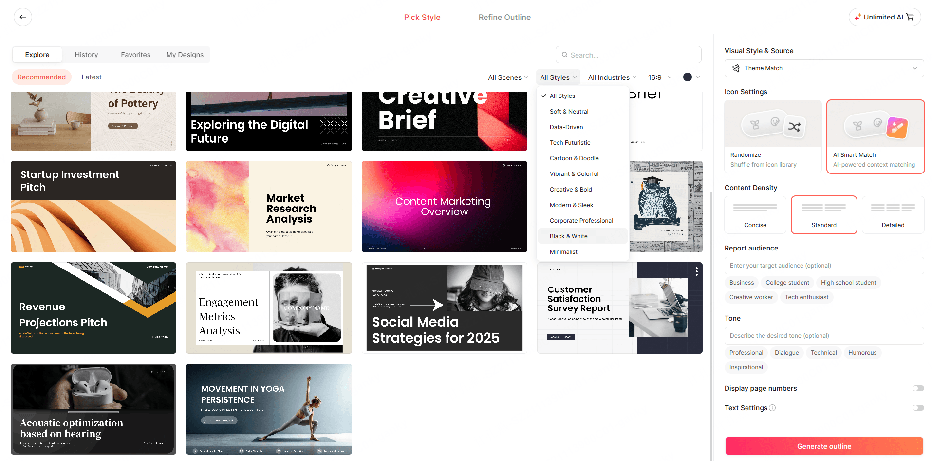
After your outline is ready, continue to the Pick Style stage and choose a black-and-white template.
Presenti displays a gallery of presentation designs that you can browse using options such as scenes, styles, industries, aspect ratios, and search.
Look for templates with characteristics such as:
- Black-and-white photography
- White or near-black backgrounds
- Minimal accent colors
- Large typography
- Editorial layouts
- Generous negative space
Preview different styles and select the one that best matches the tone of your presentation.
For example, a management report may benefit from a light, structured layout, while a creative pitch may look stronger with a dark photographic theme.
The goal is not simply to choose the most visually impressive template. Choose the design that helps your content communicate more clearly.
Step 4: Generate and Customize Your Slides

Once you've selected your preferred style, generate the presentation and review each slide. Pay particular attention to:
- Text density
- Heading hierarchy
- Image consistency
- Chart readability
- Spacing between elements
- Contrast between foreground and background
You can then make final adjustments before exporting or continuing to edit the presentation.
How to Choose the Right Monochrome Presentation Template
Not every black-and-white template communicates the same mood. Before choosing one, consider the type of content you need to present and the audience who will see it.
For Business and Executive Presentations
Choose layouts with simple typography, structured grids, clearly defined chart areas, and generous white space.
Templates similar to Customer Satisfaction Survey Report work well because they place information hierarchy ahead of decoration.
For Academic and Research Presentations
Look for templates with readable body text, clearly separated sections, space for diagrams or citations, and layouts that can support data without becoming crowded.
Designs such as Research Methodology Review can provide more personality while maintaining a serious visual tone.
For Creative Portfolios and Briefs
Photography and typography can play a larger role. A minimalist composition with one strong image often creates more impact than several decorative elements competing for attention.
Creative Brief is a good example of this approach.
For Marketing and Strategy Presentations
Consider whether you want an analytical or more dramatic look.
Light monochrome templates work well for reports and dashboards, while dark templates can give campaign strategies, trend reports, and pitches a stronger visual presence.
Best Practices for Black and White Presentation Design
Choosing a monochrome presentation template gives you a strong starting point, but the final result still depends on how you use it.
Use Contrast Intentionally
Black-and-white design relies heavily on contrast, so avoid making every object equally dark.
Build a hierarchy using:
- Pure or near-black for major headlines
- Dark gray for secondary information
- Medium gray for supporting labels
- Light gray for dividers or background areas
Multiple shades of gray can create depth without abandoning the monochrome visual system.
Keep Typography Simple
Typography becomes much more visible when color is removed.
A reliable minimalist approach is to use one font family with several weights:
- Bold or semibold for headings
- Regular for body text
- Medium for labels and supporting information
Avoid using too many typefaces simply to make the presentation feel more designed.
Use Negative Space
One of the defining characteristics of minimalist PowerPoint design is knowing what not to place on a slide.
Leaving space around a chart, image, headline, or key statistic helps establish a visual focal point.
If every part of the canvas contains information, even a black-and-white presentation can quickly feel cluttered.
Limit Decorative Elements
Avoid adding icons, lines, borders, or shapes simply because empty areas feel unfinished.
Every visual element should support one of three things:
- Hierarchy
- Navigation
- Meaning
If an element does none of these, removing it may improve the slide.
Use Grayscale Charts Carefully
Charts present a particular challenge in monochrome presentations because color can no longer distinguish every data series.
Instead, use:
- Different shades of gray
- Direct data labels
- Line styles
- Patterns where appropriate
- One selectively emphasized data point
The audience should be able to understand the chart without relying only on a color legend.
When Should You Use a Black and White Presentation?
A monochrome design can work across many presentation types, but it is particularly useful when clarity and professionalism are more important than visual decoration.
Common use cases include:
- Business reports
- Board presentations
- Consulting decks
- Research presentations
- Thesis defenses
- Investor pitches
- Marketing analysis
- Creative briefs
- Architecture portfolios
- Design case studies
That flexibility is one reason black and white PowerPoint templates remain useful even as presentation design trends continue to change.
Frequently Asked Questions
What is a black and white PowerPoint template?
A black and white PowerPoint template is a presentation design that primarily uses black, white, and grayscale tones instead of a broad color palette. It typically relies on typography, spacing, imagery, contrast, and layout to establish visual hierarchy.
Where can I find black and white PowerPoint templates?
Presenti's Pick Style gallery includes a variety of minimalist, editorial, dark, and monochrome presentation designs. You can browse the gallery or search for a style that matches your presentation topic before generating your final slides.
What is a monochrome presentation template best used for?
A monochrome presentation template is particularly useful for business reports, academic presentations, creative portfolios, strategy decks, research presentations, and other situations where clear hierarchy and readability are important.
Is minimalist PowerPoint design suitable for business presentations?
Yes. A minimalist PowerPoint design can work particularly well for business presentations because it reduces visual distraction and allows key messages, data, recommendations, and decisions to receive more attention.
Are black-and-white presentations good for printing?
They are often easier to reproduce consistently in grayscale because the presentation is already designed around differences in brightness and contrast rather than depending on several colors to distinguish information.
Should I use a light or dark monochrome template?
Light backgrounds are generally a good choice for reports, academic presentations, and information-heavy decks. Dark backgrounds can work well for creative presentations, technology topics, product pitches, and presentations shown in darker environments.
Conclusion
The strength of black and white PowerPoint templates is not simply that they use fewer colors. Their real advantage is the discipline they bring to presentation design.
With fewer decorative elements competing for attention, typography, spacing, images, charts, and content hierarchy become more important. When those elements are handled well, a monochrome presentation can feel modern, professional, and distinctive without becoming visually complicated.
Presenti lets you move from presentation content and outline creation to template selection in one workflow. Once your structure is ready, browse the Pick Style gallery, choose a monochrome presentation template or another minimalist style, and generate a deck that matches the tone of your content.