Open any presentation from a Fortune 500 company, a top consulting firm, or a well-funded startup. The slides share something in common that’s hard to name but immediately obvious: they look designed. Not assembled. Not formatted. Designed.
That quality separates a designer PPT from an ordinary slide deck. And for most people who need to create presentations regularly, that gap has historically required either hiring a designer or spending hours teaching yourself visual principles that professionals spend years mastering.
AI is changing that equation. Modern presentation AI tools can now apply the same design logic that trained designers use, automatically, from a paste of text or an uploaded document. This article explains what actually makes a slide deck look professionally designed, and how AI tools like Presenti now handle that work without requiring any design skill from the person building the deck.
What Makes a PPT “Designer Quality”?
The phrase “designer PPT” gets used loosely, but the underlying concept is precise. A professionally designed presentation isn’t just attractive. It communicates more clearly, guides the audience’s attention deliberately, and looks consistent from the first slide to the last.
Eight specific principles separate a designer PPT from an amateur one. Understanding these is the first step to understanding what AI has to get right in order to replace manual design work.
The 8 Core Elements of Designer-Level PPT Design
1. Visual Hierarchy
Visual hierarchy is the most fundamental design principle in any slide deck. It’s the system that tells your audience what to look at first, what to read second, and what to skim.
In a well-designed slide, the most important element is the largest and highest-contrast item on the page. Supporting information is smaller and lower contrast. Background elements recede visually. The eye moves through the slide in a predictable sequence.
Without a visual hierarchy, every element on a slide competes equally for attention. The result is cognitive overload: the audience tries to process everything simultaneously and retains almost nothing.
Good PPT design builds hierarchy through size, weight, color, and position. This isn’t subjective preference; it’s how human visual perception works.
2. A Consistent Color System
A designer doesn’t pick colors slide by slide. They define a color system at the start and apply it consistently throughout the deck.
A functional color system has four components: a dominant background color, one or two primary brand colors, an accent color for emphasis, and a neutral for body text. Every slide in a professional deck uses the same palette. Emphasis always appears in the same color. Headers are always the same shade.
This consistency signals professionalism to the audience on a subconscious level. When color is inconsistent, the deck looks unfinished even if the content is strong.
3. Typography and Font Pairing
Most non-designers choose fonts by browsing and picking what “looks nice.” Professional designers approach typography as a system.
A proper designer PPT uses two fonts at most: one for headings and one for body text. The heading font sets personality and energy. The body font prioritizes readability above everything else. The two fonts are chosen because they create contrast while remaining visually harmonious.
Type size is equally systematic. Heading sizes, body text sizes, and caption sizes follow a defined scale. No slide in the deck has a font size that falls outside that scale. This creates visual rhythm that audiences process subconsciously as “professional.”
4. White Space and Layout
White space is the single most misunderstood concept in PPT design. Most non-designers treat empty space as wasted space and try to fill it. Professional designers treat white space as an active design element.
White space gives content room to breathe. It directs attention by isolating important elements. It makes text easier to read by preventing visual crowding. Slides with generous margins and deliberate spacing look confident and authoritative. Slides packed with content look anxious and hard to trust.
The rule professional designers follow: if a slide feels empty, it’s probably correct. If it feels full, it almost certainly has too much.
5. Images and Icons
Stock photography used carelessly is one of the fastest ways to undermine a presentation’s credibility. Staged smiling-business-people photos communicate nothing and make a deck look generic.
In a designer PPT, images serve a purpose: they reinforce the emotional tone of a section, provide concrete visual reference for an abstract concept, or break the verbal density of text-heavy content. Icons follow the same visual style across all slides. No slide mixes flat icons with photographic icons, or line-art icons with filled icons.
Visual consistency in iconography is a detail most non-designers miss entirely. It’s something audiences notice without being able to name.
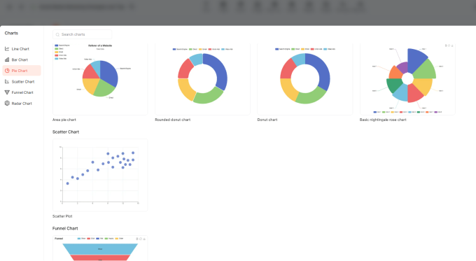
6. Charts and Data Visualization
A data visualization in a professional deck communicates one idea per chart. Not two. Not four. One.
The chart type is chosen because it best represents the underlying data relationship, not because it looks impressive. Bar charts for comparison. Line charts for trends. Scatter plots for correlation. Pie charts, almost never.
Color in charts follows the deck’s established palette. Unnecessary gridlines are removed. Labels are large enough to read without zooming in. The chart title states the conclusion, not the description (“Revenue grew 34% YoY” rather than “Revenue over time”).
These choices require knowledge of visualization principles that most people who create presentations have never formally encountered.
7. Alignment and Grid
Professional designers work on an invisible grid. Every element on every slide snaps to that grid. Text boxes start at the same left margin across all slides. Images align to consistent column boundaries. There are no rogue elements floating 3 pixels off the left edge of the frame.
This grid discipline is invisible when done correctly and immediately obvious when violated. A single misaligned text box on slide twelve undermines the visual credibility of the entire deck.
8. Brand Consistency
A designer PPT applies a brand system, not just brand colors. The logo appears in the same position and the same size on every slide that carries it. The tone of voice in slide copy matches the tone of voice in other brand materials. The overall visual language is coherent with how the organization presents itself everywhere else.
For companies with established brand guidelines, this means the slide deck looks like it belongs to the same visual family as the website, the pitch materials, and the product interface.
How AI Now Applies These Principles Automatically
Here’s where the practical question becomes interesting: can a machine apply these eight principles well enough to produce output that looks genuinely designed?
In 2026, the answer for general business, academic, and marketing presentations is clearly yes. The caveat is that not all AI tools apply these principles equally well.
What Good Presentation AI Actually Does
A capable presentation AI doesn’t generate slides the way a template tool does. It doesn’t give you a blank template and ask you to fill it in. It reads your content, extracts structural signals, and makes design decisions in response to what the content requires.
Specifically, a well-built text to ppt tool does the following:
Parses content hierarchy. It identifies which parts of your text are titles, which are subheadings, which are body copy, and which are data points. It uses those signals to assign visual hierarchy before generating a single layout.
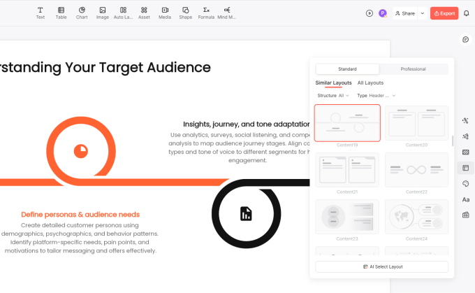
Selects appropriate layouts. Different content types need different layouts. A slide with one big statistic and a supporting sentence needs a different layout than a slide with five comparison points. The AI matches layout to content type automatically.
Applies a design system, not just a template. The color palette, typography scale, spacing rules, and grid are applied consistently across every slide in the deck. The AI doesn’t let individual slides drift from the system.
Handles visual emphasis. Key data points receive visual treatment (callout boxes, large number formatting, color emphasis) that draws the eye without requiring the user to manually create those elements.
The Gap Between Manual and AI Design
Manual design by a non-designer almost always produces one of two outcomes: either the deck looks mediocre because the person doesn’t have design training, or the deck looks good but took three hours because the person compensated for lack of training with effort.
A professional designer produces excellent results but costs time and money that most people building internal presentations simply don’t have.
A well-built AI presentation maker closes this gap for the majority of presentation use cases. The output won’t win a design award. But it will be visually coherent, professionally structured, and clearly better than what most non-designers produce on their own, in a fraction of the time.

How Presenti Delivers Designer-Level Output
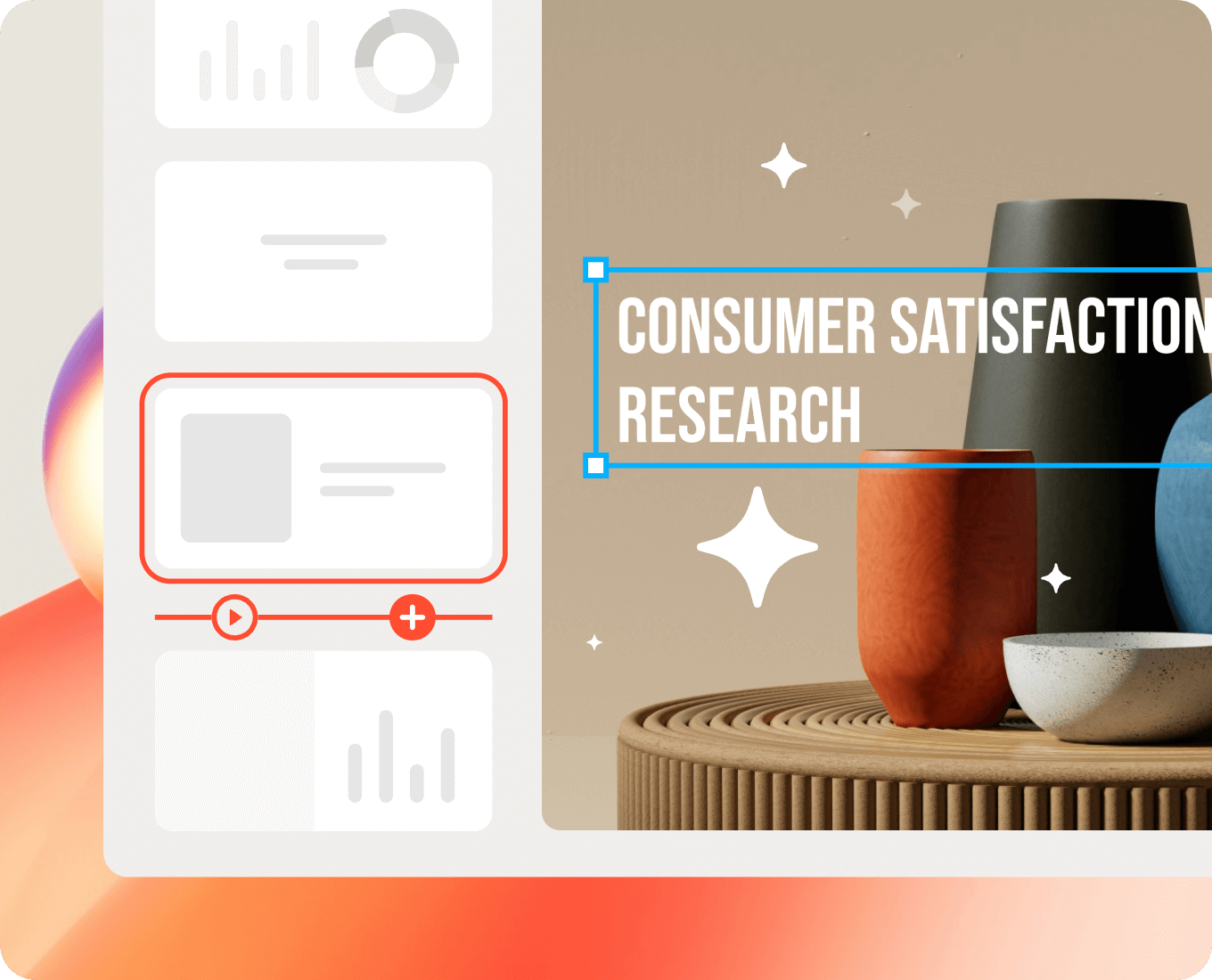
Presenti is built specifically around the question of design quality at AI generation speed. The workflow is straightforward: paste text, upload a document, or write an outline, select a design theme, and generate. The AI handles everything from content structure to visual layout.
What makes Presenti’s output consistently designer-quality rather than generically acceptable:
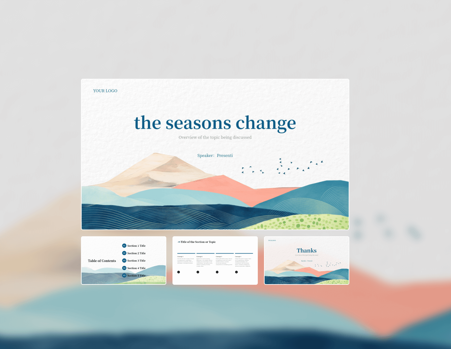
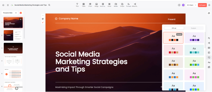
Theme-level design systems. Each Presenti theme is a complete design system, not a color swap. The typography pairing, spacing scale, color hierarchy, and layout library are designed together as a coherent visual language. When you select a theme, you’re adopting a full design system, not just a background color.
Content-responsive layouts. Presenti’s AI reads what’s on each slide and selects a layout appropriate to that content type. A single key statistic gets a spotlight layout. A comparison list gets a structured column layout. The layout serves the content rather than forcing the content to fit a fixed template.
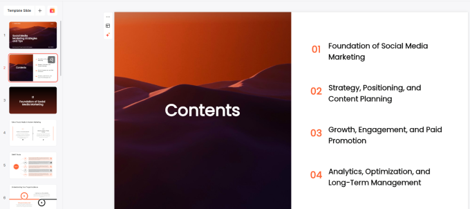
Consistent application at scale. Every slide in the generated deck follows the same grid, the same type scale, and the same color rules. The visual consistency that would require meticulous manual attention from a designer happens automatically.
First-draft quality. Most users report that 80 to 90 percent of slides in a Presenti-generated deck require no meaningful design changes before the deck is presentation-ready. The remaining editing work is content refinement, not layout reconstruction.
The text to PPT process in Presenti takes under sixty seconds for a standard 10 to 15 slide deck. The output is exportable as a fully editable PowerPoint file, which means any remaining refinements can be made in Microsoft PowerPoint without starting over.
Frequently Asked Questions
Q: What’s the actual difference between a designer PPT and a regular PPT?
The difference is systematic versus ad hoc. A designer PPT applies consistent principles (hierarchy, color system, typography scale, grid alignment) across every slide. A regular PPT applies whatever looks reasonable slide by slide, which produces visual inconsistency that erodes the audience’s confidence in the presenter.
Q: Can AI really replace a professional presentation designer?
For standard business, academic, and marketing presentations, AI tools like Presenti now produce output that most audiences cannot distinguish from professionally designed work. For high-stakes presentations requiring custom illustration, complex data visualization, or deep brand customization, human designers still add significant value.
Q: Do I need design knowledge to use Presenti?
No. The design decisions (color system, typography, layout selection, hierarchy) are handled by the AI. You provide the content; Presenti provides the design thinking.
Q: What input formats does Presenti accept?
Presenti accepts plain text, structured outlines, Word documents (.docx), and PDF files. The text to ppt workflow works with any of these inputs. Structured content with clear headings produces the most accurate slide organization.
Q: How does Presenti’s output compare to using a Canva template?
Canva templates give you a starting visual framework that you fill manually. Presenti generates the full deck from your content automatically. The time difference is substantial: Canva templates still require thirty minutes or more of content placement and formatting; Presenti produces a complete first draft in under two minutes.
Q: Can I edit the output in PowerPoint after exporting from Presenti?
Yes. Presenti exports fully editable .pptx files. Every element (text, layout, color, positioning) remains adjustable in Microsoft PowerPoint after export. The generated deck is a starting point, not a locked file.
The Design Skill Gap Is Closing
For most of the history of presentation software, creating a designer PPT required either design training or a design budget. The eight principles that separate professional slides from amateur ones take years to internalize through practice.
Presentation AI has fundamentally changed that dynamic. Tools like Presenti now encode those design principles into the generation process itself, applying visual hierarchy, consistent color systems, appropriate typography, and content-responsive layouts automatically from any text input.
The result is that the gap between what a non-designer can produce and what a professional designer produces has narrowed substantially for standard presentation work. The time it takes to go from written content to a polished, designed slide deck has dropped from hours to minutes.
If you’ve been putting off presentations because the design feels overwhelming, or accepting mediocre slides because the alternative seemed too time-consuming, the AI presentation maker category has a better answer now.
Try Presenti free and see what designer-quality slides from your own content actually look like. No design experience required. Start for free at presenti.ai