Delivering visually appealing presentations is essential to capture and maintain your audience's attention. A well-designed presentation not only conveys your message effectively but also enhances your credibility as a speaker. This blog aims to provide practical tips and resources on how to make a presentation look pretty and professional, focusing on design principles and creative ideas.
How to Make a Presentation Look Pretty and Professional
Create a Structured Outline
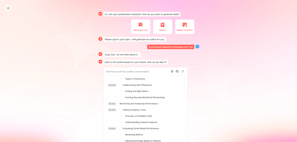
Before styling your Google Slides presentation, decide what the audience needs to understand. Start with an outline to organize your thoughts and structure your content logically. This gives each slide a purpose before you choose colors or move objects. You can generate an outline with Presenti.ai, then check the proposed sequence against your message. If the content is already drafted, the guide to refining slide layouts with Presenti is the more relevant next step.

Utilizing Professional Templates
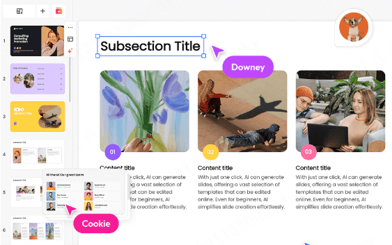
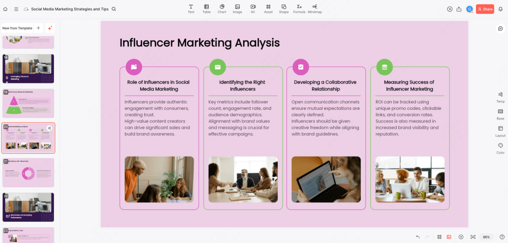
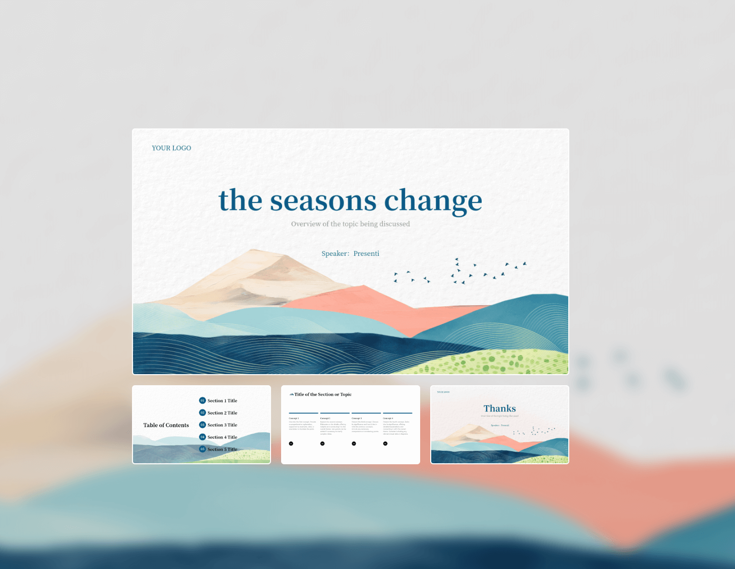
One of the easiest ways to enhance your presentation is by using professional templates. Presenti.ai offers a variety of presentation templates that can be customized to fit your needs. These templates provide a consistent look and feel, with backgrounds that complement your content. Look for templates that align with your topic and audience to make your presentation more engaging.
Google Slides Layouts and Design Principles
Customize Slide Layouts
Choose a layout that fits your content. In Google Slides, a theme controls the overall set of colors and fonts, a layout arranges the text and image placeholders, and a background sits behind those objects. Follow Google's instructions for themes, backgrounds, and layouts when you need to change the right part of the design.
Use Attractive Backgrounds
Choose a plain or subtle background with enough contrast for your text. These subtle designs enhance your text and visuals without overwhelming the audience.
Try a Black-and-White Theme
A black-and-white theme can reduce visual noise. Use one accent color only where it identifies the point you want the audience to notice, and retain labels so that meaning does not depend on color alone.
Utilize the Master Slides Tool
Use the theme or layout editor to change shared fonts, colors, and placeholders. Those changes apply to slides using the affected layouts; inspect slides with manual formatting separately.
Keep It Minimal
Less is often more. Avoid overcrowding your slides with text and images. A simple layout helps your audience find the main point without competing distractions.
Try this on a crowded project slide: Suppose the slide has a paragraph of background, three milestones, and a large decorative photo. Keep the milestone dates together on a single horizontal line, put the next decision in the title, and move the background explanation into the spoken introduction or notes. Keep the photo only if it helps identify the project. You have changed the hierarchy without deleting the information needed for the discussion.
Using Visual Elements
One effective method is to use shape masks, which allow you to apply unique shapes to your images instead of sticking to standard rectangular formats, adding interest and drawing attention. Additionally, adjusting image transparency can create depth, enabling you to overlay text on images without sacrificing clarity. Finally, always ensure high image quality by avoiding blurry or irrelevant pictures, as high-quality visuals significantly enhance your presentation's professionalism and appeal.
Enhancing Interactivity
Leave space for a question the audience can actually answer, such as “Which of these two rollout dates is workable for your team?” If you use a separate Q&A tool, test its access requirements before the session. A timeline can support this discussion by showing dependencies, but it is a visual explanation rather than an interactive feature by itself.
Color Schemes and Text Design
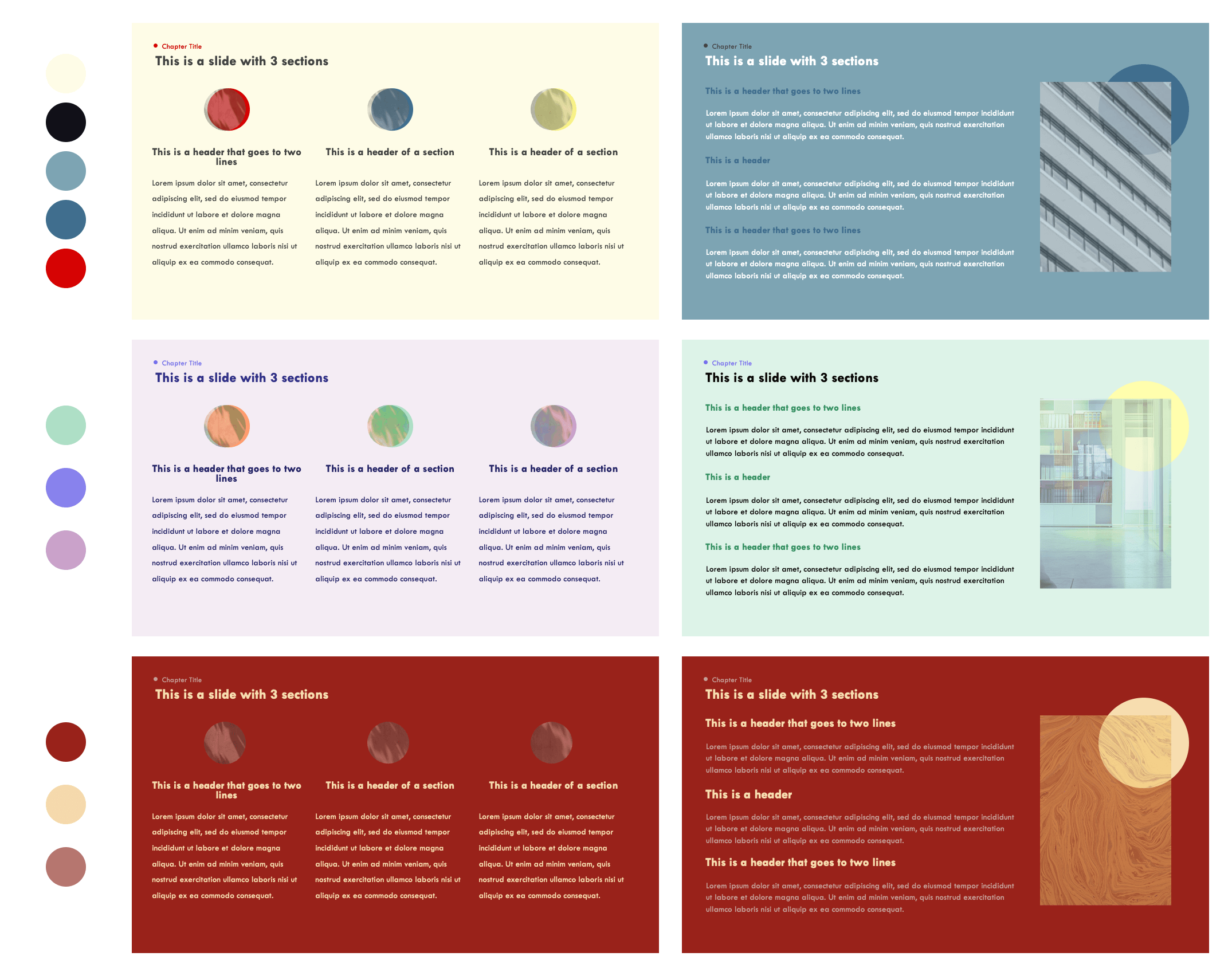
Start by customizing your color scheme to align with your branding or topic, as cohesive colors enhance visual appeal and attract attention. Incorporate complementary colors to make your slides pop while using a mix of colors to maintain audience interest. Experiment with text attributes, such as bold, italics, or underlined styles, to emphasize key points effectively. Additionally, selecting the right fonts is crucial for professionalism; consider using clean, modern fonts like Open Sans, Montserrat, or Lato to ensure readability throughout your slides.
Infographics and Data Presentation
Choose a chart for the comparison you need to make, not simply to make a slide look more elaborate. Use bars for independent categories and a line for change across an ordered period. Label the unit and reporting period, and write a title that explains the observation.
For example, if the audience needs to compare three support channels, a labeled bar chart is usually easier to read than three decorative gauges. Keep the same starting point for the bars and use the accent color for the channel under discussion. This changes the visual emphasis without changing the data.
Animation and Transition Effects
Add Subtle Animation Effects: Reveal information gradually when the order explains a process or argument. If every element needs to be visible for a comparison, show it together instead. Test the effect in the format you will actually present.
Include GIFs or Videos: Adding fun elements like GIFs or relevant videos can make your presentation more relatable and enjoyable.
Use Slide Transition Effects: Maintain a smooth flow between slides with transition effects. Recommended transitions include dissolve, fade, or slide effects that enhance the overall presentation experience.
Final Thoughts
Creating a visually appealing presentation involves thoughtful planning and design choices. By applying these tips on how to make a presentation look pretty and professional, you can enhance your presentation's aesthetics and effectiveness. Remember to utilize professional templates and resources to streamline your design process. Happy presenting!