If you’ve ever sat through a classmate’s presentation and thought “I could not read a single word on that slide,” you already understand the entire problem with most university presentations: they’re written like documents, not designed like presentations.
The good news is that a genuinely good university presentation isn’t about being a natural performer or a design expert. It comes down to a handful of repeatable decisions — about structure, text, and visuals — that you can apply to any topic, in any subject. Here’s the exact process, step by step.

Step 1: Build Your Outline Before You Touch PowerPoint
The single biggest mistake students make is opening PowerPoint first and typing directly into slides. That’s how you end up with a wall of text on slide one, because you’re using the slide as your notebook instead of your visual aid.
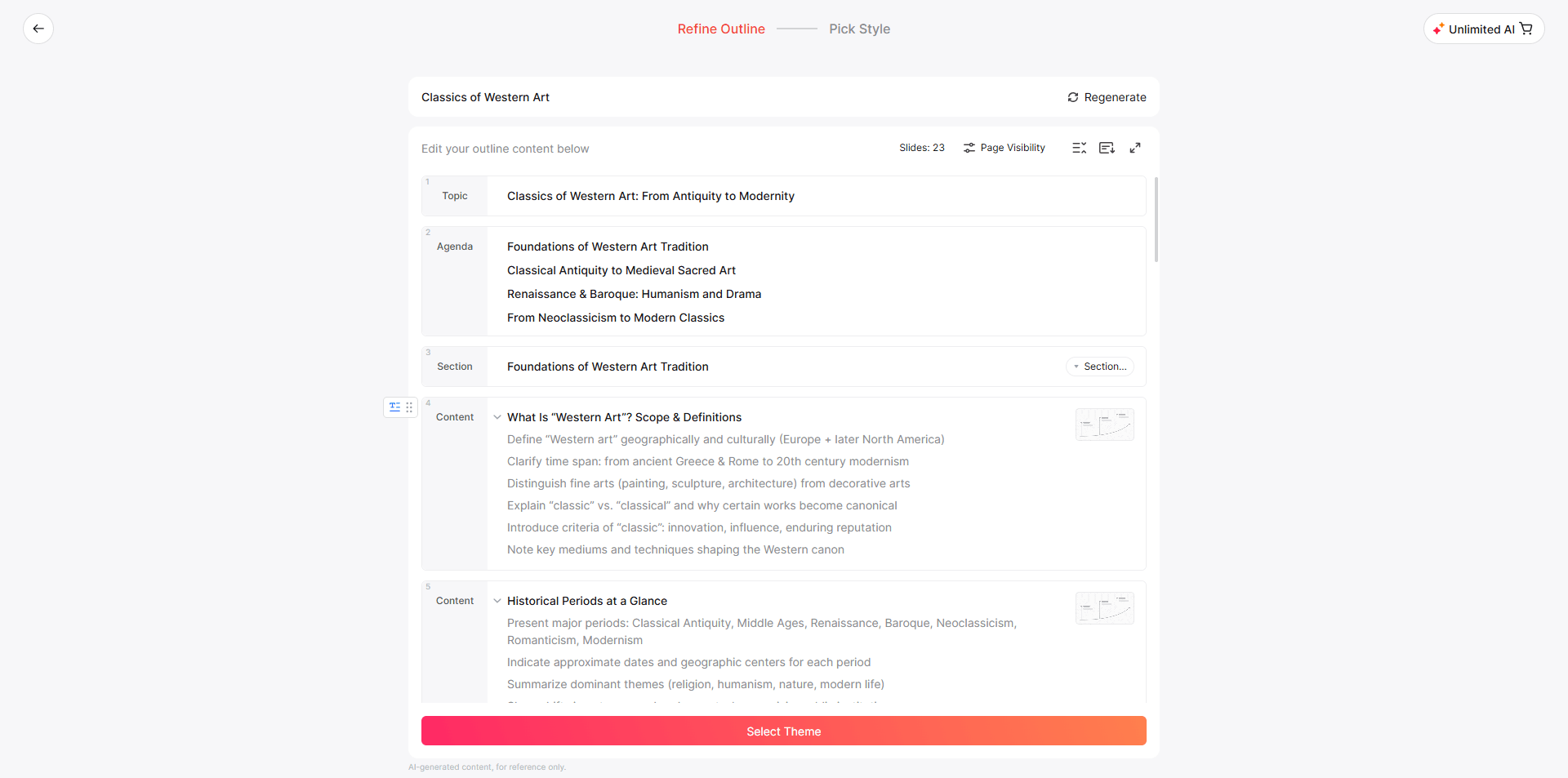
Instead, outline your talk the way you’d outline an essay — on paper, in a doc, wherever — before any slide exists:
- Opening (1 slide): What’s the question or problem you’re addressing, and why should the audience care?
- Body (3-6 slides): Your main points, one idea per slide, in a logical sequence.
- Evidence (woven throughout): Data, quotes, case studies — whatever supports your argument.
- Closing (1 slide): Your conclusion and, if relevant, what it means or what should happen next.
This is also the fastest way to figure out your slide count. As a rule of thumb, budget 1 slide per 1-2 minutes of talking time. A 10-minute presentation is roughly 5-8 slides, not 20.
Faster route: If you already have your content written up somewhere — lecture notes, a research paper, a Word document, a messy set of bullet points — you don’t have to manually rebuild that structure into slides. Presenti AI’s Word to Presentation and PDF to Presentation tools read your document, detect the natural structure (headings, sections, key points), and generate a draft outline to compare with your source. Word and PDF imports are listed on paid plans. It’s a genuinely useful shortcut for exactly this step — you still make the final calls, but you skip the blank-page problem entirely.
Step 2: Follow the One-Idea-Per-Slide Rule
This is the rule that separates readable presentations from unreadable ones. Every slide should communicate exactly one idea. If you find yourself needing two headlines to describe what’s on a slide, it’s actually two slides.
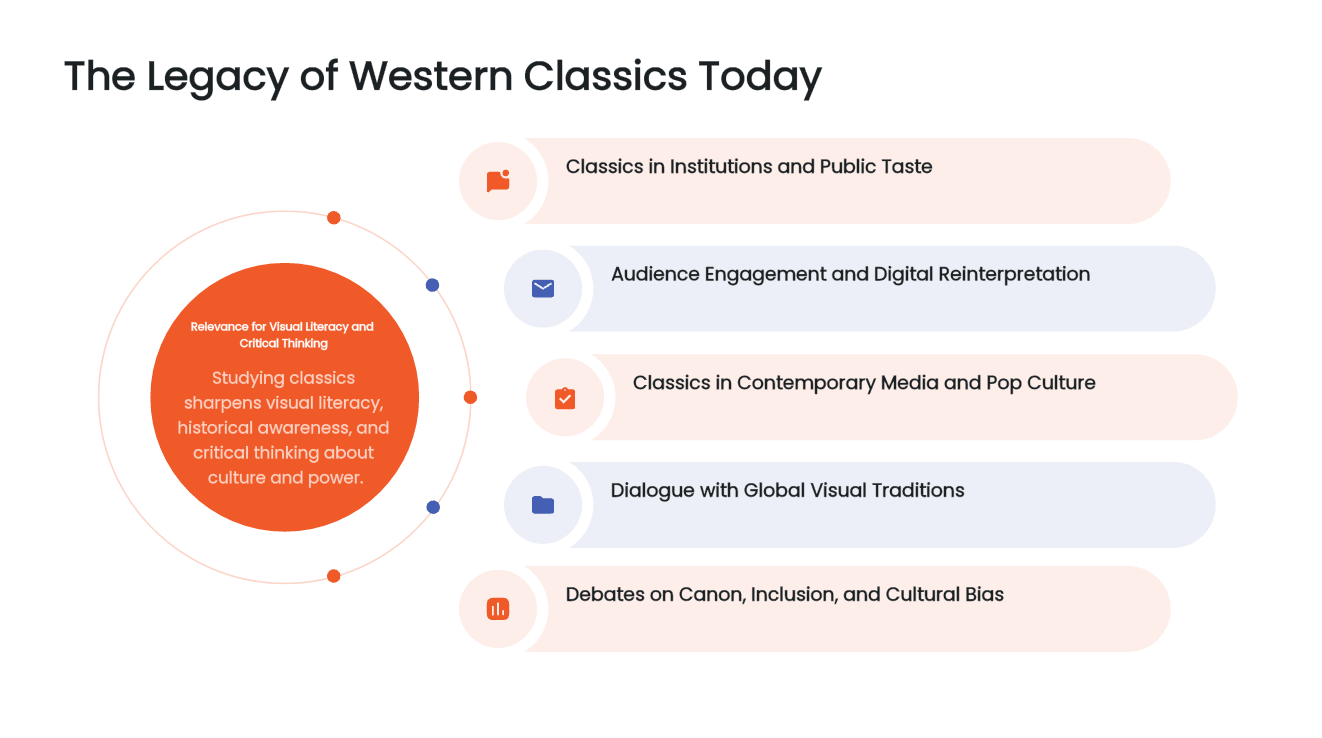
A few useful design guidelines, subject to your assignment rubric:
- 6x6 rule (a good default, not a hard law): No more than roughly 6 bullet points per slide, and roughly 6 words per bullet. If you’re writing full sentences, you’re writing a script, not a slide.
- Slides are a visual aid, not a script. Your slides should support what you’re saying, not contain everything you’re saying. If someone could understand your entire argument just by reading the slides without you speaking, you’ve built a document, not a presentation.
- Titles should be conclusions, not labels. Instead of a slide titled “Results,” try “Illustrative headline: Revenue grew after the redesign.” A conclusion-style title tells your audience what to take away before they even look at the chart.
Step 3: Get the Design Fundamentals Right

You don’t need to be a designer to avoid the mistakes that make academic presentations look amateurish. Start with four design fundamentals:
- Visual hierarchy. The most important element on the slide (usually the headline or the key number) should be the biggest and highest-contrast thing on it. If everything is the same size, the eye doesn’t know where to land.
- Consistency. Same font pairing, same color palette, same slide layout patterns throughout the deck. Inconsistency is the fastest way to make a presentation look thrown together, even if the content is strong.
- Contrast, not color count. Two or three colors used deliberately look far more professional than seven colors used because they were available.
- Whitespace is not wasted space. Cramming content edge-to-edge makes a slide feel dense and stressful to read. Empty margin around your content is doing real work.
If you’re starting from a blank template and this all feels like a lot to manage on top of actually writing your content, this is where an AI design layer earns its keep. Presenti’s AI-Beautify feature takes an existing, plainly-formatted deck — even an old one from a previous semester — and reapplies consistent typography, spacing, and color theory across every slide automatically. It’s a fast way to fix “my content is good but my slides look messy” without redesigning each slide by hand.
Step 4: Turn Data Into Visuals, Not Paragraphs
If your presentation includes any numbers — survey results, an experiment’s findings, financial figures, statistics from a source — do not present them as a sentence buried in a bullet point. Turn them into a chart.
- Use a bar chart to compare categories.
- Use a line chart to show change over time.
- Use a single big number when one statistic is the whole point (e.g., “73% of respondents agreed”).
A suitable chart can make a comparison or trend easier to see. Include readable labels, units, and a source, and use a prominent number when no chart is needed. If the draft includes a chart, verify its values, scale, labels, and relationship to the source. Replace inaccurate or unsuitable visuals before presenting.
Step 5: Build It Fast, Then Spend Your Time Rehearsing
Here’s the part most guides skip: the manual slide-building process — picking a template, formatting text boxes, aligning images, choosing colors — is exactly the part of “making a presentation” that has the lowest return on your time. It doesn’t make you more prepared to speak. It just eats the hours you should be spending on rehearsal.
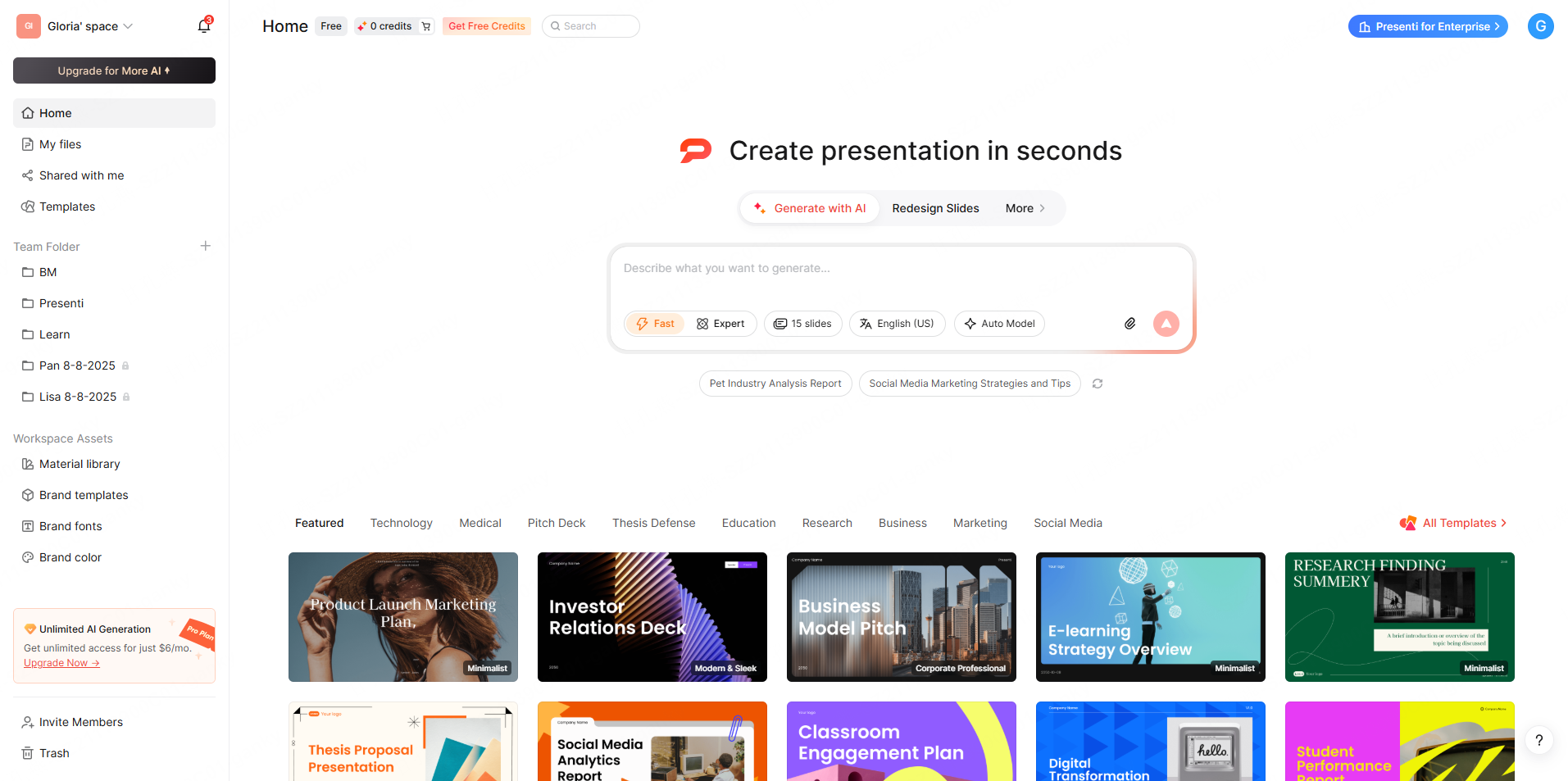
This is genuinely where a tool like Presenti AI changes the math. Instead of spending an evening formatting slides:
- Paste in your outline, upload your Word doc or PDF, or even drop in a rough mind map.
- Review Presenti's proposed outline and design, then check all supporting visuals against your sources.
- Use the available editor controls to refine the content and adjust elements where needed.
- Use an eligible paid plan for editable PPTX or PDF export, or review the sharing options available to your account.
The point isn’t that the AI writes your argument for you — you still need to know your material and be able to answer questions about it. The point is that it can provide a drafting starting point. Allocate time for accuracy, design, citations, and delivery according to your course rubric.
👉 Try building your deck with Presenti AI — start with your outline and review the resulting draft.
Step 6: Rehearse With the Slides in Front of You, Out Loud
Once the deck exists, the highest-leverage thing you can do is rehearse — specifically, out loud, with the actual slides in front of you, not just reading your notes silently.
- Time yourself. Run through it once, and check whether you’re over or under your slot. Cut content, don’t just talk faster.
- Practice the transitions. The moments where students stumble most aren’t mid-sentence — they’re the “next slide” transitions where you lose your train of thought. Rehearse those specifically.
- Prepare for one obvious question. Think about the single most likely question your audience or professor will ask, and have a one-sentence answer ready. It’s a small thing that makes you look considerably more in command of the material.
- Practice in front of one person if you can. Even a roommate or a phone camera recording is enough to catch pacing issues you can’t hear inside your own head.
Common Mistakes That Cost Students Marks
A quick checklist of the errors that show up most often in graded university presentations:
- ❌ Paragraphs on slides. If you’re reading full sentences off the screen, so is your audience — and they’ll read faster than you can talk, then tune out.
- ❌ Inconsistent citation formatting. Academic presentations are still graded on source credibility. Keep your citation style consistent with what your course requires (APA, MLA, etc.), even in slide footnotes.
- ❌ Low-contrast text on busy backgrounds. Light gray text on a light background looks stylish on your laptop and is unreadable from the back of a lecture hall.
- ❌ Too many slides for the time slot. Running out of time and rushing the conclusion is one of the most common (and most avoidable) ways students lose marks.
- ❌ No visual variety. Twelve slides of bullet-point lists in a row is exhausting to sit through, even if every individual slide is well-formatted. Mix in charts, images, and the occasional full-bleed quote or statistic slide to reset attention.
A Quick Pre-Presentation Checklist
Before you present, run through this in under two minutes:
FAQ
How many slides should a university presentation have? As a rough guide, one slide per 1-2 minutes of talking time. A 10-minute presentation is typically 5-8 slides; a 20-minute one is closer to 10-15.
What font should I use for a university presentation? A clean sans-serif font (like Arial, Calibri, or Helvetica) using roughly 24-point body text and larger titles as a starting point. Check readability for the room, screen, and chosen font.
Can I use PowerPoint templates for university presentations? Yes, and you generally should — a clean, consistent template looks more professional than a custom design assembled slide by slide under deadline pressure. Just make sure it isn’t so decorative that it distracts from your content.
Is it okay to use AI tools to help build a university presentation? Check the course's AI rules before using a generator, including permitted assistance and disclosure requirements. Generative AI may produce or change content as well as formatting, so verify the argument, facts, and citations yourself.
Not sure a presentation is even required for your course? Read Do You Have to Do Presentations in University? What Every New Student Should Know for a full breakdown by major and presentation type.