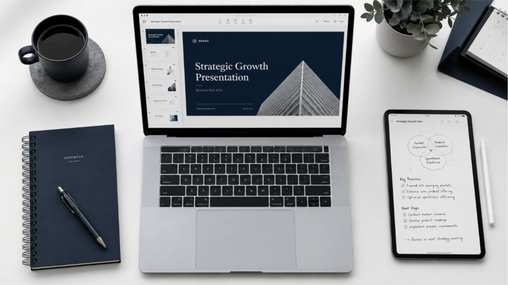
Clear slides make the main point easy to find. This guide covers twelve practical techniques for visual design, content structure, and delivery, so you can choose the changes your presentation needs.

What Makes a Great PowerPoint Presentation?
A great PowerPoint presentation combines clear visual hierarchy, minimal text, and purposeful design to guide the audience through one idea at a time. It uses consistent typography, intentional color contrast, and relevant imagery to support the spoken message — not restate it. The best slides feel effortless to follow and professional enough to reinforce the speaker’s credibility without distracting from the content.
4 PowerPoint Tips for Stronger Visual Design
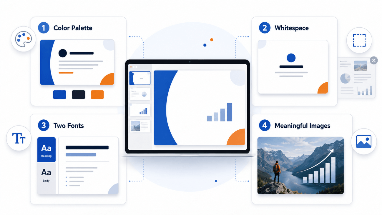
Good design is not about making slides look elaborate. It is about removing every visual obstacle between your audience and your message. These four presentation design tips address the most common mistakes professionals make when building slides from scratch.
Tip 1: Choose a Color Palette and Commit to It
Randomizing colors across a deck is one of the most reliable ways to make a professional presentation feel unplanned — even when the content is strong. Limit yourself to two or three colors for the entire presentation: one primary or brand color, one neutral for body text, and one optional accent for emphasis.
Contrast matters more than aesthetics. Text that blends into the background disappears on a projected screen in a bright conference room. The Web Content Accessibility Guidelines recommend a minimum contrast ratio of 4.5:1 for normal text — a benchmark that applies equally well to slide design. Use that standard as your floor, not your ceiling.
Tip 2: Use Whitespace as a Design Tool
Whitespace — the empty area around text, images, and elements — is not wasted space. It is a deliberate signal to the audience that they have found the main point. Slides packed to the edges force viewers to search for the message, which means they stop listening while they read.
A useful test: if removing an element from a slide does not change its meaning, remove it. Push content toward the center, keep generous margins, and resist the urge to fill every corner. The discipline is uncomfortable at first. The result, however, is slides that read faster, hit harder, and look more executive than anything a crowded layout can produce.
Tip 3: Use Two Fonts and Set Them in the Slide Master
Typography is the part of slide design most people ignore until something looks wrong. One font for headings, one for body text — set globally in the slide master, never overridden on individual slides. Mixing three or more typefaces is a reliable way to make a polished deck look unintentional.
Sans-serif fonts such as Inter, Lato, or DM Sans are generally the safest choice for presentations. They remain legible across a range of sizes and render cleanly on projected screens, unlike some serif typefaces that lose definition when scaled down. Whatever you choose, set it once and leave it alone. Typographic consistency communicates the same thing as color consistency: this person prepared.
Tip 4: Use Images That Add Meaning, Not Decoration
A generic stock photograph of a team celebrating placed next to a Q3 revenue chart adds nothing. Audiences are trained to ignore decorative images, and the presence of obvious filler lowers your credibility faster than almost any other design choice. Only include images when they clarify, illustrate, or emotionally reinforce the specific point on that slide.
When you do use imagery, use full-bleed layouts — photographs that fill the slide edge to edge rather than floating in a box. Microsoft’s official presentation guidance offers general advice on readable slides and delivery. Choose a full-bleed image only when it supports the slide’s purpose. For data-driven slides, a clean chart will almost always communicate more than any photograph.
4 PowerPoint Tips to Make Slides Easier to Follow

Visual design only gets you so far. A beautifully formatted slide that contains three different arguments and fifty words of dense body text will still lose your audience. These four tips address the structural and content decisions that determine whether your message actually lands — the core of knowing how to make a good PowerPoint that works.
Tip 5: Put One Idea on Every Slide
This is the most impactful structural principle in presentation design and the most consistently ignored. Give each slide one main point, with the evidence or supporting details needed to explain it. Not one topic. One idea.
When you enforce this rule, two things happen immediately. Your narrative becomes clearer because you can no longer hide fuzzy thinking behind crowded bullet points. And your pacing improves because each slide transition signals a genuine progression to your audience — they always know where they are in your argument. If a slide seems to require three bullets to make its point, consider whether each bullet might deserve its own slide.
Tip 6: Cut the Text — Then Cut It Again
Slides are not documents. They are visual anchors for a spoken conversation. When every detail is already on the slide, your audience reads instead of listens — and they finish reading before you finish talking, which means they are already ahead of you and waiting rather than engaged with you.
Keep bullets concise and use only as many as the audience needs to follow the point. Everything else belongs in your speaker notes or the leave-behind handout distributed after the presentation. Resources from Nielsen Norman Group can inform broader usability decisions. For your deck, rehearse the slide and narration together and remove text that needlessly duplicates what you say.
Tip 7: Structure Your Deck Like a Narrative
Effective presentations have structure: a beginning that frames the problem, a middle that presents evidence or argument, and an end that delivers a clear conclusion and next steps. Most presenters skip the beginning — they jump straight into content before the audience understands why they should care.
Before building any deck, write one sentence that captures the whole presentation: “I am going to explain [problem], show that [solution works], and ask [audience] to [take this action].” Every slide should serve that sentence. If a slide does not move the narrative forward, it is a candidate for deletion. This framework works whether you are presenting quarterly results, pitching a new product, or running a client workshop. The container changes. The underlying structure — context, evidence, conclusion — does not.
Tip 8: Size Your Type for the Back Row
Font size on slides is almost always too small. Body text should be at least 24pt; headings 36pt or larger. Actual readability depends on the room, display, font, and viewing distance.
The test is simple and takes thirty seconds. Stand at the back of the room where you will be presenting. If you squint at anything on screen, the font is too small. For virtual presentations, assume participants are viewing slides in a small tile on a laptop and err larger rather than smaller. There is an additional benefit: large type physically prevents you from writing paragraphs on slides, which enforces the discipline of Tip 6 without requiring willpower.
4 PowerPoint Presentation Tips for Engagement and Delivery

Design makes your slides readable. Structure makes your argument followable. These final four PowerPoint presentation tips address what keeps an audience engaged from the first slide to the last — the elements that make a presentation memorable rather than merely acceptable.
Tip 9: Animate Only What Needs Directing
Animations exist to direct attention, not to entertain. The only animations worth using are those that reveal information progressively — surfacing bullet points one at a time so the audience focuses on what you are currently discussing rather than reading ahead, or highlighting a specific data point on a chart to anchor attention exactly where you need it.
Avoid entrance and exit effects that serve no purpose beyond visual flair: spinning headlines, bouncing icons, wipes that take two seconds to complete. These slow your pacing and signal a lack of design discipline. When in doubt, Fade or Appear is the correct default — clean, fast, and invisible to the audience in the best possible sense.
Tip 10: Choose One Transition and Use It Throughout
Slide transitions are the punctuation of a presentation. Used consistently, they provide a rhythmic background signal that the presentation is progressing without drawing attention to itself. Used randomly, they read as indecision.
Pick one transition — Fade or Push is almost always sufficient — and apply it to every slide in the deck. Reserve more dramatic transitions for rare, intentional moments: a before-and-after comparison, a major section break, a reveal that warrants visual emphasis. The instinct to vary transitions for variety should be resisted entirely. Variety without purpose reads as inconsistency, not creativity.
Tip 11: Frame Your Presentation as a Story
People remember stories. They forget bullet points. Every strong effective presentation has the same basic narrative architecture: a character (your audience or a customer they recognize), a conflict (the problem that needs solving), and a resolution (your recommendation, product, or decision). You do not need to make a budget review feel cinematic — but you do need to identify the tension your presentation resolves and make that tension visible from the first slide.
A simple framework that works across contexts: open with “Here is the world as it stands.” Move to “Here is the problem with that world.” Close with “Here is what changes when we solve it.” That structure applies equally to investor pitches, internal strategy reviews, sales demos, and academic lectures. The content changes. The underlying shape of the argument stays the same.
Tip 12: Design Every Slide for Your Audience, Not for Yourself
The most common cause of poor presentations is designing for the comfort of the presenter rather than the comprehension of the audience. Slides packed with data, notes, and qualifications exist to reassure the presenter that they have covered everything — not to help the audience understand anything.
Before finalizing any slide, ask: “What does someone unfamiliar with this topic need to see to understand this point in thirty seconds?” Design to that answer. Keep the context needed to interpret the claim; move less relevant detail to backup slides. For executives: fewer words, bigger numbers, one recommendation per slide. For educators: progressive reveal, visual examples, clear learning objectives stated upfront. For client pitches: lead with the client’s problem, not your product’s capabilities. Knowing your audience is the foundation that every other presentation tip depends on.
Quick Reference: What to Avoid vs. What to Do
| Common Mistake | Better Approach |
|---|---|
| 5+ colors used across slides | Commit to a 2–3 color palette set in the slide master |
| Paragraphs of text on every slide | Short, readable points; supporting detail in notes or a handout |
| Mixing multiple fonts throughout the deck | One heading font + one body font, applied globally |
| Generic stock photos as decoration | Images only when they directly clarify or reinforce the point |
| Multiple ideas packed onto one slide | One claim, one data point, or one recommendation per slide |
| Body text smaller than 20pt | Start around 24 pt body text and 36 pt headings, then test at the viewing distance |
| Flashy entrance animations on every element | Fade or Appear only, and only when it aids attention direction |
| Different transitions between every slide | One consistent transition style used throughout |
| Opening with data before establishing context | Frame the problem first; evidence follows |
| Slide content written to reassure the presenter | Design each slide for the audience’s thirty-second comprehension |
Which PowerPoint Tip Makes the Biggest Difference?
Start with the problem your audience encounters. For an executive review, make the decision and evidence easy to find. For a lesson, check whether the sequence and examples support the learning objective.
For a sales or client presentation, connect the proposed approach to the audience’s actual problem. Use these design choices to improve clarity, then evaluate the result through rehearsal and feedback.
Build Better Slides Faster with Presenti AI
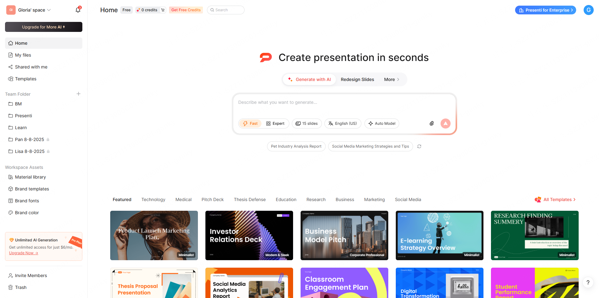
Knowing these presentation design tips is straightforward. Applying all twelve from scratch on a deadline is a different challenge. Typography decisions, layout consistency, color balance, visual hierarchy — each element takes time and attention that most professionals do not have when a presentation is due tomorrow.
Presenti AI can generate a slide draft from supplied text or a supported document. Review the structure, typography, spacing, and visuals using the tips above, then verify the content and exported file.
Frequently Asked Questions
What are the most important PowerPoint tips for beginners?
Start with two fundamentals: one idea per slide, and a maximum of three short bullets per slide. Before worrying about design, get the content structure right. A well-structured deck with simple visuals will always outperform a beautifully designed deck with a cluttered, unfocused argument underneath it.
How many slides should a PowerPoint presentation have? Choose the slide count by rehearsing within the available time. A complex chart may need several minutes; a section divider may need only a moment. Remove slides that do not support the purpose of the talk.
What font size is appropriate for PowerPoint slides?
Body text should be a minimum of 24pt. Headings should be 36pt or larger. For large conference rooms, increase both by 4–6pt. The practical test: stand at the back of the room where you will present and check whether you can read every word on screen without effort. If you squint at anything, the font is too small.
Should I use animations in my PowerPoint presentations?
Yes — but only to direct attention, not for decoration. Use animations to reveal bullet points progressively or highlight a specific chart element. Fade or Appear is the safest default for almost all situations. Avoid spinning, bouncing, or multi-step entrance animations that slow your pacing and pull focus away from what you are saying.
What is the difference between presentation tips and PowerPoint tips?
Presentation tips refer to the broader principles that make any slide deck more effective — narrative structure, audience design, content discipline. PowerPoint tips are the specific techniques applied within the application that implement those principles: setting the slide master, using animations purposefully, controlling transitions consistently. The 12 tips in this guide cover both levels: the underlying principle and the practical way to execute it.
Conclusion
Great slides are not an accident. They result from deliberate choices about color, typography, content density, structure, and storytelling — the same decisions covered by these 12 PowerPoint tips. None of them are technically difficult. All of them require discipline and the willingness to cut things that feel comfortable but do not serve the audience.
Start with the tip that addresses your most obvious current weakness. If your slides look visually inconsistent, apply Tips 1 and 3 before your next deck. If audiences lose attention mid-presentation, revisit Tips 5 and 11. If senior stakeholders are glazing over, make the main point visible and shorten crowded text. Each improvement compounds.
The bar for effective presentations has never been higher. Apply these PowerPoint presentation tips consistently, and you will feel the difference — in the room, on the call, and in the decisions your audience makes after the presentation ends. Ready to put them to work? Create professional slides with Presenti AI and review the draft using these principles.