A Three Minute Thesis presentation needs one research story that a person outside your field can follow: a problem they can recognize, the question you investigated, what you found and why the finding matters. Choose that thread before designing the slide. A compressed tour of every thesis chapter usually leaves too little time to explain the contribution.
Start with a sentence you would like someone to repeat after your talk. Then select the evidence that earns that sentence. Presenti can help you prepare an editable educational presentation draft; for 3MT, develop a single visual around your chosen claim and check the final file against your event's rules.
What the 3MT format requires
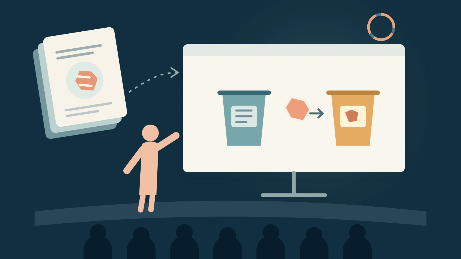
The University of Queensland's published 3MT competition rules allow one static PowerPoint slide, displayed from the beginning of the presentation. The talk is limited to three minutes. Slide movement, additional electronic media and props are excluded. Check your own event's instructions before preparing the submission.
Those constraints affect the story. The audience can see your result before you reach it in the speech, so the slide must make sense as a whole. You cannot rely on revealing one arrow at a time, playing a demonstration or switching to a methods slide when a term needs explanation.
Separate the spoken and visual jobs. Your voice can explain the sequence, motivation and uncertainty. The slide can hold a concrete object or a small comparison in view. If the slide requires a minute of silent reading, it is competing with your explanation.
Choose one question and one contribution
Write four short notes before writing a script:
- Situation: Where does the problem show up in someone's life or work?
- Research question: What did you investigate that was not already clear?
- Evidence: What observation or result best answers that question?
- Meaning: What can someone now understand or do differently?
The meaning must fit the evidence. A laboratory result can identify a promising mechanism without proving that a policy will work in a city. A small interview study can explain participants' experiences without estimating how common those experiences are. These distinctions can often be expressed in one plain sentence.
For an example, imagine a fictional research project about signs on campus recycling bins. Ninety-six volunteers are randomly assigned to one of two label designs. Each person sorts the same item. With words alone, 27 of 48 people choose the intended bin on their first attempt. With words plus example photographs, 39 of 48 do. This is an illustrative study, not a report of an actual experiment.
The contribution to communicate is narrow: in this controlled task, the label with example photographs led to more correct first choices. The study does not establish how much waste a university would recycle over a year. A useful opening could still begin with the everyday uncertainty of standing in front of several bins.
A worked script you can adapt
The following manuscript shows how the parts connect. It is a starting script for rehearsal; its word count does not guarantee a three-minute delivery. Pauses, emphasis and your speaking pace determine the actual duration.
You have finished lunch. In your hand is a food wrapper, and in front of you are several bins. You want to put it in the right one. But the label gives you a category, and you are still not sure whether your wrapper belongs there.
My research asks a small question inside that everyday decision: can a sign make the correct choice easier at the moment someone needs to act?
In our study, 96 volunteers faced the same sorting task. We randomly assigned half to bins with word labels. The other half saw the same words with photographs of example items. We recorded whether each person's first choice matched the intended bin.
With words alone, 27 of the 48 volunteers chose correctly. With the photographs added, 39 of 48 did. You can see those two results on the slide. Each row represents the same number of people, so the comparison is between two label designs with equal-sized groups.
That difference suggests a useful direction for designing instructions. A category name can be clear to the person who wrote it and still leave the person using it unsure how to act. An example connects the category to an object they recognize.
There is a limit to what this experiment tells us. Our volunteers sorted one item in a controlled setting. A busy cafeteria includes queues, mixed materials and decisions made in a hurry. We have not yet shown that these labels improve a university's recycling over a whole term.
The next step would be to test the labels in that everyday setting and see whether the advantage holds across different items. We would also need to learn where the photographs fail: an unfamiliar item may still leave people guessing.
What this study gives us is a reason to examine the sign as part of the problem. Before asking people to make a better decision, we can ask whether we have made the decision clear enough to make.
Notice where the detail goes. Random assignment and equal group sizes make the comparison understandable. The closing limitation names the difference between the experiment and the intended setting. The script leaves out the recruitment email, every item considered during planning and the full analysis procedure. Those details belong in the research record and longer presentations.
Make the slide carry the comparison
For this example, the slide could show a small wrapper illustration above two equal rows of 48 dots. One row highlights 27 correct first choices; the other highlights 39. Label them “Words” and “Words + examples,” with “Correct first choices” beside the counts. Keep the objects large enough to understand from the audience's position.
The rows should have the same length and dot size. Otherwise, the visual can exaggerate or obscure the difference. A restrained title such as “An example can make the next action clearer” introduces the idea without claiming that photographs solve every sorting problem.
You could also use two simple bars labeled 27/48 and 39/48. Choose the version that is easiest to explain aloud. The slide does not need both charts, a paragraph of methods and a photograph of a landfill. Every extra element asks the audience to decide where to look while you speak.
Keep the result visible from the start. In rehearsal, see whether showing it early weakens the story. If it does, change the script so that the result invites a question instead of relying on a surprise reveal. Static-slide rules are easier to work with when the visual is designed for them.

Rehearse with a time map
Use time allocations as a planning aid, then change them after speaking aloud. This example could begin with:
| Part | Planning allowance |
|---|---|
| Everyday situation and research question | 35 seconds |
| What was compared and what happened | 60 seconds |
| Interpretation and the important limit | 45 seconds |
| Next step and closing idea | 25 seconds |
These allowances total 165 seconds, leaving some room within the three-minute limit for pauses and variation. They are not measured timings of the example script. Record an uninterrupted rehearsal, then note the actual moment at which you reach each part.
If you run long, identify the sentence doing the least work. Remove a second example, an unnecessary definition or a repeated implication. Speeding up every sentence makes the central result harder to absorb. Preserve the words needed to distinguish what you found from what you hope to test next.
Ask one listener outside your specialty to tell you the research question and main finding after hearing the talk once. Their retelling is more informative than asking whether they liked it. If they repeat your hoped-for future impact as an established result, revise the transition between the finding and the next step.
Finish the file and the spoken ending
Inspect the actual submission file on a screen at presentation size. Check labels, symbols and any source or acknowledgment required by your event. Confirm that no animation or transition has survived from a larger deck. A slide that looks clear while zoomed in on your laptop may need fewer elements for a room.
Finally, practice the last two sentences without looking at the screen. They should return the audience to the question you opened, with a clearer understanding of what your research contributes. In the example, that is the connection between a sign and a decision. Your own ending should name the contribution your evidence can support.