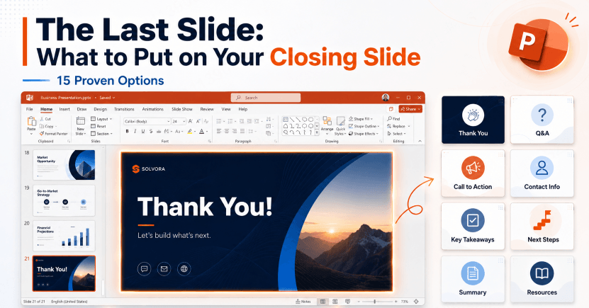
The last thing your audience sees matters more than most presenters realize. You have spent hours crafting your argument, refining your data, and polishing every slide in the deck — and then you coast to a stop with a plain white slide that says “Thank You.” That single closing slide determines the final impression your presentation leaves. It shapes what the room remembers, whether anyone asks a question, and what happens next. This guide covers 15 options to the question of what to put on the last slide of a presentation, with scene-based picks, a comparison table, and design principles so you can choose the right ending every time.
What Is a Closing Slide?

A closing slide is the final slide displayed in a presentation — the last visual your audience sees before questions, discussion, or the room clears. Unlike content slides that build an argument, the closing slide serves a distinct purpose: it reinforces the core message, directs attention toward a specific next action, and leaves a durable mental anchor. A strong closing slide works as hard as your opening one.
When to Add More Than “Thank You”
The instinct is understandable. You finish your last point, advance to the final slide, and “Thank You” fills the screen. It feels polite. It signals you are done. And it is, as presentation expert Jon Schwabish argues at PolicyViz, a completely wasted opportunity.
Here is the structural problem. Once questions begin, your last slide presentation becomes a backdrop for the next ten to thirty minutes of conversation. A blank “Thank You” tells the audience nothing during that entire window. No key message. No contact details. No action to take. Just whitespace and a courtesy phrase holding the screen while your argument slowly evaporates from memory.
A well-designed closing slide does three things:
- It reinforces your single most important message so the audience walks away with it intact
- It prompts a specific action — a question, a decision, a follow-up email, a next meeting
- It leaves a credible visual anchor that continues working after you stop talking
The good news is that knowing how to end a presentation well takes no special skill. It takes a decision. The 15 options below cover a range of presentation contexts — from investor pitches to academic defenses to team workshops — so you can make that decision quickly and confidently.
15 Closing Slide Options Beyond “Thank You”
1. Key Message Recap
Distill your entire presentation into one clear, declarative sentence and put it on screen. Not a bullet-point summary — one statement the audience can carry out of the room without needing to reference anything else.
When to use it: Business proposals, investor pitches, strategy reviews.
Example: A product launch deck ends with:
“Improve onboarding so new customers can reach their first useful result sooner.”
That sentence stays on screen for the entire Q&A, reinforcing exactly what you need the room to remember.
2. Call to Action
Tell the audience precisely what you want them to do next. Not “let’s discuss” — a specific, time-bound, frictionless request.
When to use it: Sales pitches, fundraising decks, marketing presentations, product demos.
Example:
“Schedule your 30-minute pilot review before Friday — link already in your inbox.”
A strong presentation closing always makes the next step obvious. Remove every reason to delay.
3. Contact Information
Name, title, email, and optionally a LinkedIn URL or direct phone number. Clean layout, readable from the back of the room, easy to photograph.
When to use it: Conference talks, networking events, academic conferences, any presentation where follow-up conversations are the primary value.
This option performs best when paired with a brief closing statement so the slide carries both a message and an invitation — not just a business card on a white background.
4. Q&A Invitation
A clear visual prompt — “Questions?” or “Let’s discuss” — with or without contact details alongside it. Simple and effective when your closing message was already delivered verbally and you simply need a clean, distraction-free screen for the discussion that follows.
When to use it: Internal team meetings, educational workshops, presentations where live Q&A is the primary goal rather than a post-presentation action.
5. Inspirational Quote
A carefully chosen quote that reinforces your core theme and leaves the audience in the right emotional state to act. The key word is carefully. Generic motivational quotes signal low effort. The best closing quotes feel earned by the presentation — specific to the problem you just addressed or the vision you just articulated.
When to use it: Keynote talks, all-hands meetings, leadership presentations, conference sessions closing a major theme.
6. Next Steps / Roadmap
A numbered list of the three to five concrete next steps that follow from this conversation. Deadlines, owners, and actions — the clearest possible bridge between the meeting and what happens tomorrow morning.
When to use it: Project kickoffs, client proposals, planning sessions, any presentation where execution begins immediately.
This is one of the highest-value closing slide formats for business contexts because it eliminates post-meeting ambiguity about who does what and when.
7. Data Highlight
Return to the single most compelling statistic or finding from your deck. Isolate it visually — large number, minimal surrounding text, strong contrast between figure and background.
When to use it: Research presentations, data-driven pitches, annual reviews, any deck built around a quantitative argument.
Hypothetical example: A healthcare analytics team could close with its verified readmission finding, including the comparison period and population. Use an observed result or clearly labeled target, never an unsupported promise.
8. Social Proof / Testimonial
A brief customer quote, case study result, or third-party endorsement that validates everything you just presented.
When to use it: Sales pitches, product demos, client presentations, partnership proposals.
One quote, one attribution. Two lines of text from a recognizable source hit harder than a collage of five logos. The audience is already leaving mentally — make the proof absorbable in five seconds.
9. Resource / Further Reading List
A short, curated list of links, reports, or documents for audience members who want to go deeper. Three to five resources maximum. Beyond that, curation collapses into noise.
When to use it: Educational workshops, research talks, conference sessions, any presentation for an audience that actively seeks to learn more.
QR codes work well here to make links scannable in the room. Five genuinely useful resources communicate expertise. Twenty links dilute it.
10. QR Code Links
A single, scannable code leading to your slides, a landing page, a sign-up form, or a portfolio. One code per slide — multiple codes create decision paralysis.
When to use it: Product launches, live events, workshops, any context where you want to drive the audience to a specific digital destination before they leave the room.
Label the destination clearly beneath the code. Remove any uncertainty about what the audience is about to access.
11. Team Credits
Acknowledge the people who built the work you just presented. Names, roles, a brief note of thanks.
When to use it: Large project showcases, product launches with cross-functional teams, academic group presentations, internal all-hands meetings.
Team credits serve two audiences simultaneously: they demonstrate organizational depth to external viewers and build internal goodwill by making contributions visible. In investor or client contexts, they also signal that the capability shown is systemic rather than dependent on one person.
12. Key Decision Slide
State the decision the audience needs to make before leaving. Frame it clearly: the options, the tradeoffs, and your recommendation in plain language.
When to use it: Board presentations, executive strategy reviews, any meeting that ends in a vote, approval, or budget allocation.
This is the highest-stakes closing slide format in business settings. The slide should do the work of a decision memo compressed into visual form — clear options, clear recommendation, clear consequences of inaction. Remove everything else.
13. Problem Restatement
Return to the problem you opened with and show how far the conversation has traveled. Open loop, closed loop. The audience arrived with a question; they leave knowing it has been answered.
When to use it: Proposals, strategy decks, any presentation structured as a problem-solution argument.
This technique creates narrative resolution. It is far more memorable than a thank you because it completes a story rather than simply ending one.
14. Invitation to Follow Up
A warm, specific invitation for continued conversation: office hours, a scheduled follow-up meeting, a direct email address with a prompt.
When to use it: Academic thesis defenses, teaching presentations, coaching sessions, any context where ongoing dialogue is more valuable than a single transaction.
Specificity is everything here. “Feel free to reach out” is weak. “I hold office hours Tuesdays 3–5 PM and would welcome questions about the methodology” is credible, actionable, and memorable.
15. Minimalist / Clean Close
Your logo, your name, and nothing else. Deliberately, confidently sparse.
When to use it: Premium brand presentations, design industry talks, any context where restraint communicates more than explanation.
This ending only works when the presentation preceding it has been strong and complete. Silence after a great argument is powerful. Silence after a mediocre one is just uncomfortable. Earn this ending before you use it.
How to Choose the Right Closing Slide for Your Presentation Type
No single closing slide works across every context. The table below maps presentation type to the options that perform best, organized by the primary goal of each setting.
| Presentation Type | Primary Goal | Best Closing Slide Options |
|---|---|---|
| Business Proposal | Win approval or budget | Key Decision Slide, Next Steps / Roadmap, Key Message Recap |
| Sales Pitch | Drive a specific next action | Call to Action, Social Proof / Testimonial, Contact Information |
| Academic Defense | Demonstrate mastery, invite questions | Q&A Invitation, Invitation to Follow Up, Key Message Recap |
| Internal Team Update | Align on priorities and assign ownership | Next Steps / Roadmap, Q&A Invitation, Key Decision Slide |
| Conference Talk | Leave a lasting impression, build audience | Inspirational Quote, Contact Information, QR Code Links |
| Educational Workshop | Reinforce learning, extend engagement | Resource / Further Reading List, Key Message Recap, QR Code Links |
The governing principle is simple: match the closing slide to the decision or action the audience needs to take in the minutes immediately after the presentation ends. The best last slide presentation endings always point outward — toward what happens next — rather than looking backward at what was just said.
Design Principles for a Strong Closing Slide
Content determines whether your closing slide works. Design determines whether people notice it or ignore it. The Presentation Designer points out that the final slide functions like the last chapter of a book — the visual experience should feel conclusive and intentional, not thrown together. These five principles apply regardless of which content option you choose.
One focal point only. The closing slide is not the place for complexity. One headline, one supporting element, one call to action. If the audience has to scan the slide to find the most important piece of information, the slide has already failed. Clarity is not a design style — it is a structural requirement.
Maintain visual consistency with the rest of the deck. A closing slide with different fonts, colors, or layout from the previous twenty slides reads as an afterthought. Your presentation closing should feel like the natural conclusion of a consistent visual argument. Same type family, same color palette, same grid. The audience should not be able to tell which slide you spent the most time on.
Give the main message breathing room. Whitespace on a closing slide is not emptiness. It is emphasis. A short, powerful statement surrounded by generous margins carries significantly more weight than the same statement crowded into a dense layout. When uncertain, remove one more element. You will almost always be right.
Make contact details legible from the back of the room. If you are including contact information, choose a size readable at the actual viewing distance. Email addresses in 10pt on a projected screen are invisible to half the room. Test your closing slide from the back of the actual room before the presentation begins. What you see from the presenter’s monitor is rarely what the audience sees.
Brand the closing slide consistently with external materials. The closing slide is often photographed during Q&A. Logo placement, color accuracy, and typographic consistency all matter for the materials that circulate afterward. Make sure what goes out into the world represents your brand accurately.
Build Your Closing Slide Faster with Presenti AI
Most presenters build their closing slide last, under time pressure, with depleted creative energy. The result is usually a blank white slide with two words centered in Calibri 40pt. That pattern has an easy solution.
When you create a presentation draft with Presenti AI, include the purpose of the closing slide in your outline. For example, specify the decision you need or the next meeting date. Check the generated closing slide against that brief, then adjust its wording, typography, and layout to match the rest of the deck.
Review the draft using the design principles above. What remains is your judgment about which of the 15 options best serves your specific audience and goal — and the final wording should reflect the actual next step.
If you are weighing whether to include a thank you slide at all — when it works, when it does not, and how to design one that earns its place — that guide covers the full picture.
Frequently Asked Questions
What should the last slide of a presentation say?
It depends on what you need the room to do next. For board meetings and approval contexts, the final slide should state the decision required and your recommendation. For conference talks, a key message recap or closing quote tends to land better.
Is a “Thank You” slide ever appropriate?
Yes. A simple thank-you can suit the occasion; add useful context when the slide will remain visible during discussion. A thank you message works when combined with contact information, a Q&A prompt, or a key message, so the slide carries substance alongside the courtesy. The problem is not expressing gratitude; it is blank white space where your core message could be reinforcing itself during the entire question period.
How long does a closing slide typically stay on screen?
Often the entire Q&A period — which runs anywhere from five minutes to half an hour depending on the context. That makes the last slide presentation one of the longest-displayed slides in the entire deck. Design it accordingly: clean, memorable, and free of anything that becomes awkward or outdated mid-conversation.
What is the most common closing slide mistake?
Attempting to summarize the entire presentation in bullet points on the final slide. The result is a wall of text the audience ignores. One message. One action. That is the entire brief for a strong closing slide. Anything beyond that competes with itself.
Should the closing slide match the rest of the presentation design?
Always. Visual consistency across the full deck — including the closing slide — is a baseline signal of preparation and professionalism. A closing slide that breaks from the established fonts, colors, or layout creates a jarring experience at the worst possible moment, right when you need the audience focused on your message rather than noticing a design inconsistency.
Conclusion
The closing slide is the last image in your audience’s mind — and the backdrop for every question, every follow-up conversation, and every decision that follows the presentation. A plain “Thank You” wastes all of that. The 15 options in this guide cover every major context: high-stakes board approvals, academic defenses, sales demos, conference keynotes, and everything between.
Choose based on what you need the room to do when you stop talking. Design it with the same intention you gave your opening slide. You can also create a presentation draft with Presenti AI, then refine the closing slide for your audience and next step.