Presentation design affects how an audience perceives authority. When a deck is inconsistently designed, it can undermine the most effective strategies. Most professionals, however, do not have the time to study color theory or manual alignment. Presenti provides a functional solution by applying data-driven design standards to your slides. Instead of manually editing templates, you can use Presenti to ensure your visuals are professional and consistent. This allows you to prioritize message development over visual execution.
How Color Supports Your Message
Colors can carry associations, but their meaning depends on culture, subject, brand, and surrounding visuals. Blue is often used in corporate design, while red may mark an exception or warning. Neither color produces the same response in every audience.
Use contrast to establish hierarchy and repeat colors with a consistent meaning. Label categories directly rather than relying on color alone. A tool can apply a theme, but it cannot determine how every viewer will interpret it.
How Presentation Tools Help Apply Color
1. Presenti: Templates and Color Customization
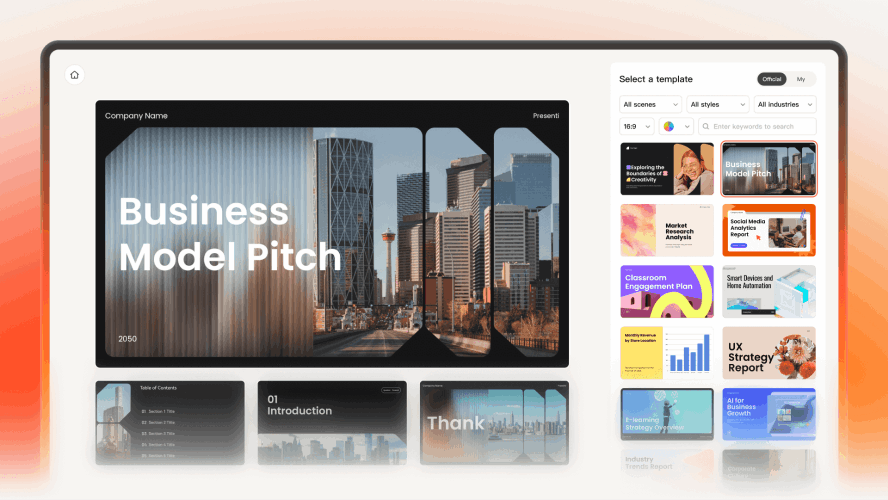
If you need a tool that bridges the gap between raw ideas and polished aesthetics, Presenti is the frontrunner. Unlike basic tools that just generate text, Presenti uses its "AI Beautify" engine to ensure your visual choices align with the emotional goal of your speech.
- Contextual Intelligence: Choose a palette for the audience, subject, and brand. Review the suggested theme with your actual charts and labels before applying it throughout the deck.
- The Cure for "Slide Drift": Use approved brand colors consistently across titles, charts, and accents. Check any imported objects or new slides for exceptions.
- Data-Driven Aesthetics: Use a limited palette and check contrast between text, chart marks, and backgrounds. An AI-generated palette still needs review.
2. Gamma: Master of Atmosphere and "Mood"
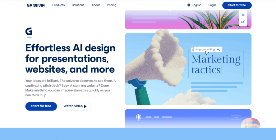
Gamma has taken the presentation world by storm because it doesn't just create slides; it creates "sites." Its approach to color psychology in presentations is centered around the concept of "Atmosphere."
When you use Gamma, you aren't just choosing a template; you're choosing a mood. Its color-matched presentation ai offers a "one-click restyle" feature that is shockingly intuitive. If your presentation feels too aggressive, you can swap the entire theme to a "Pastel" or "Natural" palette in a second. The AI adjusts the background, text, and accent colors simultaneously to ensure that the psychological impact remains cohesive. It’s perfect for creators who want their decks to feel modern, airy, and visually stimulating without being overwhelming.
3. Beautiful.ai: The Guardrails for Perfectionists
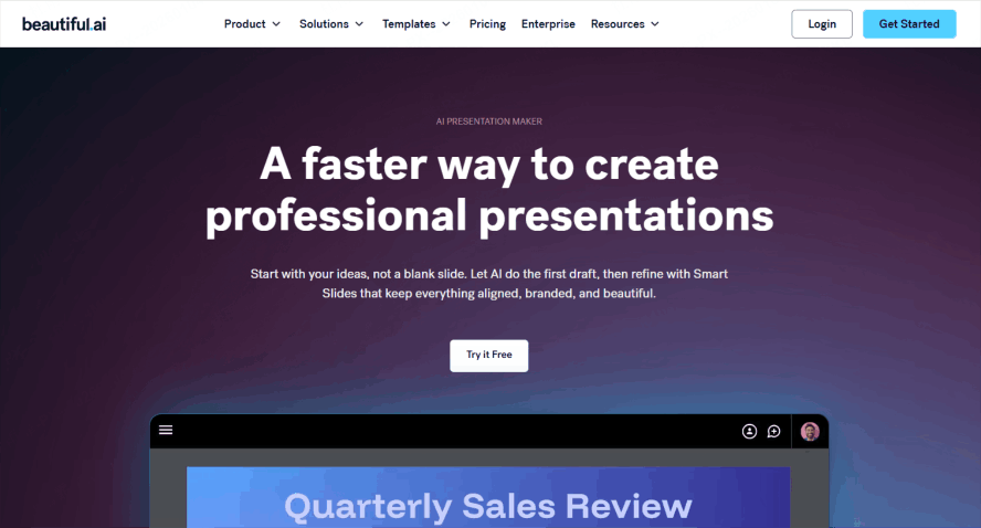
If you are someone who tends to over-edit and end up with a visual mess, Beautiful.ai is your best friend. This tool is built on a foundation of strict design rules. It’s perhaps the most disciplined intelligent color scheme tool on the market.
Instead of manual color selection, Beautiful.ai offers a selection of professional palettes. Once a primary color is chosen, the software coordinates secondary shades to ensure visual harmony. Inspect the selected palette and final slides for contrast and legibility. This allows teams to maintain a uniform brand identity across all decks, ensuring that the visual presentation remains consistent throughout the organization.
4. Decktopus: The Goal-Oriented Color Strategist
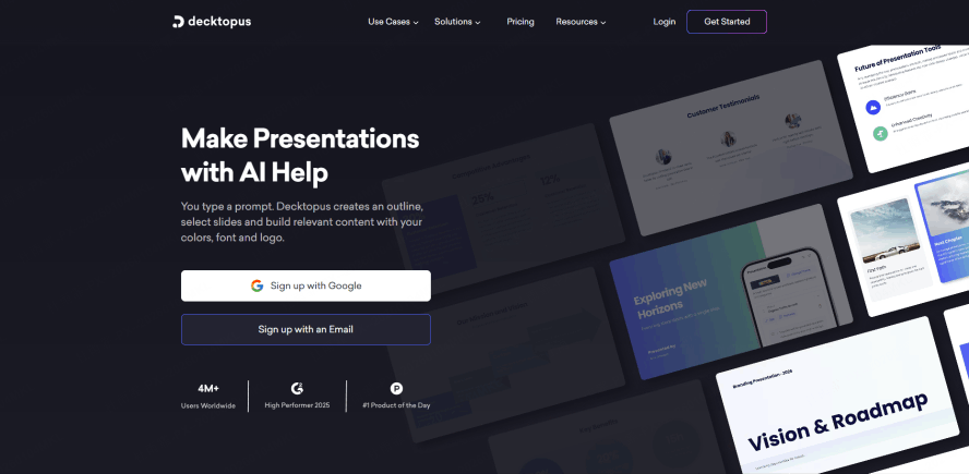
Decktopus takes a unique approach by asking you a series of questions before it even opens the canvas. Who is your audience? What is the goal of this presentation? This "Audience-First" logic makes it a fantastic brand-aligned slides generator.
Use the audience and purpose in your brief, then inspect the suggested theme. Warm or cool colors may suit the subject, but there is no reliable rule that an “inspiring” presentation must be orange or an “informative” one blue.
5. Canva Magic Design: From Inspiration to Palette
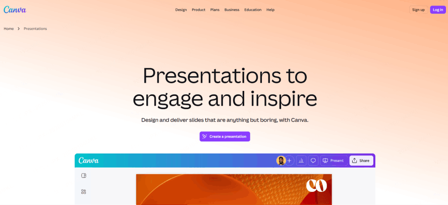
Canva has integrated artificial intelligence to automate significant portions of the design process. Its "Magic Design" function is useful for those who rely on visual communication. When a user provides a core image, the system analyzes the colors and composition to build a corresponding presentation. For example, a single product photo can be used to set the visual theme for an entire deck, ensuring that the final output remains aligned with the original asset.
A product image can provide a starting palette. Check the chosen colors against approved brand values and add contrast where image-derived colors would make text or charts difficult to read.
6. Microsoft Copilot: The Enterprise Authority
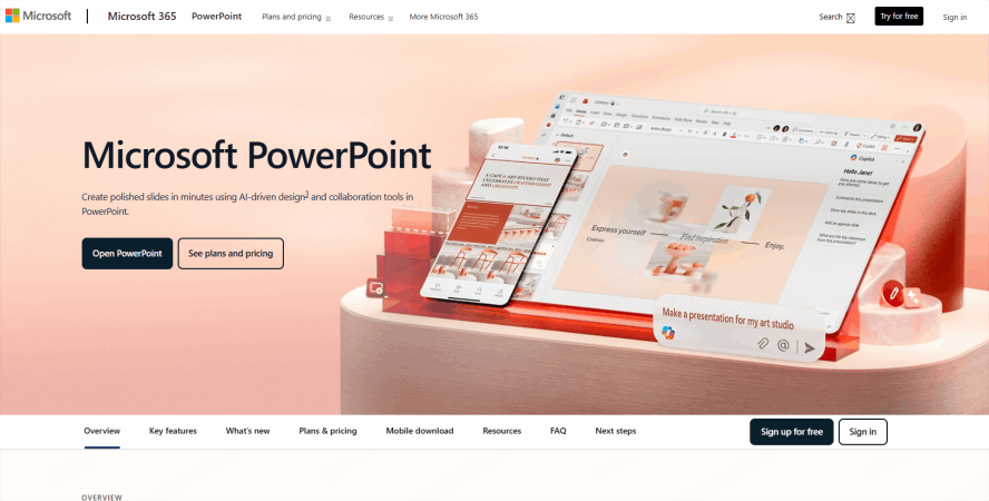
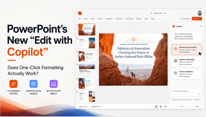
For those living in the Microsoft 365 ecosystem, Copilot in PowerPoint is bringing color psychology in presentations to the corporate mainstream. Copilot’s strength lies in its ability to scan your organization’s existing assets.
If your company has spent millions on branding, you can’t afford to go rogue with your colors. Copilot acts as an intelligent color scheme tool that respects your corporate identity. It can take a boring, text-heavy Word document and turn it into a PowerPoint deck that uses your company’s "Power Blue" or "Success Green" in all the right places. It’s about maintaining authority and continuity—the psychological pillars of corporate communication.
The "Cheat Sheet" of Color Psychology in Presentations
Even with a color-matched presentation ai doing the heavy lifting, it helps to know the "Why" behind the "What." The following are common design associations, not universal psychological effects or rules implemented by every AI tool:
- Blue (Stability and Professionalism): Blue is associated with reliability and logic. It is the standard for corporate communication, such as board meetings and financial reports, because it promotes a calm and focused environment.
- Red (Urgency and Emphasis): Red signals importance and physical energy. It is effective for highlighting critical problems or call-to-action slides, though it is generally used as an accent color to avoid visual fatigue or perceived aggression.
- Green (Growth and Sustainability): Green represents both environmental health and positive fiscal trajectories. It is the primary choice for sustainability initiatives, environmental technology presentations, and reporting on increased profit margins.
- Yellow and Orange (Warmth and Emphasis): These shades are used to increase viewer engagement and suggest a creative, approachable atmosphere. They are frequently applied in internal culture presentations or brainstorming sessions to encourage participation.
- Purple (Premium Positioning and Innovation): Purple is historically associated with luxury and intellectual depth. This palette is suitable for high-end branding or presentations focusing on long-term visionary concepts and sophisticated technology.
- Black and Dark Gray (Authority and Minimalism): These tones convey formality and technical precision. They provide a high-contrast foundation for luxury product reveals or technology launches that prioritize a minimalist, sophisticated aesthetic.
Automated Implementation of Color Scheme
Advanced design software manages the distribution and ratio of these colors to ensure visual clarity. For example, a presentation may utilize a primary blue palette to establish credibility while applying red specifically to action buttons to direct the audience's attention. By using automated tools, professionals can ensure that these color combinations are applied consistently across all slides, maintaining a standardized visual identity that supports the specific objectives of the content.
Conclusion
The era of struggling with hex codes and "clashing" slides is officially over. Understanding color psychology in presentations is no longer a requirement for making a great impression, instead, the requirement is choosing the right partner. Whether you use Presenti to polish your corporate pitch or Gamma to create a stunning visual journey, a consistent palette can help the audience follow your visual hierarchy.
By leveraging a color-matched presentation ai and a brand-aligned slides generator, you free up your mental energy to focus on what really matters: your story. Don't let a bad color choice kill a great idea. Pick an AI tool that gets the psychology right, and let your message shine in its best light.