A data quality report presentation should tell people whether a dataset is fit for a particular job, which problems could change the result, and what needs to happen before they use it. Show the rule and denominator beside each metric. A single “98% quality” score can hide the very issue that would make the planned activity fail.
This guide builds a report from 300 fictional contact records. It shows how missing values, invalid formats, repeated identifiers, and stale verification dates answer different questions. Once the checks are complete, use Presenti to turn the reviewed findings into an editable presentation. Supply the calculations and their meaning as text; the slide draft does not validate the underlying database.

Start with the job the data must support
“Is our contact data good?” is too broad for a useful meeting. In this example, an account team wants to send a service-update email to the relevant operational contact for each customer account. It needs an address that is present and usable, a contact who still has the intended role, and a way to avoid duplicate messages.
That purpose determines the report. A complete postal address might matter to a shipment but not to this email task. A correctly formatted email address may still belong to someone who left the company. Decide which checks support the intended use before choosing the chart colors.
The Government Data Quality Framework treats quality as fitness for purpose and distinguishes dimensions including completeness, uniqueness, consistency, timeliness, validity, and accuracy. Those dimensions help organize questions; they do not provide a universal passing score for every dataset.
Open the deck with a short scope statement: “Review of the 300-row operational-contact extract for the proposed service update. Checks refer to this saved snapshot. The report assesses contact usability; it does not authorize sending the message.” The last distinction matters because communication approval and data quality are separate decisions.
Show the rule and denominator beside each result
Assume the fictional extract has one intended operational-contact row per account, identified by account ID. The checks below apply to the same 300 raw rows. Their results are invented for explanation, not measured Presenti or customer performance.
| Check | Result in this snapshot | What it establishes |
|---|---|---|
| Email present | 294 of 300 rows contain a nonblank email field: 98%. | Six rows lack an address. A filled field is not proof that the address works. |
| Email format | 12 of the 294 populated fields fail the agreed format rule; 282 pass. | 282 of all 300 rows, or 94%, have a populated address that passes this rule. |
| Account-ID uniqueness | Four account IDs each occur twice; the other 292 rows have distinct IDs. | Eight rows belong to duplicate-key pairs. There are 296 distinct account IDs, not 300 accounts. |
| Contact verification date | 240 rows were checked within the example’s 90-day window; 42 were checked earlier; 18 have no verification date. | 60 rows do not have evidence of a recent check. That does not prove their contacts are wrong. |
The format check has two legitimate denominators. Among populated fields, 282 ÷ 294 is about 95.9%. Across the full extract, 282 ÷ 300 is 94%. Use the latter when explaining how much of the raw list has both a populated address and an acceptable format; label the former if discussing only the format of supplied addresses.
Make the uniqueness rule equally explicit. Repeated account IDs are a problem here because the agreed design allows one operational-contact row per account. In a different table that intentionally stores several contacts per account, repeated account IDs might be correct. A test that ignores the table’s grain can misclassify valid data as duplication.
The 90-day window is an assumption chosen for this example, not a legal rule or an industry standard. The data owner should set a window appropriate to the task and how quickly contacts change. Keep “checked earlier” separate from “no check date” so the audience can see what is known.
Do not add overlapping issues into a fake total
The six blank addresses and twelve malformed populated addresses are disjoint by definition, so 18 rows fail at least one of those two email checks. That arithmetic is safe. The duplicate-key rows and older verification dates may overlap with either group.
Adding 6 + 12 + 8 + 60 would produce 86 issue occurrences, not necessarily 86 different affected rows. It would also mix eight rows involved in duplicate pairs with counts based on individual field checks. You cannot subtract that sum from 300 and call the remainder “clean contacts.”
Keep a row-level issue list behind the deck, using a stable row reference and a separate flag for each test. If the meeting needs a count of rows with any issue, take the union of those flagged row references. If it needs affected accounts, group by account ID and explain how conflicting duplicate rows are treated. These are different quantities.
A useful headline is therefore: “18 rows need an email correction; duplicate and contact-role checks still affect send readiness.” “Our contact list is 94% accurate” would go beyond the evidence. The 94% result measures presence and format, not deliverability, current responsibility, or permission to communicate.
Turn the issues into a prioritized request
Connect each result to the planned activity. A missing email field blocks that row from the proposed email list. An unresolved repeated account ID could produce duplicate or conflicting contact selection. A contact last verified more than 90 days ago needs investigation under this example’s policy; it is not automatically an invalid contact.
| Work to resolve | Responsible role in the example | What counts as a resolved record |
|---|---|---|
| Six missing and twelve malformed addresses | Account-data owner, with the relevant account contacts | Corrected address obtained through the approved source, or an explicit decision to exclude the row from this use. |
| Four repeated account-ID pairs | CRM data steward | The intended contact record is determined from the source system; conflicting fields and the reason for keeping a record are documented. |
| 42 older checks and 18 missing check dates | Account team | The operational-contact role is reconfirmed, or the account is routed for follow-up under the agreed rule. |
Do not delete a repeated row merely because it is older. One row might have the correct email while the other has the current contact role. Resolve the conflict against the maintained source, and correct that source where appropriate. Cleaning only the exported presentation workbook lets the same problem return next time.
At the meeting, ask the data owner to agree the correction work and the communication owner to agree the release condition. A partial list may be usable if the organization explicitly approves its scope and exclusions; this report does not make that decision for them. Put the excluded or unresolved population beside the proposed action so it cannot disappear behind a green summary box.
Build five slides without a misleading quality score
Use the first slide for the intended use and decision: “Confirm the operational-contact list before the service update.” State the snapshot and the rule that one row should represent one account’s operational contact. The audience should know what the dataset is supposed to do before seeing a percentage.
The second slide can show three prominent figures: 98% email presence, 94% presence plus format pass, and 80% with a verification date inside the example’s window. Keep the counts directly below them: 294/300, 282/300, and 240/300. Use the full labels, not three unexplained gauges.
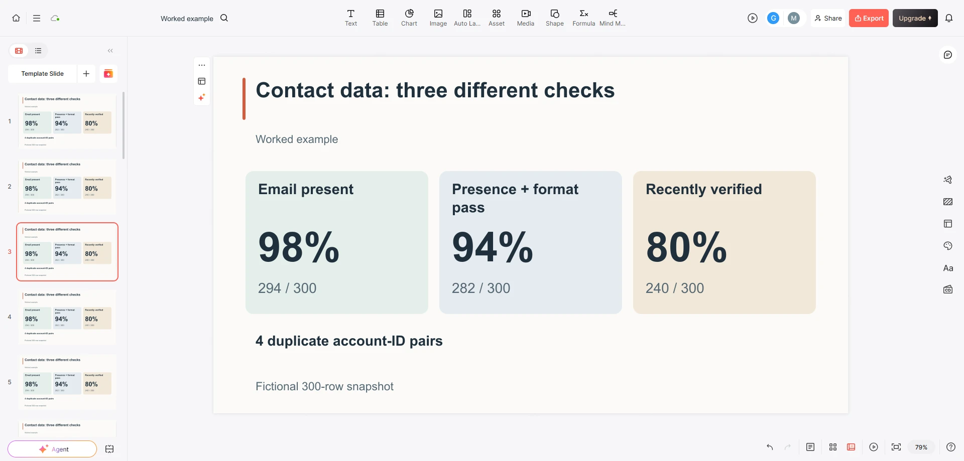
The third slide explains the four repeated account-ID pairs and the limits of the checks. The fourth shows the correction work by role. The fifth records the decision requested, unresolved scope, and when a new snapshot will be reviewed. Keep the row-level issue list outside the main deck, with a controlled reference for people who need to resolve individual records.
Do not average 98%, 94%, and 80% to create an overall score of 90.7%. The checks have different purposes and overlap; a high average would not make the missing addresses available. If your organization already uses a composite indicator, show its weighting and purpose separately and keep the task-blocking counts visible.
In the brief for a slide draft, write: “Use the 300-row fictional snapshot exactly. Keep presence, format, recency, and duplicate identifiers separate. Label all denominators. Do not call a format pass accurate or deliverable. Do not add issue counts to estimate affected people. Show the requested correction work without inventing a completed fix.” That gives the draft a useful structure while leaving judgment with the data owner.
Compare the next report on the same basis
A follow-up percentage can improve because records were corrected, because difficult rows were excluded, or because the population changed. Those are not interchangeable improvements. Keep the snapshot date, selection rule, test definition, and treatment of exclusions with each report.
If the four repeated pairs are confirmed as genuine duplicates and reduced to one row each, the next extract would have 296 rows before any other changes. Recalculate every rate on that new population; do not carry forward 282/300 as though the rows were unchanged. You also need to know which retained and removed rows had format or recency issues before claiming the new result.
For progress on the original problems, track the original issue references separately: corrected, excluded for this use, still unresolved, or no longer applicable—with a reason. For the current list’s usability, run the same rules on the new snapshot. Together, those views distinguish remediation work from a changing denominator.
The next presentation should therefore say what changed in the data and what changed in its intended use. A cleaner slide is useful only when the audience can tell whether the underlying contact list is now suitable for the job they need to do.