When buyers compare several products, a chart can put the relevant differences in one place. Use comparable criteria and visible sources so the audience can judge the tradeoffs against its own needs.
For sales professionals, product marketers, and business development teams building competitive slides, the chart type you choose is not a design decision. It’s a persuasion decision. The wrong format buries the advantage. The right one makes it impossible to miss.
This guide explains when to use five comparison formats, how to avoid misleading scales and categories, and how to develop a slide draft from reviewed competitive information.
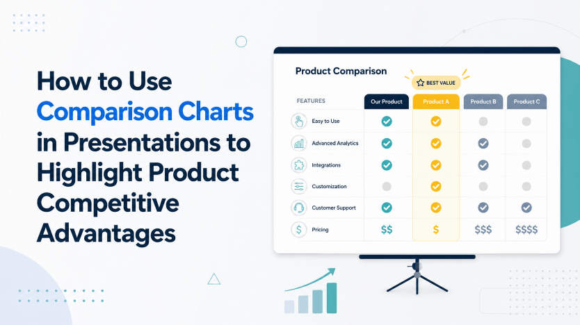
Why Comparison Charts Help Buyers Compare
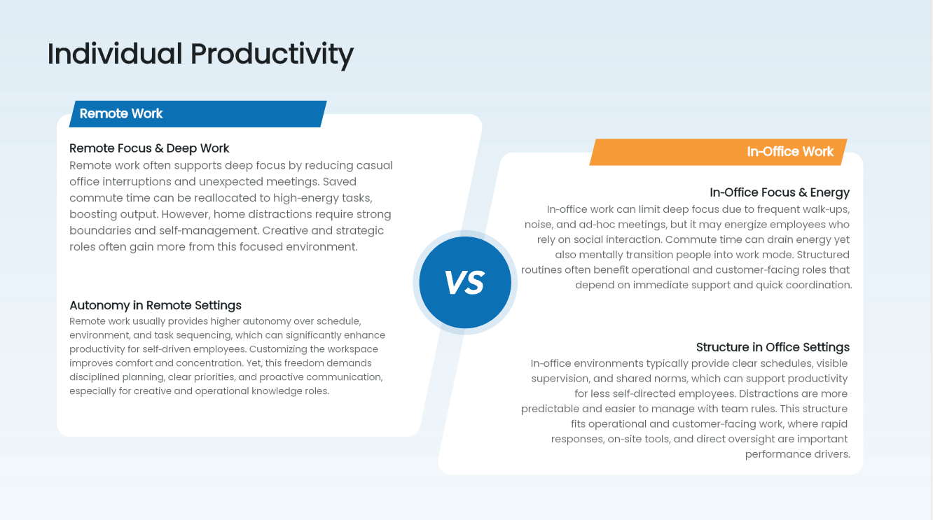
A feature comparison table lets buyers see several differences at once. Use the same criteria for every product, explain what each checkmark means, and include relevant plan limits. The buyer can then weigh those differences against their own priorities.
The Nielsen Norman Group’s guidance on comparison tables explains how they help people compare multiple attributes at a glance. In a pitch meeting where you have twenty minutes, the difference between a dense slide and a clean comparison chart isn’t aesthetic — it’s whether the key message lands before the conversation moves on.
Comparison charts work for three specific reasons:
- They reduce cognitive load. The audience doesn’t have to hold information in their head and compare mentally. The chart does the comparison for them.
- They anchor the evaluation frame. The categories you choose to compare become the criteria by which your product is judged. Choosing them intentionally gives you control of the conversation.
- They make magnitude visible. A number in a sentence is abstract. A bar that’s twice as long as a competitor’s bar is physical. Use consistent scales so the visual difference represents the data accurately.
Choose the format for the question being answered: a feature table shows availability, while a bar chart compares measured quantities. A poor match can obscure an otherwise useful comparison.
Types of Comparison Charts and When to Use Each
Quick Reference: A comparison chart is any visual format that places two or more data points, products, or entities side by side to highlight differences, similarities, or relative performance. The most common types for competitive presentations are feature comparison tables, horizontal bar graphs, Venn diagrams, radar charts, and vs. tables.
Chart Type | Best Use Case | What It Communicates
| Chart Type | Best Use Case | What It Communicates |
|---|---|---|
| Feature Comparison Table | Comparing which features each competitor includes | Binary presence/absence of capabilities — clear wins and gaps |
| Horizontal Bar Graph | Comparing performance metrics, scores, or quantities | Relative magnitude — how much better one option is on a measurable dimension |
| Venn Diagram | Showing shared and unique capabilities across two or three options | Overlap and differentiation — where you alone play, where all players overlap |
| Radar Chart | Comparing multiple dimensions simultaneously | Multi-criteria profile — overall shape of strengths vs. competitors |
| vs. Table | Narrative comparison of two specific products or vendors | Structured text-based contrast — useful when features need explanation, not just checkmarks |
Each format earns its place in a competitive presentation — but only when it matches the type of advantage you’re trying to communicate.
Feature Comparison Table: The Workhorse of Competitive Slides
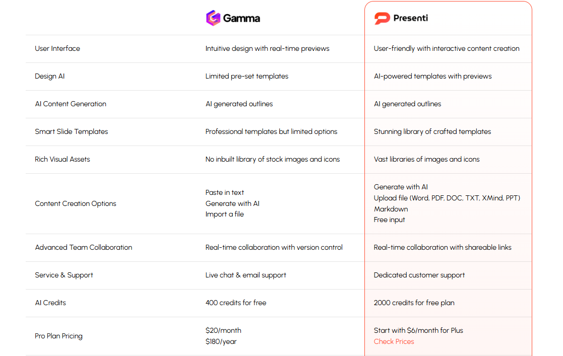
The feature comparison table is the most widely used format in competitive presentations for a reason: it delivers several attributes in a compact, aligned layout. Rows are features. Columns are products. Checkmarks, crosses, and tier indicators do the work.
The feature table is ideal when your competitive advantage is breadth — you offer capabilities your competitors don’t. A SaaS company showing that only their platform includes automated reporting, API access, and SSO single sign-on in the base tier doesn’t need a paragraph to make that argument. A table with three clean checkmarks versus three empty cells does it in a glance.
Design rule: Keep the table to 8–12 rows maximum. More than that and the eye stops scanning — it gives up. If you have twenty features to cover, break them into two tables organized by category (Core Features, Enterprise Features, Integration Features).
Horizontal Bar Graph: When Magnitude Matters
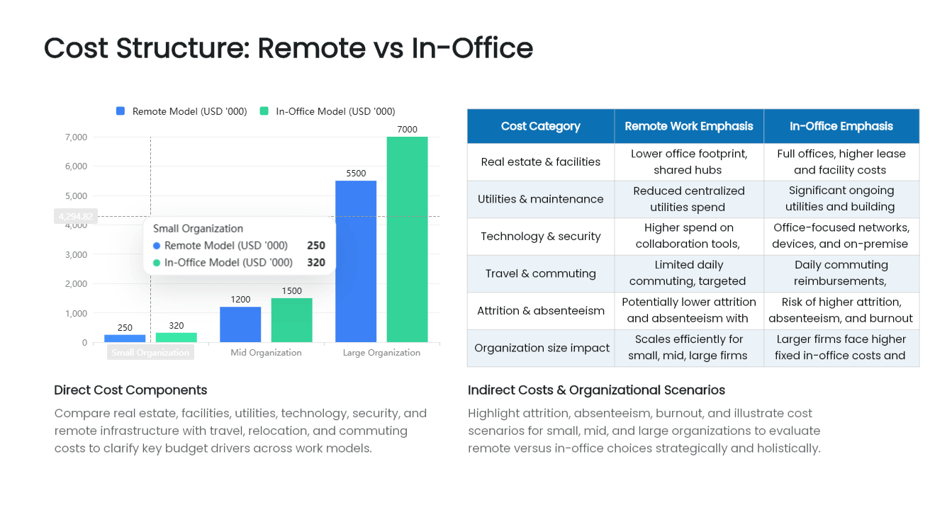
A horizontal bar graph is the right tool when the advantage you’re communicating is quantitative — a score, a speed, a percentage, a customer satisfaction rating. The horizontal orientation works better than vertical for comparison contexts because it allows longer category labels to sit cleanly to the left without rotation.
Use the horizontal bar graph when your product outperforms competitors on a measurable dimension that buyers care about: load speed, NPS score, implementation time, error rate reduction, or pricing per user. The visual length of the bar makes the advantage tangible in a way that a number alone cannot.
Hypothetical example: Suppose four comparable implementations took 14, 42, 38, and 51 days. A horizontal bar chart can show the difference. Label the measure, period, and sample; these illustrative numbers are not evidence of any vendor’s performance.
Design rule: Always start your axis at zero. Truncated axes are one of the most common (and most noticeable) forms of visual manipulation in competitive charts. If your advantage is real, it doesn’t need a distorted axis to look compelling. Starting at zero keeps the comparison credible — and credibility is a long-term asset that no short-term visual trick is worth sacrificing.
Venn Diagram Template: Showing Where You Uniquely Play
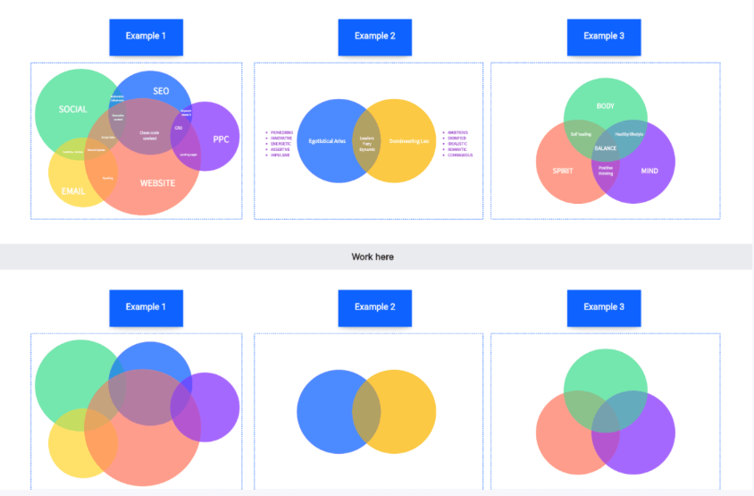
A Venn diagram template is underused in competitive presentations, but it’s remarkably effective for a specific scenario: when your product serves a unique intersection of needs that no competitor fully addresses.
In a two-circle Venn diagram, each circle represents a set of capabilities and the overlap contains capabilities shared by both. A capability unique to one set belongs outside the overlap but inside its circle. If the circles instead represent customer needs, their intersection means customers need both; label that distinction explicitly.
Hypothetical example: Circles labeled “endpoint protection” and “identity management” can show the intersection of two needs. A product that addresses both may be positioned there, but the diagram alone does not establish that competitors cannot do the same.
The Venn diagram template is particularly useful in strategic sales presentations and investor materials where you need to communicate market positioning quickly, without a feature-by-feature breakdown. It communicates the “why us” at a higher level than a comparison table does.
Design rule: Limit Venn diagrams to two or three circles. Four-way Venn diagrams become topologically complex and visually unreadable at presentation scale. If you have more than three entities to compare, switch to a different chart type.
Radar Chart: Multi-Dimensional Competitive Profiling
A radar chart plots several dimensions on axes radiating from a center. Use clearly defined, comparable scales and a consistent direction for better performance. A larger polygon is not automatically a better overall offering: axis order, scaling, and the importance of each criterion affect its appearance.
Radar charts work well when your advantage is breadth across multiple dimensions simultaneously — when you’re not just better on one metric but strong across several that competitors trade off against each other. Software platforms, consulting firms, and service providers often find radar charts useful for showing their balanced strength versus specialists who excel in one area but lag in others.
Design rule: Include no more than six to eight axes. More than that and the chart becomes unreadable. Choose dimensions that your target buyer actually uses to evaluate options — not dimensions you invented because they make you look good.
vs. Table: Narrative Comparison for Complex Decisions
The vs. table (or “challenger vs. incumbent” table) is a two-column structured comparison that uses short-form text instead of checkmarks. It’s most useful when features require context — when “yes/no” isn’t sufficient to communicate the quality difference between what you offer and what a competitor offers.
Hypothetical example: Two products may both offer API access but differ in documented endpoints, rate limits, and support. A text comparison can explain those differences. Use equivalent measures and cite the actual documentation instead of combining unrelated integration counts and uptime figures.
Use the vs. table for high-stakes proposals and custom-built competitive slide decks where the decision-maker needs depth, not just a scorecard.
Best Practices for Designing Ethical, Credible Comparison Charts
The most effective competitive charts are not the ones that exaggerate your advantages — they’re the ones that are credible enough to survive scrutiny. Buyers in 2026 are sophisticated. They’ve seen manipulative comparison charts before. A chart that’s transparently self-serving loses its persuasive power and damages your credibility with the exact audience you need to convince.
Follow these principles to keep your comparison charts compelling and trustworthy:
- Choose your comparison dimensions honestly. Include dimensions where competitors are competitive too, not only the ones where you win. A chart that shows only your strengths looks cherry-picked — because it is.
- Source your data. If you’re comparing NPS scores or market share figures, cite the source. Unsourced competitive claims invite skepticism.
- Use actual competitor capabilities, not straw-man versions. Misrepresenting a competitor’s feature set is a fast way to lose credibility with any prospect who knows the market.
- Don’t distort visual scales. Start axes at zero. Use consistent bar widths. Avoid 3D effects that distort comparative area sizes.
- Frame your advantages fairly. “Fastest implementation in this comparison” is a defensible claim if it’s true. “The best platform in the industry” is a claim that invites challenge and carries no persuasive weight.
Credibility, not cleverness, is what makes a comparison chart win deals over the long term. A buyer who trusts your competitive analysis trusts your product claims. A buyer who spots manipulation trusts nothing.
Building a Comparison Slide Draft with Presenti AI
Designing comparison charts manually — choosing the right format, applying consistent colors, aligning axes, maintaining visual hierarchy across a competitive slide deck — takes time that most sales professionals and product marketers simply don’t have before a pitch.
Presenti can help organize a first draft from your comparison notes. Decide which chart answers the buyer’s question before generating the slide.
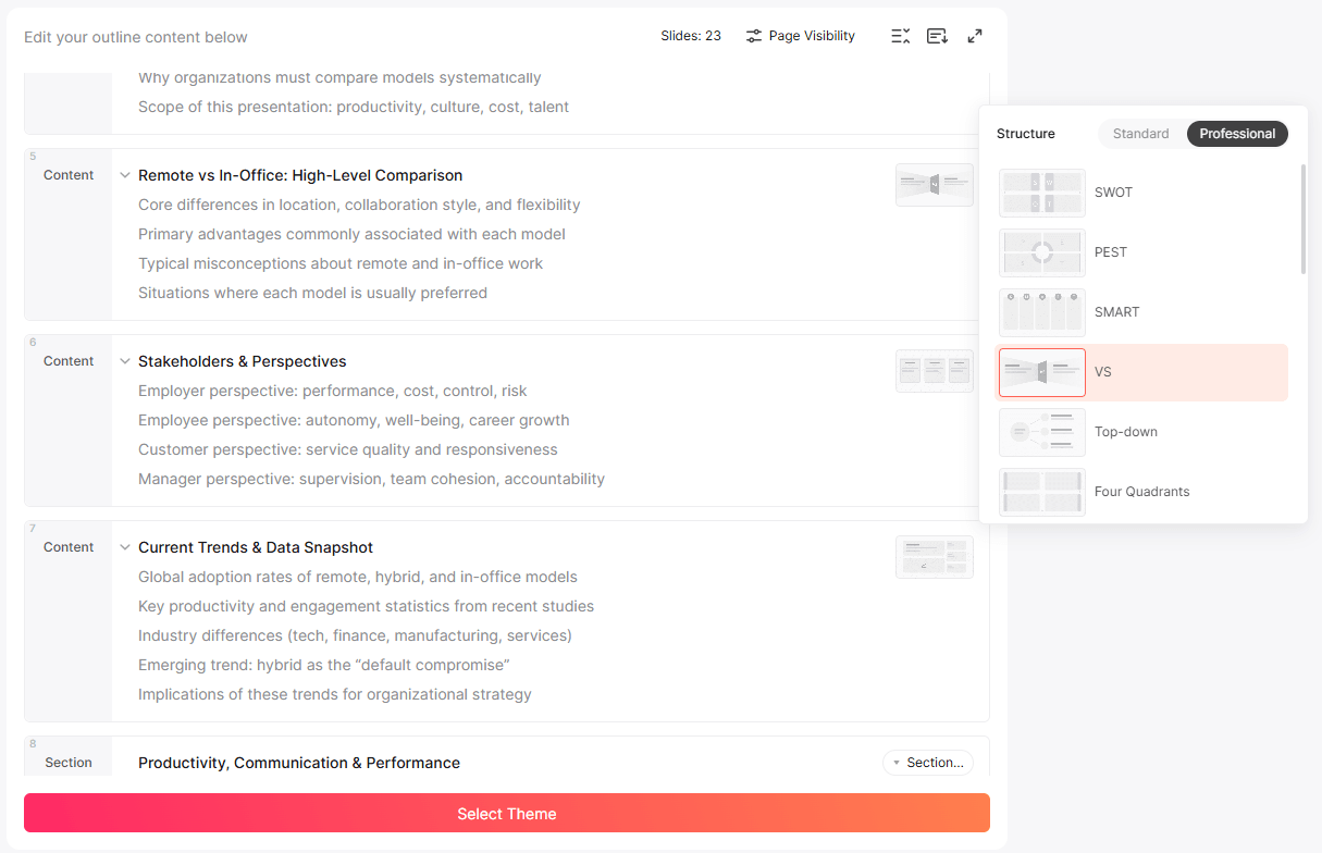
Provide the product names, criteria, values, units, plan tiers, and sources in a structured outline. Ask for a feature table or the specific chart type you need. Word/PDF/TXT import is a paid feature; Markdown/XMind import is listed on the free plan.
Check the generated chart against the source table: confirm the labels, axis scale, category order, and what any checkmarks mean. Change the chart type if it obscures the comparison.
The Presenti AI marketing template library includes competitive slide layouts built specifically for sales decks, product launches, and investor materials — all designed around the principle that the chart format should serve the argument, not the other way around.
Apply a theme suited to the rest of your presentation. Paid plans list editable PPTX export, but check the exported chart or diagram to see which parts remain native editable objects.
Conclusion: The Right Comparison Chart Changes the Conversation
Comparison charts are not decoration. They are the mechanism by which buyers see your competitive advantage clearly, quickly, and without the cognitive effort of doing the comparison themselves. Use a feature table when breadth matters. Use a horizontal bar graph when magnitude matters. Use a Venn diagram template when positioning matters. Use a radar chart when multi-dimensional balance is the story.
Design them credibly. Source your data. Frame your advantages honestly. The format should make the evidence and tradeoffs easier to assess.
Use the slide draft to refine the explanation. Keep the source notes close to the comparison and make the selection criteria clear enough for a reader to challenge or reproduce it.
Start building your competitive presentation with Presenti AI using the free features available in your account; check paid import and export requirements for the full workflow.