A presentation chart should answer one question before it adds any decoration. If the audience needs to compare categories, start with a bar chart. If the point is movement across time, start with a line chart. If the message is composition, stages, correlation, or multi-factor performance, choose the chart that makes that relationship easiest to read.
This guide shows how to choose chart types for presentations, how to prepare the data, and how to turn the decision into a readable slide. The same principles work in PowerPoint, Google Slides, and an editable Presenti draft.
1. Match the Chart to the Question
Start by writing the sentence your audience should be able to say after seeing the slide. The chart type follows from that sentence. A chart can be technically correct and still be the wrong choice if its visual structure suggests a relationship that the data does not contain.
| Question your slide must answer | Best starting point | Why it works | Watch out for |
|---|---|---|---|
| Which categories are larger or smaller? | Bar chart or horizontal bar chart | Bar length supports direct comparison; horizontal bars leave room for long labels. | Truncated baselines and too many categories. |
| How did one or more measures change over time? | Basic line or stacked line chart | The connected path makes direction and turning points easy to follow. | Connecting categories that have no meaningful order. |
| What makes up the total? | Pie or donut chart | Each segment is read as a share of a whole at a defined point. | Too many slices, similar colors, or totals that do not add up. |
| Do two numeric measures move together? | Scatter plot | Position on two axes reveals clusters, gaps, and possible relationships. | Calling correlation causation or hiding outliers. |
| Where do people or leads drop out of a process? | Funnel chart | The narrowing shape makes stage volume and drop-off visible. | Using unequal units or skipping a stage definition. |
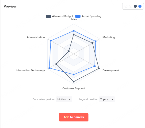
| How do several criteria compare for one or two subjects? | Radar chart | Multiple spokes show a profile across the same criteria. | Many subjects, inconsistent scales, or tiny label text. |
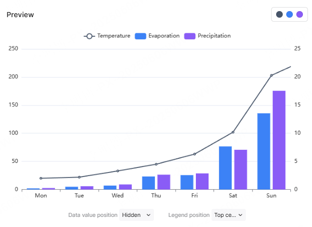
| How do volume and rate change together? | Line-and-bar combination chart | Bars and a line can carry two related measures when units and axes are explicit. | Dual-axis exaggeration and an unexplained legend. |
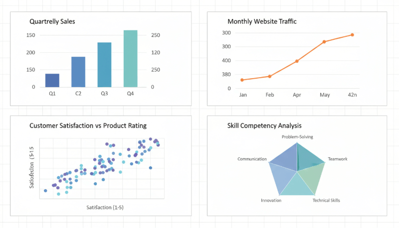
The table is a decision tool, not a rule that overrides context. A bar chart can show time periods when the audience needs to compare each period as a separate amount. A line chart can show several series when the audience needs to follow their direction. Choose the visual emphasis that matches the decision.
2. Chart Types Available in Presenti
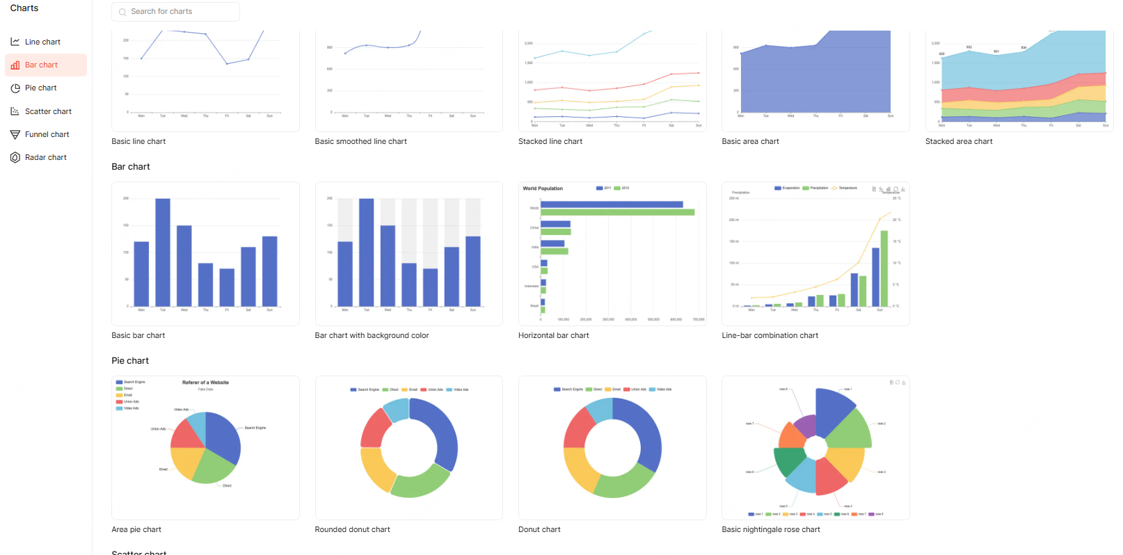
The current Presenti chart gallery supports several ways to express the relationships above. Treat these as editable starting points: the chart still needs a checked data source, a clear title, and a human review before it is shared.
Compare values with bars
Use a basic bar chart when the categories are independent. Use a horizontal bar chart when labels such as product names, regions, or customer segments need more room. If the same categories repeat across periods, sort them deliberately and keep the order consistent across slides.
Follow change with lines
Use a basic line chart for one or more ordered series. A stacked line chart shows cumulative values across a sequence; the upper lines are not the individual series values. Use ordinary lines when the audience needs to compare each series directly. Keep the time interval and unit visible.
Show a share or composition
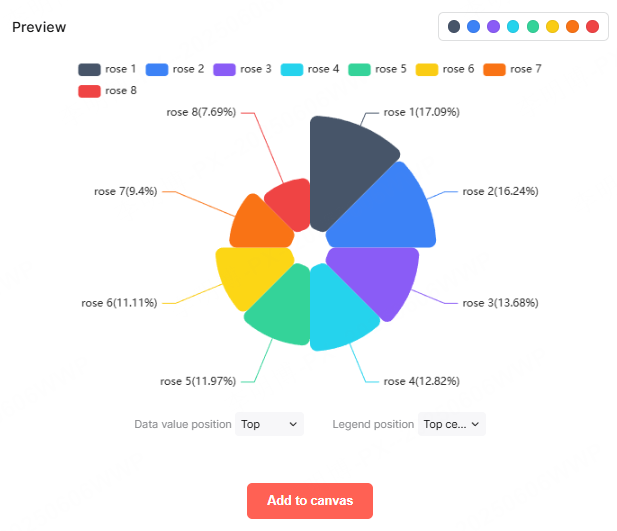
Use a pie or donut chart when the parts form a meaningful whole and the audience needs a quick snapshot. A nightingale rose chart compares values through radial segment areas and does not automatically represent shares of a whole. Check what its size encoding means before choosing it. If the audience must compare many categories exactly, use bars instead.
Show relationships with a scatter plot
Use a scatter plot when both axes are numeric and the audience needs to see distribution, clusters, or possible correlation. Add a short interpretation rather than implying that the chart proves why one variable changes another. For a deeper guide, see how to use an XY graph and scatter plot in a presentation.
Show stages with a funnel
Use a funnel when each row is a stage in the same process, such as visits to trials or qualified leads to closed deals. Name the stage, define the unit, and state the period so the narrowing shape does not become a decorative metaphor. The existing sales funnel presentation template is the related next step for a deck built around pipeline stages.
Compare multiple criteria with a radar chart
Use a radar chart for a small number of subjects measured on the same criteria and scale. It is useful for a profile or trade-off view, not for ranking dozens of items. Write the conclusion in the title or caption so the audience does not have to decode every spoke.
Combine bars and lines when the question needs both
A line-and-bar combination chart can pair a volume with a rate, such as units sold and conversion rate. Use it only when the two measures belong to the same decision. Label both axes, state the units, and explain which series carries the main conclusion.
3. Build the Chart in a Repeatable Workflow
Once the question and chart family are clear, the work becomes a short sequence of checks. The exact menu names vary by tool, but the reasoning stays the same.
Start with a one-sentence takeaway
Write the conclusion before formatting the chart. For example: “Organic search drove the increase in qualified leads from January through June.” This sentence tells you which measure needs visual emphasis and what the title should say.
Prepare a clean data table
Put the category or time sequence in the first column and each series in a separate column. Keep units consistent, name each series clearly, and remove subtotal rows that would be counted twice. If the source is a spreadsheet, keep the source file and checked date with the working deck.
Choose the chart and enter the data
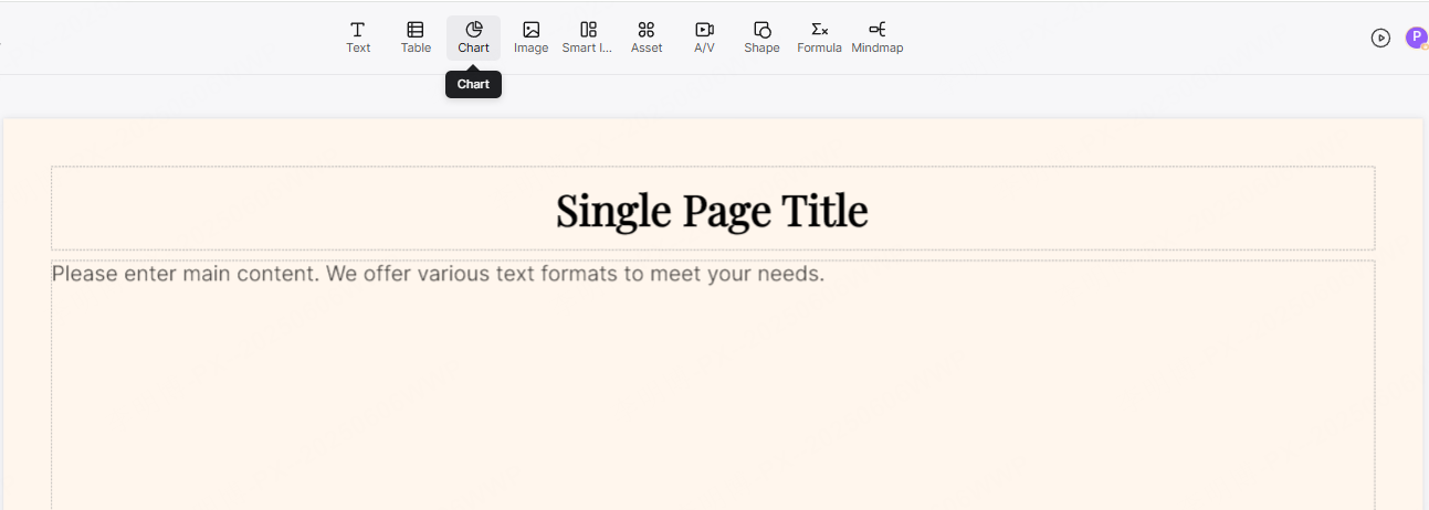
In PowerPoint, use Insert > Chart, choose the chart family, and replace the sample values in the worksheet. In Presenti, use the chart tool or a structured presentation brief to create an editable starting point, then compare the result with the source table.
Write the labels for a fast read
Use a conclusion-led title, direct labels where they reduce legend scanning, and an axis title or caption that states the unit and period. Keep the number of series and categories small enough to read at the final presentation size. A chart that requires a paragraph of explanation may need to be split across two slides.
Review the editable output
Check the values, totals, sort order, baseline, axis scales, legend, source note, and color contrast. Then review the full slide in the delivery environment. A draft can be visually coherent and still contain an incorrect value, an ambiguous label, or a chart type that answers a different question.
For the PowerPoint-specific menu sequence, use the Microsoft chart and graph instructions as the platform reference. The software operation is only one part of the workflow; the question, data, and final review remain yours.
4. See Why the Question Changes the Chart
Use one small dataset to test the choice instead of inventing a different example for every chart. Imagine a monthly marketing report with visits, qualified leads, conversion rate, and channel mix.
| If the slide asks... | Use... | Make the takeaway visible by... |
|---|---|---|
| Which acquisition channels produced the most visits? | Horizontal bar chart | Sorting channels by visits and placing the values next to the bars. |
| How did qualified leads change from January to June? | Basic line chart | Labeling the period, marking the turning point, and naming the source. |
| What share of leads came from each channel in June? | Donut or pie chart | Showing the total, limiting segments, and labeling the largest shares. |
| Did visits and qualified leads move together? | Scatter plot | Using numeric axes and describing the observed pattern without claiming causation. |
| Where did prospects leave the funnel? | Funnel chart | Showing the same unit at every stage and calling out the largest drop-off. |
| How did channel performance compare across five criteria? | Radar chart | Using one scale and naming the criteria so the profile is comparable. |
| How did lead volume change alongside conversion rate? | Line-and-bar combination | Labeling both units and explaining which measure drives the decision. |
These are different questions about the same business context. The correct chart is the one that makes the requested comparison easiest, not the one with the most visual effects.
5. Fix the Mistakes That Make Charts Hard to Read
- Starting with a chart type. Write the question first, then choose the visual structure.
- Using a line to connect unrelated categories. A line implies an ordered path; use bars when categories are independent.
- Cutting a bar chart's baseline. Bar length encodes magnitude, so a truncated baseline can exaggerate differences.
- Adding a second axis without a reason. Two scales can hide a mismatch in magnitude. Name both units and explain why the measures belong together.
- Using too many slices or spokes. Group only when the grouping is analytically honest; otherwise use bars or a table.
- Relying on color alone. Add labels, values, patterns, or annotations so the message survives grayscale and accessibility checks.
- Leaving the source and period unclear. Add the data source, checked date, unit, and any meaningful limitation.
- Trusting the draft without checking the numbers. Compare the final chart with the source table before presenting or exporting.
Microsoft's chart workflow also separates inserting a chart from replacing the sample data and formatting chart elements. That separation is useful in any tool: create the structure, verify the data, then refine the visual treatment.
6. Use Presenti as an Editable Starting Point

When the chart question and source data are ready, Presenti's AI presentation maker can help turn the brief into a structured, editable presentation draft. You can start with a topic, a supported document, or a URL, then review the outline and refine the slide content before sharing.
For a data-heavy deck, specify the audience, decision, reporting period, approved source, required chart type, units, and wording constraints in the brief. Use the AI PPT maker workflow to review the draft, then adjust the chart and surrounding layout in the workspace. Presenti is a drafting and editing step; it does not replace checking the source values, chart meaning, accessibility, or final PowerPoint/PDF rendering.
7. Put the Chart Choice into Practice
Choose a chart by the question your slide must answer. Use bars for category comparisons, lines for ordered change, pie or donut for a carefully bounded share, scatter for numeric relationships, funnels for stage drop-off, radar for a small multi-factor profile, and a bar-and-line combination only when the two measures belong to the same decision.
Then prepare the data, write the takeaway, check the labels and units, and review the final slide at presentation size. Presenti can help you move from a brief or source document to an editable slide draft, but the final responsibility for chart accuracy and audience understanding remains with the presenter.