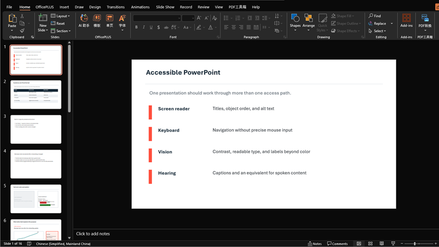
An accessible PowerPoint presentation gives people more than one way to understand and navigate the content. Use meaningful slide titles, built-in layouts, logical reading order, sufficient contrast, useful alternative text, descriptive links, structured tables, captions, and a tested final file.
PowerPoint's Accessibility Checker helps find many common problems, but it is not a guarantee. Accessibility also depends on the clarity of the content, the delivery method, the exported format, and testing by people using the relevant assistive technologies.
What Makes a PowerPoint Presentation Accessible?
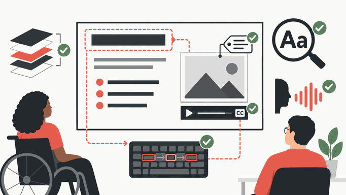
An accessible deck lets people identify each slide, follow its content in a sensible sequence, understand meaningful visuals without relying only on sight, perceive text and data with sufficient contrast, operate interactive elements without a mouse, and access spoken information through captions or an equivalent alternative.
These needs overlap with the Web Content Accessibility Guidelines principles of perceivable, operable, understandable, and robust content. A PPTX is not a web page, so use the relevant Microsoft guidance and test the exact deliverable rather than treating a WCAG checklist as automatic PowerPoint conformance.
Step 1: Define the Audience and Final Format
Find out how the audience will receive the presentation: live in a room, on a call, as a PPTX, as a PDF, or as a recording. Ask the organizer about known access needs and how participants can request accommodations.
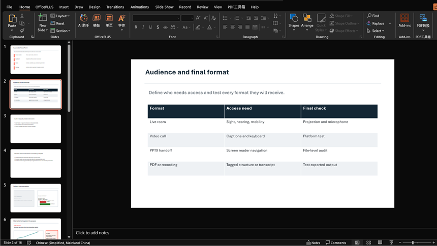
Choose the checks that apply to each format and agree who will do them. An accessible PPTX does not automatically produce an accessible PDF or recording; test each version you plan to share.
Step 2: Start with Built-In Layouts
Start with an accessible organizational template or PowerPoint’s built-in slide layouts. Use the title and content placeholders instead of drawing every text box manually. If you need a custom template, inspect its layouts before building the whole deck.
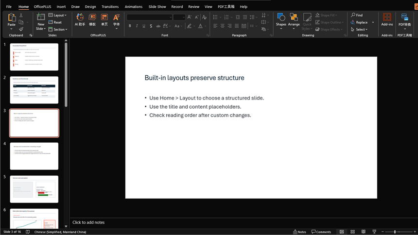
A text box positioned at the top of a slide may look like a title without being recognized as one. Use the title placeholder, and check the reading order after moving or adding objects.
Step 3: Give Every Slide a Unique, Meaningful Title
Give each slide a unique title in its title placeholder. A title such as “Renewals increased after onboarding changed” tells readers more than “Results.” If the design needs no visible title, use PowerPoint’s supported hidden or off-slide title option so assistive technology can still find it.
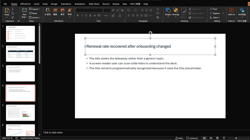
Run Review > Check Accessibility to find missing or duplicate titles. Then read the titles in sequence: they should help someone understand the deck and find the section they need.
Step 4: Make Text and Color Perceivable
Use readable type, clear contrast, and enough space between elements. Where color indicates a status or category, add words, patterns, or symbols as well. For example, label a red status indicator “Delayed” rather than expecting everyone to recognize the color.
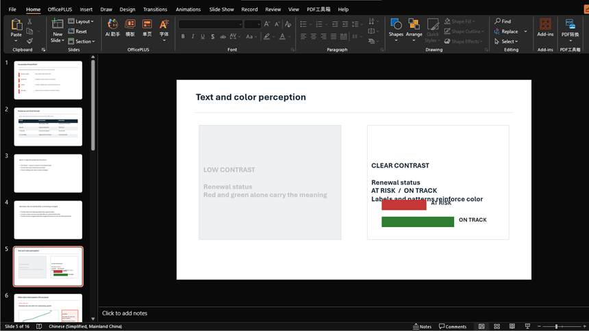
Check contrast with a contrast tool and preview the slides at the size the audience will see. A grayscale view can expose color-only distinctions, but it does not replace contrast measurement or testing on the intended display.
Step 5: Add Useful Alternative Text
For each visual, decide whether it communicates information or is only decorative. Open the Alt Text pane for an informative image and describe what it contributes in this slide’s context. Mark purely decorative objects as decorative where PowerPoint supports it.
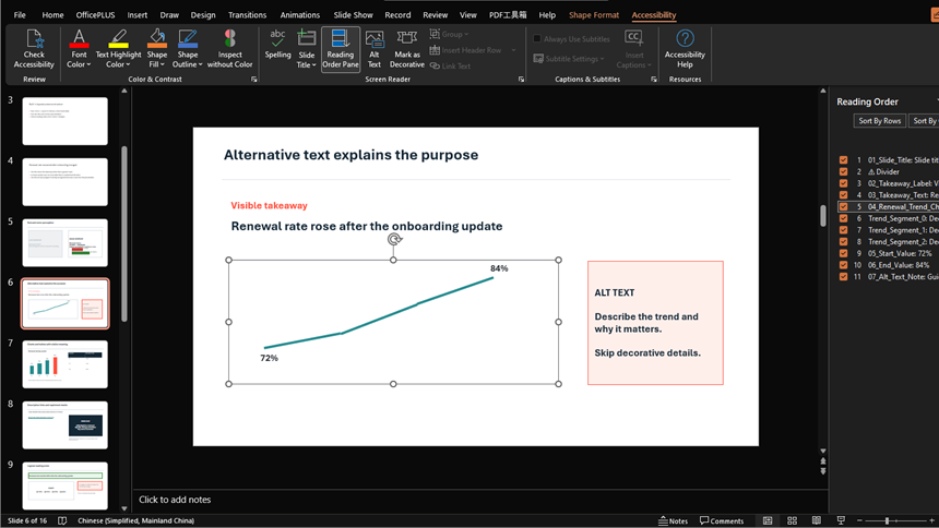
For a chart, describe the main relationship or trend and provide detailed values in accessible text or a table when needed. Read the description with the surrounding slide text: it should add missing meaning without repeating every word. A file name or a description of the image’s colors is rarely enough.
Step 6: Make Charts and Tables Understandable
Give charts a clear takeaway and label important values directly. For tables, use a simple structure and identify the header row in the table design options. Avoid merged cells and tables used only to position content.
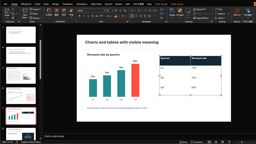
If a chart or table needs more detail than the slide can hold, provide an accessible companion document. Try explaining the chart without pointing at it, and test essential tables with assistive technology to make sure their headers and values can be understood.
Step 7: Use Descriptive Links and Captioned Media
Use link text that names the destination, such as “Read the Q3 retention analysis,” instead of “Click here.” Add accurate captions to video and provide the appropriate text or audio alternative for information that would otherwise be missed.
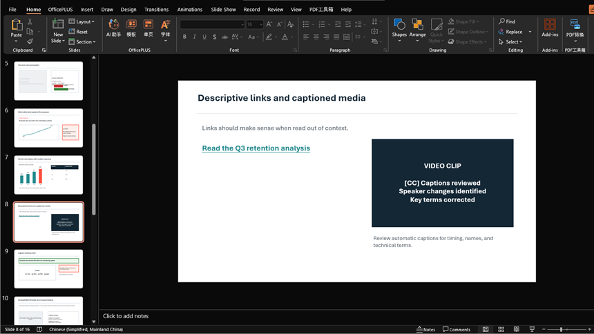
Open links and play media from the final delivery copy. Review automatic captions for names, terminology, speaker changes, and timing. Avoid essential information that flashes briefly or can only be reached by precise timing.
Step 8: Check the Reading Order
In supported PowerPoint versions, open Review > Check Accessibility > Reading Order Pane. Items in this pane are read from top to bottom. Put the title first, then arrange the content in the sequence that makes sense for the slide.
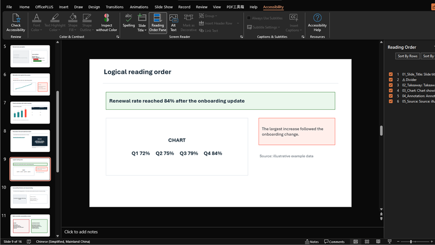
Check the result with a screen reader or keyboard. Pay particular attention to grouped objects, hidden items, and repeated decoration, which can interrupt the explanation even when the visual layout looks correct.
Step 9: Run the Checker and Test the Deliverable
Run Review > Check Accessibility and work through the findings. Then manually test navigation, titles, reading order, alt text, links, captions, and contrast. If you need a PDF or recording, inspect that output separately after export.
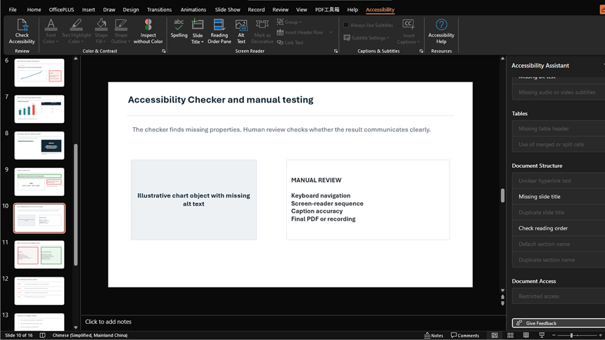
For an important presentation, involve an accessibility specialist or a representative user where possible. The checker can find a missing description; it cannot judge whether that description explains the visual clearly.
Worked Before-and-After Example
Consider a quarterly update slide with the title "Performance," a red and green line chart, a screenshot of customer feedback, and a "Click here" link.
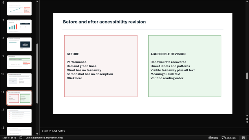
| Before | Accessible revision | How to verify |
|---|---|---|
| Generic title: "Performance" | Unique takeaway: "Renewal rate recovered after the onboarding change" | Review the slide-title list |
| Red and green series with a small legend | Direct labels, distinct line patterns, sufficient contrast, and visible values | Check grayscale and contrast |
| Chart with no stated conclusion | One-sentence takeaway plus concise alt text describing the trend | Explain it without pointing |
| Unlabeled feedback screenshot | Visible quotation in text and decorative screenshot, or meaningful alt text when the image adds information | Hide the screenshot and review meaning |
| "Click here" link | "Read the Q3 retention analysis" | Read links out of context |
| Objects added in visual order only | Title, takeaway, chart, note, and source placed in logical reading order | Use Reading Order Pane and a screen reader |
The accessible revision is also a stronger executive slide: the takeaway is clear, the evidence is easier to inspect, and the source has a meaningful path.
Accessible Presentation Delivery
The file is only one part of the experience. Send materials early when appropriate, describe important visuals aloud, identify yourself when speaking in a remote session, repeat audience questions, and keep your language clear. Avoid instructions that rely only on location or color, such as "look at the green box on the right."
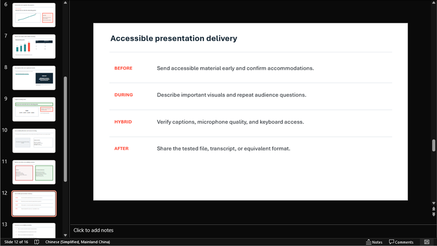
For hybrid sessions, verify captions in the meeting platform, microphone quality, keyboard access, chat moderation, and how remote participants can request clarification. Provide an accessible contact path for materials or accommodation requests.
Common Accessibility Mistakes
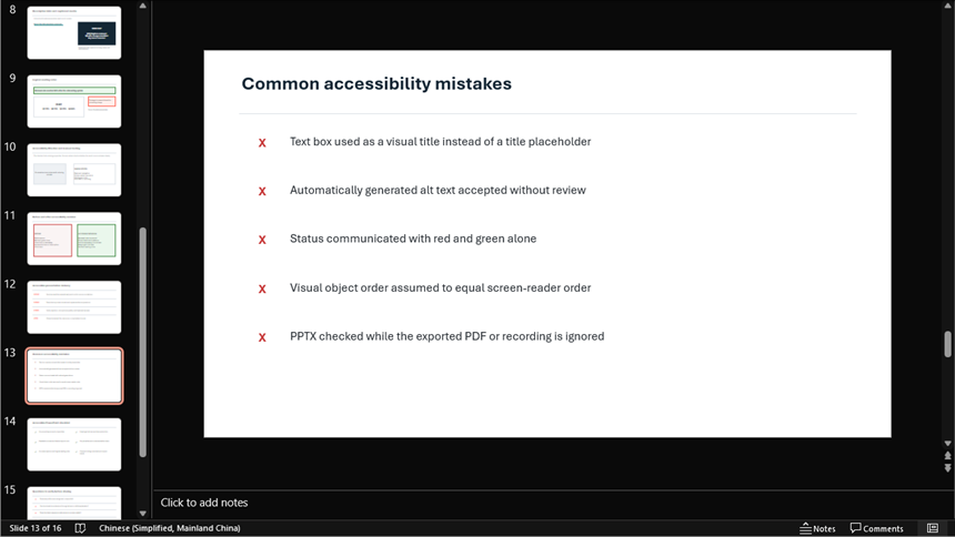
- Using a text box that looks like a title instead of the title placeholder.
- Leaving duplicate titles on several slides.
- Accepting automatically generated alt text without checking its purpose.
- Encoding status with red and green alone.
- Placing essential instructions inside a screenshot.
- Using complex tables as page-layout devices.
- Assuming visual layer order equals reading order.
- Publishing captions without correcting terminology and speaker changes.
- Treating a clean Accessibility Checker result as proof of complete accessibility.
- Checking the PPTX but not the final PDF, video, or presentation platform.
Use Presenti as an Editable Starting Point
Presenti can draft slides from a topic, URL, or supported document. Include the audience and any accessibility needs in your brief. PDF input and PowerPoint or PDF export require an eligible paid plan. After exporting, check the slide structure and accessibility in the application and format your audience will use.
Check generated slides just as you would a manually created deck. In particular, review title placeholders, reading order, alt text, chart labels, and contrast. A visually tidy layout does not tell you how a screen reader will navigate it.
Accessible PowerPoint Checklist
- The audience, final formats, test owner, and accommodation path are defined.
- Slides use suitable layouts and recognized title placeholders.
- Every slide has a unique, meaningful title.
- Text is readable and contrast is checked in the expected display setting.
- Color is not the only way information is communicated.
- Informative visuals have useful alt text; decorative objects are marked appropriately.
- Charts state their takeaway and label important values directly.
- Tables are simple, use a header row, and have an accessible alternative when needed.
- Links describe their destinations.
- Audio and video have accurate captions or required alternatives.
- Reading order is logical and verified with assistive technology.
- The Accessibility Checker findings are resolved or documented.
- The final PPTX, PDF, recording, or platform experience is tested separately.
Frequently Asked Questions
How do I run the Accessibility Checker in PowerPoint?
In current supported versions, go to Review > Check Accessibility. Inspect each error, warning, and tip, correct the slide, and rerun the review. Menu wording can vary by platform and version.
Does every image need alt text?
Every image should be classified. Informative images need useful contextual alt text or an equivalent visible explanation. Purely decorative images should be marked decorative when supported so they do not add noise.
Why do slide titles matter for accessibility?
Unique titles help people using screen readers understand the deck structure and navigate to the slide they need. Use the title placeholder so PowerPoint recognizes the title programmatically.
What is reading order in PowerPoint?
Reading order is the sequence in which assistive technology announces slide objects. In Microsoft's Reading Order Pane, items are arranged in the intended sequence and should be verified through actual navigation.
Does passing PowerPoint's Accessibility Checker make the deck accessible?
No. The checker finds many technical issues, but it cannot fully judge clarity, useful alt text, accurate captions, cognitive load, delivery behavior, or the accessibility of exported formats.
Test What the Audience Will Receive
Make accessibility part of the slide-production workflow, not a final repair. Start with structured layouts and titles, communicate meaning beyond color and images, check object order and media, run PowerPoint's checker, and test the exact file or platform the audience will receive.