An area chart in PowerPoint is useful when your audience needs to see how a quantity changes over time and the magnitude of that change matters. A stacked area chart adds a second question: how did the parts contribute to the total? The fill is not decoration. It changes what the reader notices, so the chart should be chosen only when volume or composition is central to the decision.
This guide explains when to use a standard, stacked, or 100% stacked area chart, how to build one in PowerPoint, and how to label it so the conclusion survives a quick executive scan.
What Question Should an Area Chart Answer?
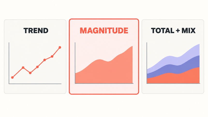
An area chart plots values across an ordered sequence, usually time, and fills the space between the line and a baseline. That fill emphasizes how much of something exists as well as how it moves. A line chart primarily invites the reader to follow direction and rate of change; an area chart makes the quantity feel more substantial.
A standard area chart works best with one series. Multiple unstacked fills can cover one another, so a reader may lose the series behind the front layer. Microsoft specifically advises considering a line chart instead when several non-stacked series would obscure one another.
A stacked area chart places each series on top of the previous one. The top edge shows the total, while the colored bands show how categories contribute to it. Only the bottom band has a stable baseline, which means the higher bands are harder to compare precisely. Use the form when total and broad composition matter more than exact category-to-category comparisons.
Which Area Chart Type Fits the Comparison?
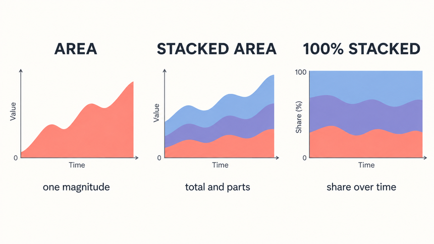
The three common area-chart forms answer different questions. Choose the form before formatting colors or labels.
| Chart type | Best question | Good example | Do not use when |
|---|---|---|---|
| Standard area | How did one quantity's magnitude change over time? | Total active users by month | You need to compare several overlapping series precisely |
| Stacked area | How did the total and its contributors change? | Website sessions by acquisition channel | The categories cannot be meaningfully added |
| 100% stacked area | How did each category's share of a constant 100% change? | Revenue mix by plan | The absolute total is important |
| Line chart instead | How do several independent trends compare? | Conversion rate by region | Magnitude or part-to-whole composition is the main point |
For stacked charts, each series needs the same unit and the categories need to form a defensible total. Do not stack revenue, conversion rate, and customer count simply because they share a date column. They measure different things. Negative values also require care because they can make stacked boundaries difficult to interpret.
Use a 100% stacked area chart only when the mix is the question. It normalizes every time period to 100%, so a segment’s percentage share can grow even while its absolute value falls. If volume matters, show a standard stacked area chart or pair the percentage view with a total.
How Do You Build an Area Chart in PowerPoint?
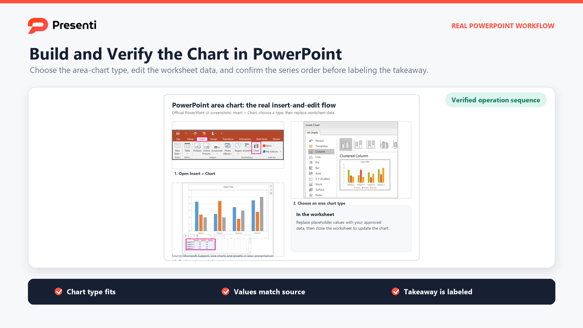
PowerPoint uses an embedded worksheet for chart data. The exact menu labels can vary by version and operating system, but the core workflow is stable.
1. Prepare the data table
Put the ordered category, usually a date or period, in the first column. Put each additive series in a separate adjacent column. Use consistent units, regular intervals, and meaningful series names. Remove subtotal columns that would be counted again when the series are stacked.
2. Insert the chart
Choose Insert > Chart > Area, then select Area, Stacked Area, or 100% Stacked Area. Replace the sample values in the worksheet with the checked source data. If the source changes frequently, consider building and maintaining the chart in Excel, then linking or pasting it into PowerPoint according to your team's file-handling policy.
3. Verify order and baseline
Confirm that time runs from left to right and the value axis starts at zero. In a stacked chart, place the most stable or important series at the bottom when that choice supports the story, because the bottom layer is easiest to read against a common baseline. Then check that the top boundary equals the total at several points.
4. Add the takeaway and source
Replace a topic title such as "Traffic by Channel" with a conclusion such as "Organic search drove most of the traffic increase." Add the period, unit, data source, and any relevant limitation. Use direct labels where possible so the audience does not have to repeatedly match bands to a distant legend.
How Can You Make the Chart Easy to Read?
Filled charts can look persuasive before they are informative. Use a few disciplined design rules to prevent the fill from exaggerating or hiding the evidence.
- Keep the zero baseline visible. Because readers compare filled height, a truncated axis can overstate the change.
- Limit the number of bands. Three to five series is a practical ceiling for many presentation slides. Group minor categories only when the grouping is analytically honest.
- Use a logical stack order. Put the largest or most stable category at the bottom when possible, and keep the order consistent across related slides.
- Prefer direct labels. Label the band near its widest readable point and add exact values only for moments that support the decision.
- Use color beyond decoration. Highlight the driver of the conclusion and mute supporting bands. Do not rely on color alone; include labels and sufficient contrast.
- Avoid 3-D effects. Perspective distorts the apparent area and makes boundaries harder to compare.
- Annotate the change. Mark relevant launches, policy shifts, campaigns, or data-quality breaks. Distinguish events that coincide with the movement from explanations supported by evidence.
When the audience needs exact comparisons for every series, switch to lines, small multiples, or a table. The best chart is the one that makes the required comparison easiest, not the one that fills the most space.
What Does a Website Traffic Example Look Like?
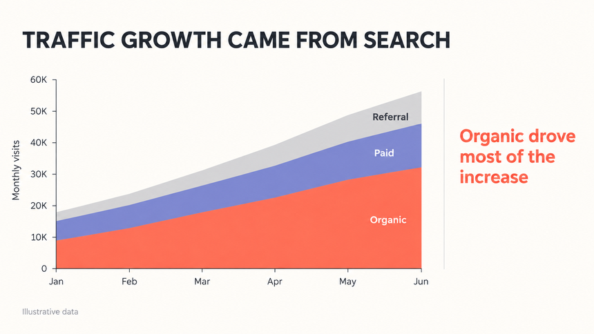
Imagine a six-month reporting period in which total website sessions rise. Organic search contributes most of the increase, paid traffic remains stable, and referrals add a smaller lift. A stacked area chart can show the total and its broad composition in one view.
The slide should not stop at showing three colored bands. Its title should state the verified message: "Traffic growth came from search." Directly label Organic, Paid, and Referral; annotate the month when the increase began; and add the source and date range. If the decision is whether to reallocate budget, follow the chart with evidence about lead quality or conversion rather than assuming that more sessions automatically mean more business value.
This is where data storytelling for presentations matters: the chart establishes what changed, the annotation suggests why, and the next slide tests whether that change produced the desired outcome.
How Can Presenti Speed Up the First Draft?
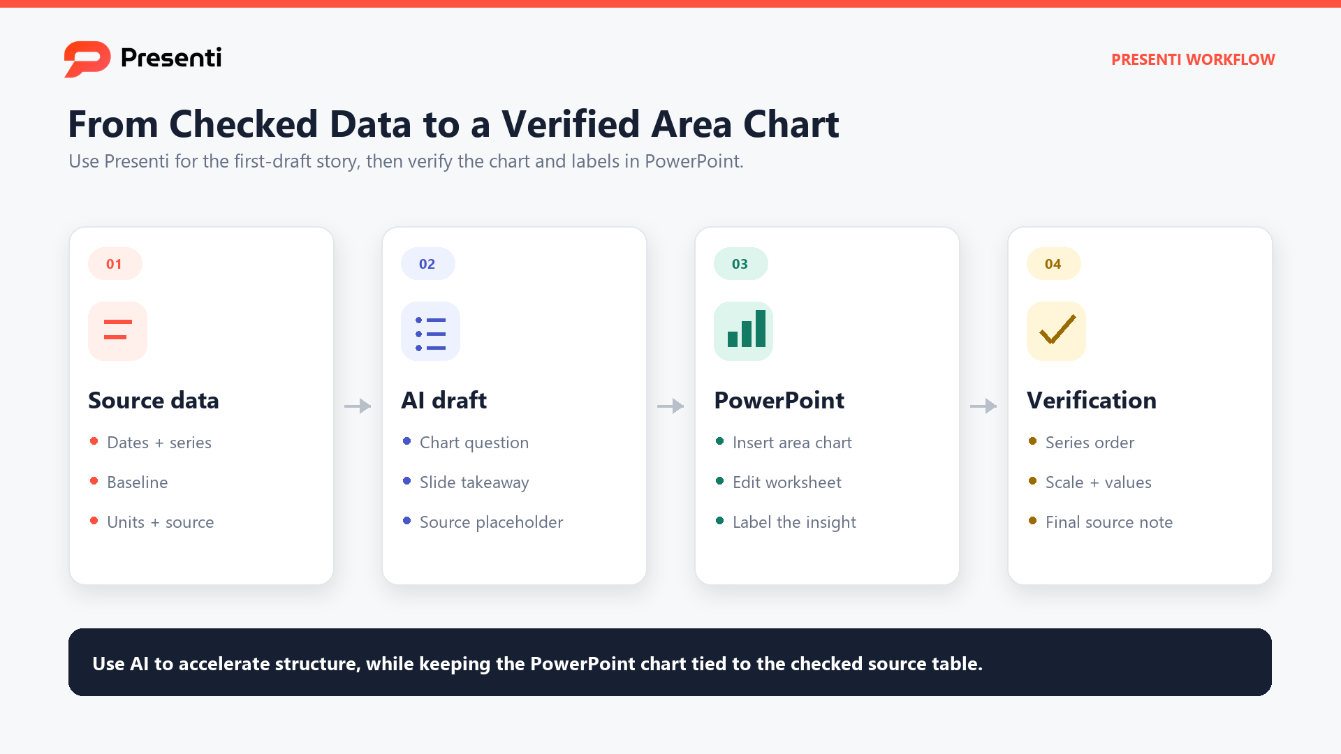
When the storyline and source data are ready, Presenti can help structure an editable presentation draft around the audience, conclusion, evidence, and next action. Give the prompt the reporting period, decision, approved data source, required chart type, and wording constraints. Treat any generated wording or visual suggestion as a starting point.
Rebuild or verify the final chart against the source workbook in PowerPoint or the required delivery tool. Check the totals, stack order, baseline, labels, source note, alt text, and title. The person publishing the deck remains responsible for the accuracy of the data and the accessibility of the final file.

Frequently Asked Questions
What is the difference between an area chart and a line chart?
Both can show change across an ordered sequence. A line chart emphasizes direction and comparison between trends. An area chart fills the space to a baseline, emphasizing magnitude or volume. Use the fill only when that extra emphasis serves the question.
When should I use a stacked area chart?
Use it when additive categories form a meaningful total and you need to show how both the total and broad contribution change over time. Avoid it when precise comparisons between upper bands are the priority.
What does a 100% stacked area chart show?
It shows how each category's percentage share changes over time. Every period totals 100%, so the chart hides changes in absolute volume. Pair it with a total when the audience needs both views.
How many series should an area chart have?
There is no universal limit, but presentation slides usually become difficult to read as layers multiply. Start with three to five meaningful categories, combine minor ones only when justified, and test the final slide at delivery size.
Can an area chart use negative values?
Some tools support them, but positive and negative stacking can overlap or create hard-to-read baselines. Consider a line, bar, or waterfall chart if the audience must compare gains and losses precisely.
Bottom Line
Use an area chart when magnitude over time is part of the message. Use stacked area when the total and its contributors matter, and 100% stacked area when the changing mix is the main question. Keep a zero baseline, limit the layers, label the evidence directly, and write a conclusion-led title. If the fill makes the comparison harder, choose a line, bar, table, or small multiple instead.