Data storytelling for presentations means organizing verified evidence around a decision. A strong data story helps an audience answer three questions in order: What changed? Why does it matter? What should we do next?
The practical workflow is simple: define the decision, validate the data, write one core message, select only the necessary evidence, choose charts that show the right relationships, arrange the slides as a logical argument, and end with a specific action. Narrative does not give you permission to dramatize or hide inconvenient findings. It gives the audience a clear path through the evidence.

The Short Answer: Build the Decision Before the Deck
Before opening presentation software, write this sentence:
Because [verified finding], we should [decision or action] so that [expected outcome].
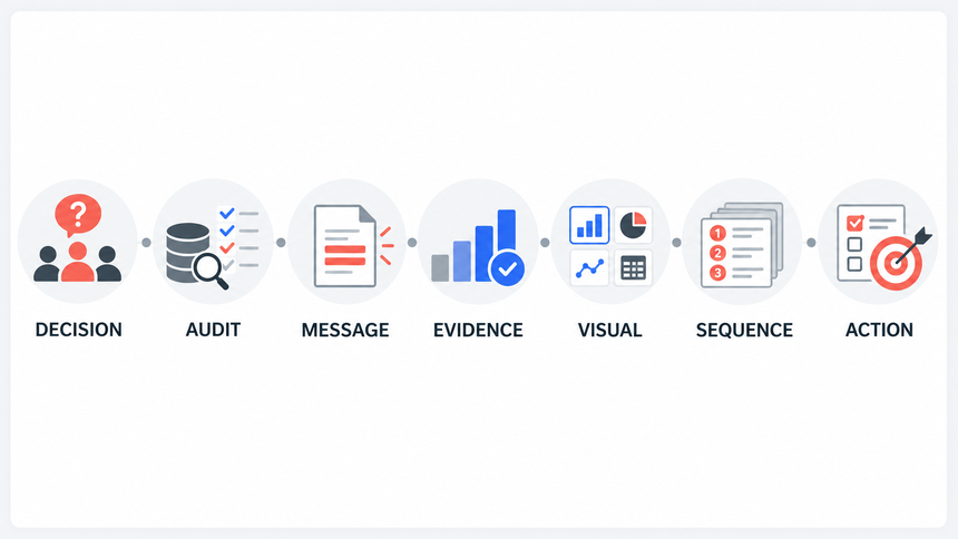
If the sentence is still vague, the presentation is not ready to design. A useful data storytelling process has seven steps:
- Define the decision and audience.
- Audit the data and its limits.
- Write the one-sentence message.
- Select the minimum sufficient evidence.
- Match each claim to the right visual.
- Build a slide sequence that answers likely questions.
- Close with the action, owner, and timing.
This article applies that workflow to one clearly labeled illustrative example, so you can see how analysis becomes a presentation rather than a collection of charts.
Data Storytelling Is More Than Data Visualization
Data visualization makes information easier to see. Data storytelling makes it easier to decide what the information means and what to do about it. The two overlap, but they are not interchangeable.
| Layer | Question it answers | Typical output |
|---|---|---|
| Analysis | What does the evidence show? | Findings, calculations, segments, uncertainty |
| Visualization | How can the pattern be seen accurately? | Chart, table, diagram, annotated value |
| Narrative | Why does this pattern matter now? | Context, sequence, explanation, trade-off |
| Decision | What should the audience approve or do? | Recommendation, owner, timing, success measure |
SAP's overview of data storytelling similarly connects trusted data, narrative, visuals, audience context, and action. The United Nations Statistics Division's practical guide to data storytelling also emphasizes context, a clear key message, appropriate visuals, and honest communication of the evidence. For presentation work, the important implication is that a polished chart is not the finish line. It is one part of a decision-ready argument.
A Running Example: The Top-Line Metric Hides the Problem
Consider a fictional software company preparing a monthly growth review. The following numbers are illustrative, not Presenti customer data:
- Website visits increased 18%.
- Trial starts increased 9%.
- Trial-to-paid conversion fell from 14.2% to 10.8%.
- New paid customers decreased 17%.
- The largest drop appeared in the mobile trial-to-paid journey.
A weak presentation might show five charts titled Traffic, Trials, Conversion, Customers, and Mobile. A clearer opening connects the results: Traffic and trials grew, but fewer trial users became paying customers. Investigate the mobile trial-to-paid journey before increasing acquisition spend. The data identifies where to look; it does not yet establish the cause.
That sentence gives every later slide a job. Each slide must establish the change, explain the driver, test a plausible alternative, or support the recommended action.
| Illustrative metric | Change | What it tells us |
|---|---|---|
| Website visits | Up 18% | More people reached the site. |
| Trial starts | Up 9% | More people began a trial. |
| Trial-to-paid conversion | 14.2% to 10.8% | A smaller share of trial users became paying customers. |
| New paid customers | Down about 17% | Trial growth did not offset the lower conversion rate. |
How to Build a Data Storytelling Presentation in 7 Steps
1. Define the Decision and Audience
Start with the decision the meeting must produce, not with the data you happen to have. Ask:
- Who can approve or act on the recommendation?
- What do they already know?
- What objections or trade-offs will they care about?
- What decision is realistic within this meeting?
In the running example, the audience is a growth leadership team. The decision is whether to keep increasing acquisition spend or redirect part of the budget to investigate the mobile decline and test an improvement. That is much more useful than the broad goal "present monthly performance."
Different audiences may need different versions of the same analysis. An executive may need the impact, recommendation, cost, and risk. An analyst may need methodology, segmentation, and confidence. The evidence stays consistent, but the depth and order change.
2. Audit the Data and Its Limits
A persuasive story built on unreliable data is still unreliable. Before selecting visuals, verify:
- Definitions, date ranges, units, and denominators
- Whether comparisons use equivalent populations
- Missing values, tracking changes, and outliers
- Whether the evidence shows correlation or supports a causal claim
- Important uncertainty, sample-size, or methodology limits
For the example, confirm that the conversion-rate calculation uses the same trial definition in both periods. Check whether a tracking change could explain the mobile decline. Segment by device, traffic source, operating system, and upgrade or checkout step. If the evidence only shows that the decline is concentrated on mobile, say that. Do not claim a specific cause until the data supports it.
3. Write the One-Sentence Message
Use a What / So what / Now what structure:
- What: Paid conversion fell while traffic and trials grew.
- So what: Increasing acquisition spend may be less effective while conversion remains lower.
- Now what: Investigate the mobile trial-to-paid journey and test a change before scaling traffic.
Turn Data-First Notes into an Insight-First Message
Many weak data presentations begin as a list of metrics. Convert that list into a claim before you choose a chart. In the illustrative example, the data-first notes might read: visits increased 18%, trials increased 9%, conversion fell from 14.2% to 10.8%, and new paid customers fell 17%.
The message for the meeting could be: More trials are not translating into more paying customers. Examine the mobile trial-to-paid journey before buying more traffic. This gives the audience a recommendation while leaving room to investigate what caused the decline.
Run a simple “so what?” test on every candidate visual. If the audience cannot name the decision, risk, or next question that the chart changes, move it to the appendix or remove it. Keep the chart that helps the audience evaluate the message, not every chart that exists in the analysis.
The sentence should be specific enough to disagree with. "Performance changed" is not a message. "Mobile trial-to-paid conversion needs investigation" is a claim the deck can examine.
Keep qualifiers that affect the decision. If mobile shows the largest decline, say so. To claim that it explains most of the overall fall, you also need the number of trials in each segment and its contribution to the total.
Choose the Narrative Arc Before You Choose the Charts
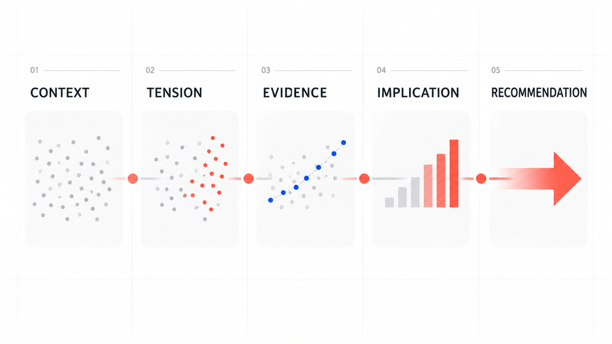
A decision-led data story usually moves through five questions: context (what are we trying to understand?), tension (what changed or is at risk?), evidence (what supports the interpretation?), implication (why does it matter?), and recommendation (what should happen next?). This sequence keeps the audience from having to infer the point from a gallery of visuals.
| Use case | Arc to test | Question the audience should answer |
|---|---|---|
| Performance or diagnosis | Baseline → change → driver → action | What moved, why, and what should we fix? |
| Proposal or investment | Current state → risk → options → recommendation | Which option best addresses the evidence and trade-off? |
| Research finding | Question → method → finding → limitation → implication | What did we learn, how certain is it, and how should it be used? |
The arc is an editorial check, not a license to force a dramatic story. If the evidence is inconclusive, make that limitation part of the message.
4. Select the Minimum Sufficient Evidence
Include evidence because it changes the audience's understanding or decision. Useful evidence usually serves one of four roles:
- Magnitude: How large is the change?
- Context: Is it unusual relative to a target, baseline, or benchmark?
- Driver: Where is the change concentrated?
- Decision support: Why is the recommended action preferable?
Move validation detail, alternative cuts, and full tables to an appendix when they matter for scrutiny but interrupt the main argument. Do not remove evidence merely because it complicates the story. If a segment contradicts the recommendation, address it directly.
A good test is to delete a slide temporarily. If the recommendation remains equally credible and clear, that slide probably belongs in the appendix or can be removed.
5. Match Each Claim to the Right Visual
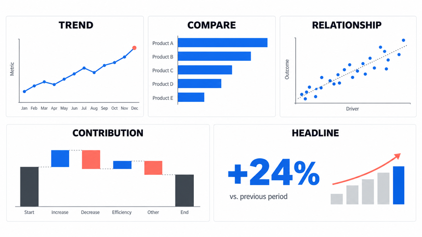
Choose a chart according to the relationship the audience needs to see, not according to visual novelty.
| Question | Useful visual | Watch for |
|---|---|---|
| How did a measure change over time? | Line chart | Inconsistent intervals or a truncated scale |
| Which category is larger? | Sorted bar chart | Too many categories or unclear units |
| How do options compare across criteria? | Grouped bar, dot plot, or comparison table | Mixed scales and hidden trade-offs |
| How are two measures related? | Scatter plot | Implying causation from correlation |
| What contributed to a net change? | Waterfall chart | Overlapping or incomplete components |
| What is the current headline value? | Large number with context | A number without baseline, target, or date |
If you need practical chart construction guidance, see Presenti's guide to PowerPoint charts for clear data visualization. For option or segment comparisons, use a chart with aligned scales and direct labels. A simple ranking is often clearest as a sorted bar chart.
Use direct labels, readable units, accessible contrast, and a truthful scale. Highlight the part of the chart that supports the title, but keep enough context for the audience to verify the interpretation. Decoration should never compete with evidence.
Add Context, Sources, and Accessibility
A persuasive visual is still misleading if its audience cannot verify what it represents. Put the source, reporting period, unit, and denominator close to the chart. Label targets, forecasts, and estimates separately from observed results. Annotate an inflection point only when the underlying definition and comparison are stable.
- Use direct labels, readable type, and sufficient contrast; never make color the only way to distinguish categories.
- Provide a text alternative or speaker-note description for an important chart so the conclusion is available beyond the visual encoding.
- State methodology, limitations, and relevant bias. For human data, remove identifying detail and confirm that the intended use is appropriate.
- Do not turn correlation into causation. If a driver is a hypothesis, label the test that would confirm or challenge it.
6. Build a Slide Sequence That Answers Questions
Arrange the story in the order the audience needs, which may differ from the order in which the analysis happened. A practical decision-led sequence is:
- Decision and recommendation: State what you are asking for.
- Outcome: Show the business result that requires attention.
- Context: Establish the baseline, target, or prior trend.
- Driver: Reveal where the change is concentrated.
- Explanation: Present the strongest supported reason.
- Options and trade-offs: Compare realistic responses.
- Action plan: Name the owner, timing, and success measure.
Use assertion titles rather than topic labels. "Trial-to-paid conversion fell 3.4 percentage points" tells the audience what the evidence means. "Conversion by device" makes them interpret the chart unaided.
One slide should make one main claim. Supporting charts, annotations, and text can all contribute to that claim, but they should not introduce several competing messages.
7. Close with the Action, Owner, and Timing
For a decision meeting, finish with a concrete proposal. In this example, the team could agree to investigate the decline before committing more money to acquisition:
- Action: Investigate the mobile trial-to-paid journey and test a proposed improvement.
- Owner: Growth product lead.
- Timing: Complete the initial diagnosis in the next sprint, then schedule a test.
- Measure: Mobile trial-to-paid conversion and paid-customer volume.
- Guardrail: No increase in abandonment or support requests.
- Decision requested today: Approve time and a defined budget for diagnosis and a subsequent experiment.
Label assumptions and proposed targets. In the illustrative example, the action plan is a demonstration of structure, not a claim about a real organization.
The Example as a 7-Slide Data Story
| Slide | Assertion title | Evidence or purpose |
|---|---|---|
| 1 | Investigate mobile conversion before increasing acquisition spend | Recommendation and decision request |
| 2 | Traffic rose while new paid customers fell about 17% | Headline outcome with period comparison |
| 3 | The funnel weakened after trial start | Visits, trials, and paid conversions in one funnel view |
| 4 | Mobile showed the largest observed conversion-rate decline | Device comparison with absolute and rate changes |
| 5 | Locate the drop-off within the mobile trial-to-paid journey | Step-level evidence, with any tracking caveat |
| 6 | Compare an investigation and test with additional acquisition spend | Options, cost, risk, and expected learning |
| 7 | Approve the investigation and agree when to review its findings | Owner, timing, metric, guardrail, and approval |
The sequence moves from the business result to the part of the funnel that needs investigation. It ends with a proposed test, not a claim that the cause is already known.
Storyboard the Proof, Not Just the Slide Titles
The outline below adds a validation check to each slide. It makes the story easier to review with an analyst, subject-matter expert, or executive sponsor before design polish begins.
| Slide | Audience takeaway | Visual or evidence | Validation check |
|---|---|---|---|
| 1 | Investigate mobile conversion before increasing acquisition spend. | Decision request and one-line recommendation | Confirm the owner, decision, and guardrail. |
| 2 | Traffic rose while new paid customers fell. | Period comparison with aligned denominators | Reconcile the customer, traffic, and date definitions. |
| 3 | The funnel weakened after trial start. | Funnel or step conversion view | Use the same cohort and window at every step. |
| 4 | Mobile showed the largest observed conversion-rate decline. | Sorted device comparison with absolute and rate change | Check equal population definitions and segment coverage. |
| 5 | Locate the drop-off within the mobile trial-to-paid journey. | Annotated step-level flow | Label any tracking caveat or instrumentation change. |
| 6 | Compare the costs and expected learning from each option. | Option table with cost, risk, and expected learning | Separate forecast assumptions from observed facts. |
| 7 | Approve the investigation and agree on the next review. | Owner, timing, metric, and guardrail card | Confirm the review date and the definition of success. |
Five Reusable Decision Patterns
You do not need a dramatic plot. Most business and research presentations use one of these evidence patterns:
- Performance update: target, actual result, gap, driver, action
- Trend explanation: baseline, inflection point, contributing factors, implication
- Option comparison: criteria, evidence, trade-offs, recommendation
- Problem diagnosis: symptom, segment, likely cause, test, fix
- Research finding: question, result, interpretation, limitation, application
Treat these as editorial patterns, not rigid formulas. Choose the one that fits the audience's decision, then preserve any nuance the evidence requires.
Common Data Storytelling Mistakes
Starting with Every Available Chart
A chart inventory reflects the analysis process, not the audience's information needs. Start from the decision and include only the visuals required to understand or challenge it.
Hiding the Conclusion Until the End
A surprise reveal can work in entertainment, but decision-makers usually benefit from the answer first. State the recommendation, then show the evidence and trade-offs.
Using Topic Titles Instead of Claims
Titles such as "Results" or "Regional Analysis" waste valuable space. Write the sentence you want the audience to remember: "Two regions account for most of the shortfall."
Confusing Correlation with Cause
If two measures move together, describe the relationship accurately. Use language such as "associated with" or "concentrated in" unless an experiment or strong research design supports causality.
Removing Uncertainty to Make the Story Cleaner
Show uncertainty that could change the decision. A range, confidence interval, scenario, footnote, or explicit caveat is better than false precision.
Ending Without a Decision
Summarizing the findings is not the same as asking for action. End with what should happen, who owns it, when it will happen, and how success will be measured.
How Presenti Fits into the Workflow
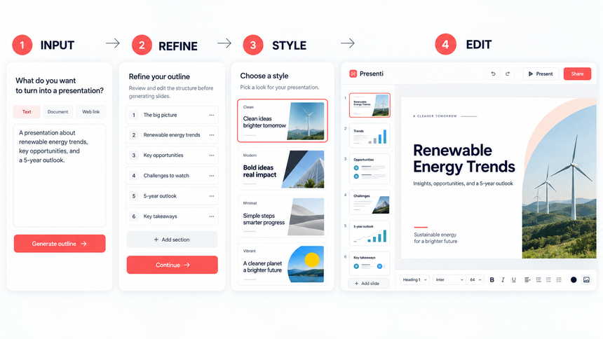
AI can accelerate the transition from a verified story outline to a designed deck, but it should not decide which claims are true. Do the analytical work first. Then provide a structured outline with the audience, decision, assertion titles, supporting evidence, source notes, and required action.
Presenti can turn source text or a topic into a presentation draft, let you edit the result in the browser, and export an editable PowerPoint file or a PDF on an eligible paid plan. For an outline-led workflow, start with Text to Presentation. Review every generated title, number, chart, and source against the approved analysis. If you already have a rough deck, AI slide beautification can help improve its visual consistency while you retain responsibility for the content.
A useful prompt or source outline includes:
- The audience and decision to be made
- The one-sentence What / So what / Now what message
- One assertion title for each proposed slide
- The exact evidence and units that support each title
- Any caveats, source labels, or claims that must not be changed
- The final action, owner, timing, and success measure
Treat the generated presentation as a first draft. AI may compress qualifiers, choose a chart that does not match the relationship, or add a visual that looks relevant without adding evidence. A human review is part of the workflow, not an optional final polish.
Check That the Numbers Tell the Same Story
In the fictional example, suppose the first period had 10,000 trials. At 14.2% conversion, that produces 1,420 paying customers. A 9% rise gives 10,900 trials in the second period; at 10.8% conversion, that produces about 1,177 customers, roughly 17% fewer. The conversion rate fell by 3.4 percentage points.
That calculation connects the headline figures. It does not prove why conversion fell or how much mobile contributed. Those questions require comparable cohorts and device-level data. Show that distinction in the deck, especially when asking for a budget change.
Rehearse the Story Before You Polish the Deck
Strong data storytelling is tested in conversation, not only in the editor. Before final design, run three short checks:
- Ask for a 60-second summary. Give the outline to someone who did not run the analysis. If they cannot state the decision and reason, the opening needs work.
- Write one speaker note per slide. The note should explain the claim, the evidence, and the transition. Do not use it to introduce a new number that is absent from the slide.
- Revise from the questions. If reviewers ask for detail, add the definition, source, or appendix view that resolves the question. If they ask “so what?” move the implication earlier instead of adding decoration.
Use the rehearsal feedback to revise any unclear title, crowded chart, or missing explanation before the final run-through.
Label forecasts, targets, and illustrative examples so readers can distinguish them from observed results. If the data concerns people, remove identifying details and confirm consent before sharing it.
Frequently Asked Questions
What is data storytelling in a presentation?
It is the practice of combining verified data, appropriate visuals, and a logical narrative to help a specific audience understand a finding and make a decision. It adds context and action to data visualization without changing or exaggerating the evidence.
How is data storytelling different from data visualization?
Data visualization shows patterns through charts or other visual forms. Data storytelling connects those patterns to context, implications, and a next step. A chart can stand alone as a visualization; a data story explains why the chart matters to this audience now.
How many charts should be on one slide?
Use the fewest visuals needed to support one main claim. Many effective slides use one chart. Two related charts can work when the audience must compare them directly, but several independent charts usually split attention and weaken the message.
Should a data story lead with the conclusion?
For most executive and business presentations, yes. State the recommendation or key finding early, then provide the evidence, explanation, trade-offs, and action plan. For research or teaching, you may need more context first, but the audience should still know the question and why it matters.
How can AI help with data storytelling?
AI can help organize an approved outline, propose slide structures, rewrite titles, and create a visual first draft. It should not replace data validation, causal reasoning, source review, or the final decision about what the evidence supports. The report-tool comparison separates data analysis, written reports, and slide drafting so you can choose support for the appropriate stage.
How do you keep a data story from becoming misleading?
Preserve definitions, scales, denominators, comparisons, uncertainty, and counterevidence. Separate observation from interpretation, and label illustrative values or assumptions. Ask an independent reviewer to check whether the slides support the stated conclusion.
Turn the Analysis into a Decision
A useful data presentation makes the finding easy to understand and the reasoning easy to question. In this example, that means showing how trial growth and falling conversion combine, then distinguishing the observed mobile decline from possible explanations.
Give the audience enough detail to assess your recommendation. If a cause remains uncertain, propose the next analysis or experiment instead of presenting a guess as the answer.
When your story outline is ready, try Presenti for free, then review the generated slides against your data before sharing them.