You generate a deck, and for the first thirty seconds it looks great. Then you scroll past slide six and notice slide eleven has almost the exact same layout. Same photo placement, same title box, same two-column bullet arrangement wearing a different color. It's not broken, exactly. It just looks like every other AI-generated deck you've seen this month.
This is one of the most common complaints from people who've already used an AI presentation tool and gotten a usable-but-uninspired result. The good news is that generic AI slide layouts aren't really a limitation of AI-generated presentations as a category — they can often be improved by changing the template, individual layouts, or image direction. Here's what's actually going on, and four concrete ways to fix it without starting the deck over.
Why AI-Generated Slides End Up Looking the Same
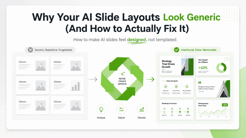
A deck can feel generic when several slides use the same structure despite serving different purposes. A comparison, a process, and a key finding may need different arrangements. Judge the visible result rather than assuming the generator has understood each slide's role.
The other half of the problem is color and font drift. If every generation pulls from a randomized or default palette instead of a locked one, decks made a week apart can look like they came from two different companies, even if the content is consistent. That's the "repetitive but also inconsistent" complaint people run into: individual slides feel templated, and the deck as a whole doesn't feel cohesive either.
How Auto-Design Is Supposed to Work
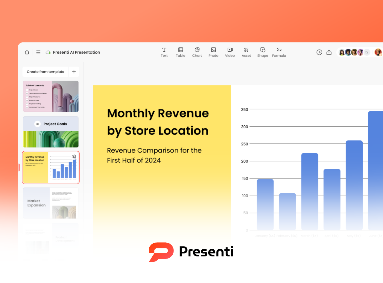
Presenti can propose slide designs, but you should check whether each layout suits the message. A pitch, a classroom explanation, and a training exercise may need different content density, imagery, and hierarchy. Visual variety is useful when it clarifies these differences; consistency still helps the deck feel coherent.
Where people run into trouble is when they generate once, don't like the result, and just hit regenerate on the same prompt hoping for something different. That usually produces a variation on the same theme rather than a real fix. The tools below are the actual levers for getting varied, professional-looking output — and they work whether you're fixing a deck Presenti just generated or one you built manually in PowerPoint years ago.
Four Ways to Get Varied, Professional AI Slide Layouts
1. Build a custom brand template so every deck starts on-brand
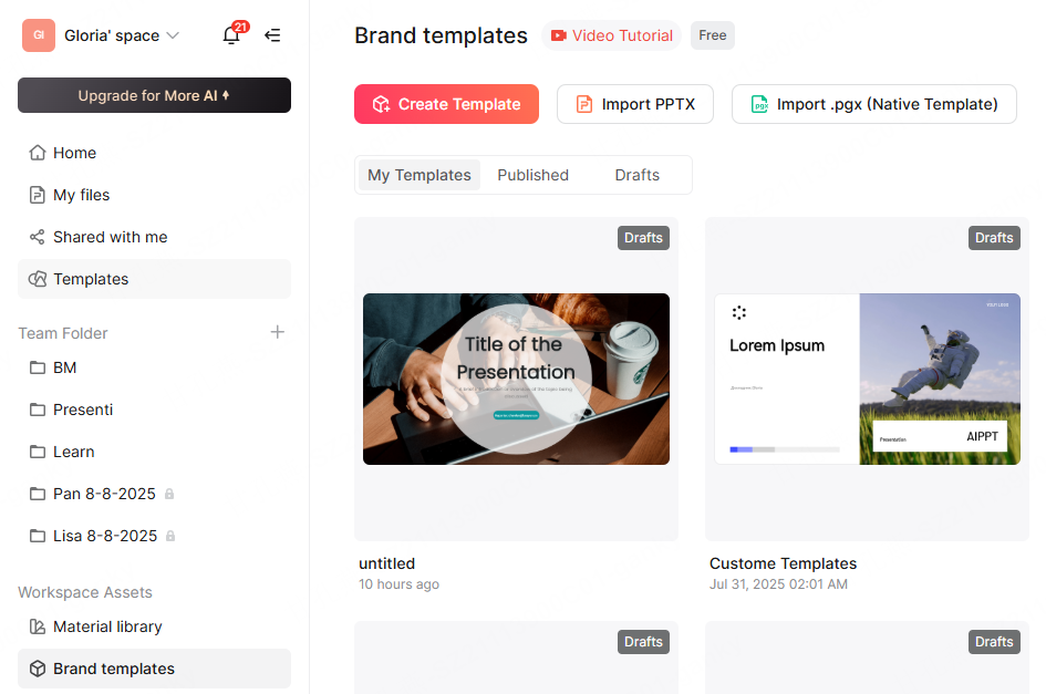
Under Workspace Assets, Brand templates is where this gets solved at the source instead of slide by slide. You've got three ways in: build a template from scratch with Create Template, bring in a deck you already have with Import PPTX, or bring in a Presenti native template file with Import .pgx. Any of the three gets you into the template editor.
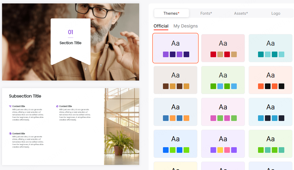
Inside the editor, the right-hand panel provides these design controls:
- Themes
- Fonts
- Assets
- Logo
The panel includes Official presets and My Designs options for custom designs. Pick a color theme once here, drop in your logo and brand fonts, and review that palette across the template's title slides, dividers, and content layouts.
From this point on, generating a new deck from this template means starting from your brand's visual language instead of a generic default, which gives subsequent decks a more distinctive starting point.
2. Use Slide Polisher to redesign an existing deck
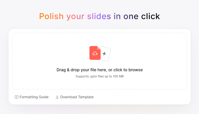
If the deck causing the problem already exists — something you built by hand, or an earlier AI generation you never went back to fix — you don't need to rebuild it. Slide Polisher takes a .pptx file (up to 100MB) and proposes layout, spacing, and color changes for supported slide content. Compare the result with the original, especially charts, tables, and complex objects. It's a genuinely different action from generating a new deck: the starting material is an existing deck rather than a topic prompt. The Slide Polisher guide to images and tables shows which imported elements to inspect during that comparison.
This can help with a deck that's "repetitive but also messy" — old formatting inconsistencies, mismatched fonts left over from copy-pasting between slides, spacing that drifted slide to slide. Inspect the redesigned deck and make any remaining adjustments in the editor.
3. Swap the whole theme, or just one slide's layout, and review the result
This is the answer to "how do I get more variety without breaking consistency" specifically, because theme and layout are two separate controls, and understanding the difference is what makes this work.
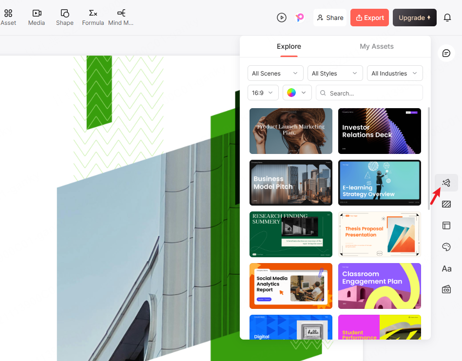
Swapping the theme changes the visual language of the entire deck at once — color palette, fonts, background treatment — then requires a check for text fit, image placement, and any unintended changes. The Explore panel, filterable by scene, style, and industry, lets you browse alternatives and apply one with a single click. Because it's applied deck-wide in one action, this is actually the safer way to get a fresh look: you can assess the new direction across the deck rather than changing each slide independently.
Swapping a layout works at the individual slide level instead. If one specific slide's structure feels off — bullets where a comparison would read better, or a text-heavy layout where an image-led one would land harder — the Layout panel shows a grid of alternate structures under Standard or Professional styles, filterable by structure type. Pick a different one and the content moves into it; the color and font stay tied to whatever theme is already active, so this doesn't disturb consistency either. There's also an AI Select Layout option if you'd rather have the system pick a suggested structure for that slide's content.
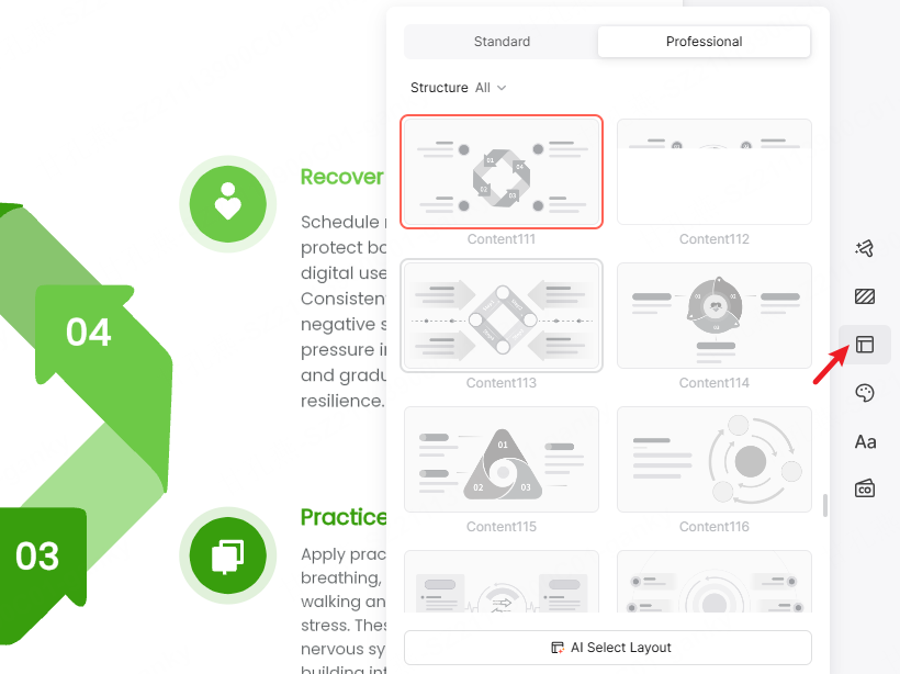
Used together, these two controls are how you get real variation — different slides with genuinely different structures — without the "looks inconsistent" problem, because the color and brand layer stays constant underneath whatever layout each slide uses.
4. Lock a consistent visual theme with AI-generated images
Mismatched imagery is one of the fastest ways for an otherwise well-designed deck to fall apart visually — a stock photo here, a flat icon there, a screenshot with different lighting than everything else. The Visual Style & Source panel, set to AI Generate, is where this gets solved directly: the Prompts & Art Style field lets you describe the scene, mood, or color treatment you want for a slide's image, using the length limit shown in your current interface. The image-style update walkthrough illustrates the creation-time and existing-slide routes; use the styles available in your current interface.
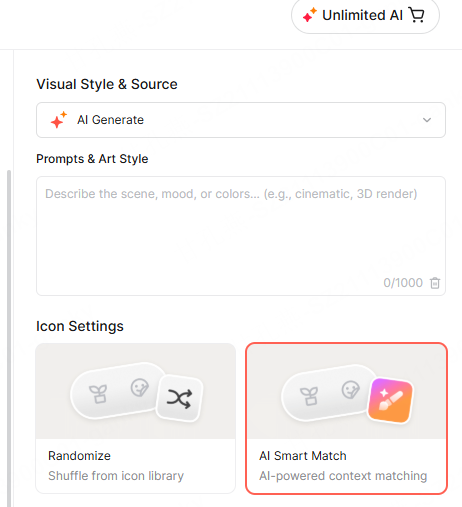
The trick for deck-wide consistency is reusing the same style descriptor across every image you generate — the same lighting language, the same color mood, the same rendering style (say, "soft natural light, warm neutral tones, minimalist office photography" or "cinematic, high-contrast, cool blue palette") on every slide that needs an image. Because you're controlling the art style directly rather than accepting whatever a generic image search returns, you give the images a common direction. Review the results together and replace any that clash or misrepresent the subject.
Strengthening Visual Hierarchy Once the Layout Is Right
Varied layouts and a consistent theme solve half the "generic" problem. The other half is hierarchy — whether someone glancing at a slide for two seconds knows what actually matters on it. A few things worth checking once your layouts and theme are locked in:
- One accent color, used sparingly. If your locked theme includes an accent color, that color should be doing a job — highlighting a key number, a section label, a single call-out — not appearing on every third element. Overused accent color reads as decoration; sparingly used accent color reads as intentional.
- Title weight versus body weight should contrast clearly. A generic-looking slide often has a title and body text that are too close in size and weight, so nothing draws the eye first. Presenti's templates generally handle this automatically, but it's worth a glance after a layout swap, since some structures put more visual weight on imagery than on the title.
- Let the layout panel do the density work. A slide that feels flat is often just carrying more text than its layout was designed for. Rather than shrinking the font to fit, swapping to a layout built for that content density (a two-column or content-with-sidebar structure instead of a single block) usually reads better and looks more deliberate.
- Section breaks earn their own visual weight. A section divider slide should look distinctly different from the content slides around it, not just carry a bigger title. That contrast is part of what makes a deck feel structured instead of like one long scroll of similar-looking slides.
Putting It Together
None of these four techniques require rebuilding a deck from scratch, and none of them are mutually exclusive. A common real workflow looks like: lock a brand template once so every future generation starts from your colors and fonts, run Slide Polisher on anything old that needs a quick cleanup, use the Explore panel when an entire deck needs a fresher look and the Layout panel when just one slide's structure feels wrong, and keep a consistent art-style prompt on hand for any AI-generated imagery.
Review the finished deck as a whole: each layout should support its message, while fonts, colors, and imagery remain coherent. That final pass helps turn a generated draft into a presentation suited to its audience.