A simple background gives text, charts, and images room to stand out. This guide explains how to choose colors, use gradients, and place visual elements without distracting from your message.
The Role of Backgrounds in Presentation
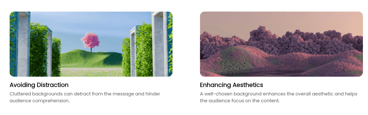
A background sets the visual conditions for everything placed on top of it. The broader guide to choosing a presentation background for your project covers matching that choice to the subject. Here, the focus is keeping the background simple enough for the text, charts, and images to remain easy to read.
The Power of Simplicity
Simplicity in design is not just a trend; it's a principle that has stood the test of time. In the realm of presentation design, simple backgrounds are powerful because they allow the content to shine without competition from busy patterns or colors. They create a clean canvas that directs the viewer's attention exactly where you want it, and tools like Presenti AI make achieving this simplicity seamless and professional.
Elements of a Simple Background
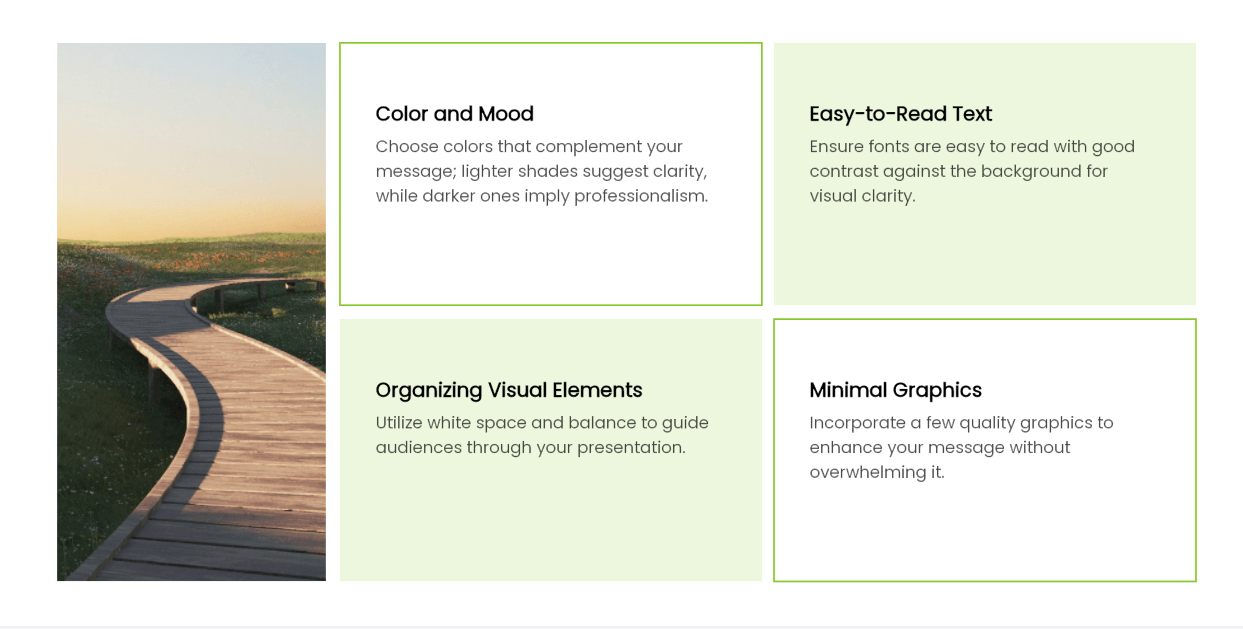
1. Color and Mood
The choice of color can affect the feel of your presentation, but its associations depend on the audience and context. Choose colors that support the content rather than relying on a fixed rule about what a color means.
For a financial update with small chart labels, start with a plain background so the labels do not compete with a pattern. For a product-introduction slide, a photograph can carry useful information if the product remains visible and the title has a clear text area. For a section divider, a restrained gradient may be enough because there is less information to read.
2. Easy-to-Read Text
With a simple background, your text takes center stage. Choose fonts that are easy to read against the background, and check contrast across the whole text area—not just behind the first word.
Example: A dark heading may be readable on the pale sky in a photograph but disappear where the next line crosses a dark building. Move the heading into a consistently light area, place it on a solid panel, or use a plain background. A shadow alone may not make every word readable.
3. Visual Elements
A simple background helps you organize visual elements for a clear path through your presentation. Use white space to your advantage and keep your layout balanced. This organization makes it easier for your audience to follow along with your points.
4. Minimal Graphics
When adding graphics to a simple background, quality and relevance are key. A few well-placed images or icons can add depth without clutter. Minimize your graphics so they complement your message rather than overpower it.
Practical Tips for Creating Simple Backgrounds
1. Start with a Template
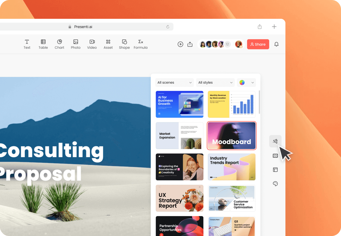
When crafting a presentation, beginning with a template can save time and ensure a professional look. Many presentation software options, such as PowerPoint and Google Slides, offer templates that are designed with best practices in mind. These templates provide a solid foundation, allowing you to focus on content rather than design from scratch. They often include a harmonious color scheme and a clean layout that keeps the focus on your message, not the backdrop.
2. Use Gradients Wisely
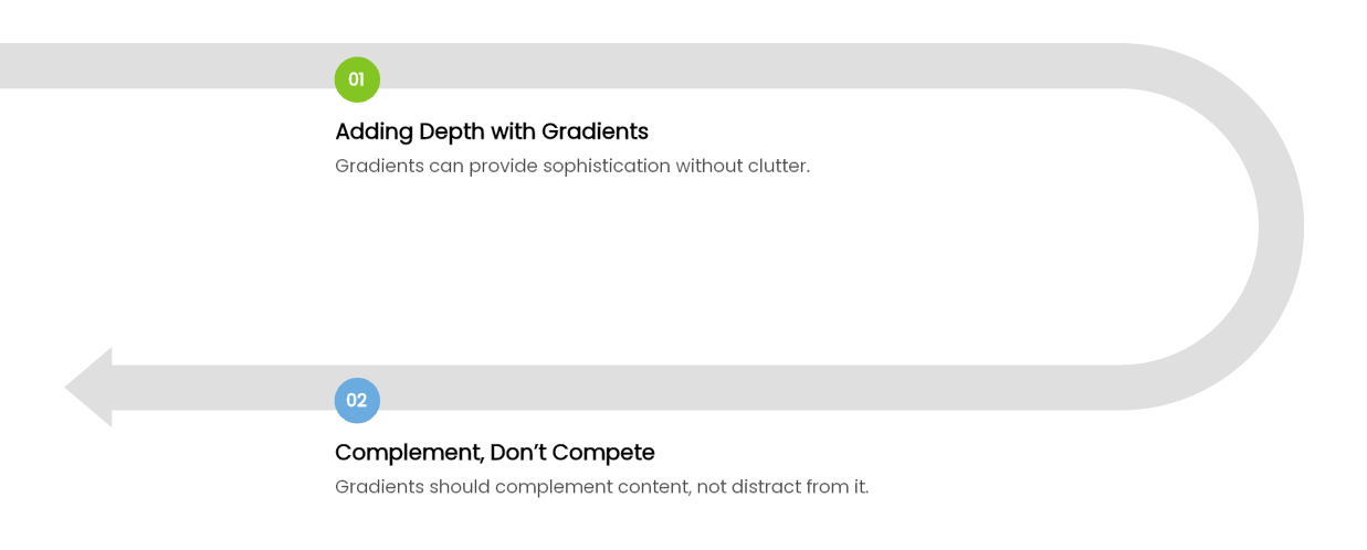
A gradient can add depth without needing a photograph. Keep the contrast change away from the main text area: if a heading runs across both a light and a dark zone, one text color may not work across the whole line. Try moving the gradient toward an empty edge or reducing the difference between its two colors.
When a gradient looks smooth in the editor but shows visible bands on the presentation screen, compare it with a solid fill on that same screen. Use the solid fill if the gradient draws attention to the background rather than the message. Keep the original slide as a separate draft so the two versions can be compared at the same size.
3. Keep It Consistent
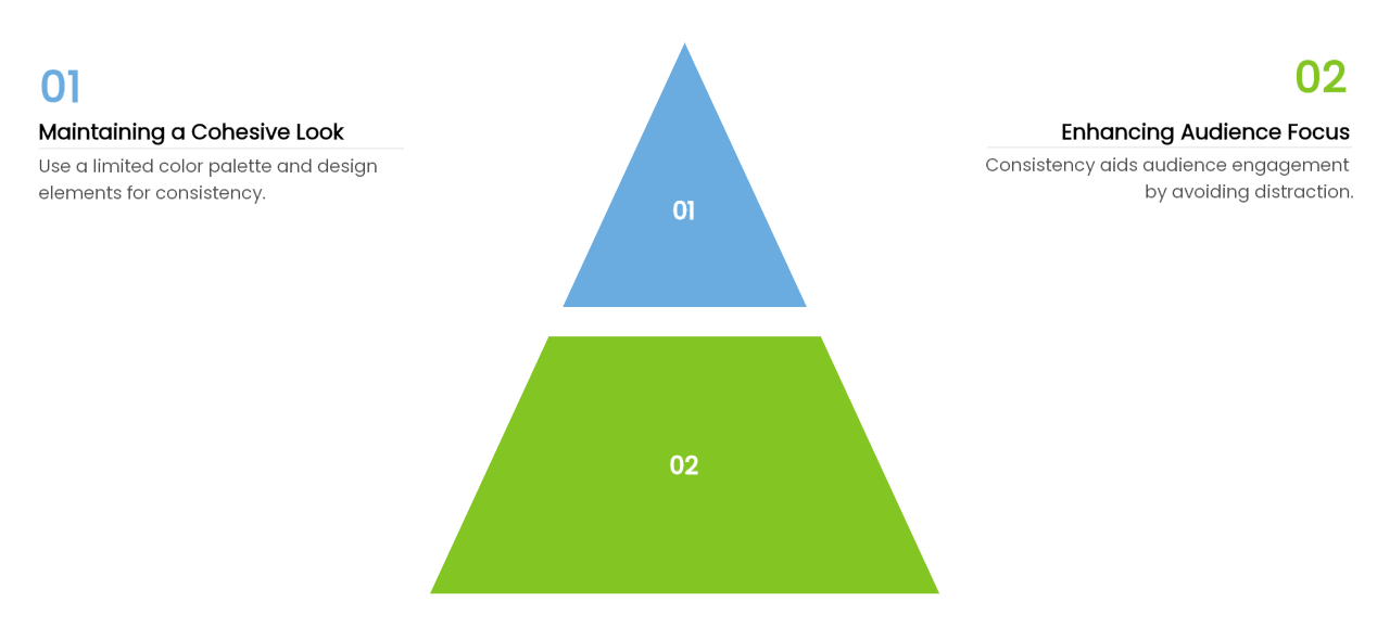
Consistency is the backbone of any good design, especially when it comes to backgrounds. Stick to a limited color palette and a set of design elements throughout your presentation to maintain a cohesive look. This consistency helps your audience to focus on the information you're presenting without being distracted by a hodgepodge of styles. Whether it's the same shade of blue or a recurring pattern, consistency helps to create a seamless experience from slide to slide.
4. Choose High-Quality Images Sparingly
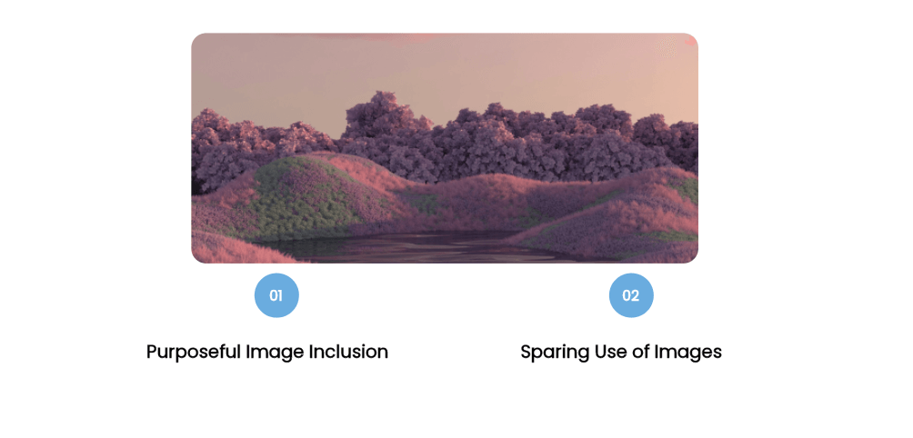
If you decide to include images in your simple background, make sure they are high quality and serve a purpose. A high-resolution image can add a professional touch and reinforce your message. However, be selective and use images sparingly to maintain the simplicity of your design. The image should enhance your presentation, not overshadow it.
Making a Simple Background with Tools
When it comes to tools for creating less complicated backgrounds, there are several options available. From traditional design software to more specialized presentation tools, each has its own strengths.
1. Traditional Software
For many years, software like Adobe Photoshop has been the go-to choice for graphic design professionals. With its comprehensive set of tools, it allows for precise control over image manipulation and design creation. It's a reliable choice for those who require detailed customization and high-quality output. For those seeking a free alternative, GIMP provides similar functionalities, making it a popular choice for cost-effective design work.
2. AI Presentation Tools

Presenti AI can help create an editable slide draft. When reviewing it, compare the background with the actual text and images, not just the template preview. Keep a plain version of a busy slide so you can see whether removing decoration makes the main point easier to find.
Final Thoughts
In the world of presentation design, simple backgrounds are often the unsung heroes. They might not grab all the attention, but they create the perfect stage for your content to shine. Remember, the goal is not to impress with flashy designs but to communicate effectively. Tools like Presenti AI make achieving this balance easier than ever, and next time you're preparing for a presentation, consider the power of a simple background to elevate your design.