Try explaining a project timeline out loud, and you’ll notice how fast “who’s doing what, and by when” turns fuzzy. Even a slide full of bullet points doesn’t fully fix it — everyone reads it a little differently. A well-built schedule slide solves that problem: it gives the whole team, or the whole room, the same shared picture in a few seconds.
So why PowerPoint, instead of Excel or a dedicated project-management tool? Three reasons. First, familiarity — if your team already works in PowerPoint, the schedule can stay in the same presentation workflow. Second, it drops straight into the deck you’re already building — no switching files mid-presentation when a schedule slide is just one part of a proposal or status update. Third, design freedom — colors, fonts, and shapes are all fully customizable, which means PowerPoint can handle everything from a simple three-step flow to a full multi-task Gantt chart. To choose a layout for dates and milestones, compare the PowerPoint timeline formats and template sources.
This guide walks through how to choose the right schedule format, build it step by step, avoid the design mistakes that make schedules hard to read, and — for anyone who’d rather skip the manual layout work entirely — a faster AI-powered alternative.
Part 1: Choose Your Schedule Type Based on Purpose
Before opening PowerPoint, get clear on one thing: who is this for, and what do they actually need to walk away knowing?
A common mistake is jumping straight into a Gantt chart because it “looks official.” But if you’re mapping a one-week onboarding flow, a Gantt chart usually ends up either half-empty or cluttered with columns nobody needs — either way, it gets harder to read, not easier.
Three questions make the choice much easier:
- How long is the timeframe? A few days to a few weeks calls for a different format than a multi-month or annual plan.
- Who’s the audience? A quick internal reference for yourself or a small team needs less detail than a deck going to a client or multiple departments.
- How much detail actually matters? Do people need the big-picture flow, or do they need exact start dates, end dates, and owners for every task?
Here’s how those three factors typically map to a format:
| Timeframe | Audience | Detail Needed | Best Format |
|---|---|---|---|
| Short-term | Small group | High-level flow | Flow Diagram |
| Short-term | Multiple owners | Who does what | Swimlane Flow |
| Short-term | External audience | Hour-by-hour | Daily Timeline |
| Long-term | Mid-size team | Month-by-month | Monthly Calendar Schedule |
| Long-term | Leadership / IR | Quarter-by-quarter | Quarterly Roadmap |
| Long-term | Full project | Year at a glance | Annual Monthly Schedule |
| Long-term | Multiple parallel tasks | Task-level tracking | Gantt Chart |
| Long-term | Multiple owners | Who’s active when | Annual Ownership Schedule |
Part 2: Before You Open PowerPoint: 2 Prep Steps
Once you’ve picked a format, resist the urge to dive straight into slide-building. A little upfront prep saves a lot of rework later — starting without it is how you end up with constant “wait, this task got added” or “the owner changed” revisions.
Step 1: Gather the Essentials
Every schedule slide needs these four things:
- The overall goal. What is this schedule actually trying to accomplish?
- Key tasks and milestones. Work backward from the end goal to identify what needs to happen.
- An owner for each task. Someone needs to be clearly responsible.
- A start and end date for each task. Without at minimum these two, it isn’t really a schedule.
With those four pieces in hand, any format on this list is buildable.
If external clients or multiple departments are involved, check in with stakeholders before you start building — it’s much easier to catch “that timeline actually won’t work” in a quick conversation than after the slide is finished. For long-running projects especially, delays and scope changes are common enough that it’s worth building in some buffer time upfront, which cuts down on how often you’ll need to revise the slide later.
Step 2: Pick a Starting Template
PowerPoint ships with a handful of built-in options — search “schedule,” “timeline,” or “Gantt” from the New Presentation screen and you’ll find a few to start from. Built-in templates are often too generic for real business use, though, so it’s worth browsing Microsoft’s official template site or a third-party template marketplace for something more tailored.
The key selection criterion is scale: a Gantt-chart template applied to a simple one-week task list will look empty and over-engineered, while a basic flow-diagram template won’t hold a complex, multi-month project. Use the timeframe/audience/detail framework from earlier to guide the pick.
Part3: Create Short-Term Schedule Slide Layouts & Templates
1. Flow Diagram (Shape-Based)
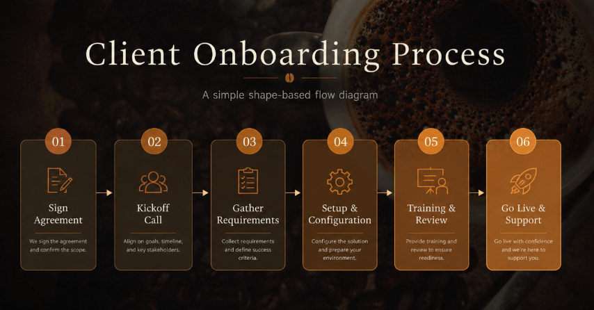
Best for: A simple, linear sequence — an onboarding process, a service rollout, an event-day timeline. If everything fits in roughly 5-8 steps, a straight-line flow is the clearest way to show it. It’s especially common as the “here’s what happens after you sign” slide in a sales proposal, since it gives clients a reassuring, easy-to-scan sense of what’s next.
How to build it:
1. Go to Insert → Shapes and pick a rectangle or rounded rectangle.
2. Draw your first box, then duplicate it (Ctrl+D) as many times as you need, arranging them left to right.
3. Double-click each box to add the task name and a short detail (owner, duration).
4. Connect the boxes with Insert → Shapes → Arrow.
5. Color-code by phase — for example, blue for prep, green for execution, gray for done — and include labels or a legend. 6. Use simple connectors that show the intended sequence without crossing labels.
A horizontal layout usually fits a widescreen slide better; switch to vertical if you have a longer list of steps that need room to breathe.
2. Swimlane Flow (By Owner)
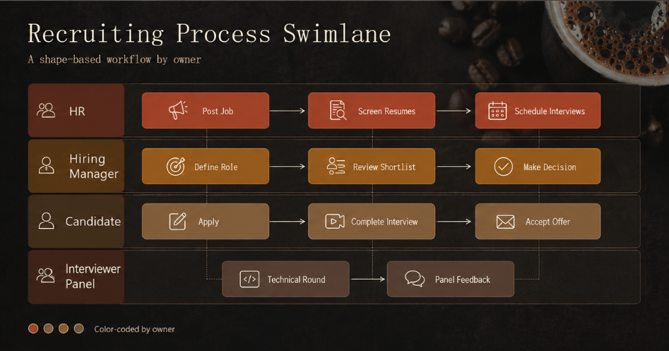
Best for: Projects where multiple people are working in parallel — an engineer and a designer on different tracks, a client and an agency handling their own pieces, HR and a hiring manager coordinating a recruiting process. This format is built specifically to answer “who’s doing what, at the same time.”
How to build it: Same shape-based approach as the flow diagram, but split the slide into horizontal rows — one per owner or role — with each row’s tasks placed left to right along a shared timeline. This is essentially a simplified swimlane diagram. A thin divider line or a subtle background shade between rows makes each lane easy to follow, and color-coding by owner makes it instantly clear whose work is whose.
3. Daily Timeline
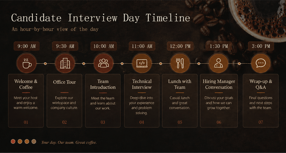
Best for: A candidate-facing “day in the life” slide for recruiting, a conference or training agenda, or an event-day run of show — anywhere you need to break the day down hour by hour. This format is especially common in recruiting decks, where walking candidates through an hour-by-hour day gives them a concrete feel for the role and culture.
How to build it: List times down the left side (9:00, 10:00, 11:00…) with the corresponding activity to the right — a table works well here, since it keeps the grid lines clean without manual alignment. For a horizontal version, put the time markers along the top and the task blocks underneath. If you’re breaking things into smaller increments (every 30 minutes, for example), PowerPoint’s table tool is far easier to manage than individually placed shapes.
Part 4: Create Long-Term Schedule Slide Layouts & Templates
1. Monthly Calendar Schedule
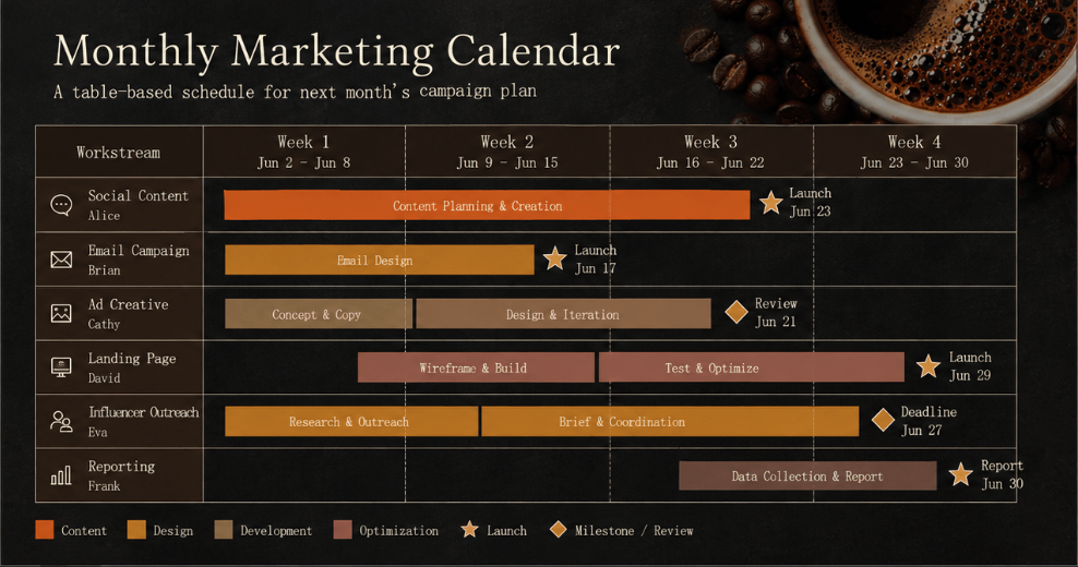
Best for: A month of marketing activity, monthly project check-ins, or juggling several campaigns at once. This is also a common slide for “here’s next month’s plan” inside a client proposal.
How to build it: Dates run along the top (day-by-day or week-by-week), projects or owners run down the side, and each cell gets colored in to show a task’s duration — essentially a lightweight Gantt chart. Building this with PowerPoint’s table tool makes future edits painless, since adjusting a timeline is just a matter of recoloring cells. Mark key milestones (deadlines, launch dates) with a star or diamond icon so they stand out immediately.
2. Quarterly Roadmap
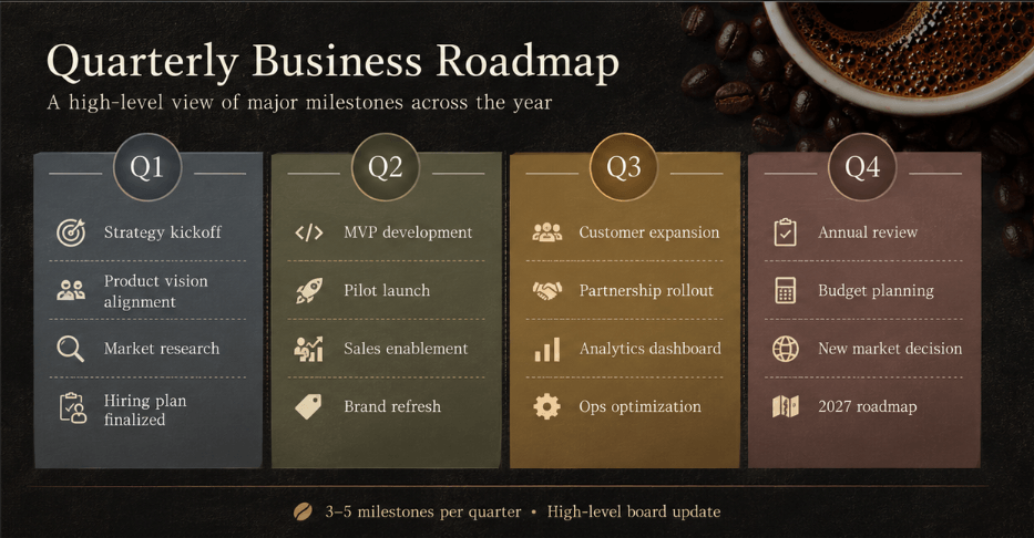
Best for: Investor-relations decks, company-wide strategy presentations, or any board-facing update where you’re showing the year broken into quarters. The goal here isn’t task-level tracking — it’s “here’s what happens in Q1, here’s what happens in Q2” — so less detail is genuinely better. If the discussion is about strategic direction and priorities, compare roadmap presentation formats before adding task-level detail.
How to build it: Split the slide into four blocks (Q1-Q4) and list only the major milestones inside each — a light background tint per quarter (pale blue for Q1, pale green for Q2, and so on) makes the divisions clear at a glance. Keep each block to roughly 3-5 items; cramming in more defeats the purpose of a high-level roadmap.
3. Annual Monthly Schedule
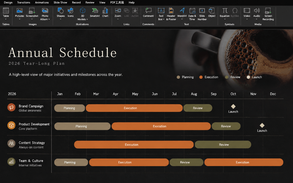
Best for: Tracking ongoing progress across a full year without quarterly groupings — project roadmaps, annual communications plans, or product roadmaps that get revisited regularly.
How to build it: Months run along the top, projects or owners down the side — structurally similar to the monthly calendar, but since a full year has to fit on one slide, each cell holds far less text. Stick to task names or milestone labels only; anything more detailed will make the slide unreadable. Treat this format as a bird’s-eye view, not a place for granular detail.
4. Gantt Chart (Task-Level Project Schedule)
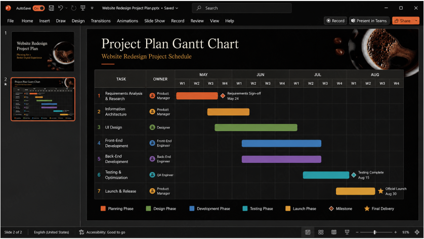
Best for: Complex, long-running projects with parallel tasks, dependencies, and multiple owners — the format built specifically to show start dates, end dates, task duration, and dependency (“this can’t start until that finishes”) at a glance. It’s also the easiest format for spotting exactly which task has slipped.
How to build it (the table method — strongly recommended):
Most people try to build a Gantt chart out of individually placed shapes, which becomes a nightmare to edit the moment a date changes. Building it as a table instead means every schedule change is just a matter of recoloring cells — no manually repositioning shapes.
- Go to Insert → Table and set up columns for weeks or months, plus one column on the left for task names.
- Enter task names and owners in the left column.
- Enter dates, week numbers, or month names across the top row.
- Select the cells spanning each task’s duration and fill them with a background color.
- Use color to indicate phase — planned, in progress, complete.
- Mark hard deadlines with an icon (a square or diamond) for emphasis.
A note on slide size: Gantt charts need horizontal room, so keep your slide set to widescreen (16:9) to make the most of it. For print, choose a landscape size such as A4 or Letter under Design → Slide Size → Custom Slide Size, then inspect the resized layout and print preview.
5. Annual Ownership Schedule
Best for: A simple, year-long view of who’s active and when — a company events calendar, department-level planning, or a shared marketing-and-sales timeline. The goal is a quick read on “who’s doing what this year,” not task-level detail.
How to build it: Owners or departments run down the side, months run across the top, and each person’s active periods are filled in like a bar chart. It’s structurally close to a Gantt chart, but the focus is on ownership timing rather than task specifics — keep it to 1-3 major items per person and skip the smaller sub-tasks.
Part 5: Want to Skip the Manual Work? Try Presenti AI
Everything above proves that building a schedule slide in PowerPoint isn’t actually hard. But if you’re building these often, the real friction usually isn’t difficulty — it’s repetition. Rebuilding the layout from scratch every time, or knowing the design could look sharper but not quite having the time or eye for it, is a common frustration.
That’s the specific gap Presenti AI is built to close. Instead of manually inserting a table, adjusting column widths, and color-coding cells by hand, you describe what you need — “a schedule slide for a six-week product launch” — and Presenti generates a properly structured, styled layout that matches the request.
What’s actually different from building it in PowerPoint:
Building a schedule manually means laying out the grid, inserting the table, color-coding it, and matching fonts — work that may be reusable through an approved template. Presenti compresses most of that into template selection and a content description, cutting the design time down substantially.
Editable PPTX export is available on paid plans. Inspect the layout when inserting the exported slide into an existing deck — you can keep the rest of your presentation built manually in PowerPoint and use Presenti just for the schedule page if that’s all you need.
Where this fits well: - Anyone who builds proposal or status decks with schedule slides on a regular basis - People who don’t feel confident with design but still need slides to look polished - Situations where speed matters more than pixel-level manual control
To be clear about where the trade-off sits: if you want full manual control over every element, or you have very specific customization needs, building it by hand in PowerPoint is still the better fit for that particular slide. Presenti is best thought of as a way to cut production time, not a replacement for every use case — it’s worth trying free to see whether it fits your workflow before deciding either way.
Part 6: 3 Design Rules for a Schedule People Can Actually Read
Ever finished a schedule slide and thought “something about this just feels off”? Almost always, it comes down to a few basic design fundamentals. Nail these three, and the slide’s readability improves dramatically.
Rule 1: Limit yourself to 3 colors. Too many colors create visual noise and make it unclear where to focus. Cap your palette at three (four at most), and give each color a consistent meaning — blue for planned, green for in progress, gray for complete, for example — with a small legend tucked in a corner. If your company has established brand colors, use them; it also makes the slide feel consistent with the rest of your deck.
Rule 2: Size text for the viewing conditions. It’s tempting to cram as much as possible into each cell, but text that’s too small defeats the purpose of the slide — 10–12-point document text is usually too small for a projected slide. Start around 20–24 points for slide body text, use larger headings, and test the actual screen, font, and viewing distance. If the content genuinely doesn’t fit at a readable size, split it across two slides rather than shrinking the font. Stick to one or two font families — Calibri, Segoe UI, or Arial all work cleanly for this kind of content.
Rule 3: Make the two or three things that matter most impossible to miss. Deadlines, milestones, or approval checkpoints should stand out through bold text, borders, icons, or an accent color. If everything on the slide looks equally important, nothing does — the audience has to work to figure out what matters, and usually nothing sticks. Pick two or three points that genuinely need attention and make sure those are the things people remember.
Part 7: Keeping Your Schedule Alive: 3 Rules for Sharing and Updates
A schedule slide only earns its keep once the team is actually using it. Here’s how to avoid the most common ways that value gets lost after the slide is “done.”
1. Make it accessible to everyone, not just emailed once. If a schedule only exists as a one-off email attachment, you’ll quickly end up with multiple versions floating around and confusion about which one is current. Uploading the file to OneDrive or SharePoint and sharing a link is the easiest way to keep one source of truth — if your team works in Microsoft Teams, pinning it to a channel’s Files tab means everyone can always find the latest version. And don’t skip permissions: restrict who can edit, or the schedule can get changed without anyone meaning to.
2. Update it the moment something changes, and tell people you did. Schedules shift constantly on active projects — the update itself isn’t optional, but neither is telling the team about it. “I updated the file but nobody noticed” is one of the most common ways schedule tracking quietly falls apart. A one-line note in Teams or Slack — “Task X slipped by a week” — is usually enough to keep everyone aligned. A natural cadence is to update right before a weekly check-in or right after a major milestone lands.
3. Ask what’s working and adjust. Periodically check whether the format and level of detail are actually serving the team — “too much information to parse quickly” or “no owner column, so I couldn’t tell whose task this was” are exactly the kind of feedback worth acting on. For formats you reuse often (monthly reports, recurring project updates), saving an improved template once you’ve incorporated that feedback saves real time on every future version.
Frequently Asked Questions
Should I build my schedule in Excel or PowerPoint?
It comes down to what the schedule is for. Excel is built for ongoing data management — filtering, formulas, daily updates — so it’s the better fit if the schedule doubles as your actual project-tracking tool. PowerPoint is built for showing a schedule inside a presentation or proposal, with far more design flexibility for a polished, presentable look. A simple rule of thumb: Excel for managing, PowerPoint for presenting.
What’s the difference between a Gantt chart and a timeline?
A Gantt chart uses horizontal bars to show each task’s start date, end date, duration, and dependencies — it’s built for tracking multiple tasks running in parallel. A timeline plots events or milestones as points along a single axis, focused on the sequence of “what happens when” rather than task duration or dependencies. Use a Gantt chart to manage tasks; use a timeline to tell the story of a sequence of events.
Are free PowerPoint schedule templates available?
Yes. Microsoft’s official template site hosts a range of free Gantt chart and timeline templates, and searching “schedule” from PowerPoint’s New Presentation screen surfaces several built-in options. Third-party template marketplaces like Slidesgo and SlidesCarnival also offer business-focused schedule templates, both free and paid.
Is it fine to share a schedule as a PDF instead of a live file?
It depends on the use case. PDF works well when the schedule is meant to be read as a fixed reference — it preserves a fixed page layout more predictably, but still check readability and rendering before sharing. But if the schedule updates regularly, PDF means re-exporting and re-sending every time something changes. For anything that updates often, sharing a link to a file on OneDrive or SharePoint is far more efficient, especially if the recipient only needs to view it rather than edit it directly.
Is PowerPoint a good fit for managing a large, complex project?
PowerPoint is strong for presenting a schedule, but it isn’t built for the day-to-day management of a project with 100+ tasks. For that scale, a dedicated tool like Asana or Notion, or a detailed formula-driven Excel sheet, will give you far more precision. The practical split: use PowerPoint for stakeholder-facing summaries, and keep the detailed, task-level tracking in a purpose-built tool.
Conclusion
Building a good schedule slide in PowerPoint comes down to a short list of decisions, done well. Start by getting clear on who it’s for and how much detail they actually need, using timeframe, audience, and detail level to pick the right format — a simple flow diagram for a short, linear process, or a table-based Gantt chart for something longer and more complex. Do the prep work upfront (tasks, owners, dates), and keep the design disciplined: three colors or fewer, text large enough for the intended viewing distance, and two or three things clearly emphasized. Once it’s built, the job isn’t done — sharing it properly, updating it the moment something changes, and acting on feedback are what turn a static slide into something the team actually relies on.
If you’re building these often enough that the manual setup has become the bottleneck, it’s worth trying a tool like Presenti AI alongside your existing PowerPoint workflow — using each where it fits best is usually the fastest path to consistently good schedule slides without burning hours on formatting every time.