Useful presentation feedback identifies a moment the audience could not follow and gives the presenter a change they can make. “Looks professional” and “needs more energy” offer little direction. A rubric works better when reviewers agree on observable criteria before they watch the talk.
This presentation feedback rubric separates message, evidence, layout, and delivery. Use it to review a rehearsal or draft, not to rank a person's confidence or personality. The broader guide to building a clear, well-supported presentation explains how these parts fit together.
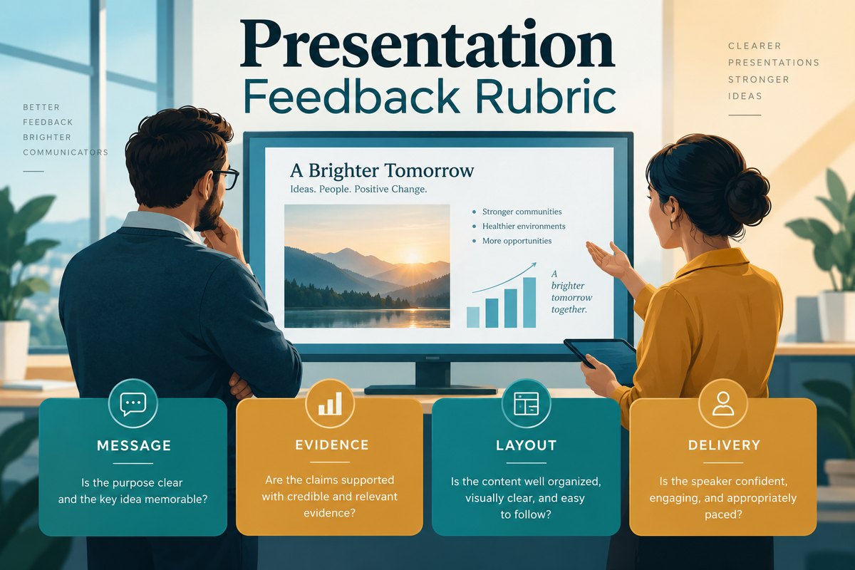
Agree on the task before assigning a score
Write down the audience, the presentation's purpose, the time available, and the decision or understanding it should support. Reviewers cannot fairly assess a five-minute project update against the expectations for a research lecture.
Use a simple three-level scale: 1: missing or unclear; 2: present but needs revision; 3: clear enough for this audience and task. Add “not observed” when the material does not let you judge. For example, delivery is not observed when you have only received a slide file. Do not score it zero.
These are working labels for an editorial review, not a validated assessment instrument. If an institution requires a grading rubric, follow its published criteria and weighting.
Assess four dimensions separately
Message: can the audience explain the point?
- 1: The talk lists topics, but the takeaway or requested action is unclear.
- 2: The purpose appears, but competing points or an unclear sequence make it difficult to follow.
- 3: The opening establishes the task, the sections support it, and the ending states the relevant action or conclusion.
Write down the takeaway you heard before asking the presenter what they intended. The difference between those two sentences often reveals the most important revision.
Evidence: does the support justify the claim?
- 1: Important claims lack a source, or examples are presented as proven results.
- 2: Sources are present, but a missing date range, denominator, comparison, or limitation makes the conclusion hard to assess.
- 3: The audience can trace the relevant support and distinguish an observation from an interpretation or proposal.
A beautiful chart cannot compensate for missing evidence. Record a factual concern explicitly rather than letting a high layout score cancel it out. When a reviewer cannot trace a claim, use a claim-to-source map for the research presentation to connect the exact finding, its source and the qualification the slide must retain.
Layout: can the audience find and read what matters?
- 1: Essential labels are unreadable, or decoration competes with the point.
- 2: The content is mostly readable, but hierarchy, labeling, or density needs work.
- 3: The title and main visual make the point easy to locate; labels, contrast, and spacing support the intended viewing setting.
Review at a realistic display size. A chart that looks clear on the author's large monitor may be unreadable in a shared meeting window. Note the actual label or element, not merely “too much text.”
Delivery: does the explanation help people follow?
- 1: The audience loses the sequence, the talk substantially overruns, or the speaker reads dense slides without explanation.
- 2: Most of the talk is understandable, but transitions, pace, or explanation of visuals is uneven.
- 3: The speaker connects sections, explains important visuals, and completes the intended message within the available time.
Comment on comprehension and the delivery conditions, not accent, extroversion, or a preference for a particular speaking style. Allow for agreed accessibility accommodations.
Turn one observation into one useful revision
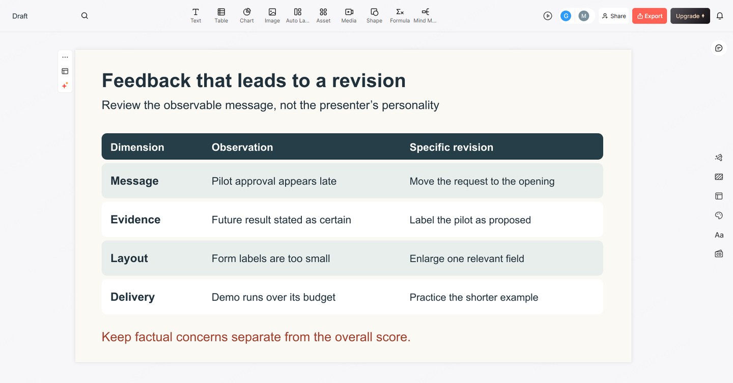
Consider a fictional presentation requesting a pilot for a revised request form. Slide 4 says “The new form will eliminate delays,” but the speaker has only shown examples of incomplete requests. A reviewer might record:
- Observation: Slide 4 presents a future outcome as certain.
- Effect on understanding: I cannot tell whether the form has been tested.
- Revision: State that the pilot will test whether required fields reduce requests for missing information. Show the pilot scope and how that outcome will be observed.
This is more useful than “add data.” The presenter may need a narrower claim rather than another chart. For layout, an equally specific comment would be: “I could not read the three field labels in the shared window; enlarge that part of the form or show fewer fields.”
Resolve disagreements without averaging them away
Have reviewers score independently before discussing. When scores differ, ask each person to point to a slide or moment. One reviewer may know the terminology already, while another represents a first-time audience. That difference matters more than the numerical average.
Do not treat a total such as 10 out of 12 as permission to share an unsupported claim. Keep urgent factual corrections separate from improvements to readability and delivery. Select the few changes that most affect comprehension, assign them, and agree which part needs another rehearsal.
Keep a short review record the presenter can use
For each dimension, record the level or “not observed,” one concrete observation, and one proposed change. End with two short notes: what should stay, and what should change first. This preserves effective examples instead of turning feedback into a demand to rebuild everything.
When a revised outline is ready, create an editable slide draft from that text in Presenti. Review the resulting wording and layouts against the specific feedback. Presenti is not being used here as an automated judge of evidence or presentation quality.