A good presentation helps the audience understand something that matters to them. That might be a research finding, a new skill, or a decision they need to make. The ideas follow a clear order, the visuals are readable, and the presenter explains the evidence at a pace the audience can follow.
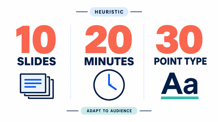
The 10/20/30 rule is a useful pitching heuristic, not a universal law: about ten slides, twenty minutes, and no font smaller than thirty points. The stronger principle is to match content to the audience, the decision, and the time available.
Start with the Audience and the Decision
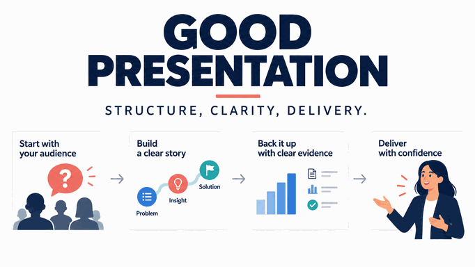
Before you choose a theme or write a title, complete this sentence: “After this presentation, this audience should be able to ___.” The blank should name an observable action such as approve a project, choose a vendor, understand a research finding, or practice a new process.
Record the audience’s starting knowledge, likely questions, available time, and decision rights. A board update, sales proposal, and classroom lesson may use the same visual tools, but not the same sequence or level of detail.
| Audience situation | What the deck must make clear |
|---|---|
| Decision meeting | The recommendation, evidence, trade-offs, owner, and decision needed. |
| Sales or pitch meeting | The buyer’s problem, your approach, proof, risk, and next step. |
| Research or report | The question, method, result, limitation, and implication. |
| Teaching or training | The learning goal, explanation, practice, and check for understanding. |
Build a Narrative Arc, Not a Stack of Topics
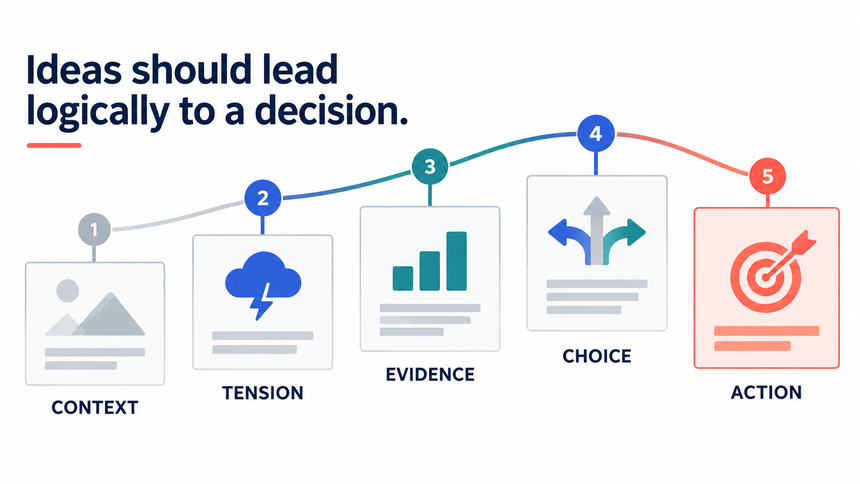
A presentation is easier to follow when each section answers the question created by the previous one:
- Context: What situation or audience problem matters?
- Question: What must the group decide or understand?
- Evidence: What facts, examples, or observations support the answer?
- Recommendation: What should happen and why?
- Action: Who does what next, by when, and how will progress be checked?
This structure does not require dramatic storytelling. It gives every slide a job. If a slide cannot answer “Why is this here?” or “What should the audience do with it?”, move it to the appendix or remove it.
Give Every Slide One Primary Job
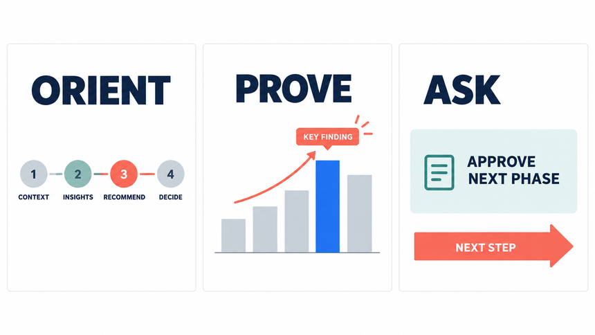
Use a slide outline before writing full copy. This is a practical starting point for an eight-slide business update:
| Slide | Primary job | What to show |
|---|---|---|
| 1. Decision | Orient the room | The question, recommendation, or outcome in one sentence. |
| 2. Why now | Establish relevance | One change, risk, opportunity, or audience need. |
| 3. Evidence | Support the claim | The strongest chart, example, quote, or comparison. |
| 4. Diagnosis | Explain the pattern | Drivers, segments, assumptions, or constraints. |
| 5. Options | Make trade-offs visible | Two or three viable paths with comparable criteria. |
| 6. Recommendation | Choose a direction | The selected path and the reason it fits the goal. |
| 7. Plan | Make execution concrete | Milestones, owner, dependencies, and review signal. |
| 8. Ask | Request a decision | The decision or next action required from this audience. |
Longer presentations can add detail, practice, or an appendix. The principle remains the same: one primary job per slide, with the title carrying the point rather than merely naming the topic.
Choose a Slide Count That Fits the Task
There is no universal number of slides that makes a presentation good. Slide count is a constraint, not a quality score. Start with the available time, the audience's familiarity with the topic, the complexity of the evidence, and the decision the presentation must support.
Build the shortest sequence that completes the narrative arc. A five-minute update may need three to five focused slides; a technical review may need more evidence and appendix slides. Estimate how long each slide needs in rehearsal, then cut or split slides that force you to rush. Keep detailed backup material outside the main path so questions do not overload the core story.
Practical check: remove a slide and ask whether the audience can still understand the problem, evidence, recommendation, and next step. If yes, the slide may not belong in the main deck.
Use the 10/20/30 Rule Only When It Fits
The 10/20/30 rule is a useful pitching heuristic: roughly 10 slides, 20 minutes, and type no smaller than 30 points. It can encourage discipline, but it is not a general definition of presentation quality. A board update, workshop, lecture, and product demo have different evidence and interaction needs.
Use the rule when you need a simple constraint for a concise pitch. Adapt it when accessibility, required disclosures, audience questions, or technical detail demand a different format. Our dedicated guide explains how to apply the 10/20/30 rule without treating it as a rigid law.
Practical check: if meeting the rule makes you omit necessary evidence or shrink labels, prioritize comprehension and credibility instead.
Make the Visual Hierarchy Do the Work
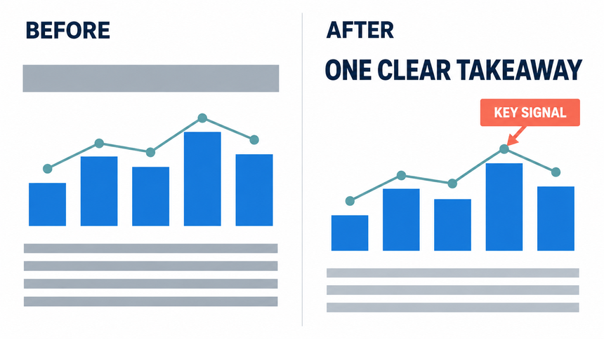
- Use a sentence-style title that states the finding or decision.
- Give the primary evidence the largest visual area and reduce competing decoration.
- Use one accent color for emphasis and neutral colors for context.
- Align elements to a repeatable grid and keep spacing consistent.
- Prefer a chart, diagram, or short example when a paragraph would be hard to scan.
- Check contrast, font size, captions, and labels on the actual display or a realistic preview.
One visual does not mean one object. A slide can contain a chart and a short annotation when they answer the same question. It becomes noisy when each element argues for a different idea.
Match Evidence to the Claim
| Layer | Example wording | Required check |
|---|---|---|
| Observation | “The three largest segments account for most of the recorded requests.” | Confirm denominator, date range, and source. |
| Interpretation | “The pattern may indicate onboarding friction is concentrated in those segments.” | Show supporting segment or qualitative evidence. |
| Recommendation | “Test a revised setup guide with those segments next month.” | Name owner, test, signal, and review date. |
Label illustrative numbers, forecasts, estimates, and examples. A polished chart can make an unsupported claim feel certain, so the source note and limitation belong on the slide or in the speaker notes.
Plan the Delivery, Not Just the Slides
Rehearse transitions between ideas, not only the words on each slide. Prepare a one-sentence answer for likely objections and decide which evidence belongs in the appendix. Test the deck on the actual screen when possible.
During delivery, give the audience a moment to read a chart before explaining it. Do not read every visible sentence aloud. Pause after the recommendation and invite the question that will move the decision forward.
For a remote session, plan for smaller windows and participants who may not see fine labels. Provide a concise written follow-up with the source, decision, owner, and next review date.
Example: Turn a Project Update into a Clear Presentation
Suppose a team needs approval to move a launch date. A deck organized around department updates makes the audience piece together the problem. A clearer version opens with the proposed date, shows what is blocking the launch, and compares the costs of delaying with the risks of proceeding.
Write the message before designing
A brief might read: “Help the project sponsor decide whether to delay launch by two weeks so the team can complete the remaining integration tests.” Add the evidence the sponsor will need: the test status, dependencies, estimated cost, and alternatives. These are illustrative planning details, not results from a Presenti customer.
Draft only the slides you need
Use five slides: the decision requested, current test status, unresolved risks, options, and recommendation. Put detailed test results in an appendix. Each title should tell the sponsor something useful, such as “Two integrations still need testing,” rather than simply “Progress.”
Build and revise the draft
Use the Presenti AI presentation maker to draft slides from your topic or supported source material. If you have already written the outline, use the text-to-presentation workflow. Compare the draft with your project notes, replace generic statements with the actual evidence, and keep the recommendation in your own words. PowerPoint and PDF exports require an eligible paid plan.
Rehearse the decision, not just the script
Practice explaining why the recommendation follows from the evidence. If a colleague asks what happens if the tests fail again, add that contingency to the options slide. Open the exported or shared deck on the presentation device to check that the charts, fonts, and links work as expected.
Common Presentation Problems and Fixes
| Problem | Likely cause | Fix |
|---|---|---|
| The deck feels long | Slides repeat context or evidence. | Give each slide a job and move detail to the appendix. |
| The audience asks “so what?” | Titles describe topics instead of decisions. | Rewrite titles as findings, implications, or asks. |
| Slides are hard to read | Text is compensating for an unclear narrative. | Reduce copy, enlarge the key point, and explain the rest verbally or in notes. |
| Questions derail the meeting | Definitions, sources, or limits are hidden. | Add a methodology note and an appendix with traceable detail. |
| The close is vague | No owner, deadline, or decision rule was assigned. | End with one explicit next action and a review signal. |
A Useful Final Rehearsal
Ask a colleague who has not seen the deck to watch a timed run-through. Afterwards, ask what they understood and what remained unclear. Their answer will tell you more than another round of cosmetic changes. If they miss the main point, revise the opening or example; if they understand it but cannot read the evidence, fix the slide.
Frequently Asked Questions
Is the 10/20/30 rule right for every presentation?
No. It is a focus and legibility heuristic created for pitches. Use the audience’s needs, room, format, and time as the governing constraints.
Should every presentation have a story?
Every presentation needs a logical path. It may be a problem-solution story, a research question, a teaching sequence, or a decision review. Narrative means the ideas connect; it does not require drama.
How can AI improve a presentation?
AI can help organize an outline, propose slide titles, and draft layouts. Review the result for factual accuracy, source handling, readability, accessibility, privacy, and audience fit.
Help the Audience Follow Your Thinking
Start with what your audience needs to understand, then choose the slides that help them get there. A clear example, a readable chart, and a well-rehearsed explanation usually do more than extra decoration. When time is tight, simplify the presentation rather than trying to speak faster.