Short answer: A quadrant chart is a two-axis decision map. Plot each comparable item against an x value and a y value, divide the space into four meaningful regions, and attach a different next action to each region. It is most useful for trade-offs such as impact versus effort, urgency versus importance, or reach versus conversion potential.
This guide explains how to choose defensible axes, build a 2x2 matrix, label it for a presentation audience, and use the result without treating a simple graphic as a complete strategy.
What Is a Quadrant Chart?
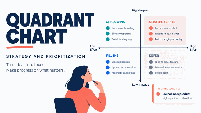
A quadrant chart, also called a 2x2 matrix or quadrant graphic, plots items against two numeric or ordered dimensions. A horizontal and vertical reference line split the plot into four quadrants. Each point, bubble, or label represents an item such as a customer segment, feature, project, or market.
The value comes from the definitions behind the axes, the evidence used to place each item, and the decision attached to each region. A quadrant chart is not a ranking machine. If placement is subjective, label it as an estimate and document the rubric.
When Should You Use a 2x2 Matrix?
Use a quadrant chart when the audience must compare several items with the same two questions. It can help prioritize projects by impact and effort, segment customers by value and growth potential, compare products by ease of use and workflow depth, screen content ideas, or show risks by likelihood and consequence.
Choose another chart when the audience needs a time trend, a precise ordered list, a part-to-whole relationship, or many exact values. A bar chart or table is usually clearer for a long ranking. A line chart is better for change over time. A comparison chart in a presentation is a better fit when the audience needs to compare many attributes rather than two.
Define the Axes Before You Plot Anything
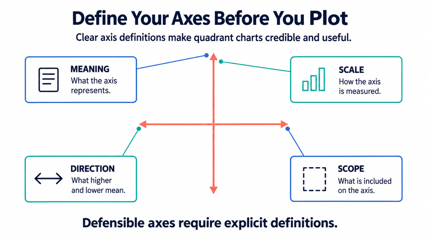
The axes determine the argument your graphic makes. Write one sentence for each axis before opening PowerPoint or a spreadsheet:
| Axis decision | Question to answer | Example |
|---|---|---|
| Meaning | What does a high value mean? | High impact means a measurable contribution to the stated goal. |
| Unit or rubric | How is the value estimated? | Effort is a shared low, medium, or high estimate based on known work. |
| Direction | Which direction is desirable? | Move from low to high left-to-right and bottom-to-top. |
| Time and scope | When and for what population is it true? | Use the same quarter and customer segment for every point. |
Avoid vague axes such as “quality” and “value” unless you define them. Two axes that measure almost the same thing add little information. Two unrelated axes make an attractive but irrelevant scatter of points.
Give Each Quadrant a Decision, Not Just a Name
| Quadrant | Interpretation | Suggested action |
|---|---|---|
| High impact, low effort | Clear near-term leverage | Commit, assign an owner, and schedule it. |
| High impact, high effort | Important but resource-intensive | Validate the case, stage the work, and define a milestone. |
| Low impact, low effort | Useful only when capacity is available | Bundle, automate, or keep as a backlog option. |
| Low impact, high effort | Weak trade-off under the current goal | Defer, redesign, or stop unless context changes. |
The labels are conditional. A project can move when the goal, evidence, or capacity changes. Add a date and methodology note so the chart is not mistaken for a permanent verdict.
Build a Quadrant Chart Step by Step
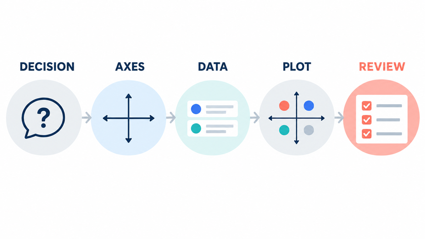
A useful quadrant chart starts with a decision and a traceable data table. Follow these steps before polishing the slide.
Step 1: Write the decision in one sentence
Input: the audience, the items being compared, and the decision due at the end of the meeting.
Action: complete this sentence: "We need to compare [items] so [audience] can decide [action]." For example, "We need to compare content projects so the marketing team can choose what to fund this quarter."
Expected result: one decision statement. Check: if the chart would still look useful without leading to that decision, the scope is too broad.
Step 2: Build the source table
Input: one row per item and the evidence used to score it.
Action: create columns for item name, x-axis value, y-axis value, source or rationale, and owner. Use one scale consistently, such as 1 to 5. Define what the endpoints mean before scoring. If "impact" runs from 1 to 5, write down whether 5 means revenue potential, audience reach, strategic value, or a weighted score.
Expected result: a table in which every marker can be traced to a row. Check: remove or flag any item that has a missing value or an unsupported score.
Step 3: Plot the paired values
Input: the item label, x value, and y value from the source table.
Action: in Excel or the worksheet behind a PowerPoint chart, select the two numeric columns and insert an XY scatter chart with markers only. Make sure the horizontal series uses the x-axis values and the vertical series uses the y-axis values. Add item names as data labels rather than relying on a distant legend.
Expected result: one marker per complete row. Check: verify at least three points against the source table, including the highest and lowest values.
Step 4: Set defensible thresholds
Input: a target, policy limit, benchmark, median, or another documented cutoff.
Action: place one vertical and one horizontal divider at those values. If no external threshold exists, use a transparent rule such as the median and label it. Do not move the lines merely to distribute items evenly.
Expected result: four regions whose boundaries can be explained aloud. Check: ask whether a small scoring change would move an item into another quadrant; if so, mark it as borderline instead of presenting false certainty.
Step 5: Turn each quadrant into an action
Input: the four regions and the decision statement from Step 1.
Action: give each quadrant an action label such as "Do now," "Plan," "Delegate," or "Avoid." Add a descriptive slide headline, a short axis definition, and a source note. Use color as a secondary cue, not as the only way to distinguish actions.
Expected result: a chart that tells the audience what to do next. Check: view the slide at presentation size; labels, thresholds, and outliers should be readable without zooming.
Illustrative Example: Prioritize Content Projects
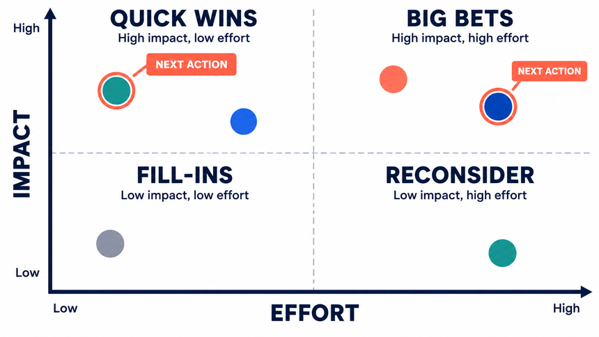
Imagine a marketing team deciding which content projects to investigate next. The x-axis is estimated implementation effort and the y-axis is expected contribution to a specific pipeline goal. The team uses the same rubric for every project and marks the estimates as illustrative rather than measured outcomes.
The upper-left region contains a refreshed comparison guide and a sales enablement checklist. The upper-right region contains a large research hub that needs subject-matter review. The lower-left region contains small copy updates, while the lower-right region contains a complex redesign with no clear connection to the current goal.
The slide should say these are the best candidates for the next validation step under the stated assumptions, not that they will produce a guaranteed return. Add the source of each estimate and revisit the positions after the next complete reporting period.
Make the Graphic Easy to Read in a Meeting
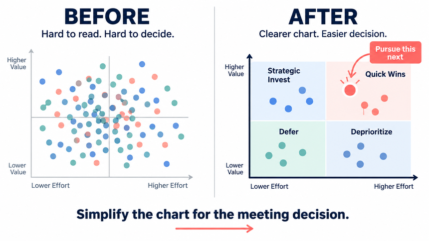
- Use a title that states the decision, not just “Quadrant Analysis.”
- Put the unit or scoring rubric near each axis.
- Use one accent color for the focal group and neutral colors for context.
- Label only the points the audience must discuss; move the full list to an appendix.
- Use bubble size only when the third variable changes the decision, and define its scale.
- Check labels at projection size and after export.
Do not rely on color alone. Add text labels, sufficient contrast, and a sentence that states the main takeaway.
Use Presenti AI for the Structure, Then Review the Evidence
- Prepare the decision question, axis definitions, scoring table, source notes, and expected action.
- Use Text to Presentation or the AI presentation maker to create a first slide structure.
- Ask for a quadrant slide that keeps the axes, threshold lines, item labels, and methodology visible.
- Inspect every point against the source table. Correct labels, scales, overlaps, and unsupported interpretations.
- Share only after checking the chart at presentation size and confirming an owner.
The tool can accelerate layout and sequencing; it cannot decide whether an estimate is defensible or whether opinion and evidence have been mixed. Keep source data and review notes with the deck.
Common Quadrant Chart Mistakes
Using convenient thresholds
Median lines, averages, targets, and policy limits answer different questions. Name the threshold and keep it stable.
Putting opinions on numeric axes without a rubric
Judgment can be useful, but it should be repeatable. Define low, medium, and high and record who supplied the estimate.
Overloading the slide
When every item has a paragraph, the quadrant disappears. Show the decision set and move evidence to the appendix.
Turning a snapshot into a promise
A quadrant chart describes a choice under assumptions. It does not prove that a project will succeed. Add a review date and the signal that would change the decision.
Quadrant Chart Checklist
- The slide states one decision and names the population being compared.
- Both axes have a definition, direction, unit, and time scope.
- Every point can be traced to a source, owner, or documented estimate.
- Threshold lines are explained and were not moved to improve balance.
- Quadrant labels include an action or decision rule.
- Color is not the only way to distinguish regions.
- The conclusion is conditional, dated, and easy to review.
Frequently Asked Questions
Is a quadrant chart the same as a SWOT analysis?
No. A quadrant chart positions comparable items on two dimensions. SWOT organizes strengths, weaknesses, opportunities, and threats. A quadrant can support a SWOT discussion but does not replace it.
Should the four quadrants always be equal in size?
No. Equal regions are common, but boundaries should follow the decision rule. A target or policy limit may create unequal regions.
How many items should a quadrant chart contain?
Use the smallest set that supports the decision. If labels overlap, split the view or move detail into a table.
Bottom Line
A good quadrant chart makes a trade-off explicit. Define the axes, use comparable evidence, attach an action to each region, and show the limits of the snapshot. Use Presenti AI to accelerate the first layout, then review every point and threshold against the source data.