A win–loss analysis presentation should explain which sales opportunities ended, what buyers chose, and which explanations the evidence supports. Start with the group of deals you are counting. Then compare recorded reasons with buyer accounts before recommending a change to pricing, positioning, or the sales process.
The example below follows 24 fictional opportunity records through an internal sales review. It gives you a cohort table, a reason comparison, and two slides you can adapt. Once your analysis is settled, you can use Presenti’s text-to-presentation tool to turn the findings into an editable slide draft. The numbers and judgments belong in your brief; a slide generator cannot establish why a buyer made a decision.

Define the deals before showing the win rate
Suppose a sales team is reviewing opportunities that ended during one quarter. It finds 24 records: 10 wins, 8 losses to another supplier, 4 cases in which the buyer made no purchase, and 2 records disqualified before they became qualified opportunities. These are invented teaching data, not Presenti customer results.
Use the ending date to select this review cohort, rather than mixing deals created this quarter with older deals closed this quarter. Leave open opportunities outside the table. Write down what “qualified” meant before examining the outcomes; removing unsuccessful deals afterwards would make the rate look better without improving sales.
| Outcome | Records | Included in the qualified, ended cohort? |
|---|---|---|
| Won: buyer purchased from the team | 10 | Yes |
| Competitive loss: buyer chose another supplier | 8 | Yes |
| No decision: buyer made no purchase | 4 | Yes |
| Disqualified before qualification | 2 | No; shown separately |
| All ended records | 24 | 22 qualified; 2 excluded |
For this review, the main win rate is 10 ÷ 22 = 45.5%. It includes the four qualified opportunities that ended without a purchase. If the question is specifically “When a buyer selected a supplier, how often were we chosen?”, the answer is 10 ÷ 18 = 55.6%. That is a different, conditional measure: it excludes no-decision cases.
Both calculations are useful when labeled. Switching from 45.5% to 55.6% without explaining the denominator is misleading. Also state that these are deal counts, not a revenue-weighted rate. One large contract and one small contract each count as one opportunity here.
Give no-decision cases their own place on the slide
A two-color won/lost chart would hide an important distinction in this example. Eight buyers chose an alternative; four did not buy at all. A competitive comparison may help explain the first group. For the second, the useful questions might concern priority, funding, timing, or whether anyone had authority to proceed.
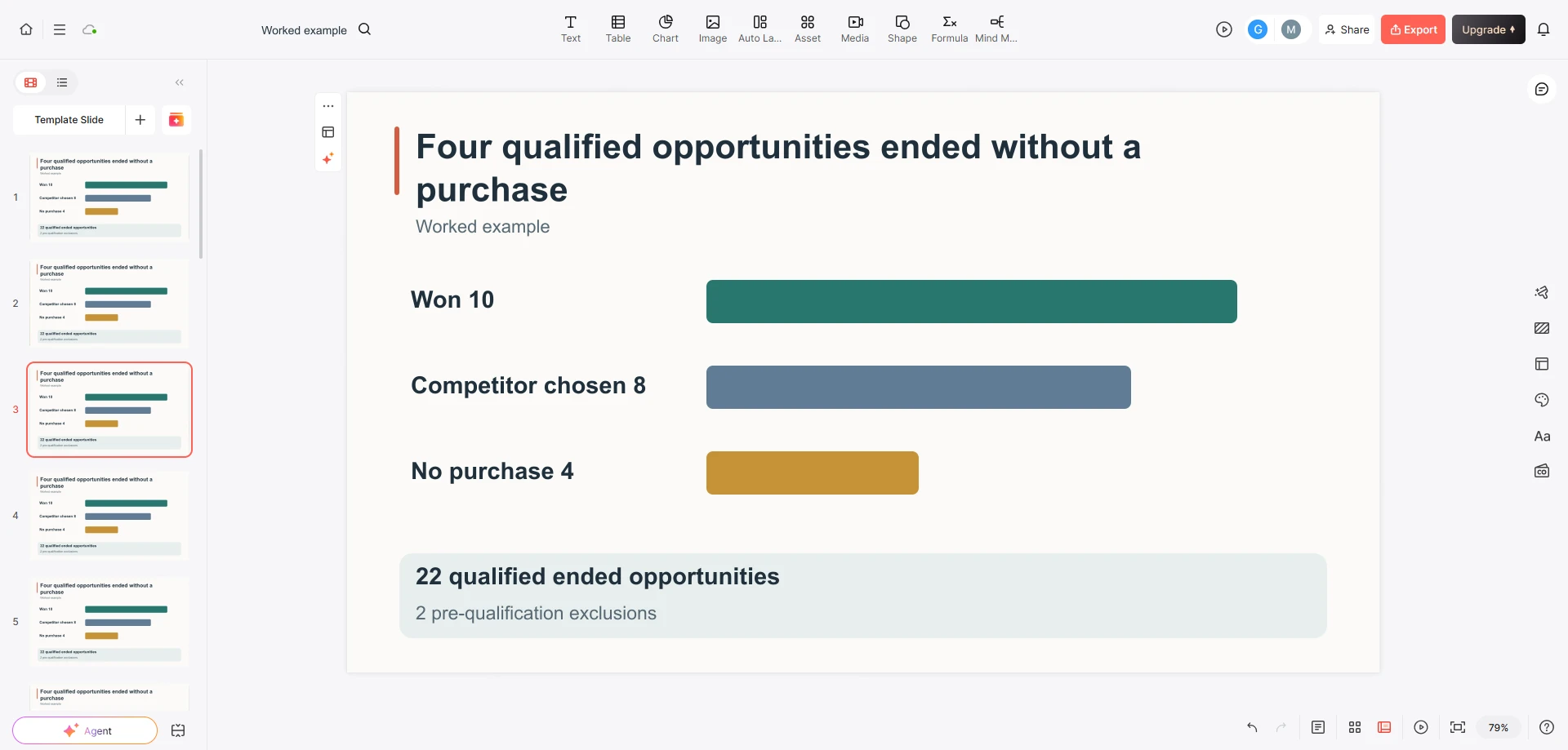
Use three labeled bars for the 22 qualified opportunities: won 10, competitor chosen 8, no purchase 4. Put “2 pre-qualification exclusions” beside the chart rather than making them a fourth segment of the same qualified cohort. This makes the relationship visible without asking the audience to decode a footnote.
With only 22 qualified records, start with counts. A shift of one deal changes the rate noticeably. You can show a prior period alongside this one if its qualification rule, ending-date window, and outcome definitions match. If they do not, explain the change in scope instead of presenting the difference as sales improvement.
Compare the reason code with what the buyer actually said
A CRM loss reason is a useful starting point, but it compresses a conversation into a label. Salesforce’s reporting tutorial separates outcome reporting, loss reasons, and competitor comparisons. Keep those questions separate in the presentation too: what happened, what was recorded, and what you know about the explanation.
In the fictional review, three selected non-winning records carry a “price” code. Two are among the eight competitive losses; the third is among the four no-decision cases. The summaries below are invented examples, not quotations from real interviews.
| Record and outcome | Buyer account in the example | What the presentation can say |
|---|---|---|
| L02 — competitive loss | The buyer selected a lower quote covering the same stated requirements. | Quoted price appears relevant in this case. Confirm that implementation and service scope were comparable. |
| L05 — competitive loss | The buyer expected less internal implementation work with the other supplier. | The account points to adoption effort. A license-price reduction would not necessarily address that concern. |
| N03 — no decision | Funding was frozen before the buyer approved any purchase. | This was a purchase that did not proceed, not evidence that a competitor undercut the offer. |
Do not turn these three selected accounts into “one-third of buyers care about implementation.” They are neither a representative sample of all 22 opportunities nor a complete explanation of the 12 non-wins. They show why the same reason code can conceal different situations.
Keep the original code and add the account alongside it, with its source and date. A seller’s recollection, a buyer interview, and a procurement document offer different kinds of evidence. If they disagree, show the disagreement in your working notes and narrow the slide’s claim. You do not need to settle every disputed explanation before presenting the useful distinction.
Write two result slides that can stand on their own
The first slide establishes the outcome pattern. The second explains one finding worth acting on. Giving each a sentence title helps the audience follow the argument without reading a wall of methodology.
Slide 1: “Four qualified opportunities ended without a purchase”
Show the three bars: 10 won, 8 competitor chosen, 4 no purchase. Beneath them, write: “22 qualified opportunities ended this quarter; 2 pre-qualification exclusions shown separately. Win rate: 10/22, or 45.5%.” Use a short note for the conditional supplier-choice rate, 10/18 or 55.6%, only if the meeting needs that comparison.
Your spoken explanation can be brief: “A third of our 12 non-wins involved no purchase at all. We should understand those cases separately from buyers who selected another supplier.” The fraction is four out of twelve non-wins, not four out of all opportunities.
Slide 2: “The price code covers three different situations”
Use three compact cards for L02, L05, and N03. Each card needs its outcome, the buyer-account summary, and the question it raises. Keep “Selected examples; not a frequency estimate” on this slide so it remains accurate when someone forwards it without your narration.
The recommendation should match the evidence: investigate comparable quotes for L02, examine adoption effort for L05, and understand the approval sequence for N03. The material does not support a blanket price cut or a claim that implementation is the team’s leading loss driver.
Choose a small next investigation, not a sweeping explanation
The useful output of this review is a sharper question. In the example, a sales operations lead could reconcile the four no-decision records with the buyers’ approval timelines. A product marketer could compare the implementation expectations in L05 with a recent win where onboarding effort was also discussed.
Looking at wins matters. If both winning and losing buyers mention implementation effort, its presence alone does not explain the outcome. Ask what the buyer expected, what the team demonstrated, and which trade-off the buyer accepted. Preserve cases that contradict your initial story.
Give each follow-up a named owner, a source to obtain, and the decision it could change. For example: “Product marketing will compare the buyer’s implementation expectations with the proposal and demonstration notes for L05 before changing the adoption message.” This is more useful than “Improve onboarding” because it identifies what is still unknown.
Confirmed findings can later inform a sales strategy presentation. Keep that broader plan separate from this review: selecting next quarter’s market, staffing, and targets requires more evidence than one small group of ended opportunities.
Turn the analysis into a deck without losing its meaning
Prepare a concise text brief with the cohort definition, the outcome table, the three example records, and the two proposed slide titles. Remove buyer names, contact details, contract contents, and other confidential material you do not need in the presentation.
For the draft, specify: “Use 22 qualified ended opportunities as the primary denominator. Show 2 earlier disqualifications separately. Keep 10/18 as a conditional measure, not the headline rate. Label the three buyer accounts as selected fictional examples. Do not infer additional reasons or recommend a discount.” These instructions preserve the analysis while leaving room to improve layout.
When editing the slides, keep denominators next to percentages and record IDs next to evidence summaries. If a table is too dense, split it across two slides rather than dropping the outcome column. The finished deck should let someone distinguish a recorded result, a buyer’s explanation, and the next question—even when they read it after the meeting.