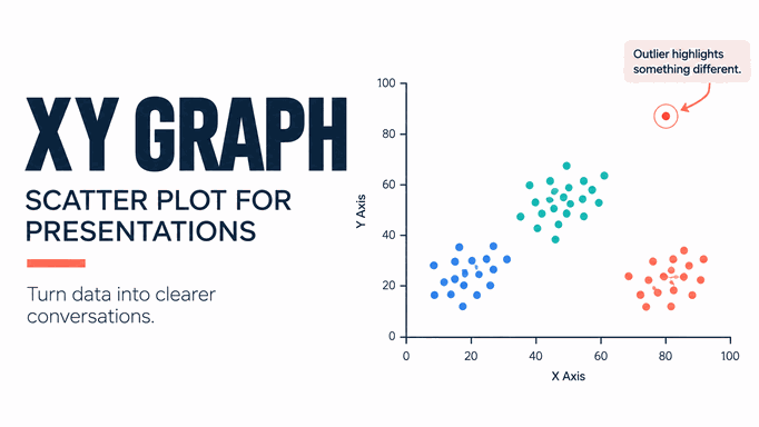
Short answer: An XY graph, usually called a scatter plot or scatter chart, places paired numeric values on a horizontal x-axis and a vertical y-axis. Use it when the question is about the relationship between two measured variables, not simply the order of categories or the passage of time.
This guide explains when a scatter plot is clearer than a line chart, how to prepare paired data, how to label the result for a presentation audience, and how to review an AI-assisted chart without losing the connection to the source table.
For the wider decision—bar, line, pie, donut, funnel, radar, or scatter—see the chart types for presentations guide before narrowing the question to an XY graph.
What Is an XY Graph?
An XY graph plots each observation as a point with an x value and a y value. Both axes are value axes, so the distance between 10 and 20 is represented numerically rather than as two equally spaced categories. Several series can be shown when each series uses the same axis definitions.
Microsoft describes a scatter chart as a chart with two value axes, and notes that it is often called an XY chart. Google’s chart guidance likewise uses a scatter chart to show numeric coordinates and explore how one variable is affected by another. These definitions are useful boundaries: a scatter plot is about paired values and relationships, not a decorative collection of dots.
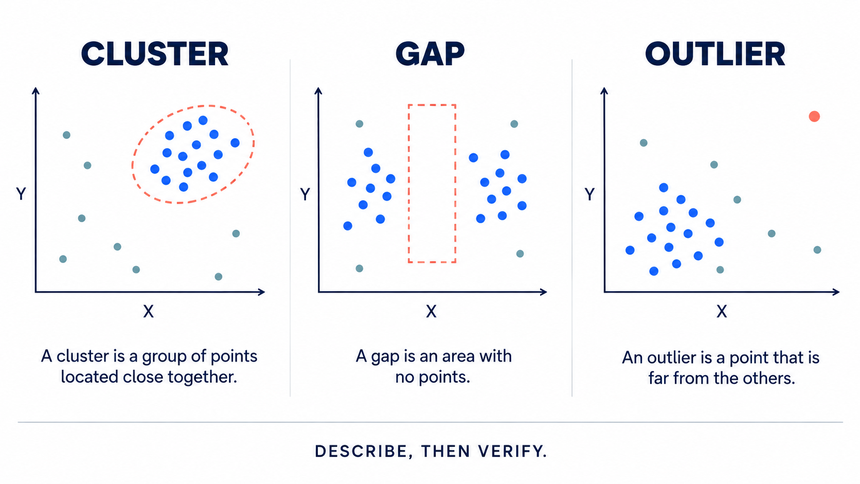
A point can reveal a cluster, a gap, an outlier, or a possible trend. It cannot, by itself, prove causation. The slide should identify the observation unit, time window, source, and any transformation applied to the data.
Scatter Plot or Line Chart?
| Use a scatter plot when... | Use a line chart when... |
|---|---|
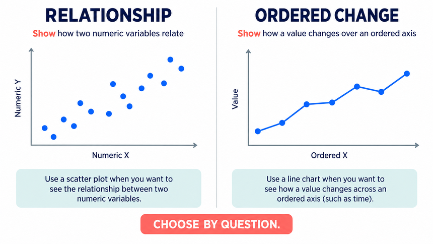
| The x values are numeric measurements such as price, size, or hours. | The x-axis is an ordered sequence such as days, months, or quarters. |
| The spacing between x values matters. | Categories should be evenly spaced for a simple trend view. |
| You want to inspect clusters, outliers, or a possible relationship. | You want to emphasize movement over an ordered time period. |
| Each row contains a paired x and y observation. | Each value belongs to a sequence where connecting points helps the reader follow change. |
“Hours of training and assessment score” is a natural scatter-plot question. “Assessment score by month” is usually a line-chart question. If months are missing or irregular, check whether a scatter plot better represents the spacing.
Prepare Paired Data Before Designing the Slide
Start with a table, not a chart template:
| Column | Purpose |
|---|---|
| Item or observation ID | Lets the audience trace a point back to a row. |
| X variable | The explanatory measure, with unit and date. |
| Y variable | The outcome or comparison measure, with unit and date. |
| Group, if needed | Identifies a segment or series using a non-color cue as well. |
| Source note | Records where the value came from and whether it is observed or estimated. |
Keep x and y values from the same observation or reporting window. Do not silently replace a missing value with zero. Mark missingness, filter it with a visible note, or use a method that handles it explicitly.
Build an XY Graph Step by Step
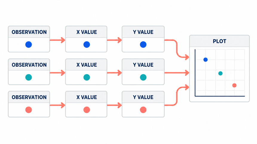
The charting tool is the easy part. The important work is preserving the relationship between each observation and its two values.
Step 1: Arrange one observation per row
Input: the items you want to compare and two numeric measures for each item.
Action: create columns for item name, x value, y value, optional group, and source. Keep units consistent within each axis. Do not place x values in one unlabeled block and y values in another.
Expected result: every row contains one complete x-y pair. Check: identify blanks, text stored as numbers, mixed units, and duplicate observations before charting.
Step 2: Select the paired numeric columns
Input: the cleaned x and y columns.
Action: select the x column first and the y column second. In Excel or the worksheet behind a PowerPoint chart, choose Insert > Scatter > Scatter with only markers. Use a line chart only when the horizontal axis is an ordered sequence and connecting observations has meaning.
Expected result: one point per complete row. Check: the horizontal and vertical positions of three sample points should match their source values.
Step 3: Verify the series mapping
Input: the first chart draft.
Action: open the chart's data or series settings and confirm which range supplies x values and which supplies y values. If the chart created multiple series by mistake, rebuild it from the two numeric columns instead of trying to style around the error.
Expected result: a single accurate series, or clearly separated groups that share the same axes. Check: confirm the x and y coordinates of several labeled observations against the original rows; a symmetric pattern alone cannot establish that the mapping is correct.
Step 4: Set readable axis bounds and units
Input: the data range and any meaningful benchmark.
Action: set minimum, maximum, and major intervals so the points use the plotting area without exaggerating small differences. Add axis titles with units, such as "Response time (ms)" or "Conversion rate (%)." Use the same number format on the axis and in labels.
Expected result: an honest scale that can be read quickly. Check: the bounds should not hide outliers or imply that a truncated scale starts at zero.
Step 5: Label the evidence, not every pixel
Input: item names, groups, and the message the slide must support.
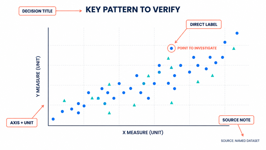
Action: write a descriptive headline, label both axes, and directly label the few points that matter: a key outlier, a target, or a representative cluster. Use a restrained color for the full series and one accent color for the point being discussed.
Expected result: the audience can identify the pattern and the important exception without searching a legend. Check: labels must not overlap at normal slide size.
Step 6: Add analysis only when it is justified
Input: enough observations and a reason to summarize the relationship.
Action: add a trendline only when its form and interpretation are defensible. State that correlation does not establish causation, and show uncertainty or sample size when it materially affects the conclusion.
Expected result: analysis that supports the claim without overstating it. Check: remove the trendline if the conclusion depends on one outlier or if the sample is too small.
Step 7: Move the chart into the presentation
Input: the verified chart and its source note.
Action: place the chart on a slide, preserve its aspect ratio, and size it for the final room or screen. Add a one-sentence takeaway and keep the source close to the graphic. If data may change, decide whether the chart should remain linked to the worksheet or be pasted as a stable image.
Expected result: a slide that communicates one evidence-backed relationship. Check: test it at the actual presentation resolution and confirm that the source still opens.
Label the Chart So the Audience Can Read It
“Conversion rate versus page load time” identifies the variables; “Slower pages cluster below the conversion baseline” adds a claim that the plotted data can support or challenge.
- Write the full variable name and unit on each axis.
- State the observation unit, such as page, account, campaign, or week.
- Use direct labels for a few important points and a table or appendix for the rest.
- Explain whether a line is a fitted trend, a target boundary, or a visual guide.
- Use symbols, labels, or patterns in addition to color for groups.
- Keep a source and checked-date note close enough to survive slide forwarding.
Do not imply that a trendline is a forecast unless you have described the model and assumptions. A line can summarize association while still being a poor basis for a causal recommendation.
Read Clusters, Gaps, and Outliers Carefully
| Pattern | Useful question | Next check |
|---|---|---|
| Cluster | Which group shares the same operating condition? | Segment by product, channel, region, or time. |
| Outlier | Is the point real, a data issue, or a special case? | Trace it to the source row and confirm the measurement. |
| Gap | Which range has few or no observations? | Check whether the sample excludes that range. |
| Fan shape | Does variability change as x increases? | Review scale, subgrouping, and whether one summary misleads. |
Correlation describes how values move together under the observed conditions. It is not proof that changing x will cause y to change. Use an experiment, domain evidence, or a more appropriate method when causality matters.
Use a Practical Example Instead of a Decorative Plot
Suppose a customer-success team reviews onboarding accounts. The x-axis is setup sessions completed in the first month. The y-axis is the percentage of the core workflow completed by day 30. Each point is one account, and the slide states that the values are illustrative.
The audience sees a middle cluster, a group with many sessions but low completion, and several accounts with high completion after few sessions. That pattern suggests questions about setup friction and enablement. It does not establish that adding sessions will automatically improve completion. The next slide can show segment definitions and interviews needed to test the explanation.
Use Presenti AI as an Editable Starting Point

- Provide the audience, decision, x and y definitions, units, observation period, and source note.
- State whether the data should be shown as points, groups, a target line, or a trendline. Do not ask the tool to infer a relationship from an unlabeled table.
- Use Text to Presentation or the AI PPT maker to draft the slide sequence.
- Compare the editable result with the source table row by row. Check mapping, scale, labels, units, and summarized claims.
- Keep the source file and review note with the deck. A polished chart is still a draft until human review.
Presenti is an AI presentation maker that can turn a chart brief or source document into an editable presentation draft. For a scatter-plot slide, keep the chart question, x and y definitions, units, observation period, and source note in the input so the draft has a traceable starting point.
The chart gallery includes a Scatter Plot option. The screenshot below shows the available product type; it does not replace checking the plotted values against the source table.
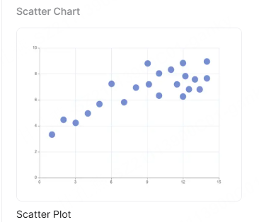
Once the draft is ready, refine the labels, layout, and takeaway in the editable workspace. Before sharing, compare every plotted point with the source table and make sure the slide still communicates the intended relationship.
Common XY Graph Mistakes
Using categories on a numeric x-axis
Labels such as “low,” “medium,” and “high” are not automatically numeric. Define an ordered scale or use a category chart.
Connecting points that have no sequence
Lines imply an order or path. Use markers without connecting lines when observations are independent.
Hiding the scale choice
Truncated axes, uneven intervals, and unexplained log scales can change the perceived relationship. Make the scale visible and purposeful.
Calling association a cause
Use “moves with,” “is associated with,” or “clusters around” when that is what the evidence supports.
Using too many points without a reading plan
Aggregate, sample, or split the view when the audience cannot see the pattern. Preserve the full dataset in the appendix.
XY Graph Presentation Checklist
- The question requires paired numeric values rather than categories or a simple time trend.
- Each point has a clear observation unit, date, and source.
- The x and y variables, units, direction, and scale are visible.
- Series and labels are mapped correctly and readable at presentation size.
- Any trendline, target, or threshold is named and explained.
- Outliers, gaps, and missing values have documented treatment.
- The conclusion distinguishes association from causation and names the next check.
Frequently Asked Questions
Is an XY graph the same as a scatter plot?
In presentation and spreadsheet software, the terms commonly describe the same family of charts: points positioned by x and y numeric values. Names and subtypes can vary by software.
Can a scatter plot show three variables?
It can encode a third variable with bubble size, shape, or color, but every encoding adds a reading burden. Define it and use it only when it changes the decision.
Should I add a trendline?
Add one when the relationship is part of the question and the model choice is defensible. Label it, state limitations, and do not present it as a forecast by default.
Bottom Line
An XY graph earns its place when the audience needs to see how two numeric variables relate. Prepare paired data, choose the right scale, label the source, and inspect patterns and exceptions. Use Presenti AI to accelerate the slide structure, then verify the chart against the original rows.