A donut chart is useful when a presentation needs to show a small part-to-whole breakdown and one headline total in the center. It works best with a few clearly different categories. If the audience needs to compare many values precisely, use a sorted bar chart instead.
Here is how to choose the right data, create the chart in PowerPoint, and add labels that readers can understand at a glance. Before building the visual, use the guide to choosing presentation charts to decide which comparisons the audience needs to make.
What Is a Donut Chart?
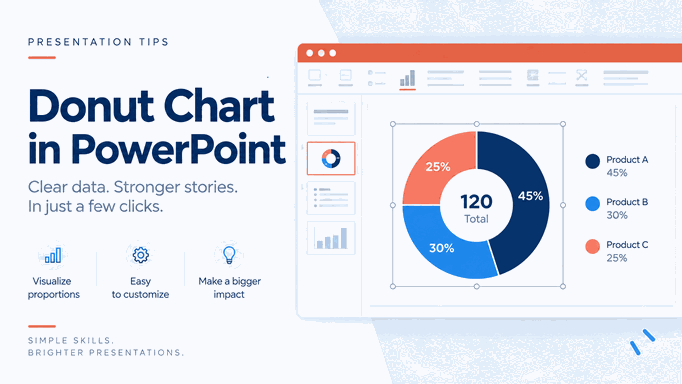
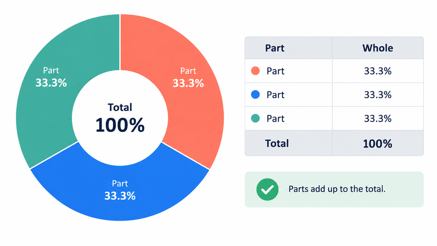
A donut chart, also called a doughnut chart in Microsoft Office, is a circular part-to-whole chart with an empty center. Each segment represents a share of a total, and all segments should add up to the same complete whole.
The center gives you room for one summary value, such as total revenue, total responses, or completion rate. That space is useful only when the number adds context. A decorative number that uses a different denominator makes the chart harder to trust.
Before designing the slide, write the denominator in a sentence: “These segments show the share of qualified leads by acquisition channel in Q2.” If you cannot name one total and one time period, the data probably does not belong in a donut chart.
When to Use a Donut Chart
Use a donut chart when the audience needs a quick composition view rather than an exact ranking. The chart should support a sentence such as “Direct and partner channels now account for most qualified leads.”
- All categories are mutually exclusive parts of the same total.
- The chart has about two to five meaningful segments.
- The differences are large enough to see without measuring angles.
- One total or primary percentage belongs naturally in the center.
- The slide needs a compact composition graphic, not a detailed comparison.
For example, a customer success review could use a donut chart to show the share of accounts in three health bands. A campaign review could show qualified leads by four channels. In both cases, the presenter should name the total population, the period, and any excluded records.
When Not to Use a Donut Chart
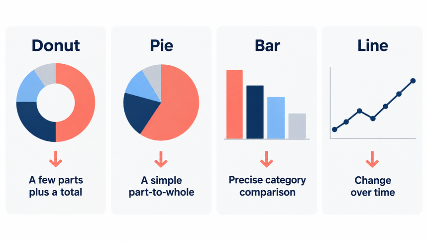
A donut chart is a poor choice when small differences matter. Readers compare positions along a common scale more accurately than arc lengths, so a bar chart is usually clearer for ranking six regions, comparing close percentages, or showing change across multiple periods.
Choose another chart when:
- The categories do not add to 100 percent or to one stated total.
- There are many slices or several slices are nearly equal.
- The audience must compare values across teams or time periods.
- Negative values, ranges, or overlapping categories are present.
- The main point is a trend, distribution, or relationship between variables.
Use a bar chart for accurate category comparisons. Use a line chart for a time series and an XY graph for relationships between paired numeric variables.
How to Create a Donut Chart in PowerPoint
In desktop PowerPoint, chart data is stored in an embedded worksheet. Prepare the categories and values first, then build the chart.
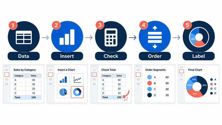
- Prepare one clean table. Put category names in the first column and values in the second. Remove subtotals, blanks, and duplicate categories.
- Insert the chart. In PowerPoint, select Insert > Chart, open the Pie category, and choose Doughnut. Replace the sample worksheet values with the approved data.
- Check the total. Confirm that the values match the intended denominator. If percentages are supplied, check that rounding explains any small difference from 100 percent.
- Order the segments. Use a logical order, such as largest to smallest, workflow stage, or an established business sequence.
- Format and label. Adjust the hole size, remove unnecessary borders, shadows, and legends, add direct labels, and use the center for one related total or message.
After formatting, compare the labels with the source table. Labels drawn from the worksheet update with the chart; a center value typed into a separate text box does not. Remember to update that text box when the data changes.
Label, Order, and Color the Segments
Direct labels reduce the work of matching slices to a separate legend. Show the category and either the value or percentage, depending on the decision. Avoid displaying both when the result becomes crowded.
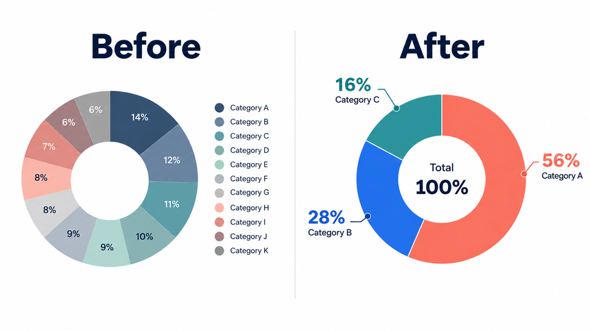
Use one accent color for the segment the title discusses and quieter colors for context. Color should not create a conclusion that the data does not support. If category colors already have an agreed meaning, preserve that system across slides.
Do not rely on color alone. Add category names, keep sufficient contrast, and make the slide understandable when projected. A very thin ring may look refined on a laptop but can disappear in a meeting room.
Put the Right Number in the Center
The center label should summarize the same population as the ring. Good options include the total number of records, the selected category's share, or a short phrase that names the whole.
Suppose the ring shows 2,400 qualified leads by source. “2,400 qualified leads” is a valid center label. “Revenue up 18%” is not, unless the chart itself shows revenue and the same period and population support that claim.
Keep the center to one primary value and a short descriptor. If the message needs three KPIs, use a KPI row beside a simpler chart instead of forcing everything into the hole.
Donut Chart vs. Pie Chart
Both charts encode parts of a whole with angles and areas. The donut chart trades some central area for a label, while the pie chart gives each slice a direct path to the center. Neither solves the difficulty of comparing many similar segments.
| Decision | Donut chart | Pie chart | Better alternative |
|---|---|---|---|
| Show a few shares plus one total | Good fit | Possible | Use the donut center for the total |
| Show one simple part-to-whole | Good fit | Good fit | Choose the cleaner layout |
| Compare close values | Weak | Weak | Sorted bar chart |
| Show change over time | Weak | Weak | Line chart or small multiples |
| Show more than five categories | Usually weak | Usually weak | Bar chart or table |
The right choice depends on the question, not fashion. A broader data storytelling workflow connects chart choice to the decision the audience needs to make.
Build the Slide Around the Chart
A chart is evidence, not the slide's conclusion. Write a claim-led title, place the donut where it can be read, and use a short annotation to explain the implication.
Weak title: “Lead Sources.” Stronger title: “Partner and direct channels produced 68% of qualified leads in Q2.” The stronger title states the finding, while the chart lets the audience verify the composition.
Add the source and period near the chart. If the data excludes unknown channels or duplicate records, note that limitation on the slide or in speaker notes.
Use Presenti AI to Draft the Deck Structure
Presenti can help turn an approved outline into an editable presentation draft. Start with the audience, the decision, the denominator, the category values, and the claim each slide should make. Ask for a chart slide only after the data has been checked.

Review the generated structure, replace any illustrative chart with the approved data, and verify labels, totals, colors, and accessibility. AI can accelerate the draft, but it cannot decide whether the denominator or business interpretation is correct.
Common Donut Chart Mistakes
- Mixed denominators: segments come from different totals or time periods.
- Too many slices: small categories become impossible to compare or label.
- Decorative center number: the headline metric does not describe the ring.
- Legend hunting: the audience must repeatedly match similar colors to labels.
- False precision: labels show decimals that the decision does not need.
- Multiple donuts: several rings invite comparisons that the geometry does not support.
- No source or period: the chart cannot be audited when forwarded.
Handle Rounded Percentages Clearly
Three equal categories may display as 33%, 33%, and 33%, even though together they make up the whole. Keep the underlying values accurate and add a short note that percentages may not sum to 100% because of rounding. Do not change a category value just to make the displayed labels add up.
Frequently Asked Questions
How many categories should a donut chart have?
Use a small number of categories, usually two to five. If several slices are small or nearly equal, a sorted bar chart will be easier to compare.
Should a donut chart add up to 100 percent?
It should represent one complete whole. Percentages normally add to 100 percent, while counts should add to the stated total. Minor percentage differences may come from rounding and should be explained if visible.
How do I put text in the center of a doughnut chart in PowerPoint?
Add a text box over the center and type the verified total or headline value. Because that text may not update with the worksheet, include it in the final data check.
Is a donut chart better than a pie chart?
Not universally. A donut gives you room for one central label. Both are best for a few part-to-whole categories and both are weak for precise comparisons among similar values.
Keep the Comparison Simple
A good donut chart makes one composition easy to understand. Define the whole, keep the segment count low, label directly, and use the center only for a related total. When precise ranking or change matters, choose a bar or line chart instead.