A combo chart in PowerPoint places two chart types in one plot area, most often columns for an absolute measure and a line for a rate, average, or target. Use it when both series share the same categories and the relationship between them is the point of the slide. If the two measures answer different questions, separate charts will be clearer.
The familiar example is monthly sales shown as columns with margin shown as a line. The columns answer “how much?” while the line answers “at what rate?” A secondary vertical axis may be necessary because dollars and percentages use different units, but it also creates room for visual distortion. Build the chart only after defining the decision, checking the source table, and deciding what each series should communicate.
What Is a Combo Chart in PowerPoint?
A combo chart, also called a combination or mixed chart, displays two or more data series with different chart types in the same plot area. In business slides, the standard form is a clustered column chart plus a line. Microsoft lists both a clustered-column-and-line version and a version that places the line on a secondary axis.
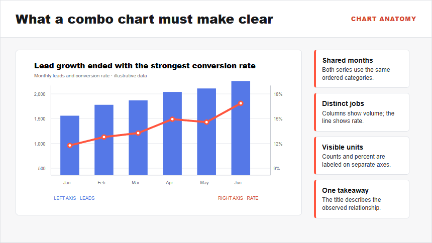
The horizontal axis supplies the common categories. The left vertical axis normally controls the columns, and the right vertical axis controls the line when the series use different units. Color, labels, and axis titles must make that mapping obvious. A useful action title explains the relationship the audience should inspect; a generic title such as “Monthly Performance” leaves the interpretive work to the viewer.
A combo chart is not automatically better than two charts. Its advantage is proximity: the audience can compare two related patterns without shifting between panels. Its cost is complexity: two visual forms and possibly two scales must be decoded at once.
When Should You Use a Column-and-Line Combo Chart?
Use a column-and-line combo chart when the measures share an ordered category axis and their relationship helps answer one decision. Typical pairs include revenue and margin, units sold and average price, leads and conversion rate, or project effort and completion rate.
Before combining them, apply four tests:
- Same categories: every series refers to the same months, regions, products, or stages in the same order.
- Related question: seeing the measures together changes or sharpens the decision. Coincidental movement is not enough. For unordered categories such as regions or products, a connecting line can imply a sequence that does not exist; use separate charts or a marker-based comparison instead.
- Different visual jobs: columns support discrete magnitude comparisons; the line supports movement, rate, average, or target.
- Manageable density: one or two column series and one line are usually easier to discuss than a stack of bars crossed by several lines.
A common use is volume plus efficiency. The columns show how many opportunities entered the funnel, while the line shows what share converted. The combination lets a sales team see whether growth came with stronger or weaker conversion. It does not prove that one measure caused the other.
When Are Two Separate Charts Better?
Use separate charts when the measures are unrelated, the categories do not align, the audience must compare exact values, or a secondary axis changes the apparent relationship too easily. The question should determine the layout, not the desire to fit more information on one slide.
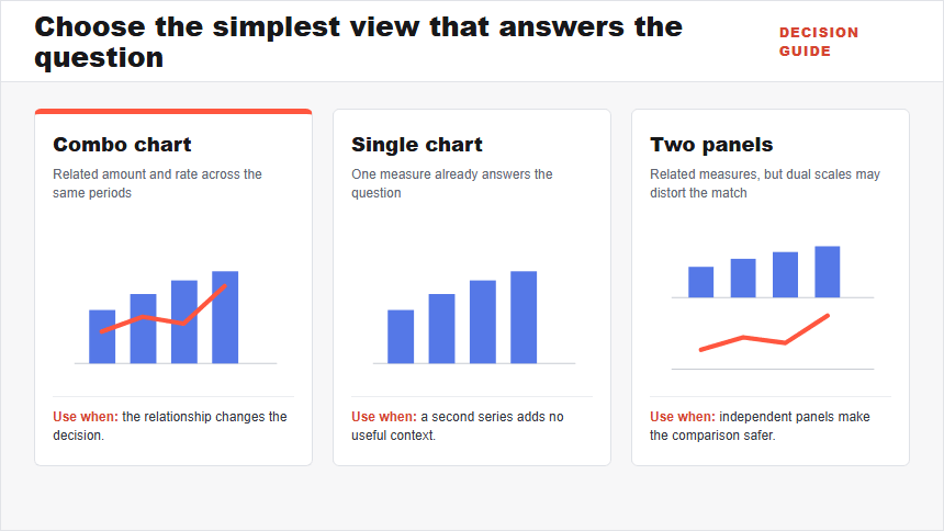
| Situation | Better display | Reason |
|---|---|---|
| Related amount and rate share the same periods | Column-and-line combo chart | The relationship is useful and each series has a distinct role. |
| One measure answers the whole question | Single bar or line chart | A second series would add decoding effort without information gain. |
| Measures are related but dual scales could suggest a false match | Two vertically aligned charts | A shared horizontal axis preserves timing while each measure keeps an independent panel. |
| Several series compete for attention | Small multiples or an appendix | Repeated panels make comparison more systematic than one crowded plot. |
For a single category comparison, use the bar chart workflow in PowerPoint. For a single time trend, follow the line chart guide. To choose among more chart families, use the PowerPoint chart selection guide.
How Should You Prepare Data for a Combo Chart?
Start with one rectangular table. Put the shared categories in the first column, the measure for the columns in the second, and the measure for the line in the third. Keep units in the headers rather than mixing currency symbols, percentages, or explanatory text into data cells.
The worked example uses monthly marketing leads and conversion rate. The numbers are illustrative.
| Month | Leads | Conversion rate |
|---|---|---|
| January | 1,200 | 12.0% |
| February | 1,420 | 13.0% |
| March | 1,510 | 13.5% |
| April | 1,680 | 15.2% |
| May | 1,750 | 14.8% |
| June | 1,900 | 17.1% |
Before opening PowerPoint, confirm the lead definition, the conversion event, the denominator, the reporting window, and the treatment of late conversions. A percentage is not self-explanatory. If June’s rate includes only leads that had enough time to convert while other months use a different window, the comparison is not valid.
Also check the first, last, minimum, and maximum values against the source. Sort periods chronologically and remove totals that would become an extra category. If a value is missing, leave it explicitly missing and explain why; do not silently replace it with zero.
How Do You Create a Combo Chart in PowerPoint?
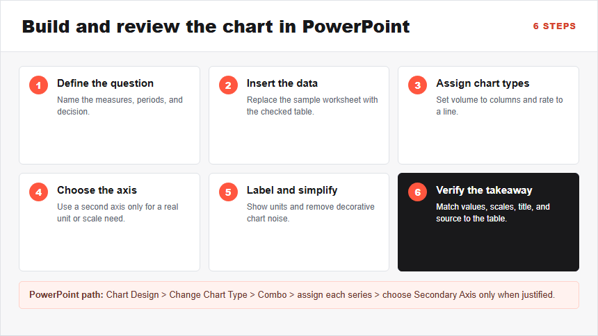
PowerPoint uses an embedded worksheet for chart data. The exact ribbon placement can vary by version, but Microsoft’s current workflow is to insert or select the chart, open Chart Design > Change Chart Type, choose Combo, assign a chart type to each series, and select a secondary axis when the units require it.
Step 1: State the comparison the slide must support
Write one question before building the chart: “Did lead growth come with stronger conversion?” Name the common period, the absolute measure, the rate, and the decision. If the two series do not contribute to the same question, plan two charts instead.
Step 2: Insert a chart and replace the sample data
On the slide, choose Insert > Chart. Select a combo preset if it is available, or start with a clustered column chart. Replace the sample worksheet values with the checked table. The chart should show six months and two series in this example; if the months become separate series, use Chart Design > Switch Row/Column or correct the table orientation.
Step 3: Assign columns and a line
Select the chart, then choose Chart Design > Change Chart Type > Combo. Set Leads to Clustered Column and Conversion rate to Line. The visible result should match the semantic role of each measure: discrete monthly volume as columns and the rate path as a line.
Step 4: Add a secondary axis only when needed
Select Secondary Axis for the conversion-rate series because counts and percentages cannot share a meaningful numeric scale. The right axis should now use percent formatting. If both series use the same unit and similar ranges, keep one axis; a second axis is not a decorative upgrade.
Step 5: Label the measures and simplify the plot
Add clear axis titles or direct labels with units. Use one restrained color for the columns and a contrasting color for the line. Remove chart borders, heavy gridlines, duplicate legends, and unnecessary labels. Keep a marker at each line value only when the individual observations matter.
Step 6: Write the takeaway and verify the slide
Replace the generic chart title with a defensible conclusion. Compare the first and last columns, every labeled line value, both axis ranges, and the source note with the table. View the slide at presentation size and ask another reader which axis belongs to each series and what changed. If either answer is unclear, revise the labels or split the chart.
Worked Example: Leads and Conversion Rate
The illustrative data tells a more useful story than “Leads increased.” Leads rose from 1,200 in January to 1,900 in June, an increase of about 58%. Conversion improved from 12.0% to 17.1%, although it dipped from 15.2% in April to 14.8% in May before reaching its highest point in June.
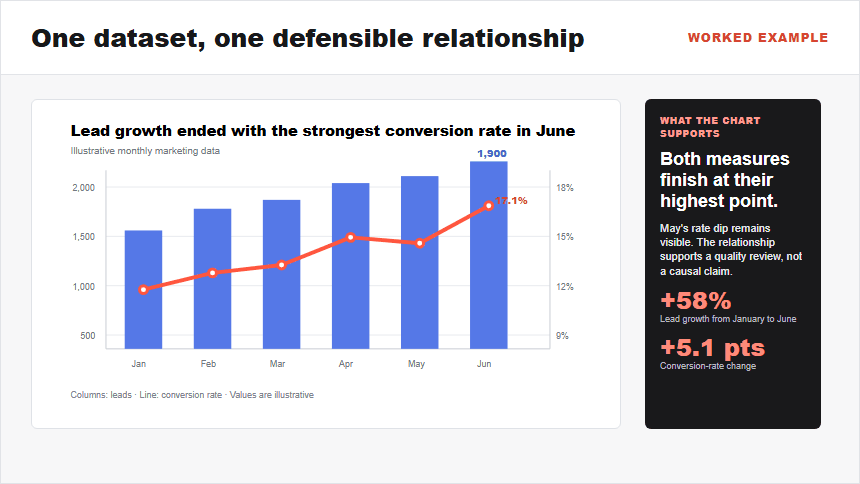
A useful title is “Lead growth ended with the strongest conversion rate in June.” It names the observed relationship without implying that higher lead volume caused better conversion. The May dip remains visible, so the audience can ask whether a campaign, audience mix, or operational delay changed.
The slide should lead to a decision, not finish the analysis. The next step might be to examine channel-level lead quality or verify whether June conversions are mature. The data storytelling guide for presentations explains how to connect a checked chart finding to context, implications, and an explicit action.
How Do You Use a Secondary Axis Without Misleading?
A secondary axis solves a real problem when the series use different units, but its scale can also change the visual relationship. Two series may appear tightly synchronized or sharply opposed depending on the minimum and maximum chosen for each axis. Treat the second axis as an analytical decision, not just a formatting control.
Use this five-question audit before approval:
- Are both units visible? Label the left axis “Leads” and the right axis “Conversion rate (%)” or use equally clear direct labels.
- Do the colors map consistently? The line, its labels, and the corresponding axis should be easy to associate without relying on color alone.
- Are the ranges defensible? Start the column axis at zero. For the line axis, use a range that shows the data without manufacturing dramatic slope, and disclose any truncated range clearly.
- Would a reasonable alternative scale change the story? Test a wider range. If the claimed relationship disappears, rewrite the title or separate the charts.
- Does the chart imply causation? Simultaneous movement supports a comparison, not a causal conclusion. Use neutral wording unless the underlying analysis establishes cause.
Accessibility matters too. Give both axes explicit titles, maintain sufficient contrast, avoid identifying a series by color alone, and provide the underlying values in an accessible table or accompanying text when the audience needs exact numbers. A clean visual does not replace a reproducible data trail.
How Can Presenti Help You Draft the Combo-Chart Slide?
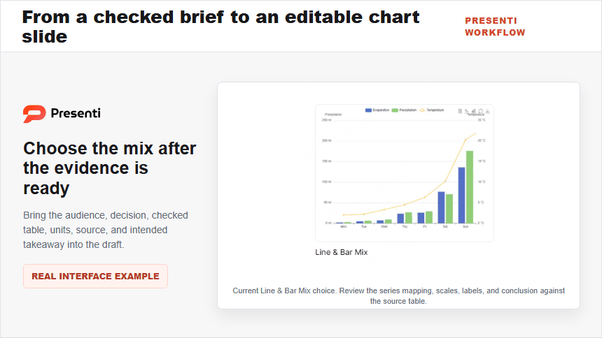
Use Presenti as an AI presentation maker once the analytical brief is ready. Include the audience, decision, checked table, column measure, line measure, units, source, and intended takeaway. That brief gives the draft a specific job instead of asking for a generic “performance slide.”
An editable presentation draft can help establish the slide structure and visual direction. Keep the source table beside the draft while refining it. Confirm the series mapping, rewrite the title from the evidence, label both axes, and test the chart at presentation size.
Presenti can support slide drafting, while the presenter remains responsible for definitions, calculations, axis choices, accessibility, interpretation, and the final decision. A polished visual is not evidence that the scales or conclusion are correct.
Frequently Asked Questions
Is a combo chart the same as a dual-axis chart?
Not always. A combo chart combines chart types, while a dual-axis chart uses two value axes. A column-and-line combo can use one axis when both series share a meaningful unit and range, or two axes when their units differ.
Should the line always use the secondary axis?
No. Use the secondary axis only when the line uses a different unit or a substantially different scale. If both series use the same unit and fit one readable range, a shared axis is simpler and less open to misinterpretation.
Can I combine a bar chart and a line chart in PowerPoint?
PowerPoint’s standard combo option uses vertical columns with a line. A horizontal bar-and-line arrangement is not the usual built-in preset because the category and value orientations conflict. If horizontal bars are essential, use a reference line or a carefully constructed custom graphic instead of forcing the standard combo layout.
How many series should a combo chart contain?
Use the fewest series that answer the decision. One or two column series plus one line is often enough for a presentation slide. If viewers must decode several bars, multiple lines, and two axes, split the content into aligned charts or additional slides.
What title should I use for a combo chart?
Write a conclusion that mentions the relevant relationship, such as “Lead growth ended with the strongest conversion rate in June.” Avoid a topic-only title and avoid causal language unless the analysis supports it.
Bottom Line
A PowerPoint combo chart is most useful when columns and a line answer one question across the same categories. Define the relationship first, prepare a clean table, assign each series a distinct visual role, and add a secondary axis only when the units require it. Then label both scales, test whether the conclusion survives a reasonable range, and write the title from what the data actually shows.
If the combined view needs a long explanation, split it. Clarity is not the amount of information on the slide; it is how quickly the audience can see the comparison, understand the limits, and make the next decision.