A line chart in PowerPoint is the right choice when the audience needs to follow change across an ordered sequence, usually time. Put the dates or periods on the horizontal axis, the measure on the vertical axis, and connect only points that belong to the same series. The chart should make the direction, turning points, and comparison visible without implying continuity that the data cannot support.
Use a line chart for a trend, not simply because the values arrive in rows. If the question is which category is larger, a bar chart is clearer. If both axes are numeric variables and the question is whether they are related, use a scatter plot. If the filled magnitude or composition is the message, consider an area chart.
What Does a Line Chart Show?
A line chart shows how a measure changes as the reader moves from one ordered point to the next. Most presentation line charts use time on the horizontal axis, but another sequence such as distance, age, or process stage can work when the order is meaningful and consistent.
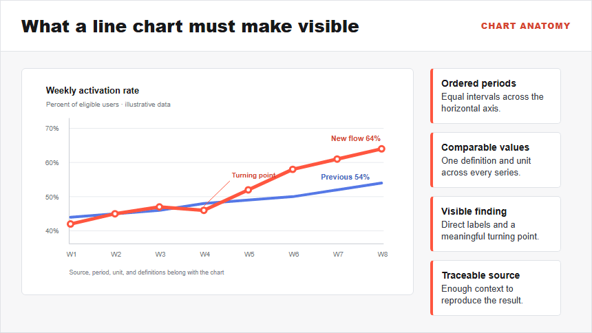
The connecting segments guide the eye along a path. That is useful when movement matters, but it also creates a claim: the points belong in this order, and the space between them represents a meaningful progression. Do not connect unrelated categories such as departments, products, or survey answers merely to create a line.
A presentation slide normally needs more than the chart. Add a conclusion-led title, units, the relevant period, direct labels or a compact legend, and a source note. The title should state the finding the audience needs to discuss, not repeat “Monthly Line Chart.”
When Should You Use a Line Chart in a Presentation?
Use a line chart when the decision depends on direction, pace, volatility, a turning point, or a comparison between trends. It is especially useful for monthly revenue, weekly activation, daily demand, quarterly retention, annual enrollment, or another measure observed at regular intervals.
Before building the slide, answer four questions:
- Is the horizontal axis ordered? A date, period, or measured sequence should have a natural progression.
- Does the path between points matter? The audience should care about how the value moved, not only the highest and lowest categories.
- Are the intervals comparable? Weekly values should not silently become monthly values halfway through the series.
- Can the audience follow the number of lines? Two or three series are usually easier to discuss on a slide than a crowded bundle.
A line chart is also useful for comparing an actual result with a target, prior period, or benchmark when both use the same definition and scale. Explain any change in method, missing period, or restatement; otherwise the apparent movement may come from the measurement process rather than the underlying outcome.
When Is a Bar Chart, Scatter Plot, or Area Chart Better?
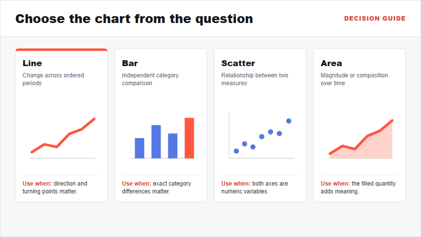
The nearest alternatives answer different questions. Choose the chart from the analytical task before opening PowerPoint.
| If the audience asks... | Use | Why |
|---|---|---|
| How did one or more measures change over ordered periods? | Line chart | The connected path emphasizes direction and turning points. |
| Which independent category is larger? | Bar chart | A common baseline makes discrete values easier to compare. |
| Are two numeric variables related? | Scatter plot | Both axes remain numeric and each point represents a paired observation. |
| How did magnitude or composition build over time? | Area chart | The fill emphasizes quantity; stacking can show contribution to a total. |
For categorical comparisons, follow the detailed bar chart workflow in PowerPoint. For paired numeric variables, use the XY graph and scatter plot guide. When the filled quantity is central, the area chart guide explains the standard and stacked choices.
How Should You Prepare Data for a Line Chart?
Start with a rectangular table: one row per period, one column for the ordered labels, and one column for each series. Keep raw data separate from the slide so another person can reproduce the visual.
The worked example below compares activation rates for a new onboarding flow with a previous cohort. The values are illustrative.
| Week | New flow activation | Previous cohort |
|---|---|---|
| 1 | 42% | 44% |
| 2 | 45% | 45% |
| 3 | 47% | 46% |
| 4 | 46% | 48% |
| 5 | 52% | 49% |
| 6 | 58% | 50% |
| 7 | 61% | 52% |
| 8 | 64% | 54% |
Before charting, confirm the unit, denominator, reporting interval, time zone where relevant, and treatment of missing values. A blank cell, zero, and “not measured” are different states. Do not join a gap unless the underlying method justifies the connection, and do not convert weekly percentages into a running total.
If several series use different units, avoid placing them on one axis. A second vertical axis can make unrelated movements look synchronized because each scale can be adjusted independently. Separate panels, an indexed comparison, or two slides are often easier to interpret.
How Do You Create a Line Chart in PowerPoint?
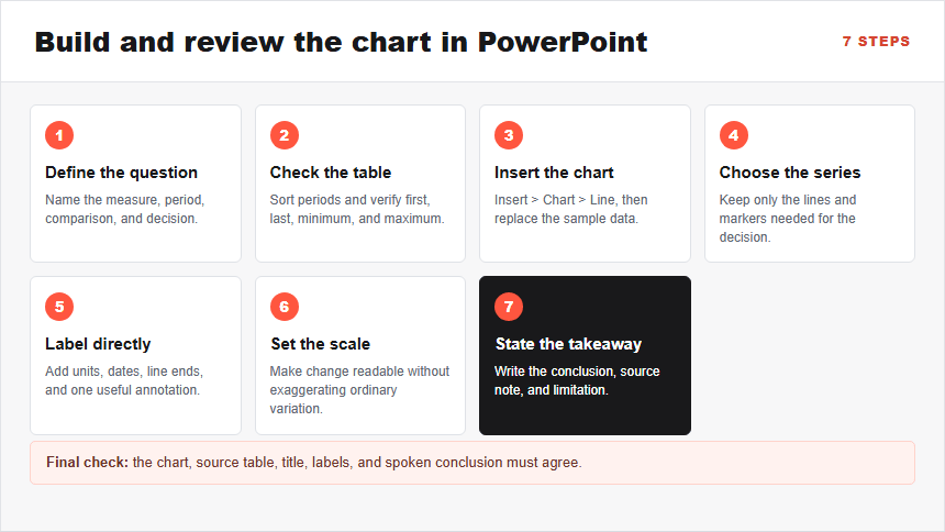
Microsoft's documented PowerPoint workflow starts with Insert > Chart, followed by replacing the sample values in the worksheet that opens. The seven steps below extend that operation into a presentation-ready review process.
Step 1: Define the trend question and period
Write the question before choosing a chart: “How did activation rates differ between the new flow and the previous cohort across the first eight weeks?” Name the measure, unit, start and end period, comparison series, and decision. You should have one sentence that the chart can answer. If the question is only “Which product is highest?”, return to a bar chart.
Step 2: Arrange the source table
Put the periods in the first column and each comparable series in its own column. Sort the periods chronologically and remove totals that would become an extra line. Check the first, last, minimum, and maximum values against the source before continuing.
Step 3: Insert the chart and replace the sample data
On the target slide, choose Insert > Chart > Line. Pick a standard line or line with markers, then replace the worksheet's placeholder labels and values with your checked table. The slide should now show the same number of periods and series as the source. If rows and columns are reversed, use Chart Design > Switch Row/Column or correct the table orientation.
Step 4: Choose markers and series deliberately
Use markers when the chart has a modest number of observations and individual points matter. With many dense periods, plain lines usually create less visual noise. Keep only the series needed for the decision; move secondary segments to a follow-up slide or small multiples.
Step 5: Label the chart where the eye needs help
Add the unit and date range. Directly label the line ends when space allows, or keep a short legend close to the plot. Label a turning point only when it changes the interpretation. Compare every displayed label with the source table.
Step 6: Set an honest scale and visual hierarchy
Choose a vertical scale that makes the values readable without exaggerating ordinary variation. A line chart does not always need to start at zero because position and slope carry the trend, but a shortened scale must remain visible and defensible. Use one strong color for the focal series, a quieter neutral for the comparison, and sufficient contrast without relying on color alone.
Step 7: Write the takeaway and source note
Replace the generic chart title with a conclusion such as “Activation moved ahead of the previous cohort after week 4.” Add the data owner, period, unit, and any definition or caveat the audience needs. View the slide at presentation size and ask a reviewer to state the finding without your narration; if they reach a different conclusion, revise the title, labels, or chart choice.
Worked Example: Explain the Activation Trend
The illustrative data contains an important detail: the new flow does not lead throughout the entire period. It starts two percentage points behind, briefly falls below the previous cohort again in week 4, and then rises to a ten-percentage-point lead by week 8. A truthful title must preserve that sequence.
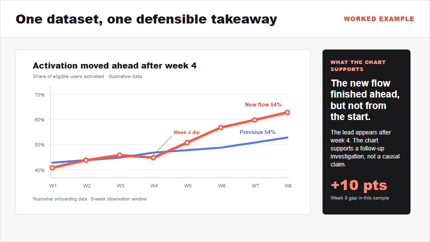
The useful slide title is not “Activation Rate.” It is “Activation moved ahead after week 4 and finished 10 percentage points higher.” The chart uses direct labels at the final values, a small annotation at the week-4 turning point, a percent scale, and a visible note that the data is illustrative.
The decision should remain separate from the observation. The chart supports investigating what changed after week 4 and whether the result persists in later cohorts; it does not prove that the new flow caused the improvement. Use the broader data storytelling workflow to connect a checked chart finding to context, implications, and the next decision.
How Do You Prevent a Misleading Line Chart?
A polished line can still communicate the wrong story. Review the following risks before the slide is approved:
- Irregular intervals shown as equal: Preserve the actual spacing or state that the periods are categorical snapshots.
- Missing values silently connected: Show a gap, explain the imputation method, or use a notation that distinguishes estimated values.
- A compressed scale that magnifies noise: Display the scale clearly and test whether the conclusion survives a reasonable range.
- Too many lines: Highlight the focal series, use small multiples, or split the decision across slides.
- Dual axes that manufacture a relationship: Prefer a shared unit, indexed change, separate panels, or a line-and-bar combination with clearly distinct roles.
- Smoothed curves that imply unmeasured values: Use straight segments unless interpolation is analytically justified.
- Color-only identification: Add direct labels, line styles, or markers and maintain readable contrast.
- A title that overstates causation: Describe the observed change; reserve causal language for evidence that supports it.
Finally, check the chart against the table. Confirm the first and last values, every highlighted point, calculation, period, source, and series label. The audience should be able to distinguish what the data shows from what the presenter recommends.
How Can Presenti Help You Draft the Trend Slide?
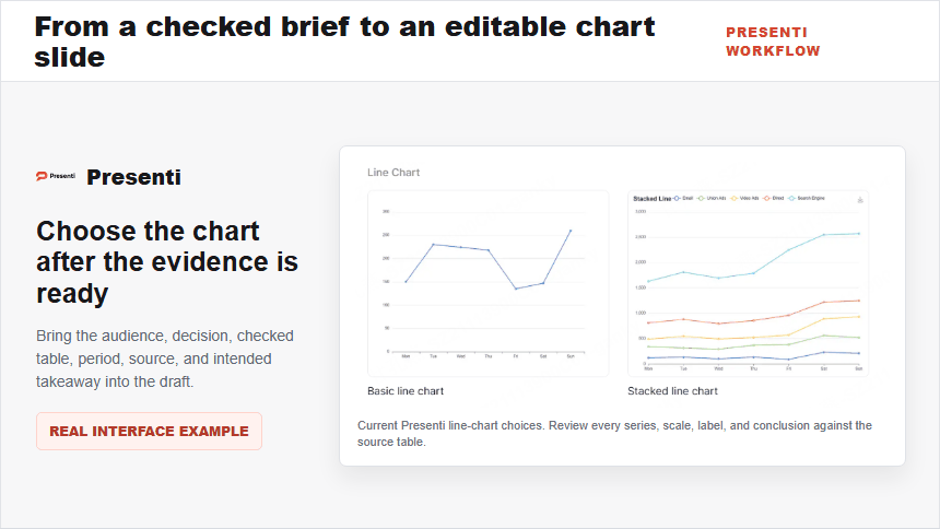
Use Presenti as an AI presentation maker after the analytical work is defined. Prepare a short brief with the audience, decision, checked data table, focal series, comparison, date range, source, and intended takeaway. That input gives the draft a clearer job than a request to “make a data slide.”
An editable presentation draft can help establish the slide structure and visual direction. Keep the source table available while editing. Confirm that each line maps to the correct column, inspect any gap or unusual interval, rewrite the title from the evidence, and check the final slide at presentation size.
Presenti can support the drafting step, but the presenter remains responsible for the data definition, calculations, scale, interpretation, accessibility, and decision. Do not treat generated wording or a visually convincing trend as evidence by itself.
Frequently Asked Questions
Should a line chart always start at zero?
No. Unlike bars, lines encode change through position and slope, so a zero baseline is not always required. The chosen range must still be visible, reasonable for the decision, and consistent across comparisons. If a shortened scale makes ordinary variation look dramatic, expand it or explain the scale.
How many lines should appear on one presentation slide?
Use the fewest lines that answer the question. Two or three are often manageable in a live presentation. When many series overlap, highlight one or two, use small multiples, or move the full detail to an appendix.
When should I use markers?
Markers help when there are relatively few observations, individual points matter, or the lines need a non-color distinction. Remove them when dense points create visual noise and the overall path is the main evidence.
Is a stacked line chart the same as a stacked area chart?
No. Both can accumulate series, but a stacked line can be difficult to interpret because upper lines represent cumulative positions rather than each series' own value. A stacked area chart makes the part-to-whole intention more explicit. Use either only when addition across series is meaningful.
What should the line chart title say?
State the verified finding and its scope: direction, turning point, comparison, and period where useful. “Activation moved ahead after week 4” is more informative than “Activation Trend,” but it should not claim a cause the chart cannot establish.
Bottom Line
Use a line chart in PowerPoint when the audience needs to follow a measure across ordered periods and the path between points matters. Prepare a checked time-series table, choose only comparable series, build the chart through Insert > Chart, label the evidence directly, use an honest scale, and write the conclusion in the slide title. If the question is about categories, relationships, or filled magnitude, choose the chart suited to that comparison.
The final review should trace every visible value back to the source and separate observation from recommendation. A clear line is useful only when the data, interval, scale, labels, and conclusion all tell the same defensible story.