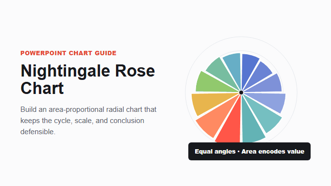
A Nightingale rose chart, also called a coxcomb or polar area chart, divides a circle into equal-angle sectors and changes each sector’s radius so its area represents a value. It works best for one cyclical sequence, such as months or seasons, when the audience needs to notice a broad pattern rather than compare exact values.
PowerPoint’s current documented chart list does not include a standard Nightingale rose type. Build the chart in a workflow that supports area-proportional polar sectors, bring the resulting vector or high-resolution image into PowerPoint, and verify it against the source table. Do not substitute a radar chart or scale radius directly to the values; both choices change the meaning.
What Is a Nightingale Rose Chart?
A Nightingale rose chart places categories around a circle at equal angular intervals. Every sector receives the same angle. The value is encoded by the sector’s area, which changes as the radius grows or shrinks. The result resembles a flower with petals of different lengths.
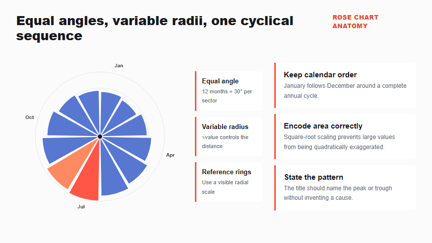
Because the angle is fixed, the chart is not a pie chart. Because each category is a separate wedge rather than a connected point on an axis, it is not a radar chart. The circular arrangement is most meaningful when the categories have a natural cycle, such as January through December, hours of the day, or seasons.
The form is associated with Florence Nightingale, whose 1858 mortality diagrams helped popularize polar area graphics. The history is useful context, but the modern design decision remains practical: use the radial form only when the cycle itself helps the audience understand the pattern.
How Is It Different From a Pie or Radar Chart?
These charts share a circular frame but encode different questions. Confusing them can turn a visually attractive slide into a misleading one.
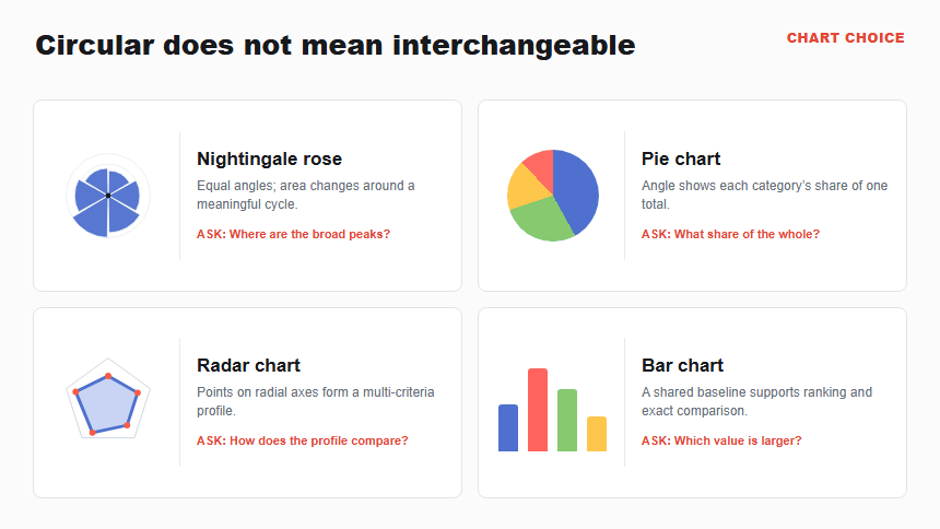
| Chart | What changes | Question it answers |
|---|---|---|
| Nightingale rose | Sector radius and area; angles stay equal | Where are the broad peaks and troughs in one cycle? |
| Pie chart | Sector angle and area; radius stays equal | What share of one total belongs to each part? |
| Radar chart | Points move along separate radial axes and form a polygon | How does one profile compare across several criteria? |
| Bar chart | Bar length changes along a shared baseline | Which value is larger, and by how much? |
Use the PowerPoint pie-chart guide for part-to-whole composition. Use the PowerPoint radar-chart guide for multi-criteria profiles. A Nightingale rose should not inherit either purpose merely because the visuals are circular.
When Should You Use a Nightingale Rose Chart?
Use a Nightingale rose when the order wraps naturally back to the beginning and the audience needs a memorable overview of magnitude around that cycle. Monthly demand, seasonal incidents, hourly activity, or directional frequency can fit when one consistent measure is used throughout.
Apply five tests before choosing it:
- Natural cycle: the last category leads meaningfully back to the first.
- One comparable measure: every sector uses the same unit, definition, and reporting basis.
- Broad pattern: the decision depends on peaks, troughs, or seasonal shape rather than a precise ranking.
- Manageable category count: labels remain readable around the perimeter at presentation size.
- Audience support: a title, scale, and short explanation make the unfamiliar encoding understandable.
The circular structure should add meaning. If the categories are departments, products, or unrelated projects with no cyclical order, rotating them around a circle creates a sequence the data does not contain.
When Is a Bar or Line Chart Better?
Use a bar chart when exact comparison, ranking, or long category labels matter. Use a line chart when the audience needs to follow detailed change from one period to the next. Both linear displays are more familiar and usually easier to estimate than sector areas.
A Nightingale rose is a poor fit when values are close, several series overlap, the radial order is arbitrary, or the chart must work without explanatory context. It is also a weak choice for a dashboard tile that is too small for scale rings and perimeter labels.
For a precise alternative, follow the bar-chart workflow in PowerPoint. For detailed movement across time, use a line chart. The PowerPoint chart selection guide connects these focused pages into the broader chart system.
How Should You Prepare Nightingale Rose Chart Data?
Start with one category column and one nonnegative value column. Keep the categories in their real cyclical order; sorting by magnitude would destroy the sequence. The worked example uses illustrative monthly support-ticket volume.
| Month | Tickets | Normalized radius |
|---|---|---|
| January | 84 | 69.9% |
| February | 76 | 66.5% |
| March | 92 | 73.1% |
| April | 110 | 80.0% |
| May | 128 | 86.3% |
| June | 146 | 92.1% |
| July | 172 | 100.0% |
| August | 160 | 96.4% |
| September | 138 | 89.6% |
| October | 116 | 82.1% |
| November | 98 | 75.5% |
| December | 88 | 71.5% |
For equal-angle sectors, calculate each radius with maximum radius × √(value ÷ maximum value). July is the maximum, so its radius is 100%. January’s radius is approximately √(84 ÷ 172) = 69.9% of the maximum. This square-root transformation keeps sector area proportional to the data.
If a chart tool offers a choice between making radius proportional to value and making area proportional to value, select the area-proportional option. Mapping the raw value directly to radius makes visual area grow with the square of the value and exaggerates large differences.
How Do You Build a Nightingale Rose Chart for PowerPoint?
Microsoft’s current documented Office chart families include radar charts but do not list a Nightingale rose or polar-area chart. Use a charting workflow that supports equal-angle polar sectors, then place the reviewed result in PowerPoint. Do not force the data into a built-in radar chart.
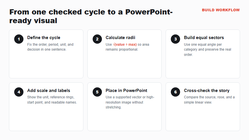
Step 1: Define the cycle and measure
Write one sentence that fixes the order, unit, period, and decision: “Show monthly support-ticket volume for the calendar year so staffing can anticipate the summer peak.” The visible result should be one checked table with 12 ordered rows and one numeric series.
Step 2: Calculate area-proportional radii
Find the maximum value, divide each value by that maximum, and take the square root. Keep the calculation beside the source table. If the tool handles area-proportional scaling automatically, verify at least the maximum, minimum, and one middle value rather than assuming the setting worked.
Step 3: Create equal-angle sectors
Use the rose or polar-area chart type in the selected workflow. With 12 months, each sector should span 30 degrees. Map the checked radius or area setting to the values, preserve calendar order, and keep a consistent starting point such as January at 12 o’clock.
Step 4: Add a readable scale and labels
Add a small number of concentric reference rings, the unit, and month labels around the perimeter. Use one restrained color family with a deliberate accent for the peak when that supports the title. If labels collide, enlarge the chart or move exact values to a table; do not shrink text until it becomes decorative.
Step 5: Place the reviewed visual in PowerPoint
Export or copy the supported vector or high-resolution image produced by the workflow, then place it on the target slide. Keep the source table with the working deck and record whether the inserted object remains editable. If the chart arrives blurry, distorted, or with missing labels, return to the source rather than stretching the object.
Step 6: Cross-check the story
Compare the final rose with the source table and a simple bar or line view of the same values. The peak, low point, and order must agree. Add a conclusion-led title and a source note, then test the slide at presentation size and in grayscale.
Worked Example: Monthly Support Volume
The illustrative series rises from 84 tickets in January to 172 in July, then declines to 88 by December. The rose shape makes the summer expansion and return toward the starting level visible around the annual cycle.
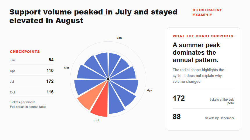
A defensible title is “Support volume peaked in July and stayed elevated in August.” It states what the chart shows without claiming why the peak occurred. The next analytical step may be to compare ticket categories, customer growth, or staffing coverage, but those measures do not belong in this one-series rose.
The chart should travel with a linear fallback. A table or bar view lets readers verify exact values and gives assistive technology access to the data. The data storytelling guide for presentations explains how to move from the observed pattern to context, implications, and a clear action.
How Can Presenti Help You Draft the Rose-Chart Slide?
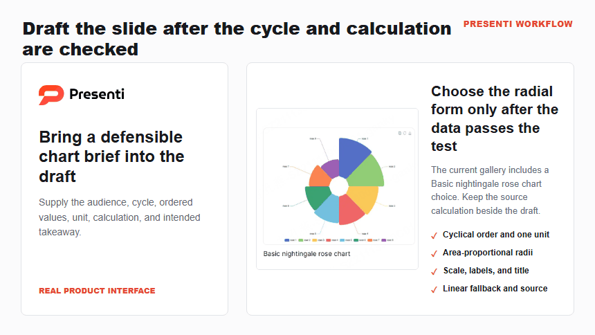
Use Presenti as an AI presentation maker after the chart brief and source table are ready. Name the audience, decision, reporting period, checked values, category order, unit, intended title, and accessibility fallback. That context gives the slide draft a specific communication job.
An editable presentation draft can help establish the surrounding slide structure and visual direction. Keep the source calculation beside the draft and confirm that the sectors, labels, title, source note, and fallback table still match before presenting.
Presenti can support slide drafting, while the presenter remains responsible for the radius calculation, data definitions, chart choice, accessibility, and conclusion. A flower-like shape is not evidence that the area encoding is correct.
Frequently Asked Questions
Is a Nightingale rose chart the same as a coxcomb chart?
The terms are commonly used for the same family of equal-angle polar area charts. Naming conventions vary, so define the encoding on the slide: equal angles, with sector area representing the value.
Can PowerPoint create a Nightingale rose chart natively?
It is not listed as a standard type in Microsoft’s current Office chart documentation. Use a workflow that supports rose or polar-area charts, then bring the reviewed output into PowerPoint. A built-in radar chart is not an equivalent substitute.
Why do I need the square root of each value?
A sector’s area grows with the square of its radius when its angle is fixed. Taking the square root before mapping the radius keeps the displayed area proportional to the original value.
Should I use multiple colors?
Use color only when it carries a defined category or emphasis. One restrained palette is often enough for a single monthly series. Labels, scale rings, and the title should communicate the pattern without relying on color alone.
How do I make the chart accessible?
Provide descriptive alternative text, a text summary of the main pattern, sufficient contrast, and the underlying values in a table or linear chart. Do not expect a radial image alone to communicate exact data to a screen reader.
Bottom Line
A Nightingale rose chart is valuable when a genuine cycle and a broad pattern justify the circular form. Keep the angles equal, calculate radius from the square root of the values, label the scale, and verify the result against a source table and a simple linear chart.
For precise ranking, use bars. For detailed change across time, use a line. If the rose remains the clearest fit, bring the reviewed visual into PowerPoint and make the audience’s reading task explicit in the title.
Use a rose chart only when the circular layout earns its space
A rose chart can make periodic values look dramatic, but the changing radius makes small differences harder to compare. Use it when the repeated categories and the cycle are the point; use a bar chart when the audience must rank values precisely. Label the period, units and zero baseline on the slide.
Before presenting, test the same data as a sorted bar chart and ask which conclusion changes. If the visual story changes, say why you selected the rose form. Keep labels outside the petals, provide a text alternative and do not imply a trend from a single illustrative dataset.