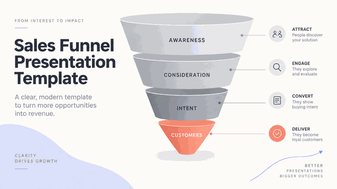
A sales funnel presentation shows how a group of prospects moved from one stage to the next and where progress slowed. Include the number at each stage, the conversion rates, and a comparison that helps the audience judge whether a drop needs attention.
Use this guide for a sales review, marketing-to-sales handoff, pipeline diagnosis, or forecast conversation. It does not replace a CRM report or a complete sales pitch. Your source should be a dated export or analysis with a known cohort, consistent stage rules, and a clear business question. If you cannot explain what entered the funnel and when, label the visual as a pipeline snapshot instead.
What Should a Sales Funnel Slide Explain?
Start with one sentence that a sales leader could repeat after the meeting. Examples include: "Qualified opportunities are entering the funnel, but discovery-to-proposal conversion is the main constraint," or "Pipeline coverage is below the target because late-stage opportunities are slipping." The sentence determines which stages, comparisons, and annotations deserve space.
Separate three questions that are often mixed together:
| Question | Best visual job | Required evidence |
|---|---|---|
| How did a cohort progress? | Funnel or stage progression | Same cohort, period, stage definitions, and volume at each step |
| What is open right now? | Pipeline snapshot or stage bars | As-of date, open value or count, probability rule, and target |
| Where should we intervene? | Bottleneck view and action slide | Conversion drop, segment cut, likely cause, and proposed test |
A funnel presentation may contain two slides when the audience needs both history and current coverage. Do not force a current pipeline into a conversion story. A snapshot shows what is in each stage today; a cohort funnel shows what happened to a group over a specified period. Confusing the two can create a false conversion rate.
Write the headline before selecting a shape. A strong data storytelling workflow follows the same chain: verified finding, interpretation, decision, and expected outcome. The funnel is one evidence unit inside that chain.
How Do You Define Stages, Cohort, and Time Window?
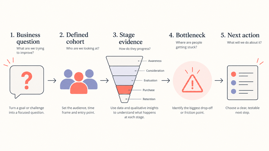
Stage names are not self-explanatory. "Lead," "qualified," "opportunity," and "proposal" can mean different things across teams or systems. Put a short definition near the chart or in speaker notes so the audience can interpret every number consistently.
Use a source checklist before you calculate conversion:
- Cohort: State whether the rows are leads created during the period, opportunities entering a stage, or all records active at the snapshot date.
- Time window: Use a complete period and write the dates. A cohort may need additional time to reach later stages.
- Stage rule: Define the event that moves a record forward. Do not mix a salesperson's judgment with a required CRM field without labeling the difference.
- Denominator: Calculate each stage rate from the correct prior-stage population. If records can skip stages, explain how you counted them.
- Segment: Keep region, product, deal size, and customer type consistent when comparing groups.
A useful rate is typically the number that progressed from one stage divided by the number eligible to progress from the prior stage. For example, discovery-to-proposal conversion is proposals created from eligible discovery opportunities, not proposals divided by all leads. If the data contains reopened, duplicated, or unassigned records, disclose the treatment.
Make the chart auditable without turning the main slide into a database. Include an as-of date, source name, and a compact footnote for exclusions. Keep a detailed table in the appendix. The competitive analysis presentation workflow uses a similar principle: define the comparison before styling the visual.
Which Funnel Layout Fits the Question?
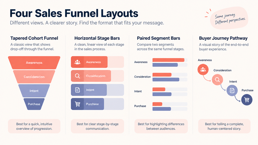
A tapered funnel is recognizable, but it is not always the most honest chart. Choose the layout that matches the question and the data shape.
If the question is broader than stage loss, use the chart types for presentations guide to compare funnels with bars, lines, scatter plots, and other chart families before choosing the visual.
| Situation | Recommended layout | Why it works | Watch-out |
|---|---|---|---|
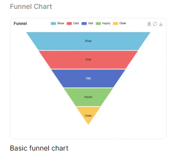
| Four or five cohort stages with meaningful drop-off | Tapered funnel with labels | Shows the narrowing journey at a glance | Do not imply proportional area if the widths are decorative |
| Very uneven volumes or a current snapshot | Horizontal bars by stage | Supports precise comparisons and long labels | Call it a pipeline or stage snapshot |
| Two segments or periods need comparison | Small multiples or paired bars | Keeps the denominator and scale visible | Use the same scale and stage order |
| Audience journey matters more than volume | Stage pathway with short descriptions | Explains the buyer experience and handoffs | Do not label it a conversion funnel without rates |
Four or five stages often fit a summary slide. If your CRM has more, group stages only when doing so preserves their meaning and the calculation remains clear. Keep the full breakdown in the appendix, especially when the problem lies within a grouped stage.
Use a restrained visual system. Keep most stages in neutral gray or low-saturation tints, then use the coral accent for the bottleneck or the stage that supports the headline. Avoid a rainbow where each color has no defined meaning. Add a short annotation that says what changed and why it matters.
How Do You Build the Slide from Volume to Conversion?
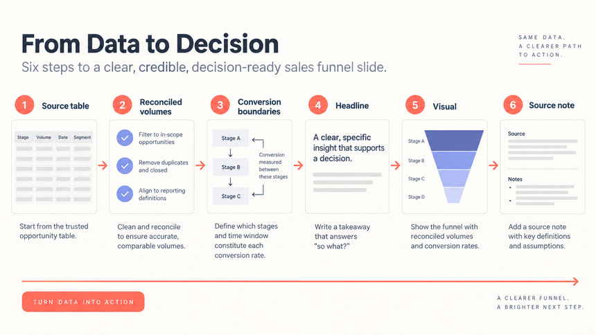
Build the chart in an order that makes review easy. First bring in the source rows. Then calculate the stage volumes and rates. Only after the calculations reconcile should you style the slide.
- Prepare the source table. Keep one row per stage or segment, with volume, prior-stage volume, conversion rate, period, and source note. Preserve the raw export separately.
- Reconcile the counts. Check that the stage definitions match the source, that the cohort is not mixed with snapshot records, and that duplicate or reopened opportunities are handled consistently.
- Write the slide headline. State the finding in business terms. "Proposal volume is healthy, but discovery conversion is below the team baseline" is more useful than "Sales Funnel Q3."
- Draw the visual. Place volume inside or beside each stage. Put the conversion rate on the boundary between stages. Use one scale for comparable bars and avoid decorative 3D effects.
- Add the comparison. Show target, prior period, or segment only if it helps explain the decision. Name the comparison period and preserve the same denominator.
- Annotate the check. Add the as-of date, source, definitions, and an explicit note when values are illustrative or incomplete.
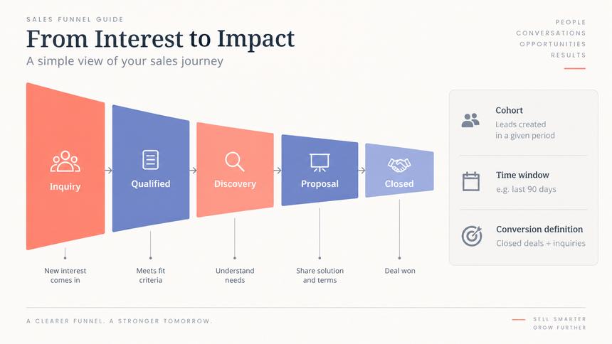
For example, an illustrative cohort might begin with 1,200 inquiries, 300 qualified leads, 90 discovery calls, 27 proposals, and 9 closed deals. The numbers are not a benchmark. They show the type of calculation the slide should expose: 25% inquiry-to-qualified, 30% qualified-to-discovery, 30% discovery-to-proposal, and 33% proposal-to-close. The finding would depend on the team's target and comparison period, not the shape alone.
Do not hide a small denominator. A 50% conversion from two proposals is not the same evidence as 50% from 200 proposals. Add counts, not just percentages, and flag segments with too little volume for a reliable conclusion.
How Do You Turn the Bottleneck into an Action Plan?
After showing a drop in conversion, explain what you want to investigate. A lower rate may reflect a change in lead quality, a sales-process problem, or simply a different mix of deals. The chart alone does not tell you which explanation is right.
| Observed signal | Questions to test | Action format |
|---|---|---|
| Large drop after qualification | Are qualification rules too broad? Is the problem statement unclear? | Refine qualification criteria and review a sample of lost records |
| Discovery-to-proposal slows | Is discovery missing required information? Is the offer hard to scope? | Use a discovery checklist and measure proposal turnaround time |
| Proposal-to-close falls | Is proof relevant? Are commercial terms or stakeholders unresolved? | Test proof and decision mapping with a defined segment |
| Pipeline coverage is low | Is demand lower, or are late-stage deals slipping? | Separate creation, progression, and timing actions before changing targets |
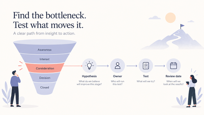
Write the action as a test, not a promise: "For mid-market opportunities entering discovery in October, add a customer-proof page and a mutual action plan. The sales operations lead reviews proposal conversion after four weeks." This format makes the outcome measurable without claiming that the test will work.
Use segment cuts carefully. A bottleneck may be concentrated in one region, product, source, or deal-size band. Show the cut only when it changes the decision, and preserve the all-funnel view so the audience can see its scale. If the cause is uncertain, label it as a hypothesis and state what evidence would confirm or reject it.
Salesforce's stage-analysis guidance emphasizes progression, conversion, and bottlenecks as separate views. That distinction is useful in a presentation: one slide can show what moved, while the next explains what the team will change.
How Can Presenti Help You Draft and Review the Funnel?
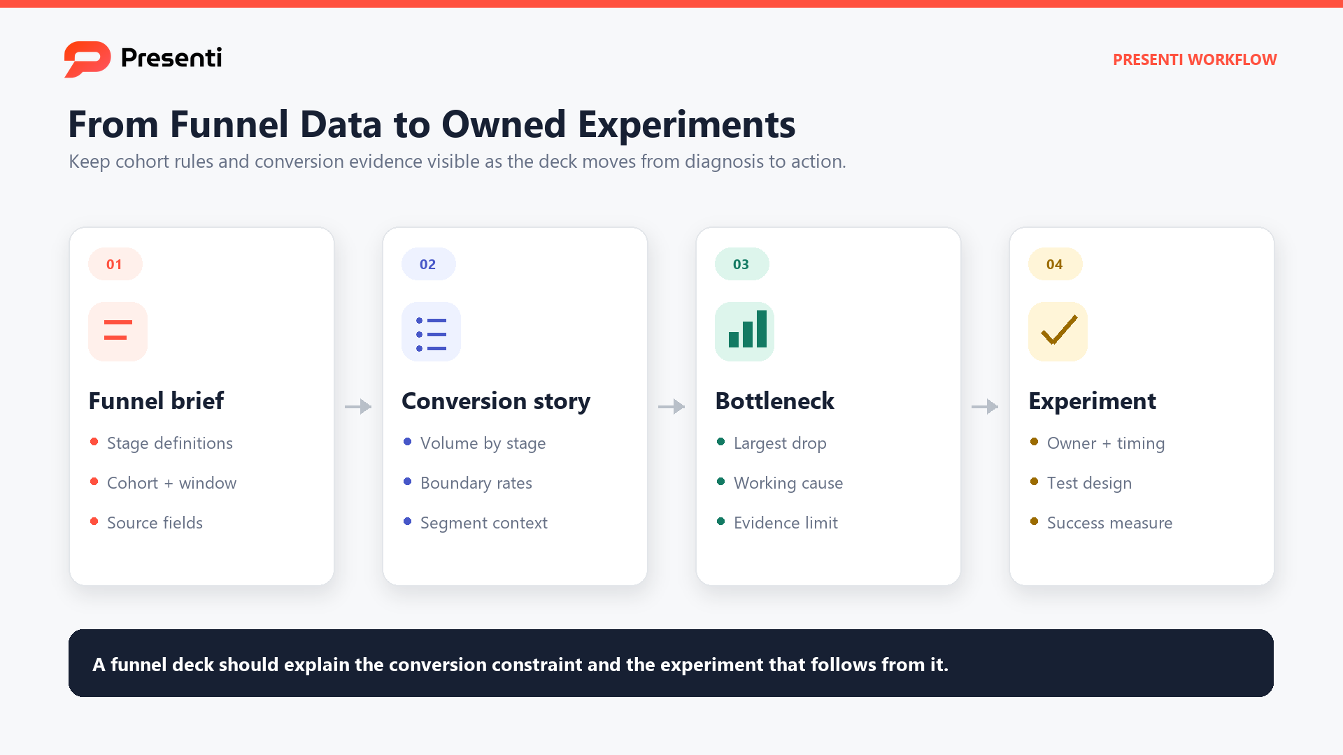
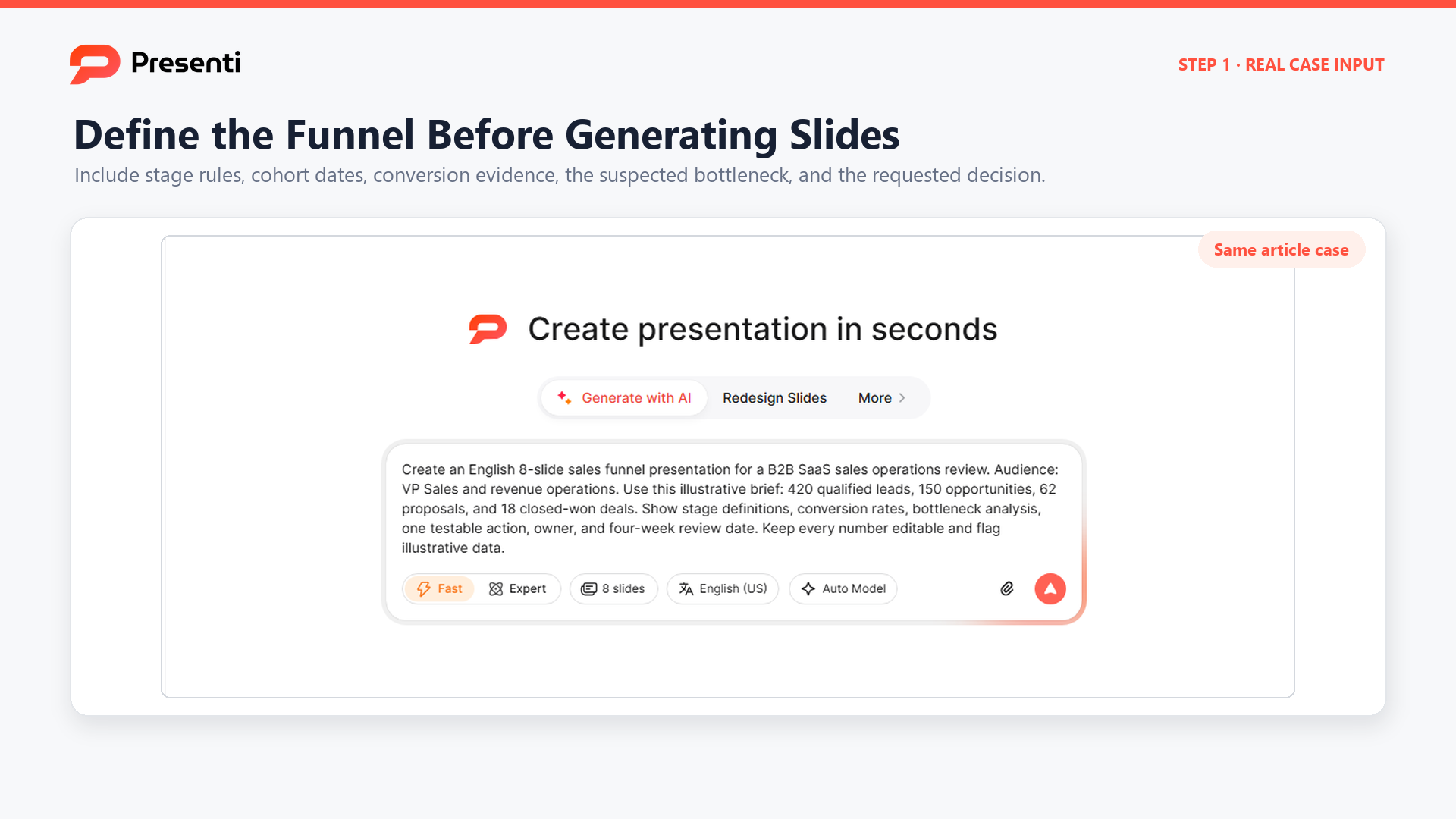
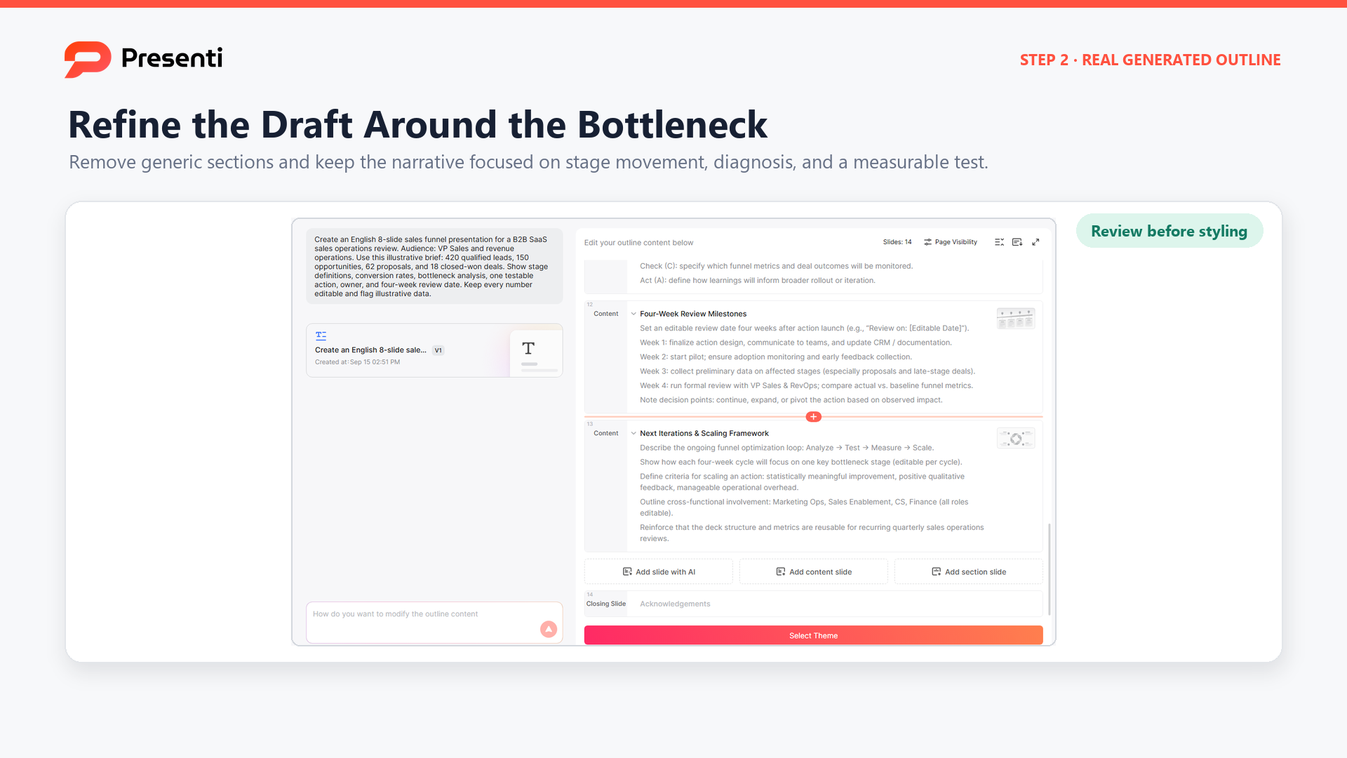
Presenti is an AI presentation maker that can turn a structured sales-funnel brief into an editable presentation draft. Start with the audience, decision, cohort definition, stage rules, source table, comparison period, known limitations, and proposed action. The draft can organize the narrative and slide sequence, but it does not validate your CRM definitions or calculations.
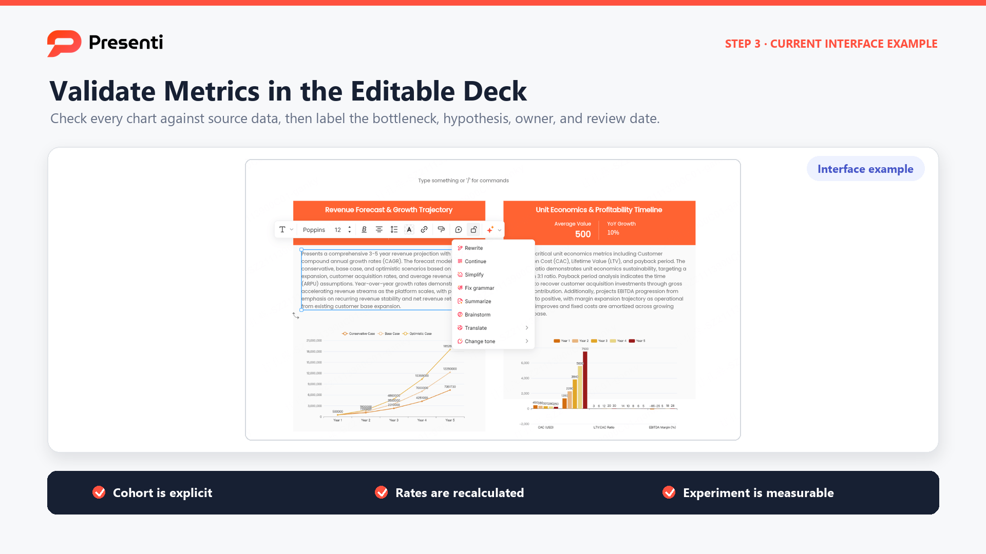
Compare the generated volumes, rates, labels, and reporting periods with your source table. Then read the slide headline alongside the chart: does the evidence support it? Replace generic funnel stages with your own definitions, and remove any explanation the data does not establish.
Keep the full export and calculation notes available for questions. A sales pitch deck guide is a better next step when the audience is a prospect and the goal is persuasion. This article is for diagnosing progression and agreeing on an internal action.
Frequently Asked Questions
What should a sales funnel presentation include?
Include the business question, cohort and time window, stage definitions, volumes, conversion rates, a meaningful comparison, the main bottleneck, limitations, and a named next action. Put detailed CRM rows in an appendix.
How many stages should a funnel slide have?
Four or five stages are usually enough for a decision slide. Merge stages that do not change the audience's interpretation. Keep the full CRM configuration separate.
What is the difference between a funnel and a pipeline slide?
A cohort funnel shows how a defined group progressed through stages over a period. A pipeline slide shows what is currently open by stage, often against a target. They use different denominators and should not be labeled interchangeably.
Should a funnel show counts or percentages?
Show both when possible. Counts provide scale and percentages show progression. A percentage without its denominator can make a small sample look more certain than it is.
How do I highlight a funnel bottleneck?
Use one accent color for the bottleneck, label the conversion drop, state its business consequence, and connect it to a test with an owner and review date. Do not highlight every stage.
Show the Drop, Then Investigate It
Show who entered the funnel, how many progressed, and over what period. Pair percentages with counts so readers can judge their scale. When you identify a weak stage, propose a focused investigation or test; avoid presenting an untested explanation as the cause.