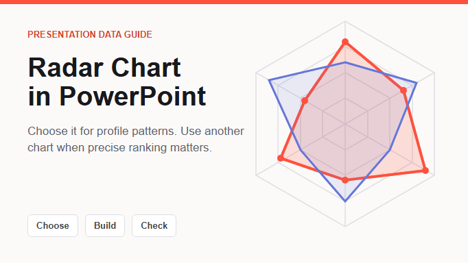
A radar chart in PowerPoint is useful when you need to compare a small number of profiles across several related measures on the same scale, and the overall pattern matters more than an exact ranking. It is a poor choice for trends over time, unrelated units, many overlapping series, or small differences that the audience must read precisely.
This guide shows how to decide whether the chart fits, prepare defensible data, build the chart in PowerPoint, and turn the profile into a clear presentation takeaway.
What Does a Radar Chart Show?
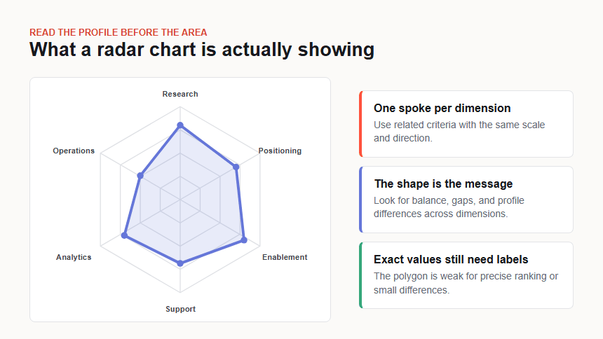
A radar chart, also called a spider chart, places one quantitative dimension on each spoke radiating from a shared center. The points for one item are connected into a polygon. A second item or benchmark can be added as another line, letting the audience compare the overall profiles.
For example, a launch-readiness chart might use research, positioning, sales enablement, support readiness, analytics, and operations as its spokes. A dip toward the center can reveal a weak dimension, while a more even shape can suggest a balanced profile. The shape helps the audience notice a pattern, but it does not explain why the scores differ or whether a small gap is meaningful.
Microsoft Office currently includes Radar, Radar with Markers, and Filled Radar subtypes. Markers make individual data points easier to locate. A filled radar can emphasize the profile, but overlapping fills can hide another series. For most presentation comparisons, an unfilled line or a light transparent fill is easier to audit.
When Should You Use a Radar Chart in a Presentation?
Use a radar chart when the audience needs to recognize a multidimensional profile at a glance. The dimensions should belong to the same evaluation framework, use a comparable scale, and move in the same direction. One to three profiles and roughly five to eight dimensions are practical starting points, not universal limits. Test the finished slide at its actual delivery size.
| Presentation task | What the radar chart can reveal | What must be defined |
|---|---|---|
| Capability assessment | Strengths and development gaps across a competency model | Rubric, evidence source, evaluator, and scale |
| Product comparison | Different feature or experience profiles | Criteria, scoring method, weighting, and source |
| Project readiness | Areas that are ready, at risk, or below a target | Readiness definitions, owner, review date, and benchmark |
| Team or market profile | Balance across related attributes | Population, period, measurement method, and limitations |
The chart is most useful when the profile leads to a decision. A project review might reveal that operations and support are ready while sales enablement is below the agreed threshold. The next slide or annotation can then assign an owner and action. Without a decision, the polygon risks becoming decoration.
Be careful with subjective scores. A value of 8 means little unless the audience understands the rubric and evidence behind it. If multiple people score the same dimensions, explain whether the values are an average, a consensus, or one evaluator's judgment.
When Is a Bar Chart or Scatter Plot Better?
Choose the visual that makes the required comparison easiest. A radar chart is not a more advanced replacement for a bar chart or scatter plot.
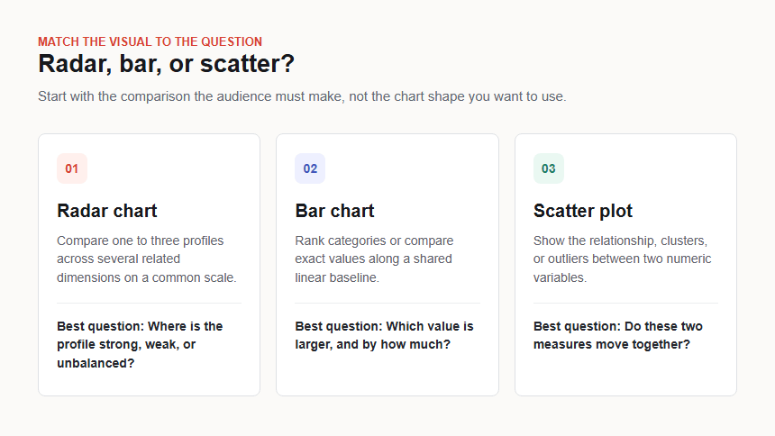
- Use a bar chart for exact ranking. Bars share a straight baseline, so the audience can compare close values more accurately. The PowerPoint bar chart guide explains how to compare category values on a shared baseline.
- Use a scatter plot for relationships. A radar spoke is a category, not a numeric x-axis. Use an XY graph or scatter plot when the question is whether two numeric measures move together, form clusters, or contain outliers.
- Use a line chart for change over time. Connecting radar spokes does not create a time sequence. Put dates on an ordered horizontal axis when the audience needs to follow a trend.
- Use a table when evidence matters more than shape. A compact score table may be clearer when the audience must inspect every value, definition, and source.
For a broader decision across chart families, use the chart types for presentations guide. Choose a radar chart when the profile pattern is the point of the comparison.
How Do You Prepare Data for a Radar Chart?
Prepare the comparison before opening the chart menu. The polygon will faithfully display whatever scores you provide, including inconsistent or poorly defined ones.
Define the decision and dimensions
Write the question in one sentence, such as: "Which launch-readiness dimension needs an owner before approval?" Choose dimensions that directly support that decision. Do not combine unrelated measures simply because they fit around a circle.
Put every measure on a common scale
Convert each dimension to the same range, such as 0-10 or 0-100. Keep the direction consistent, so an outward point always means more of the same concept, such as greater readiness. If one source measure is "risk" where lower is better, reverse or relabel it transparently before placing it beside measures where higher is better.
Document the scoring rule
Define what the scale means. A readiness score of 4 might mean that an owner and draft plan exist but the required evidence is incomplete; a 7 might require reviewed evidence and an approved mitigation. Keep that rubric with the working file or appendix so the audience can challenge the score.
Add a meaningful comparison
A target, previous review, or alternative profile gives the shape context. Use the same criteria, scale, direction, and axis order for every series. If the definitions changed, do not present the shapes as directly comparable.
| Dimension | Current score | Target | Evidence note |
|---|---|---|---|
| Research | 8 | 7 | Priority interviews complete |
| Positioning | 6 | 7 | Message requires one review |
| Sales enablement | 4 | 7 | Core proof and objection handling incomplete |
| Support readiness | 7 | 7 | Escalation path reviewed |
| Analytics | 5 | 7 | Dashboard ownership unresolved |
| Operations | 8 | 7 | Runbook and owners approved |
The values above are illustrative. Replace them with approved scores and evidence from your own review. Keep the axis order stable because rearranging the dimensions changes the visual shape even when the values stay the same.
How Do You Create a Radar Chart in PowerPoint?
PowerPoint uses an embedded worksheet for chart data. Menu labels can vary slightly by version and operating system, but the current desktop workflow follows these steps.
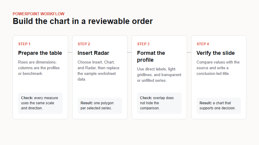
1. Build the source table
Place the dimensions in the first column. Put the current profile, benchmark, or alternative in adjacent columns. Remove totals and blank rows, confirm that the labels are short enough to read, and retain the original source separately.
2. Insert the chart
In PowerPoint, choose Insert > Chart > Radar. Select Radar, Radar with Markers, or Filled Radar, then confirm the selection. The worksheet that opens contains sample categories and series.
3. Replace the sample data
Paste the checked dimensions and scores into the worksheet. Resize the highlighted data range if needed so every intended row and series appears. Close the worksheet when the chart shows the correct dimensions and profiles.
4. Format for comparison
Use a light grid, a clear line for each series, and markers when the values need to be located precisely. If you use fill, reduce its opacity so another profile and the grid remain visible. Keep the same minimum and maximum across all spokes.
5. Add a conclusion-led title and evidence note
Replace a topic label such as "Launch Readiness" with the finding the chart supports: "Sales enablement is the main gap before launch approval." Add the scale, source, assessment date, evaluator or owner, and any important limitation.
6. Validate the finished slide
Compare every point with the source table. Confirm that outward always means the same thing, the benchmark uses the same definitions, and no label is hidden. Show the slide at presentation size and ask someone unfamiliar with the analysis to explain the main gap.
Worked Example: A Launch-Readiness Profile
Suppose a product team scores six launch-readiness dimensions on a 0-10 scale and compares them with an approved target of 7. Research and operations score 8, support meets the target, positioning is slightly below it, and sales enablement and analytics are the largest gaps.
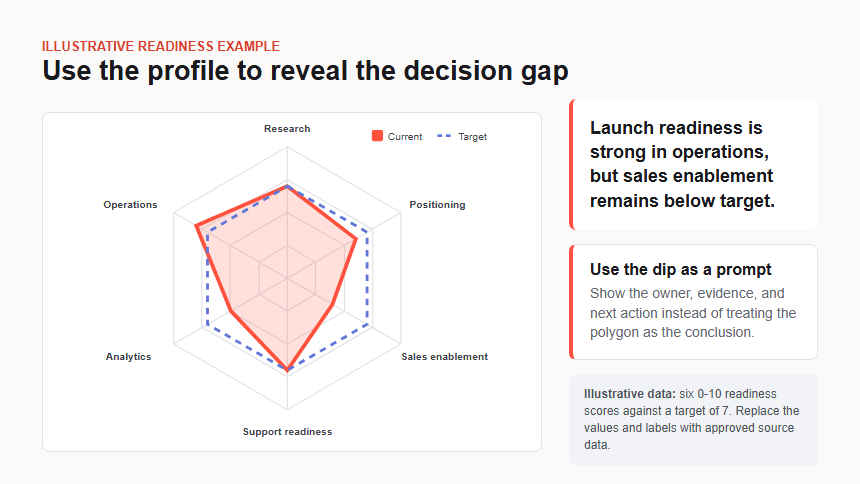
The useful presentation headline is not "Readiness Radar." It is "Launch readiness is strong in operations, but sales enablement remains below target." The chart shows where the profile differs; the surrounding content must explain the evidence and action.
A decision-ready slide would add a short annotation beside the sales enablement score: missing proof assets and incomplete objection handling. It would then name the owner, completion date, and review condition. For a broader method that connects evidence to action, use the data storytelling workflow.
Do not infer more from the polygon area than the scoring model supports. The shape is a visual summary of the six values, not an independent performance metric. If leadership needs a total readiness score, define the weighting and calculation separately.
How Do You Design a Radar Chart Without Misleading the Audience?
- Use one scale and direction. Do not place raw dollars, percentages, days, and satisfaction ratings on separate spokes without a documented normalization method.
- Keep zero and the range honest. Use a common minimum and maximum. Starting at zero is usually the clearest option when zero is meaningful; otherwise disclose the scale and avoid exaggerating small gaps.
- Limit the number of series. Add only profiles the audience must compare. If lines and fills overlap into a dense shape, use small multiples, bars, or a table.
- Keep a logical axis order. Group related dimensions and preserve the order across slides. Changing the order changes the apparent silhouette.
- Do not rely on color alone. Use direct labels, markers, line styles, and sufficient contrast. Add the exact values when the decision depends on them.
- Describe the chart for accessibility. Alt text or speaker notes should state the dimensions, comparison, largest gaps, and conclusion rather than listing every decorative element.
- Separate score from evidence. A score is a compressed judgment. Keep the rubric, source, date, and assessor available in the slide, notes, or appendix.
When a precise difference or ranking is central to the decision, replace the radar chart. A simpler visual is not a downgrade when it makes the evidence easier to verify.
How Can Presenti Help You Draft the Radar Chart Slide?
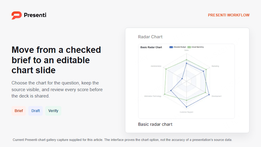
Presenti is an AI presentation maker that can help turn a structured chart brief into an editable presentation draft. Use it after the audience, decision, dimensions, scale, source values, and conclusion have been defined.
A useful brief might say: "Create an eight-slide launch-readiness review for product and revenue leaders. Use six approved dimensions on a 0-10 scale, compare the current profile with a target of 7, and make the sales-enablement gap the decision point. Keep the chart values and labels editable. End with the owner, due date, and review condition."
Review the result in two passes. First, compare every value, label, scale, and statement with the source. Then check whether the headline, chart, annotation, and next action tell the same story. The interface can help with drafting and layout; it cannot decide whether the scoring rubric or business interpretation is valid.
Frequently Asked Questions
What is the difference between a radar chart and a spider chart?
They are two names for the same chart family. Both place quantitative dimensions on spokes around a center and connect one item's values into a profile shape.
How many variables should a radar chart have?
Use enough dimensions to form a meaningful profile without crowding the labels. Five to eight is a practical starting range for many presentation slides, but the correct number depends on label length, screen size, and audience familiarity. Test the finished slide rather than treating the range as a rule.
Can a radar chart compare more than two items?
Yes, but each additional series adds overlap. One to three profiles are often manageable. If the lines become difficult to trace, use small multiples, grouped bars, or a table.
Should a radar chart start at zero?
Use a shared zero baseline when zero has a meaningful interpretation. If the scale has a justified nonzero minimum, show the range clearly and explain it. Never give different spokes different ranges without making the transformation explicit.
Is a radar chart good for survey data?
It can summarize a small set of related survey dimensions when they use the same scale and the profile pattern matters. Show the sample, period, scoring method, and uncertainty where relevant. Use bars or distributions when exact response differences matter.
Bottom Line
Use a radar chart in PowerPoint for one focused job: comparing a small number of multidimensional profiles on a common scale. Define the decision and scoring rubric first, keep the dimensions and series readable, build the chart from a checked table, and state the finding in the title. When the audience needs precise ranking, trends, or relationships between two numeric measures, choose a bar, line, or scatter chart instead.