A pie chart in PowerPoint is useful when one total is divided into a small number of meaningful parts. Each slice represents a share of that same whole, so the audience can see the dominant contributor and the broad composition at a glance. It is not the right chart for trends, negative values, or precise comparisons between several similar categories.
To make one, choose Insert > Chart > Pie, replace the sample data in the worksheet, add category-and-percentage labels, and write a title that states the finding. The more important work happens before and after those clicks: confirm the denominator, make sure the parts belong to one total, and test whether a bar chart would be easier to read.
What Does a Pie Chart Show?
A pie chart shows the composition of one total. The full circle is 100%, and each slice is one category’s value divided by that total. If qualified leads came from five mutually exclusive sources, for example, the circle can show each source’s share of all qualified leads.
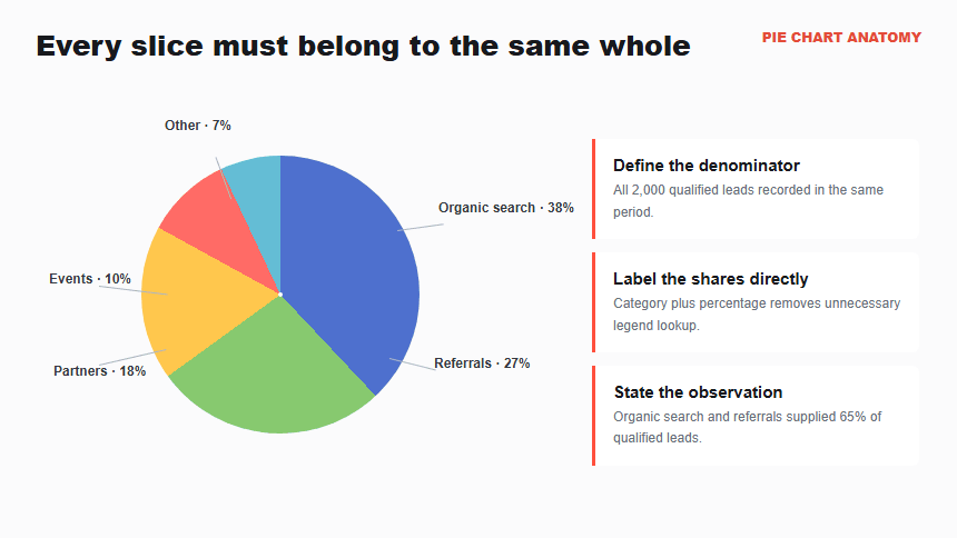
Four elements make the chart interpretable: a defined whole, categories that belong to that whole, labels that identify each share, and a title that states the observation. The audience should not have to infer the denominator from context. Name it in the title, subtitle, source note, or nearby text.
A pie chart shows composition, not change. Two pies for two periods often force viewers to compare angles and areas across separate circles. When time or movement is the question, a line, column, or 100% stacked chart will usually support the comparison more directly.
When Should You Use a Pie Chart?
Use a pie chart when the question is “What share of this one total comes from each category?” Microsoft’s current guidance says pie charts work best with one data series, values greater than zero, and no more than seven categories. Seven is a readability recommendation, not a software limit or a design target; a presentation slide is easier to discuss when every slice earns its place.
Before choosing the chart, apply these tests:
- One whole: every category uses the same denominator and reporting window.
- Mutually exclusive parts: an item is counted in only one slice. If categories overlap, use a different chart or redefine the counted units before calculating shares.
- Complete coverage: the categories plus any clearly defined “Other” group account for the entire total.
- Visible differences: the story depends on broad proportions or a dominant slice, not tiny differences that require exact judgment.
- One snapshot: the chart explains a composition at one meaningful point or period.
Good uses include budget allocation, channel mix, survey response shares, product mix, or the sources of a defined lead pool. “Revenue by region” is not automatically a pie-chart question. It becomes one only when the intended message is each region’s share of total revenue for the same period.
When Is a Bar Chart or Donut Chart Better?
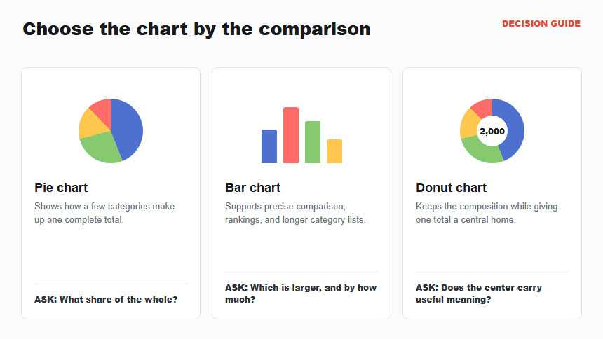
Choose the display that matches the comparison. A pie chart emphasizes the whole. A bar chart emphasizes differences among categories. A donut chart preserves the part-to-whole idea but creates central space for a total or headline metric.
| Your question | Better display | Why |
|---|---|---|
| Which few categories make up one total? | Pie chart | The whole and its broad composition are the message. |
| Which category is larger, and by exactly how much? | Bar chart | A shared baseline makes close values easier to compare. |
| Can I show the mix and feature one central total? | Donut chart | The center can hold the total while the ring shows composition. |
| How did the mix change over several periods? | 100% stacked chart or small multiples | A consistent baseline supports change over time. |
Use the PowerPoint bar-chart guide when ranking and precision matter. Use the donut-chart guide when the center needs to carry one important total. For a broader choice among chart families, start with the PowerPoint chart selection guide.
How Should You Prepare Pie Chart Data?
Start with a two-column table: one category column and one value column. Use raw counts when they are available; PowerPoint can calculate the percentage labels. Raw values preserve the source total and make rounding easier to audit.
The worked example uses 2,000 qualified leads. The values are illustrative.
| Lead source | Qualified leads | Share |
|---|---|---|
| Organic search | 760 | 38% |
| Referrals | 540 | 27% |
| Partners | 360 | 18% |
| Events | 200 | 10% |
| Other | 140 | 7% |
| Total | 2,000 | 100% |
Do not include the total row as a slice. Use it only as a reconciliation check. Confirm that all sources use the same qualification rule and reporting period, that no lead appears in two categories, and that “Other” has a documented definition. If the original values do not add to the stated total, resolve the mismatch before opening PowerPoint.
Sort the categories by value unless a meaningful sequence exists. Keep the largest slice first and group only genuinely minor categories. A broad “Other” slice can hide the very segment the audience needs to investigate, so retain the underlying breakdown in your source file or appendix.
How Do You Create a Pie Chart in PowerPoint?
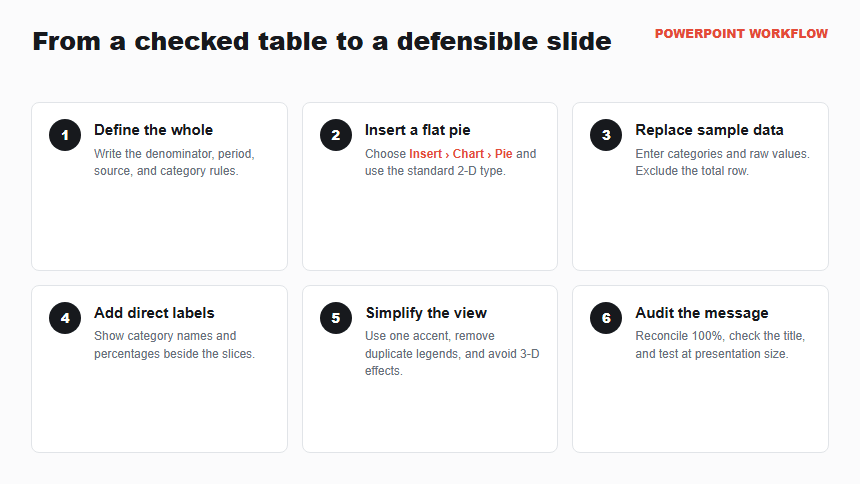
PowerPoint creates the chart from an embedded worksheet. Microsoft’s current workflow is to select Insert > Chart > Pie, choose the chart type, replace the sample data, and close the worksheet. The exact ribbon placement can differ slightly by version, but the chart and data controls remain the same.
Step 1: Define the whole
Write the denominator in plain language: “all 2,000 qualified leads recorded in Q2.” Confirm the source, reporting dates, category rules, and owner. The visible result at this stage is a checked two-column table, not a chart.
Step 2: Insert a flat pie chart
On the target slide, select Insert > Chart > Pie. Choose the standard 2-D pie and select OK. A sample chart and worksheet should appear. A flat chart keeps the slice areas easier to judge than a perspective-heavy 3-D version.
Step 3: Replace the sample data
Enter the category names in the first column and the raw values in the second. Delete unused sample rows and exclude the total row. Close the worksheet when the five intended slices appear. If the chart shows an extra “Total” slice or the wrong categories, correct the data range before formatting.
Step 4: Add category and percentage labels
Select the chart, open Chart Elements, and enable Data Labels. Open Format Data Labels, then show the category name and percentage. Uncheck the raw value when it duplicates the percentage without helping the decision. Position labels so each one clearly belongs to a slice.
Step 5: Simplify the visual
Use a restrained, distinguishable palette and one deliberate accent for the slice discussed in the title. Remove the legend when direct labels already identify the slices. Avoid shadows, bevels, excessive slice separation, and decorative icons that compete with the proportions.
Step 6: Write the takeaway and audit the chart
Replace “Lead Sources” with a finding such as “Organic search and referrals supplied 65% of qualified leads.” Compare every label with the source table, check that the underlying shares total 100% and explain any displayed rounding difference, and read the slide at presentation size. If close slices remain hard to compare, switch to bars.
Worked Example: Qualified Lead Sources
The example has one defined total and five nonnegative, mutually exclusive categories. Organic search accounts for 38% of qualified leads, while referrals account for 27%. Together they contribute 1,300 of 2,000 leads, or 65% of the total.
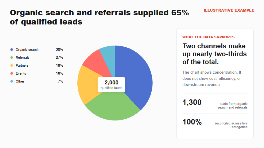
The title “Organic search and referrals supplied 65% of qualified leads” is more useful than “Lead Source Breakdown.” It tells the audience what the chart supports while leaving room for the next question: should the team protect those channels, or does the mix create concentration risk?
The chart does not show channel efficiency, cost, or lead quality after qualification. A large slice can reflect a large investment rather than better performance. Put cost per qualified lead, conversion, or downstream revenue on another slide if those measures drive the decision. The data storytelling guide for presentations explains how to connect a chart finding to context, implications, and an action.
How Do You Label Percentages Without Clutter?
Direct labels reduce the back-and-forth between the circle and a separate legend. For most presentation slides, show the category name and percentage together. Use zero or one decimal place according to the decision; false precision makes the chart look more certain without making it more useful.
Follow these checks:
- Make the label-to-slice connection obvious. Place labels inside large slices or use short leader lines for smaller slices.
- Protect the total. Calculate percentages from one denominator and review any rounding difference. If displayed values total 99% or 101%, adjust the displayed precision or add a short rounding note.
- Use color as support, not the only identifier. Keep text labels, sufficient contrast, and a logical order so the chart remains understandable without perfect color perception.
- Avoid 3-D perspective. Depth and tilt can make front slices appear larger and hide thin slices at the back.
- Write meaningful alternative text. Name the total, the largest shares, and the message rather than listing colors or every decorative detail.
For accessibility, include the source values in nearby text, speaker notes, an appendix, or an accessible data table when exact numbers matter. A screen reader cannot recover the data merely because the percentages are visible inside an image. The title and surrounding paragraph should communicate the main conclusion independently of color.
How Can Presenti Help You Draft the Pie-Chart Slide?
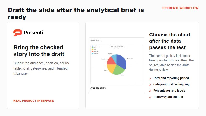
Use Presenti as an AI presentation maker after the analytical brief is ready. Include the audience, decision, checked data table, reporting period, source, and intended takeaway. For this example, the brief would state that the slide must explain how 2,000 qualified leads were distributed across five sources and emphasize the combined 65% share from organic search and referrals.
An editable presentation draft can help establish the slide structure and visual direction. Keep the source table beside the draft while refining the chart. Confirm the denominator, category mapping, percentages, label placement, title, source, and alternative text before presenting.
Presenti can support slide drafting; the presenter still owns the data definitions, calculations, chart choice, accessibility, and conclusion. A polished circle does not prove that the parts form a valid whole.
Frequently Asked Questions
How do I show percentages on a pie chart in PowerPoint?
Select the chart, enable Data Labels from Chart Elements, and open Format Data Labels. Choose Percentage and, when useful, Category Name. Uncheck the raw value if it only repeats the same information.
Do pie-chart values have to add up to 100?
The displayed shares should represent 100% of one defined total. You can enter raw counts rather than pre-calculated percentages; PowerPoint calculates each share from their sum. Confirm that the categories are complete and mutually exclusive before relying on the result.
How many slices should a PowerPoint pie chart have?
Microsoft recommends no more than seven categories. For a presentation slide, fewer is often clearer. If you need many slices or must compare similar values precisely, use bars or another display with a shared baseline.
Should I use a pie chart or a donut chart?
Both show part-to-whole composition. A standard pie gives each slice the full radius and is straightforward to read. A donut provides central space for one total or headline metric. Choose the center space only when it has a clear communication job.
Why should I avoid a 3-D pie chart?
Perspective can enlarge front slices, compress back slices, and obscure small categories. A flat 2-D chart keeps the areas easier to judge and labels easier to place.
Bottom Line
A clear PowerPoint pie chart begins with one valid whole, not with the Insert menu. Use one nonnegative series, keep the categories limited, verify that the parts reconcile to the total, and label slices directly. Then write a title that states the supported observation.
If the audience must compare close values, scan a long ranking, or track change, choose another chart. When a pie chart does fit, the final test is simple: viewers should understand the whole, the largest shares, and the takeaway without decoding a legend or questioning the denominator.